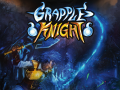
 With the opening of Steam Greenlight coming in 2 weeks, we wanted to get a build of Grapple Knight ready for it’s release, to be amongst the first of games to be put up on display. Not exactly the biggest time frame to really push our game to the next level, but at the same time, none of us saw what had to be done. I wouldn’t really say we underestimated ourselves, after all with the game as it was, we saw ourselves getting the game in shape in that time for Greenlight no worries. What we did next threw our 2 week time frame out the window, but was a step we couldn’t ignore taking.
An idea put forward by Epona Schweer, we had decided to try our hand at building up a community by seeking crowds who would potentially appreciate our product through mutual interests. Since the nature of Grapple Knight was a retro styled platformer, I wanted to find a community where pixel art was a primary focus. I talked to a few people, did a search and I found two communities of note: The Spriter’s Resource and Pixel Joint. Both of these places are very active forums for all things pixel art, so if you are looking for a place to admire great pixel art, improve your creative processes, or showcase your own art, be sure to look into these forums.
My experiences with these two places, were, to say the least, varied. On one hand, Pixel Joint’s Work in Progress forum wasn’t as active as I thought, but that may be accredited due to the fact that the majority of the people hang on the main website instead of the forums (where I’ve seen more active critique on people’s galleries, which works similar to deviantART). On the other hand, The Spriter’s Resource (henceforth abbreviated to TSR), was a completely different experience.
I introduced myself, told my story and displayed what I had for Grapple Knight at the time, which was the character sprite sheet of the hero. In contrast to Pixel Joint, the responses were a lot more frequent, albeit not what I was expecting. As a lot of you know, the internet is a wonderful yet also dangerous place, where naysayers can truly speak their mind through the mask of anonymity. Suffice to say, everyone disliked it. The replies were very critical, didn’t offer much room to breathe, and downright soul crushing. Not that I wasn’t anticipating negative comments, but the magnitude was very overbearing.

With all that was said, I felt like I really needed to find my bearings again, I was definitely feeling down, but at the same time I felt determined to try harder. Despite the negativity, people are interested in helping you out. The fact that people replied at all is indicative that they took the time to look at your work and give you their honest opinion. One just needs to remember to let the harsh words blow over you as gracefully as you can, then really look into what they’re trying to say. At that point I had decided then and there, it was time to say goodbye to the Hero as he was.
So I sat down and took note of what everyone had said and then put that into general design goals for myself.

More Emotion on the Hero, as well as personality
With these in mind, I opted for a semi-chibi proportion, with the enlarged head yet with a similar body size to the old hero. Giving more space to the Hero’s head allowed a more detailed face, which to me gave opportunities for a wider range of expression and emotion. The styling of his head also meant I could play around with exaggerating his proportions if the situation called for it and it wouldn’t look out of place (e.g. stretching his jaw down in surprise or disbelief).
Good Silhouette
Looking back on the old Hero and how his animations played out, his silhouette was a little muddled. Add onto the fact that the choreography wasn’t very empowering for a player. One of the goals I wanted to accomplish was to make sure his movements edged towards the exaggerated, where lines of motion could be more easily read at a glance. To achieve this, I had set out to record myself and get animation reference for the kinds of motions I wanted out of the new Hero. Of course, given the limitations of the human body (as well as my inflexibility), there was only so much I could do to perform what I had in mind, but the general positions of the body helped a lot in achieving really good fluidity.

Simple
One particular criticism I had received about the Hero was that his design felt cluttered. In the first pass I did of the Hero (what you saw before the redesign), I had tried to keep his design fairly simple. Though a lot of details didn’t translated very well into a small canvas, it ended up feeling like I was trying too hard to fit everything I wanted. During my redesign process I had come up with a few preliminary designs and posted them on the TSR forums to gauge how well I was taking in their feedback. Eventually with the help of a few people (Thanks Gors!) I had gotten closer to a design I was happy with and learned that simple is good, especially when dealing with smaller spaces.
Going Forward


With a new Hero design more or less nailed down, it was time to really get into the heavy lifting: creating a new sprite sheet of animations from scratch. With the environment along with the levels design getting a facelift as well, the game was looking radically different for the Greenlight launch. Despite all of these updates, by the time Greenlight was up and running, the game wasn’t quite at a point where we felt we could submit it on time and still be happy with it (although some could debate that our delay may have been better considering the questionable turnout of Greenlight during the first few days). Aside from crunching a lot of the game, there was still a lot to be done with picking out screenshots, as well as a trailer. With that in mind, we set our sights on the next big thing: EB Expo.
Courtesy of AIE, they were able to help us with the costs of a booth in the Homegrown Indie section, which was where all the independant developers were stationed to show off their wares. With the games makeover more or less complete for EB Expo, we were really able to test how people felt about the visuals. The response was overwhelmingly positive, people really appreciated the retro look the game provided and easily connected it to classics back in the day such as Megaman, Metroid, and Castlevainia.
So despite rough beginnings, we were able to make it out on top with something much, much better. Thank you to the people over at TSR who helped me get that one step closer to becoming a better pixel artist. I’m glad we made the decision to put my work up on TSR, even if I got blasted at first. Regardless of the response (barring blatant personal attacks), the fact that people reply to your work at all is something that should be appreciated as it shows they took the time to look at your work, analyse it, and give feedback. One just needs to remember to have a thick skin prepared for any negativity and try not to take things personally, as some of the best advice I received was hidden in the subtext of seemingly harsh critiques.
Thanks for reading and I hope you got something out of my experiences to help in your own endeavors. The rest of this 4 part article will be coming out soon, talking about environments, programming and level design! Stay tuned!

waz up! nice story