Character Selection
This week has been dedicated to updating the in-game UI to reflect the graphic novel style I am aiming for in RIZN. I started with reworking the character selection screen since this was one of the few UI's that was still using plain ol' white, Unity-native sprites as placeholders for buttons, etc. After browsing the Unity Asset Store, I found a pack of animation poses that seemed it'd work well for posing the 30 characters that the player has to choose from, then painstakingly positioned them all in one of several panels. The top panel - at least for the time being - will feature characters that are available to play originally, the bottom three panels featuring those that will be unlocked via in-game achievements.

Each character is using a new version of my desaturation shader that allows me to adjust the amount of color for each individual material (rather than the global setting used during gameplay). Saturation is applied at 50% when the mouse hovers over a given character, and the currently selected character is displayed in full color, which I feel ties into the desaturation of the game world during gameplay. From there, the player is given a few options to modify their character before starting the game, including both the color of their clothing and the tone of their skin.
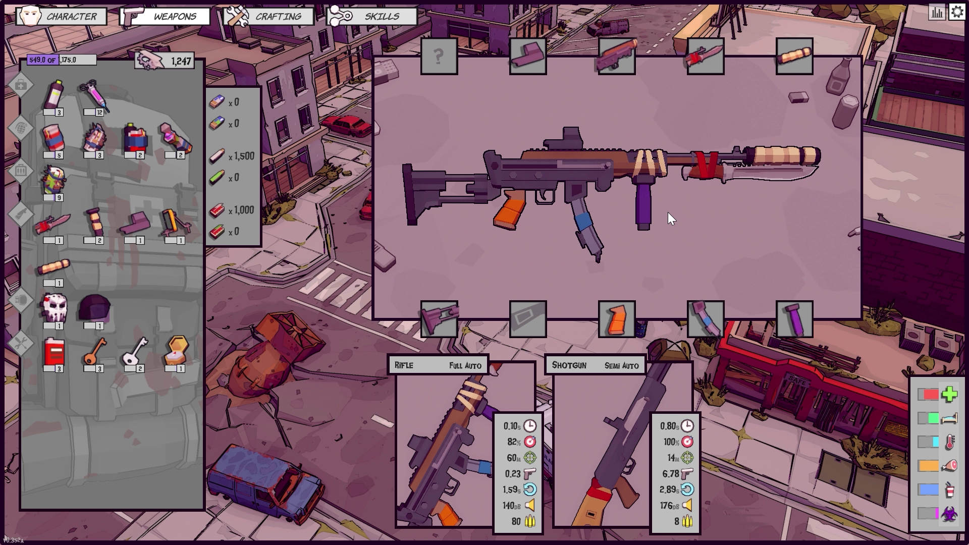
Inventory & Weapon Mods
After having finished the updates to character selection, I quickly realized that it left my character canvas screens looking subpar. The bright white outlines stood out and pulled focus away from the content of the panels themselves, so I've since gone back through these screens (again) and made several adjustments, so they now match the character selection screen more closely.

All of this is and will continue to be a work in progress, but I'm happy with the results and feel like there have been big improvements made all around.
Loading Screen
Lastly, I added a bit of 2D animation to the loading screen which replaces the old layout of a boring progress bar. The idea here is that the animation itself serves as a means of conveying the loading progress, and as the code running in the background gets closer to completing, the moon rises higher in the sky and reveals more of the game's logo. It's simple, and although it skips a bit as the next scene is loaded, it is after all a loading screen and is far from a priority at this point, so I'm going with it until I decide it needs to a round of polish.

This loading screen is only displayed when starting a new game or loading from a save file; there will be no loading screens when making the transition from one quarantine zone to the next - a feature I am currently working on and hope to have ready to share next week.