Milestone achieved! Three cheers!
Okay now, with the jubilation duly out of the way I will move on to what you actually care about- the shiny things... minus the shiny. By this I mean that there is no specular light implemented in the model viewer yet so there is a literal lack of shiny. The lighting as such is created with the texture itself and a ramp shader.
This first image shows the texture from the side, which is a view you will likely never get in the game as the camera will be fixed at a high angle but it will allow me to point out the more subtle things I did while painting the texture.
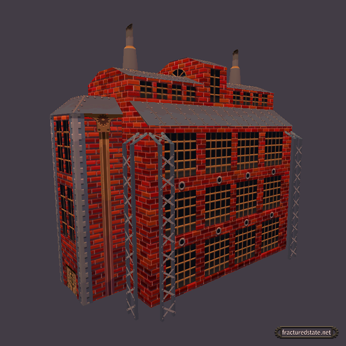
The primary thing you may notice is that the texture has a gradient going downward (not a literal gradient on the sheet, because all areas of color for the most part will be hard edged). The idea behind the gradient is that it helps the eye to separate distance more easily. The effect is most obvious if you turn your head sideways... go ahead... you may look crazy but that doesn't make you crazy. It does make you crazy by the way. You will soon by bundled away to the funny farm.
The style I want to implement will have the aforementioned hard divisions of color, which you can see rather clearly in the next image, along with a high saturation of color. The background in the model viewer may make it harder to conceive of what that will look like in the game world, but hopefully we can show you it on a map soon.
The next two images show an angle that is closer to the in game angle we are likely to use.
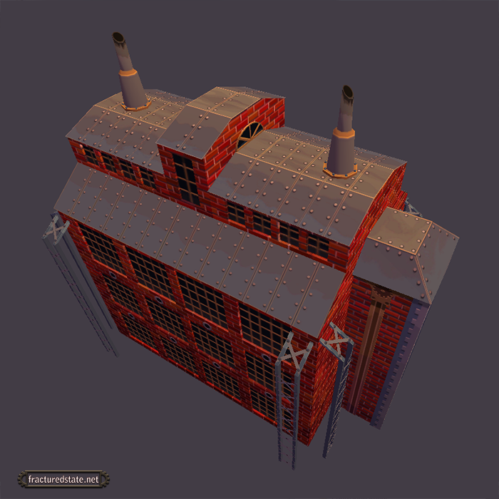
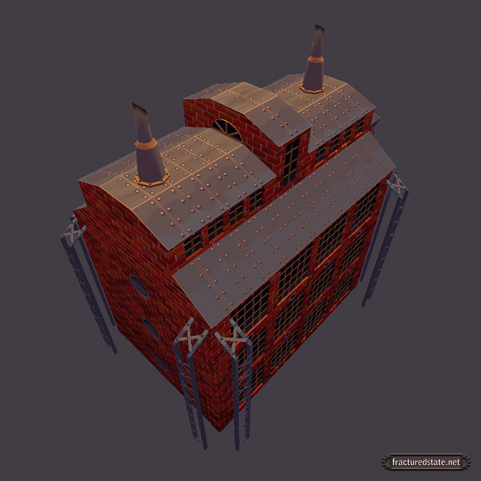
Both images show how the ramp shader effects the texture, with the roof remaining a bright counterpoint to the side of the building in shadow.
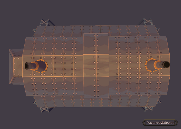
And lastly the texture sheet itself.
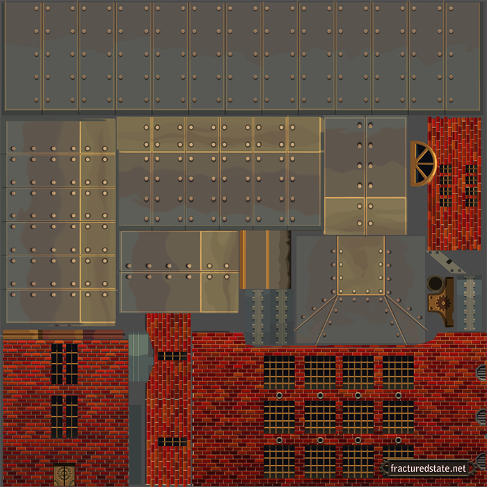
It might be worth noting too that this is the first time I have ever done a texture sheet, so hopefully the process will speed up and improve as we go.

It is difficult to give an opinion on a single piece without relation to the idea of the whole, however, from the concept art, the red seems to pop out quite a bit more in the texture. It does look good, but without seeing it in a scene I think it would look better with darker bricks.
Looking forward to seeing more! :)
When Todd first showed us this the bricks were actually a bit brighter than they are now. I can definitely see your point but we wanted to make sure it stood out with map lighting, fog, and any other effects we put in maps. It'll all be a work in progress until we get a look and feel we like.
Thanks for the feedback!