In previous blogs (Setting The World Style Part 1 and Part 2), we’ve discussed how the world and setting of our game changed over time. Here, we’re going to focus on how the graphics and visual style evolved to its current state. As we already mentioned in Dev Diary 1, this issue set us back by two months. Let’s dig into it, shall we?
LINEART GRAPHICS
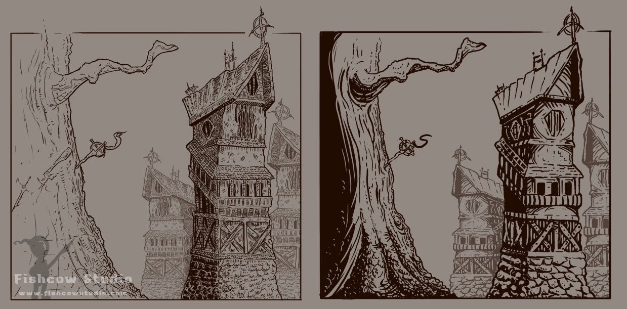
The first type of visual style we tried was lineart graphics. It was our first choice mainly because we liked the creations of our graphic artist Ivan.
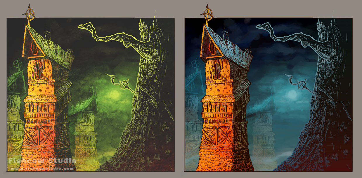
The first attempts were promising. However, we knew that how the game looks in color would be the deciding factor here, so we’ve tried plenty of various color schemes. Here are two we liked the most.
We loved the colors and were proud about the results. The sketches met our criteria of both dark atmosphere and interesting visual style.
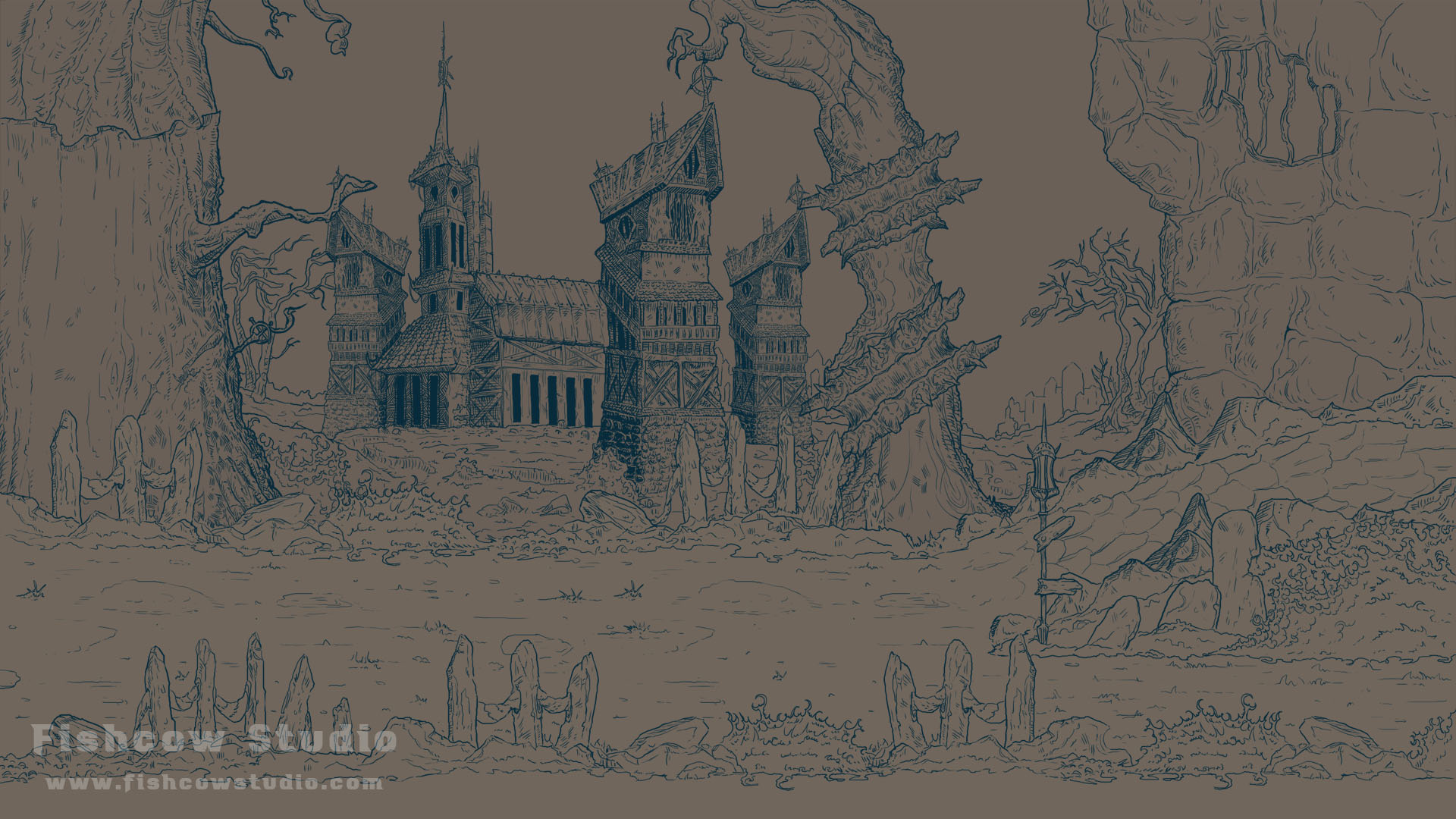
DRAFT OF THE GAME SCREEN
After our first color attempts, we started working on the game screen.
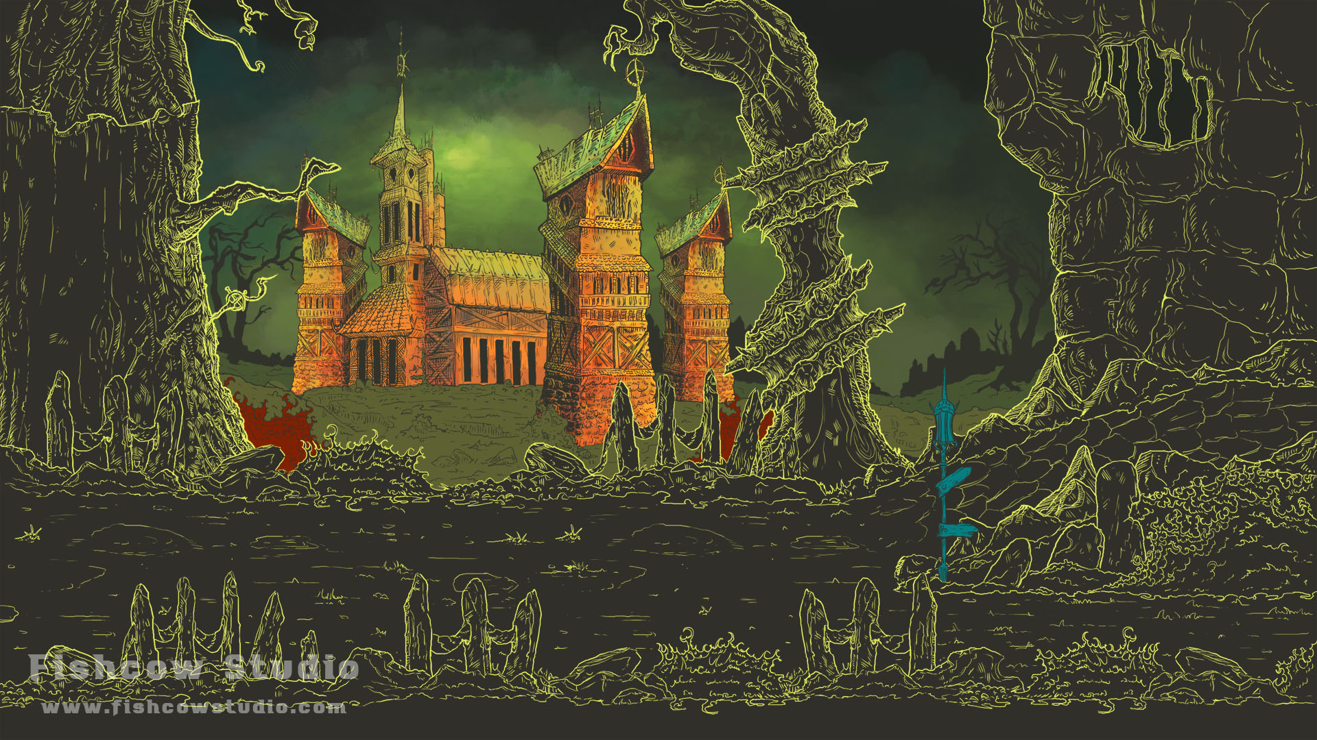
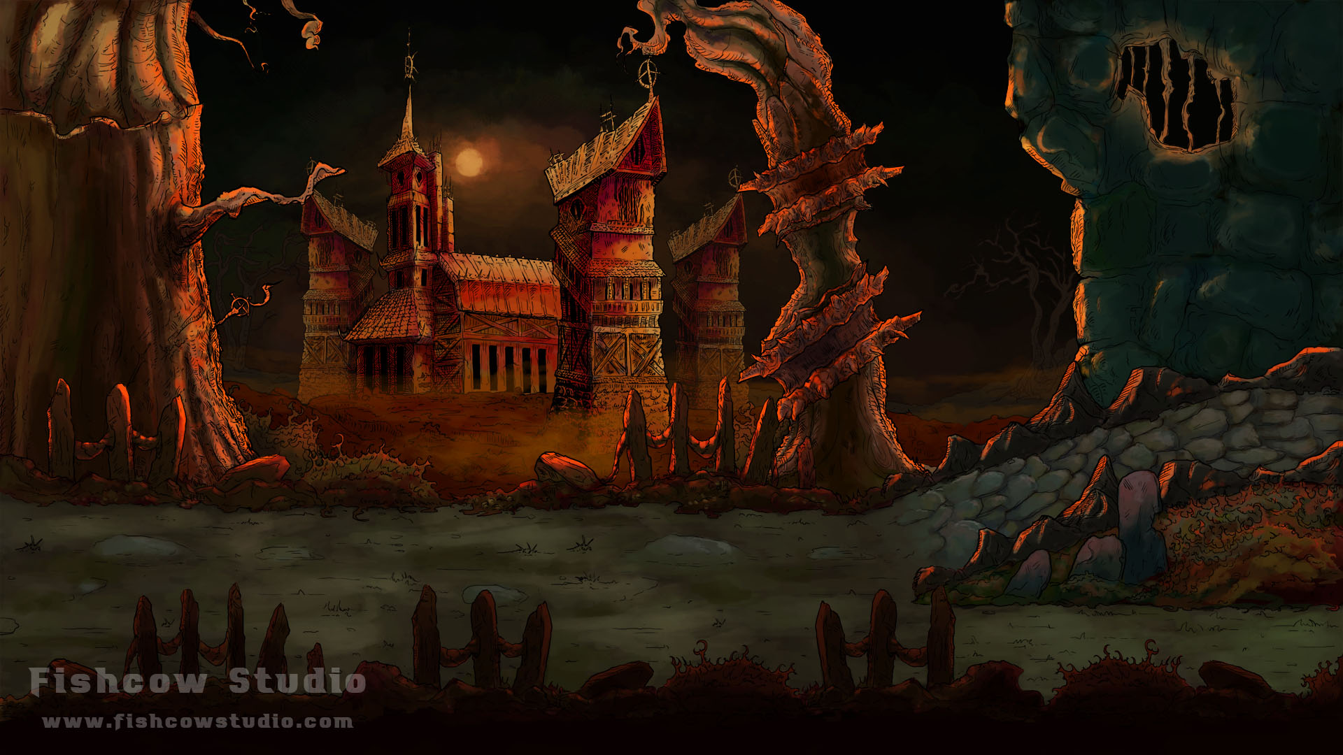
After a while, we thought we had a winner. So we transformed our sketch into colors. We picked the green version (Fig 2, left). It looked like this:
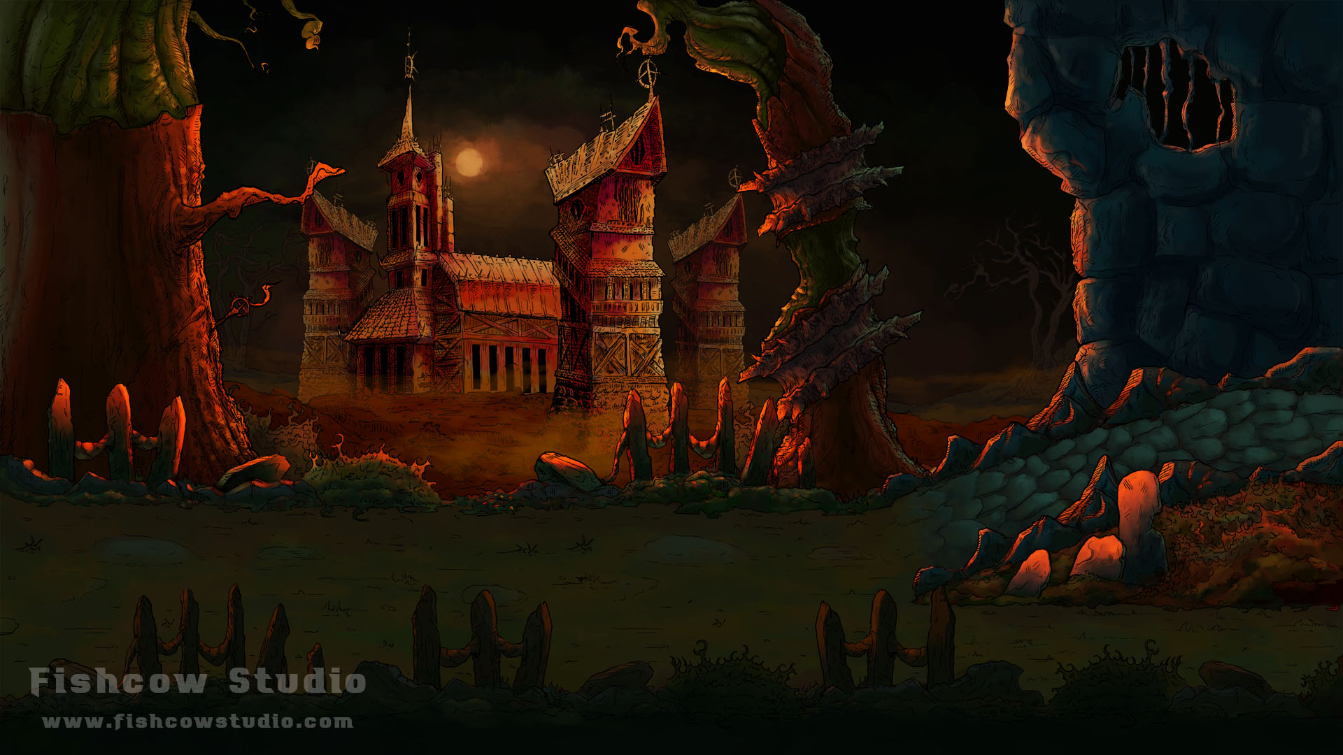
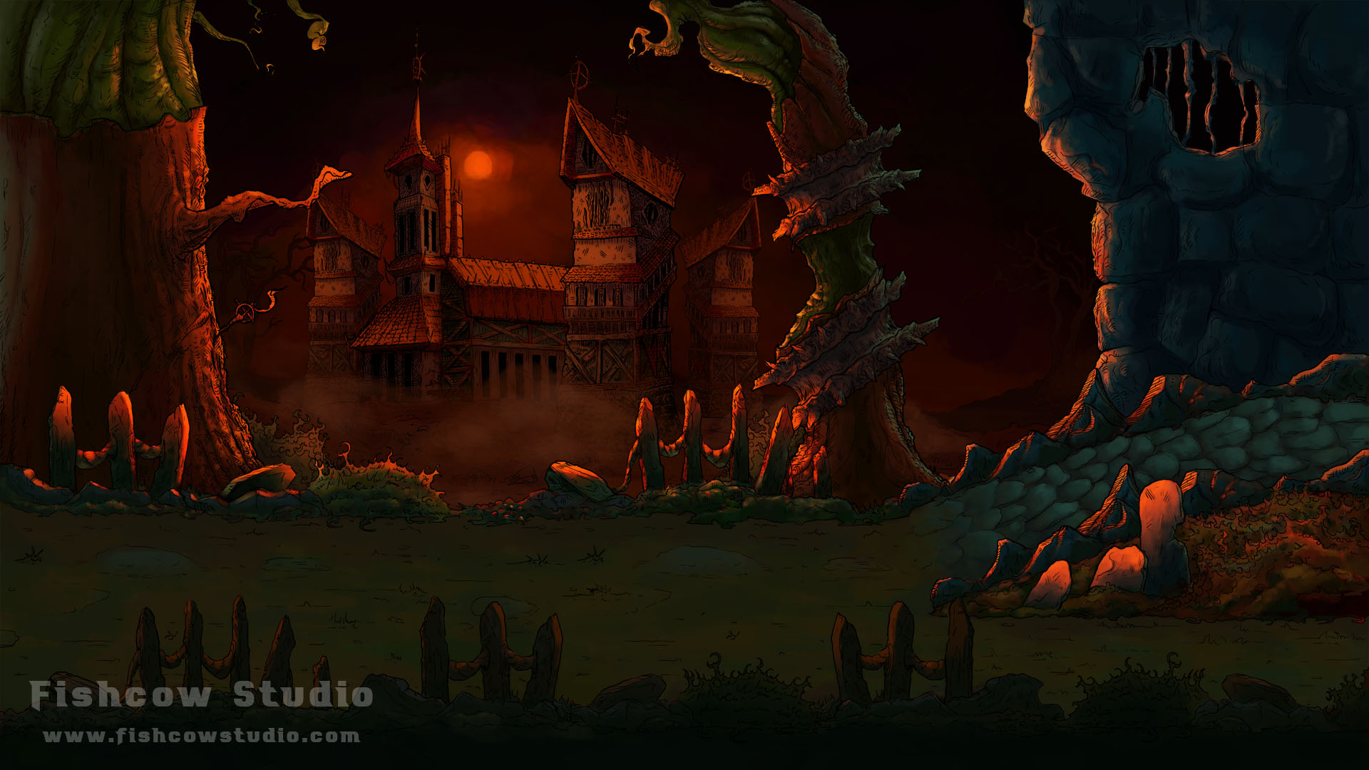
WTF? That’s what we immediately thought. It looked so strange. And we were quite disappointed with the result, since our expectations were so high. We had to try many color variations, such as these:
With each one of the thirty or so versions we thought we were approaching our dream. But when we looked at it after all those iterations, we have realized we have a huge elephant in the room. Visibility. The last versions were so dark we almost couldn’t see anything in there. Two weeks of work were in vain. And our vision for the visual style went up in the smoke.
PAINTED GRAPHICS
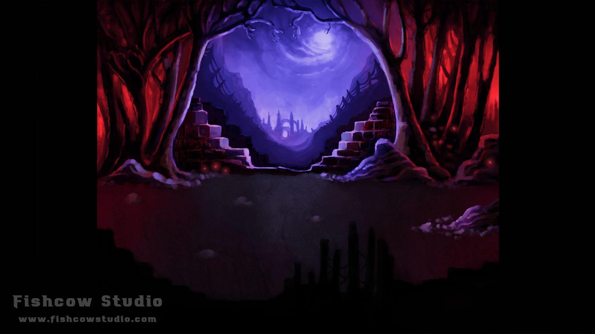
We started working on painted graphics.
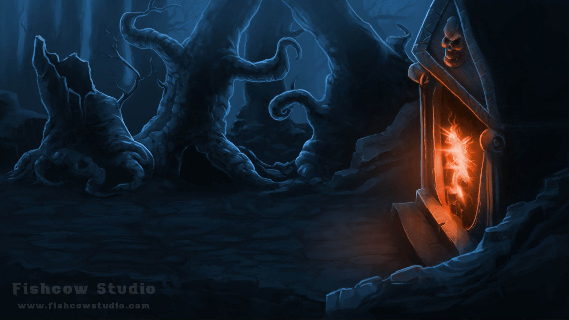
This looked much better, and more importantly, everything was visible. However, it looked like some classic adventure game. We tweaked it a bit and the result looked like this:
Wow! We loved that. Finally, after two months of attempts, we have found our visual style. We were free to work on other important aspects, after all.
FOLLOW US
- Facebook: Facebook.com/MoonfallGame
- Twitter: Twitter.com/FishcowStudio
- Blog: Fishcowstudio.com/blog
That’s all folks! And feel free to comment and discuss.


Very cool artwork. Keep it up!
Looks great!
Thank you guys! :)
Looks much better now. Great job!