Hello everyone, how are you guys doing?
Logo Evolution
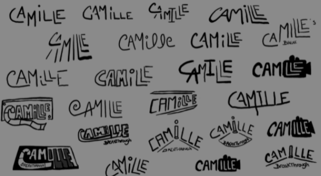
This week we want to share with you some more stuff about our game "Camille’s Breakthrough": our whole progress for the logo creation, its evolution and testing until the final result.
Our main goal was to create something unique that instantly resembles our game. Firstly, we started studying other games logos and how they manage to separate two words apart, but still keep its readability intact.
The interesting factor on the name Camille is the existence of the word Cam in it, that resembles our game core mechanic: the camera. Finding a way of separating those two parts of the name was a big challenge that resulted in long conversations with teachers and other colleagues from our course that always shared some interesting ideas.

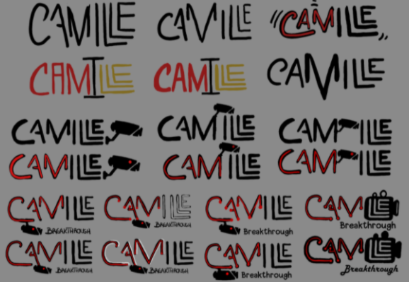
Now with a more stable product in mind, we expanded our vision a little further, adding small cameras in different places, testing if our game subtitle would fit or not, and even test some colours that would make sense for the composition

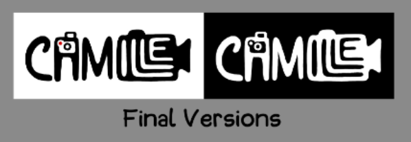
Our best result, or at least our favorite one, didn't include colour or even small cameras attached. Instead, a simpler version, with a camera silhouette and a small camera at the letter "A", which will be used in the games icon.


Main Menu Preview
For now here is a small preview of our main menu with the animation, although the product is not yet final it was something we really wanted to share.
Hope you enjoyed this update on Camille's Breakthrough.
Best regards WestFell Studios


