This was a very quiet week. Literally. Both Michi and myself were on vacation this week so there isn’t too much progress to report on. But I couldn’t help but experiment with something that has been bothering me for a while now: Tile contexts!
What are tile contexts?
The user interface of Prosperous Universe revolves around so-called tiles. Every function of the game is represented by a certain type of tile and tiles can be arranged however you like in frames - something like workspaces you can quickly switch between - or opened in buffers - the equivalent to a window in your operation system of choice - that can be moved around on top of the current frame.
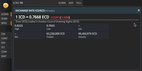
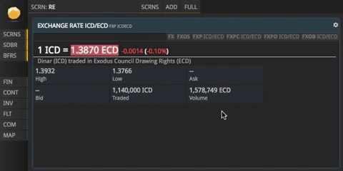
Each tile has a very narrow scope, so chances are that for a given feature there exist a lot of different tiles - one for every function. For example, the Foreign Exchange feature has different tiles to display a matrix of all exchange rates, a tile to display a single exchange rate, a tile to display a chart of an exchange rate over time, a tile to place a foreign exchange order and so on…you get the idea.
Because it is very likely you’ll need several related tiles in any given situation we came up with the concept of tile contexts: Whenever you open a tile, its context lists a set of related tile types you might need as well. You can than open any of these tiles in a new buffer by the click of a button.
Old tile contexts
Before this week, a tile context looked and worked like this:
You had to hover over the tile controls icon, than move the mouse cursor, hover over the context icon and finally click the respective entry in the list. Aside from obvious usability-issues due to the temporary design of the respective elements (very small icons etc.), this way of doing it also means that the context is very hard to find for new players and clunky to use for anyone else.
New tile contexts
So I set out to improve how tile contexts look and work with the following goals in mind:
- They should be accessible with as few clicks/steps as possible because you’ll need them a lot.
- They should still be unobtrusive to avoid creating too much noise on busy frames.
- They should emphasize the commands instead of the description of the tile to help users to learn the commands and to support the command-based nature of our UI.
This is the latest draft I’ve come up with:
If context items exist for a tile, they are displayed in a narrow band across the top of the tile which means no additional clicks or actions are required to reach them. The colors are subtle shades of grey that offer just enough contrast to make out the text while not creating too much noise and without distracting attention away from the main content. When hovering over a context item, a higher-contrast version is displayed including a description of the respective function. A click on an item opens it in a new buffer.
Obviously, this is merely a first iteration, but I think it works rather well already. Let’s see what Michi thinks of it once he gets back and if you have an opinion on this, please don’t hesitate to share it with me on the forums!