As the solo and lead artist for the indie studio RoKabium Games and working on the first game of the studio called “Something Ate My Alien”, the amount of different images I’ve created and modified for this game goes well into the many thousands. As I’m writing this blog my file number of different assets, concepts, backgrounds, logos and promotional artworks is just over 6000 files. For anyone that does not know what goes into making a game it is easy enough to not fully grasp the amount of content needed to make even a smaller but full, visually pleasing and fun to play game that has all the mechanics needed to function properly and look good.
We have been developing this game for the last 2 years and have finally come to the stage where we’ve let a few people try out the game and give us feedback during a private alpha release. At this stage of development most of the game is finished and we are tweaking, adding and changing things to make for clearer and smoother game play before releasing it as general alpha where more players are needed to test the game. Since we have reached this point I thought it would make for an interesting read to visually see the development of the game up until this point.
The overall art style
I was so in love with the art style of games such as “No Man’s Sky” and “Firewatch” and wanted to create something similar for this game with a retro-feel to the palette and style. This game was to be a reminder of the early classics such as “Boulder Dash” and “Spelunky” but with some more exploration/adventure tossed into it slightly reminiscent of the first Zelda games. We wanted future players of SAMA to feel a connection to these earlier classics but with a smooth, painted, beautiful style that had a “hand painted stroke by stroke” look. Very early on we knew we wanted to create a game with keywords such as fun, classic, hand painted, quality, beautiful.
The GUI and HUD
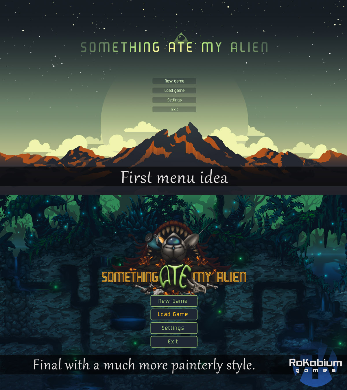
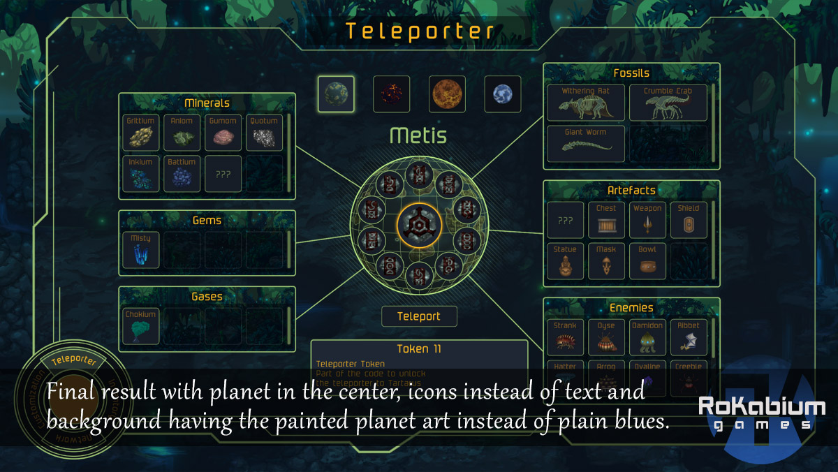
Despite the brush painted style on the different worlds, I did want to keep the retro palette and clean interface without too many fillers or decorations that could cause distraction on the GUI. You as the player are the main AI running the mining ship that in turn sends down the Aliens to dig on the planets, so the AI part of the game play needed to have a distinct and more simplistic look than the dynamic, living world the Aliens would move around in.
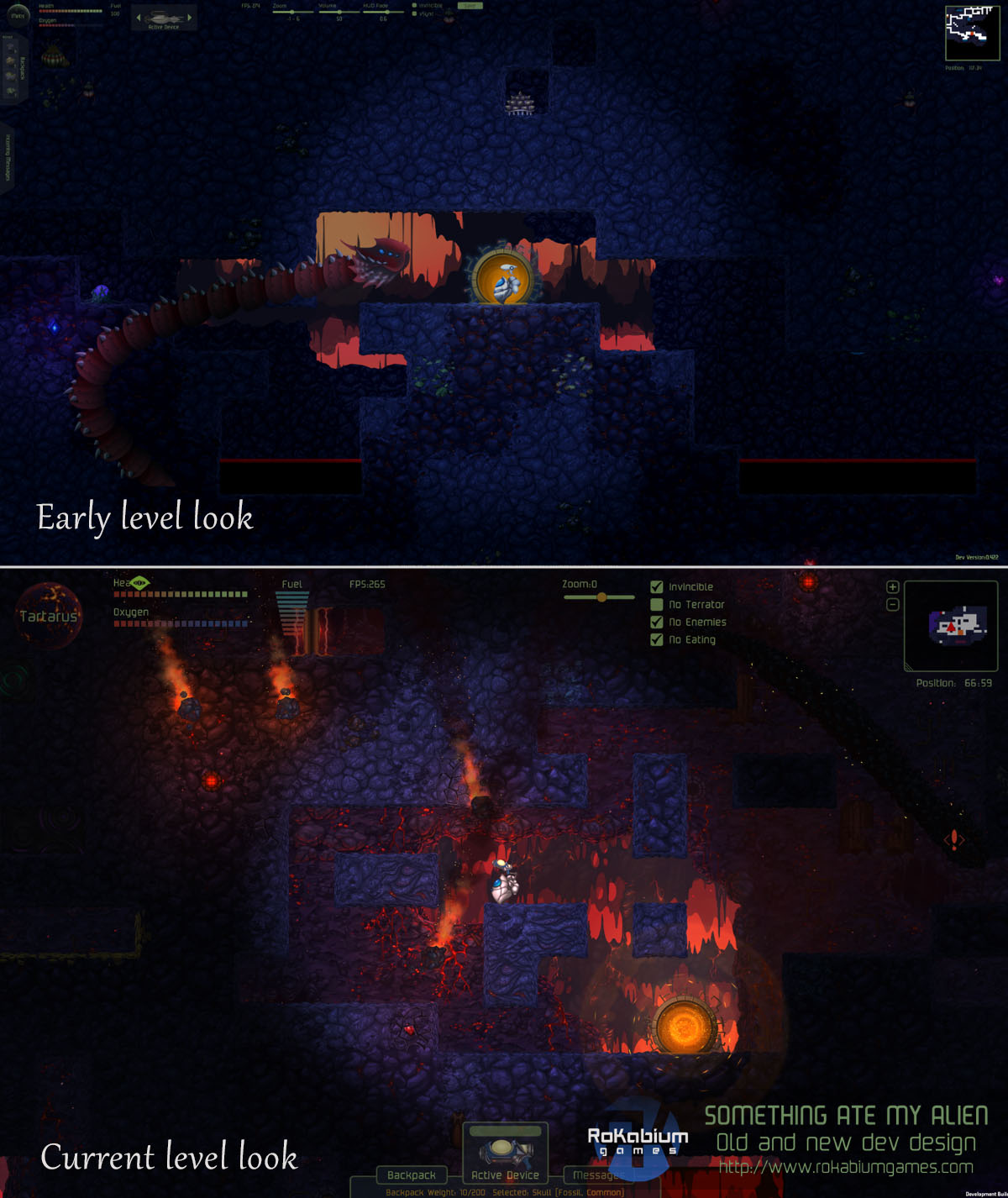
At some point we did add a bit more of the painted backgrounds used for the Menu and loading screens into the back of the GUI since the difference between the very bare GUI and the planet game play seemed too different and the merged result from combining the two extremes is what made the most visual sense.
The main concern with the HUD was to display all the info you need while mining, such as health, oxygen levels, inventory, messages that the AI need to relay to you, mini-map etc without interfering or covering too much of the game play area of the screen. This itself proved tricky and we made lots of changes to this, testing out different ideas during the last 2 years. Finally the layout we have currently is the one we find the most pleasing but even so we’ve made it re-sizable so that players who want more or less game play area outside the HUD can set that.
The Aliens
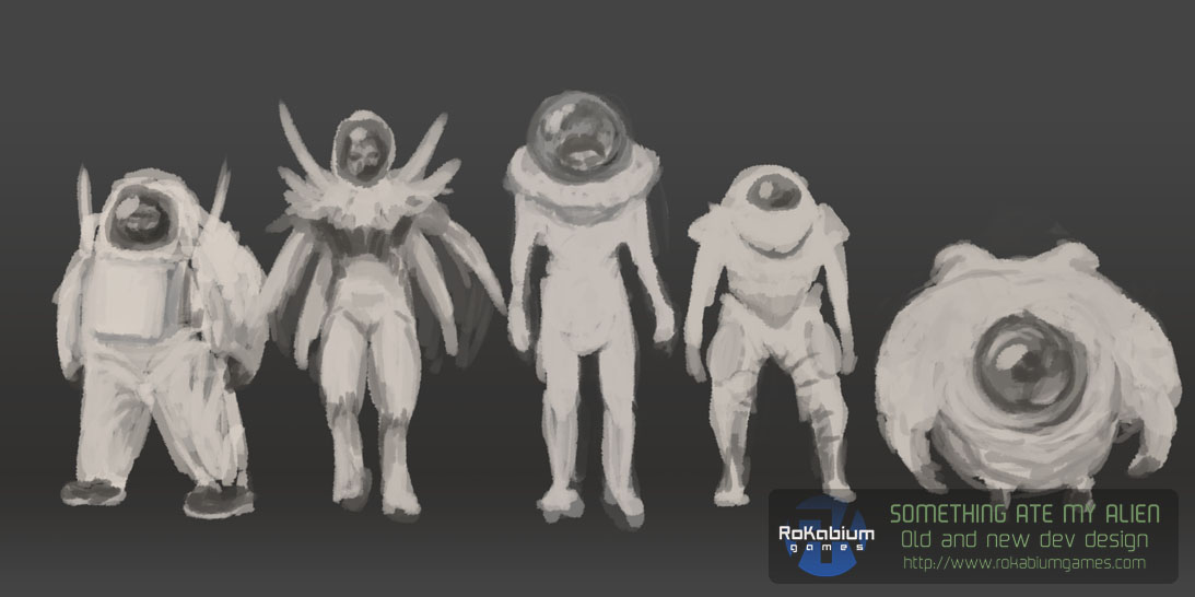
In the beginning as the game idea was merely some sentences and points on a few pieces of paper I started sketching what we thought would be the main character which was the Alien. The first concepts were made to decide which idea to build on.
In the beginning as the game idea was merely some sentences and points on a few pieces of paper I started sketching what we thought would be the main character which was the Alien. The first concepts were made to decide which idea to build on.
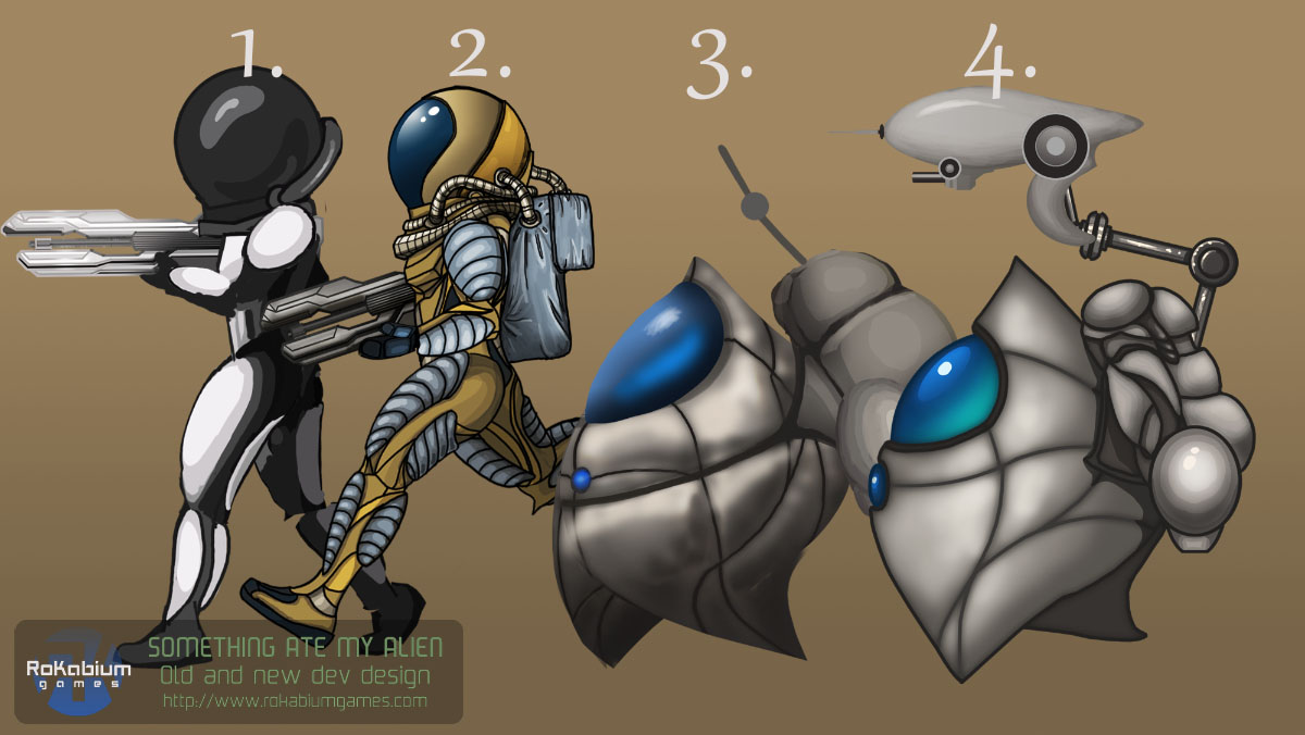
As you can see below the first idea was an actual retro style human-like astronaut and it was not until a bit into development once the story was fleshed out properly that we wanted a more unfamiliar and not too realistic (since the Alien would be the second character and be disposable) look. We wanted something unknown but appealing, something more simplified that would speak to people of all ages but that you as a player wouldn’t get too attached to.
This is when the current Alien was born.
The Levels
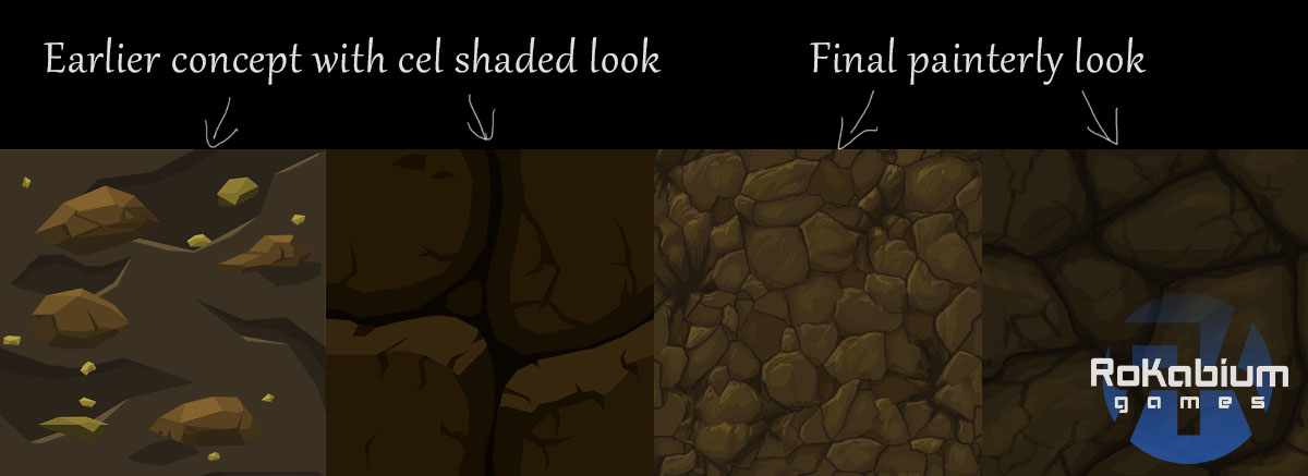
The ground on each planet in SAMA is supposed to be bedrock that can be mined by the Aliens, and early on we decided we wanted seamless tiles to build up this bedrock rather than individual blocks that was more prominent in the early classics. The first tiles were extremely simple, but we decided to move towards more of a hand painted style for the whole game quite quickly and looking back I’m really glad we did that. This style makes the game feel so much more immersive and gives a sense of quality in my opinion.
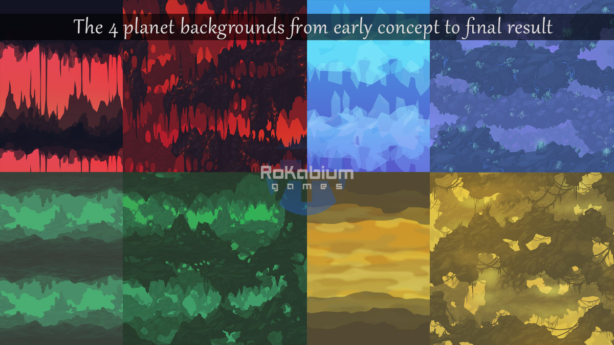
Each planet has a specific colour theme and environment and these were set quite early on in development. The far backgrounds behind all the front tiles were to set a nice, ambient parallax look to the underground, and the very first and rough paintings of the back is very different from the final, meticulously painted ones we have today.
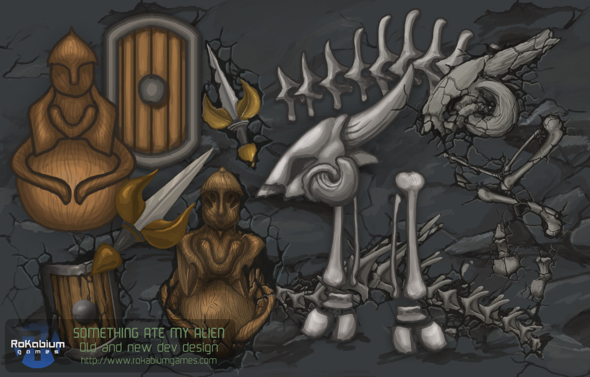
The resources and puzzle chambers were the only things I designed that would not be unique to any one world. These things needed to be uniform all over the game play areas since as a player you need to recognize these things across the planets. The look for the various resources was developed very early on and has more or less stayed the same throughout development and pretty much the same goes for the puzzle blocks.
The Wildlife
We wanted to use the environment itself against the player such as the need for filling up oxygen, emptying the backpack when full, falls or ending up in liquids etc. But we also needed dangerous wildlife that would be more interactive and seek the player out.
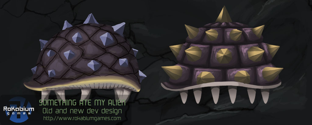
Some of the first concepts of animals were a bit wild, but after realizing the amount of animations needed for each animal and for me to make those animations without having much experience at all in animation work before this, we had to settle for creatures that had somewhat easier or easily referenced movements. Based on that I came up with a range of wildlife (enemies) that has been added to more recently to get between 8-10 different ones for each planet.
Each planet would also be guarded by something huge, a part of the wildlife that would be so dangerous it would possibly be able to eat the Alien whole. Something that would appear from time to time and then inevitably lead to some kind of confrontation/battle and so the “Somethings” or monsters/dragons/terrators/bosses were born.
The evolution of the Something has been pretty significant as you can see in these images. We had some problems coming up with how these big things would move on the screen. At one point the idea was that the big bosses would come out from the back wall and eat the Alien that way, but it just looked terrible. We weren’t sure how something going across the screen would look since really there is bedrock in the way, but in the end the visually pleasing and game play aspect of that kind of movement won over “realism”. Hey, it is a fantasy game set in a fantasy world with the bedrock depicted in a 2D platform style on the screen, who says a huge creature can’t move through it all as it pleases?
Hope you have enjoyed this look at how the art within the game SAMA has developed over the last 2 years.
