I've always enjoyed adding accessibility features, hence Cogmind's sizeable options menu and even more extensive config files. Not everyone will have the same habits or abilities, or play a game in the same way, so where possible it's nice to be able to accommodate different needs. Although I've talked a fair bit about fonts before (still more to come on that front!) and four years back also wrote about some of my ideas on potential adjustments related to color blindness, it's about time for a generalized set of color customization features.
As the player base has grown a fair bit over the past few months, I've received a few requests for ways to tweak the brightness and/or saturation, so that was the trigger for finally implementing a display filtering system.
Essentials
Many games come with a simple "gamma" adjustment option, so that's where I started. Easy enough:

Comparing the default appearance to a 66% brightness setting.
While it's true perceived color brightness is non-linear, adding in more complex calculations to compensate would slow the filter down so I implemented it as a direct percentage modifier, just [RGB * (0.0~1.0)].
Note that for comparison purposes the majority of screenshots in this article use the same scene, and all can be clicked to open at full size.
Some players may also want to drop the saturation to take the edge off the eye-burning terminal contrast :P

Comparing the default fully saturated appearance to 66% saturation.
Since I store colors using RGB and it'd be slow to convert everything to HSV simply to adjust the saturation then convert back again, I found an alternative formula for direct RGB saturation adjustment that seems to work nicely.
Filter Settings
So how are these options made available, and how to create a system that will support additional filters? For now I opted to make it a string in the advanced.cfg file. For example the line "renderFilter=BRIGHTNESS(90)|SATURATION(90)" adds two filters, a first which drops the brightness by 10%, followed by a second that then desaturates all colors by 10%.
There are currently eight different filter types, and the code converts this string into a set of filters that the engine renderer applies in separate passes over the terminal grid colors, both foreground and background. They're applied to every cell individually, so this isn't some GPU-optimized image modification, just an operation repeated for each cell, meaning each filter pass on the standard-dimension UI costs an additional 12,720 operations xD. Yeah there are better ways used by more competent programmers to achieve effects like this, but it works well with my current engine setup :)
At most the minority of players who will use filters seriously will probably only need one or two anyway.
Getting Wild
Having taken care of basic needs, there are of course even more frequently requested adjustments like the ability to outright change terminal colors.
Traditional terminal players are used to being able to fairly easily customize the appearance of a roguelike, including the color palette, but they also only have worry about maybe just 16 colors. Unfortunately there is a huge range of colors in Cogmind so it would be a lot more work to implement a way to customize individual details, but for now I've at least added a very simple method with a broad effect: hue shifting. It can lead to some crazy schemes, but there are reportedly a number of people out there interested in something like this.
")
Cogmind appearance with all hue values rotated by 180 to become...
Pinkmind! (example #2: 90-shift Bluemind)
Colors have been carefully chosen in Cogmind, designed to make the meanings and implications of certain pieces of information that much easier to intuit, and obviously shifting the hue will ruin a lot of that. Some things which were obvious may not be so obvious anymore, and on the flip side unimportant elements may be overemphasized. In any case, doesn't hurt to have this as an extra option for whatever reason!
With a system in place it's also not hard to add new filters.
I mean we can even get crazier than hue shifting and go as far as RGB shifting! Check out the color chaos that results from a +90 shift:

Shifting all RGB values by 90. No.
Are your eyes ready yet? Let's continue with more serious filter efforts...
Low-Contrast and More
One of my goals with this system was to enable low-contrast settings that don't overly impact the general color design, and rather than darkening and/or desturating everything, a better approach is to start by not using a pitch black background. This required some actual changes to the source code beyond a basic filter, since for the past five years of development I've assumed the background is black, but the necessary adjustments weren't too difficult and for the most part now work via a global switch.
The idea is to choose some other dark-yet-not-black color. To avoid wasting too much time here, I used Photoshop layers to tweak a game screenshot until it was low-contrast but highly readable, then made sure the system I had was capable of replicating that process step-for-step. As usual, it's good to have a target to work towards when designing something like this. (For the same reason I always do UI layout mockups in REXPaint first.)

Step 2 for creating Cogmind's low-contrast mode: Raising the overall brightness, especially for darker colors.
In all there were more steps but I compressed it down to just two:
- Swap out the black background with the chosen new color.
- Adjust the brightness of all foreground colors using a formula derived from the PS testing above: y = 0.7176x + 59. This raises the brightness of most darker colors so they stand out just enough against the new background, but takes the edge off any really bright ones.
For reasons specific to Cogmind's color design I did make a couple exceptions--the second step is skipped for any instances where the foreground color is itself black (this is rare but I use it for occasional reverse cell coloring--black characters imprinted over a solid color), or was intentionally set to match the background color (I sometimes do this to temporarily hide the foreground).
So what background colors did I pick as defaults? I started of course with my dark maroon background from the IDE color scheme I designed from scratch and have been using for the past 10 years or so :P
")
Some Cogmind source as seen in my IDE, the inspiration for the first low-contrast mode.
Like my IDE scheme, this particular filter is called "Autumn."
 in Action")
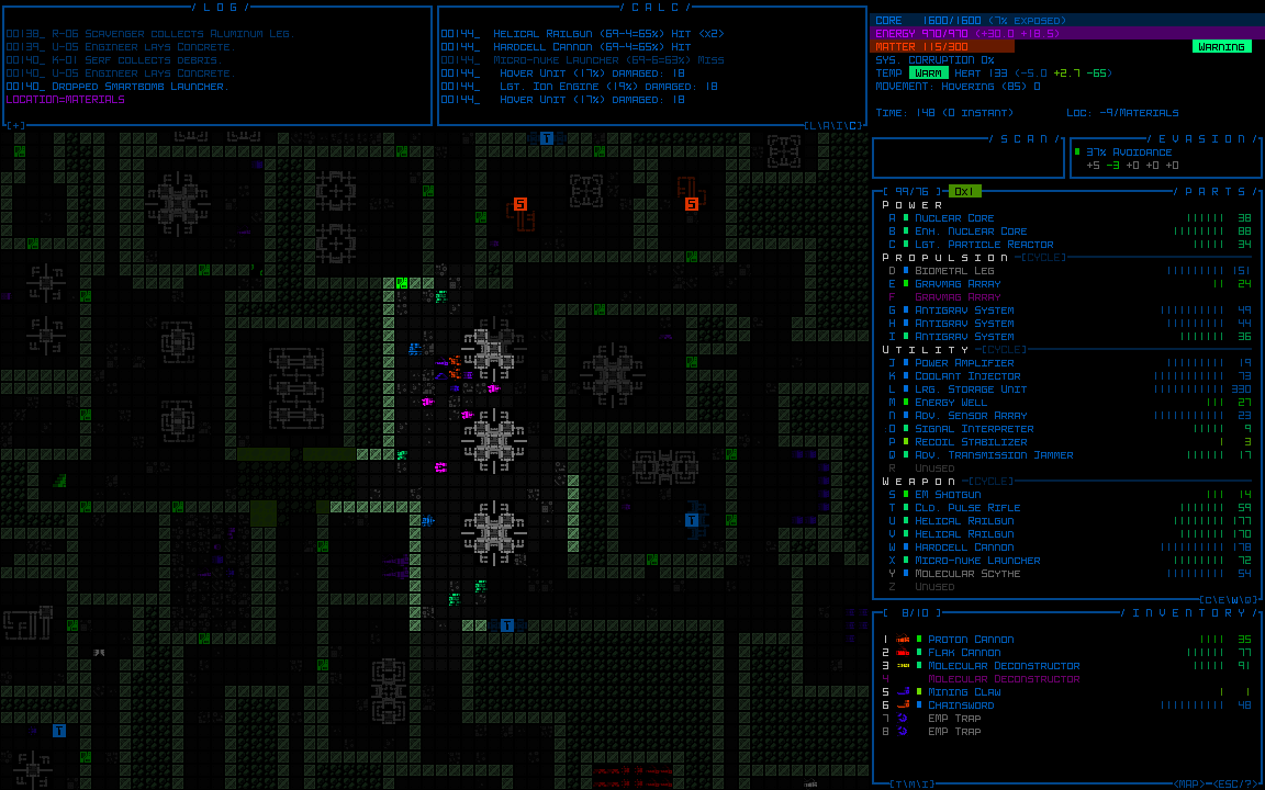
Interacting with various Cogmind UI features in Autumn low-contrast mode.
In fact, aside from being my IDE scheme Autumn is also a REXPaint skin, and Cogmind's other new low-contrast mode borrows REXPaint's default skin as well: "Sleepy."
")
Cogmind low-contrast mode "Sleepy."
These modes still aren't quite perfect due to the aforementioned universal assumption of black, though I did specifically update some of the particle scripts to be compatible with this new filter. The few features which might not always look great under this mode are some of the ASCII item art and intro/ending animations, but this only affects the small minority of areas that use their own dark background colors.
If more people start using low-contrast settings I might go back and invest more time in overcoming some of the remaining aesthetic challenges.
Although I implemented two named low-contrast filters, these are merely for convenience--under the hood they're implemented through a more general filter: LOW_CONTRAST(R,G,B). This means you can create your own low-contrast scheme using your favorite color, or whatever you think works, I just thought I'd provide defaults for some tried and true colors :)
Map-only Adjustments
Earlier I mentioned this setting is called "renderFilter," but there is a second one as well: "renderFilterMap." All filters set there apply only to the map, rather than the entire application including HUD and other UI elements. It's compatible with the same filters except low-contrast, as the latter must be applied across the entire application and cannot be limited to the map area since it's handled on the engine side (as opposed to the game side).
One of the interesting filters more suitable for the map area rather than the UI: SWAP. This filter swaps the foreground and background color of every cell to create an even more colorful "dark on light" style rather than the usual "light on dark" terminal look.
")
The results of a renderFilterMap=SWAP, with no other changes to the appearance.
I don't think this is as good from a parseability standpoint since it somewhat separates color from the character it's associated with, but maybe it could fun to play around with, plus some players can get used to or even enjoy anything :)
")
Destructive ASCII action in Swap mode
Notice that these are ASCII examples, because although it's monochrome the default tileset uses multiple shades, and the whole look is not very compatible with this kind of swapping.
")
Yeah I don't think so.
So if you're interested in trying out this mode I hope you like ASCII, otherwise we'll have to wait for someone to draw a non-shade monochrome tileset that focuses mostly on solid shapes and symbols. I'm sure we'll see something like that eventually. It could look pretty cool (and of course also work in the default/non-swapped mode as well, so the idea is that we'll get that one first then it can be simply swapped over).
Good news is the Swap filter is both compatible with and looks even better when combined with low-contrast mode!
")
Cogmind ASCII map with both a Swap filter and Low-contrast Autumn filter enabled.
All these customization features are explained a bit more in a new "Color Customization" section of the manual included with the next release (Beta 5).
Specifically with regard to color blindness, I haven't gotten any real feedback from players who need more options in this regard, though from the start I've tried to design the UI such that as much info as possible is conveyed through multiple channels, color only being one of them, so maybe there isn't much demand for additional features there. I could add new filters if necessary, and although individual color swapping would be problematic (primarily because any dynamic colors are scripted and therefore calculated via formulas), perhaps there are some formulas that could be made available as filters to adjust the final color palette that way.

Bonus GIF: Cycling through various display adjustments
in real-time after hooking up the color filter parser to the debug system :D
