megaglope1617204398
Megaglope joined
Tower Rush is a unit recruitment fantasy tug-of-war game. https://t.co/N5ytwyqbWf Wishlist: https://t.co/UUlpZ1y801
My Blogs
Hey everyone, we're here to bring you our very first blog post for our new project!! I’m sooooo damn excited about it, let’s jump right into it!
Obviously our project is still in its infancy phase so today’s blog is going to be about game design. More specifically, UI design and game mechanics.
How It Started:
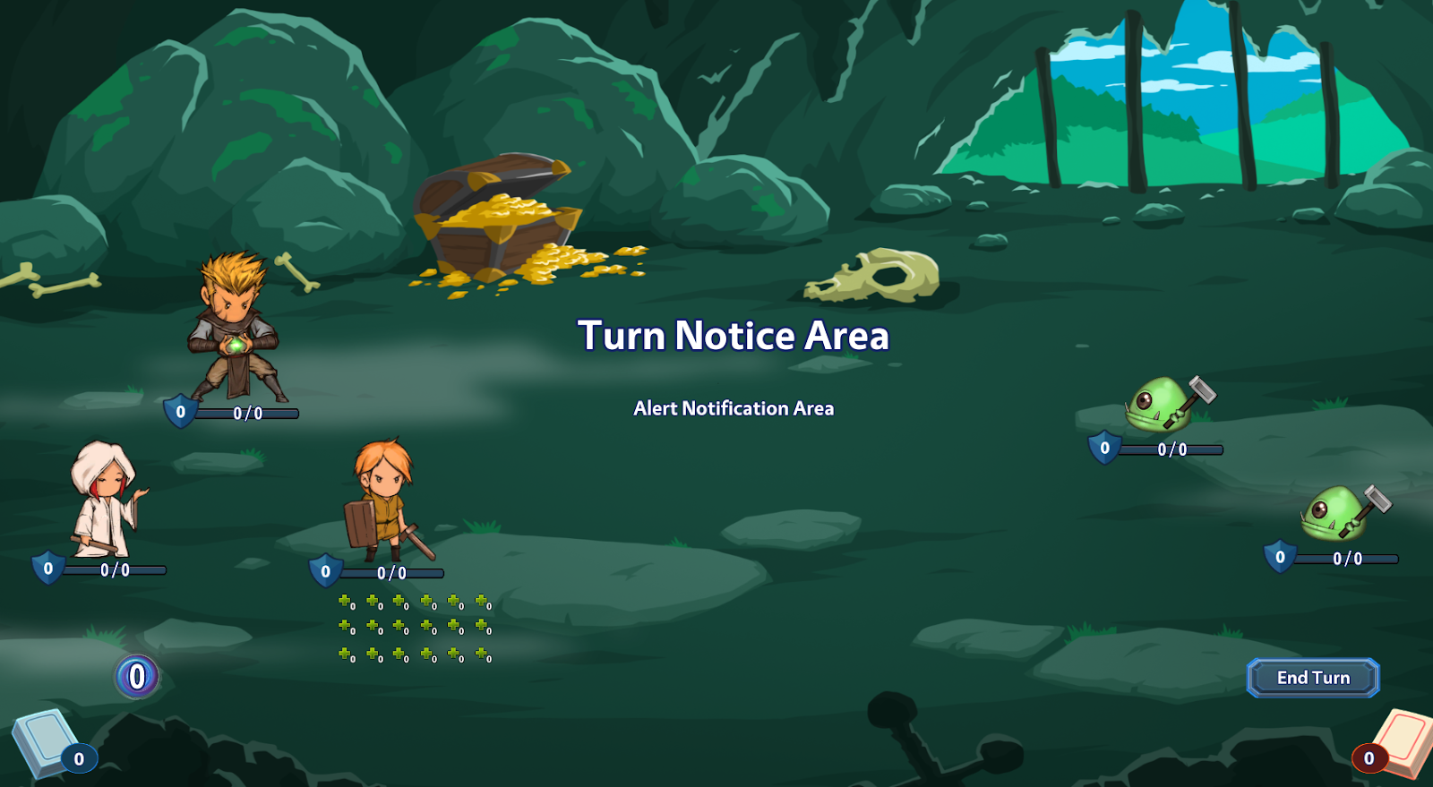
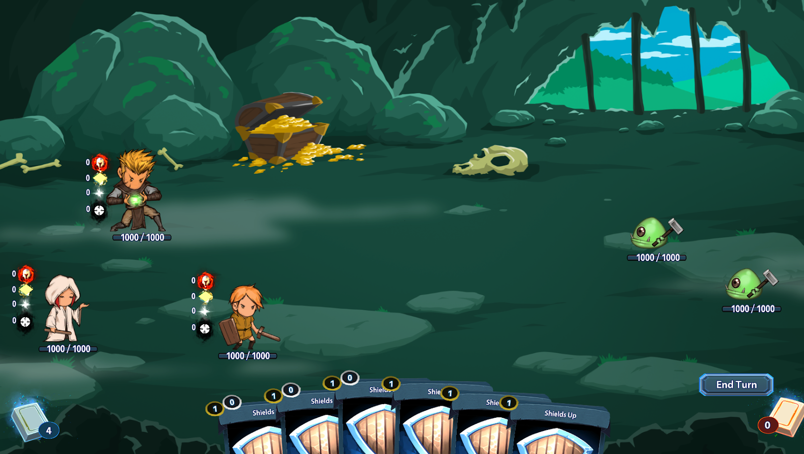
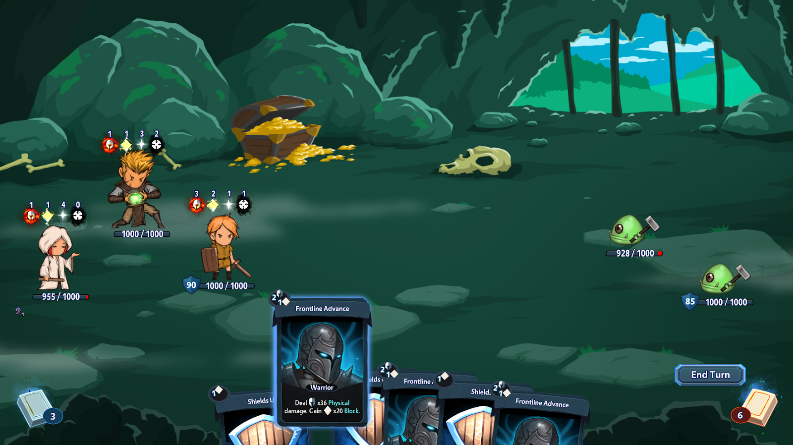
As you can see, we went with the option to have 3 characters on the screen.
Then came time to decide how to handle our first UI elements (you can see above that we were testing how 3 rows of debuffs looked… not conclusive! )
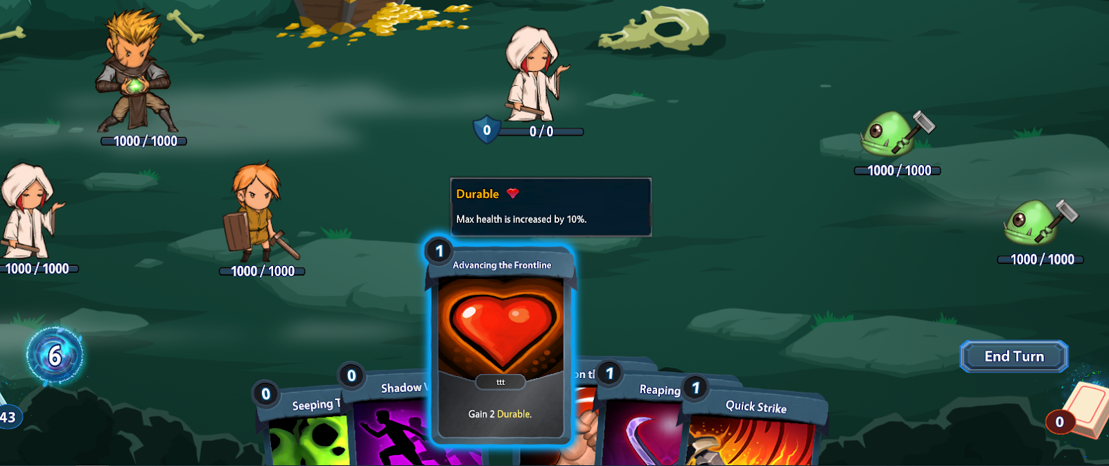
We could either go for 3 separate decks (keeping in mind that we want every player interaction to happen within one turn, and not in separate turns) or have just one single deck for the party. After choosing the second option we arranged for the game to show which character owns the card when highlighted.
So now that we have our 3 characters drawing all at once, we need to show the casting cost of cards, and all other relevant info.
We started from this and slowly worked our way to this:
Here’s a little sneak peak on how this went:
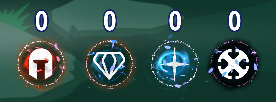
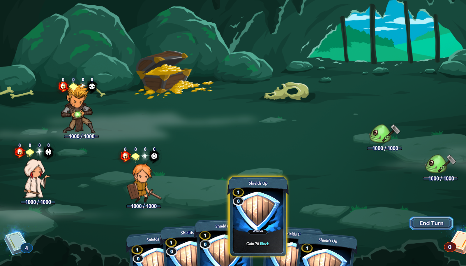
First, we chose the icons representing the 4 casting cost components, which we call Strength, Dexterity, Faith and Destruction.
First iteration:
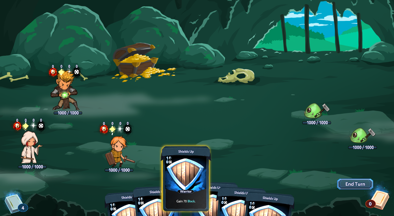
Now that we had our casting components, we needed to decide where to place them on the screen, for each of the characters, and on the cards.
We tried a few things:
Surrounding icons and slanted card icons:
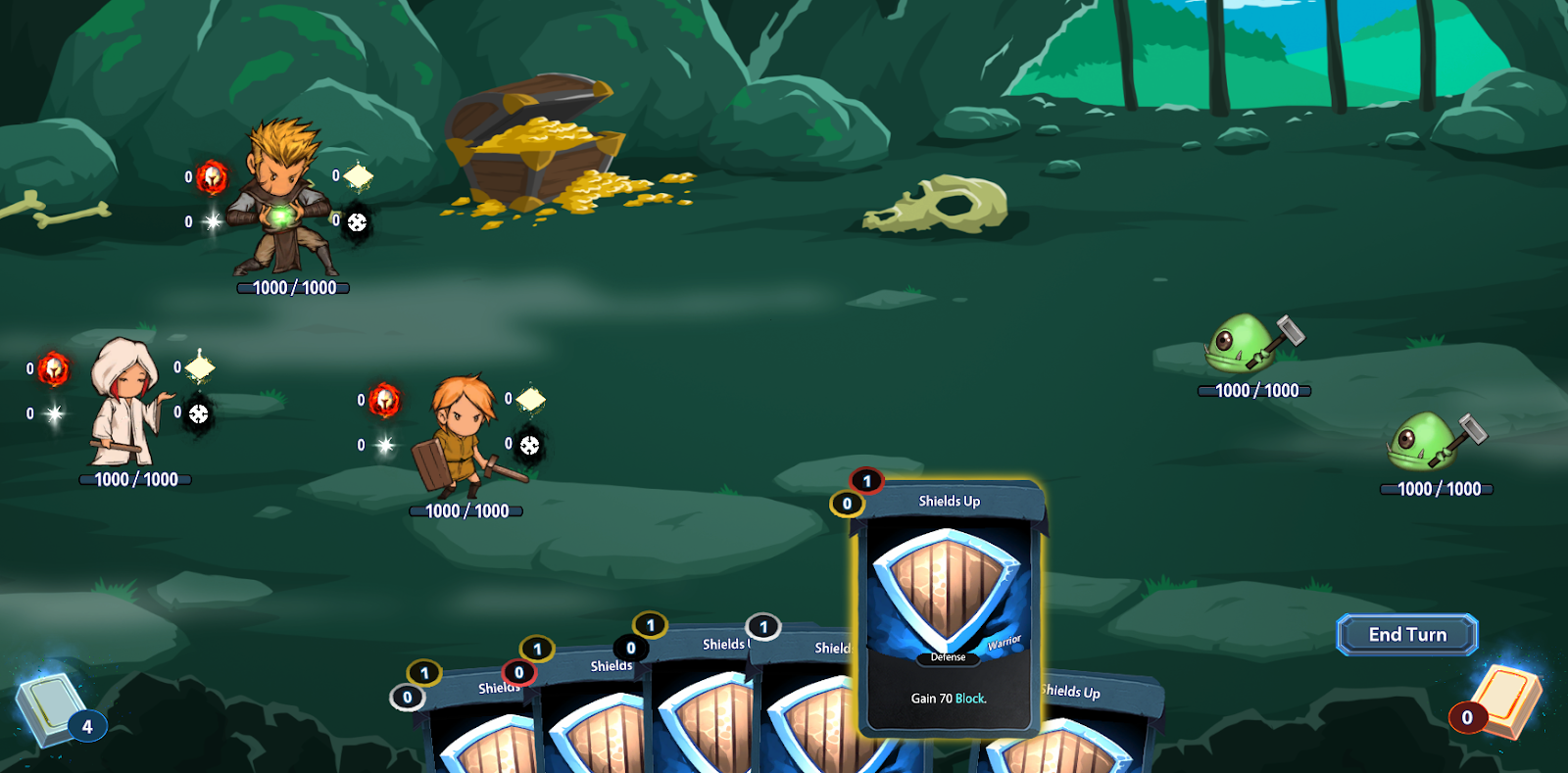
Overhead icons and vertical card icons on the left side:
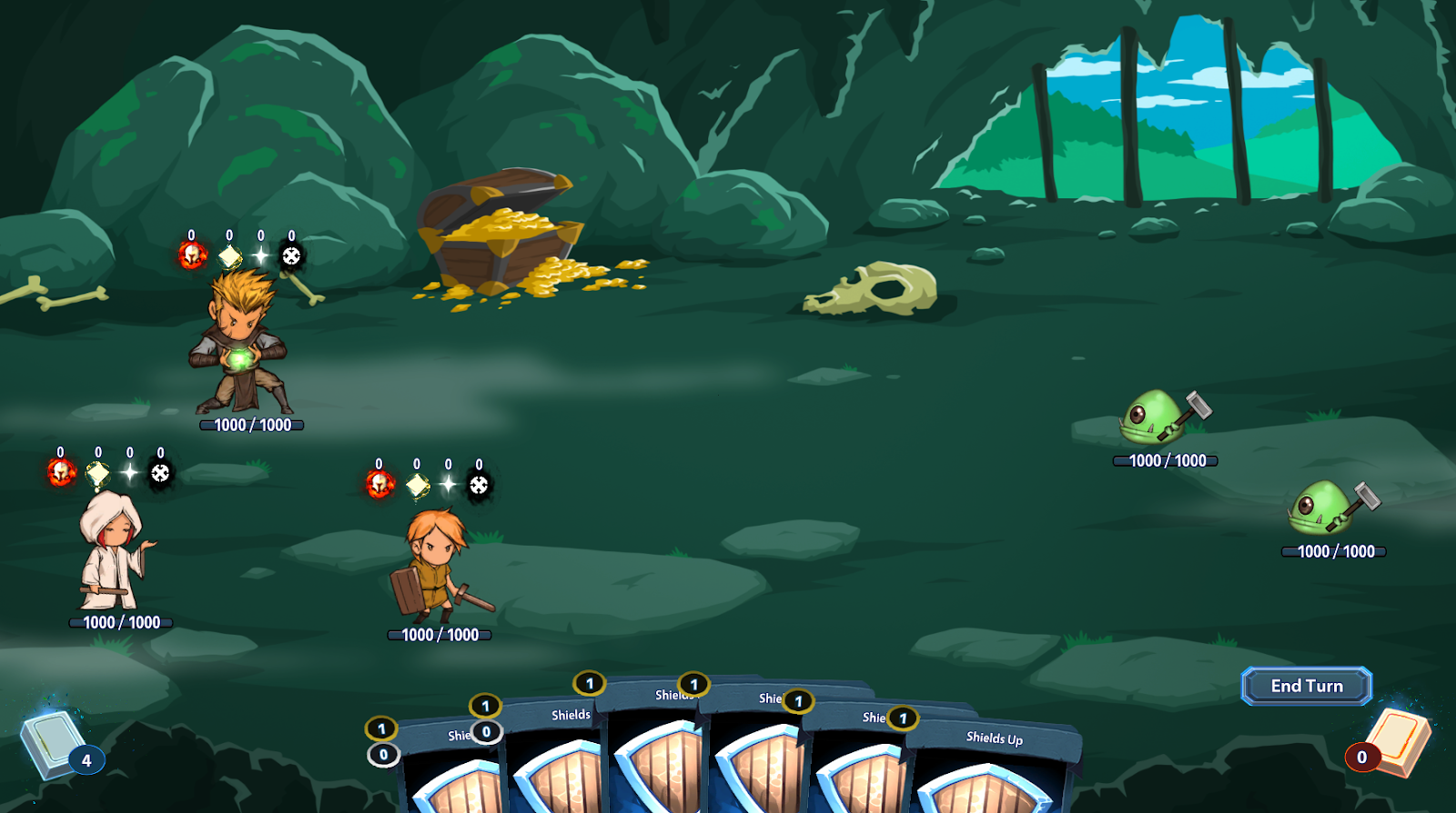
Side icons and same card configuration:
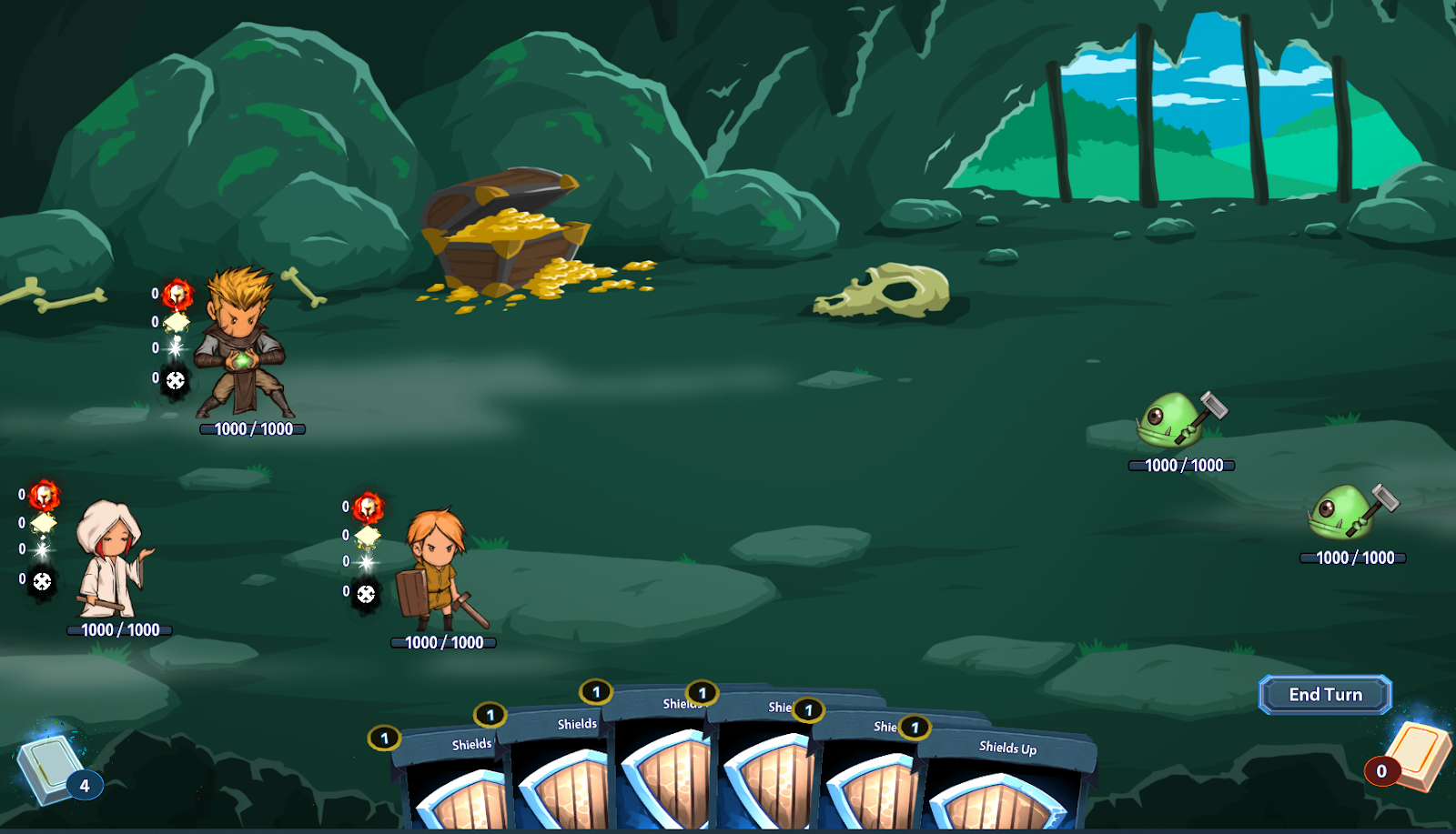
Back to overhead icons with split card icons:
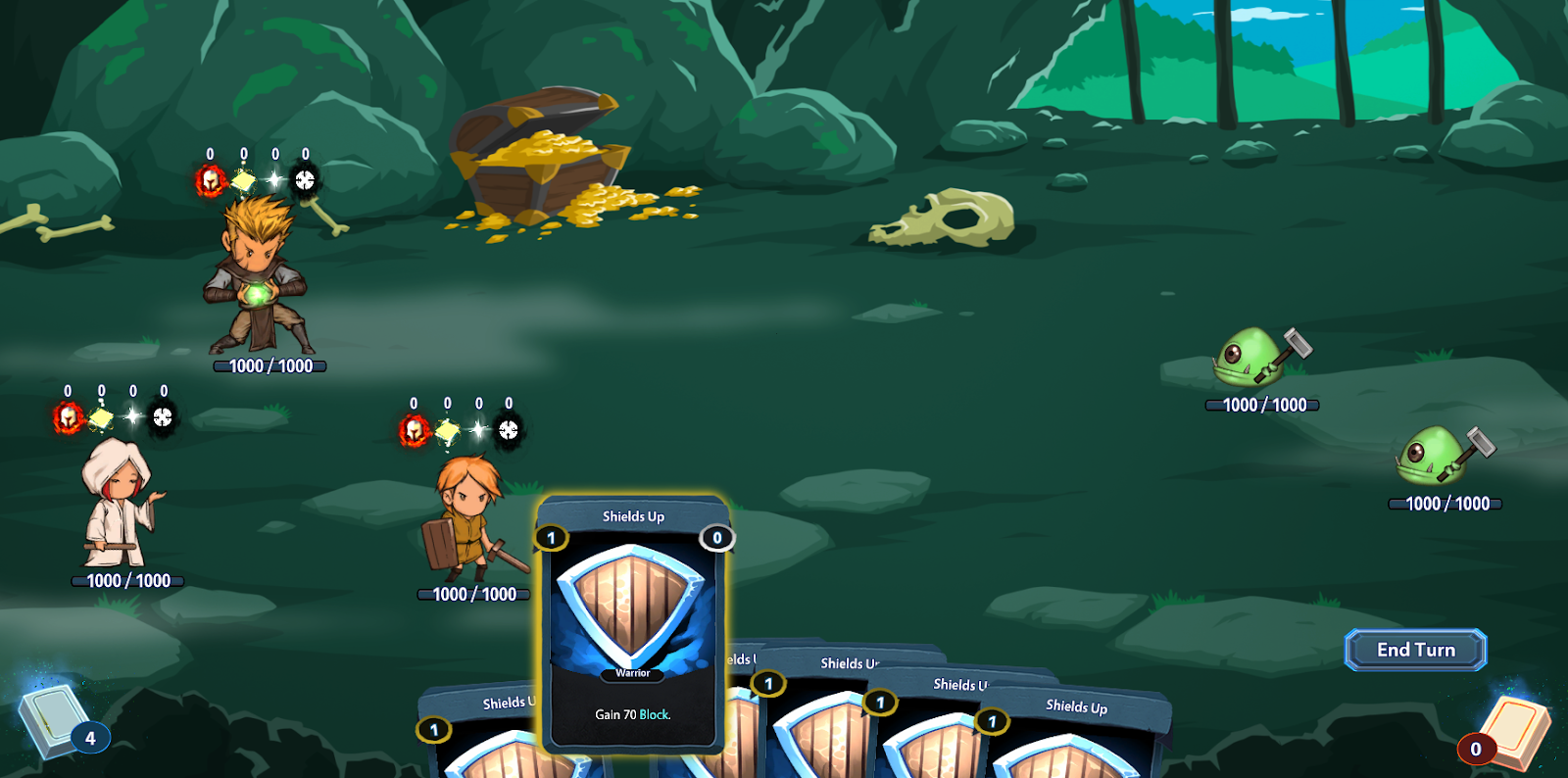
… with horizontal card icons:
… with vertical card icons inside the art area:
… with new icons inside the card art area:
… with icons back in the corner:
… with a slightly bigger background for the circle where the icons are located:

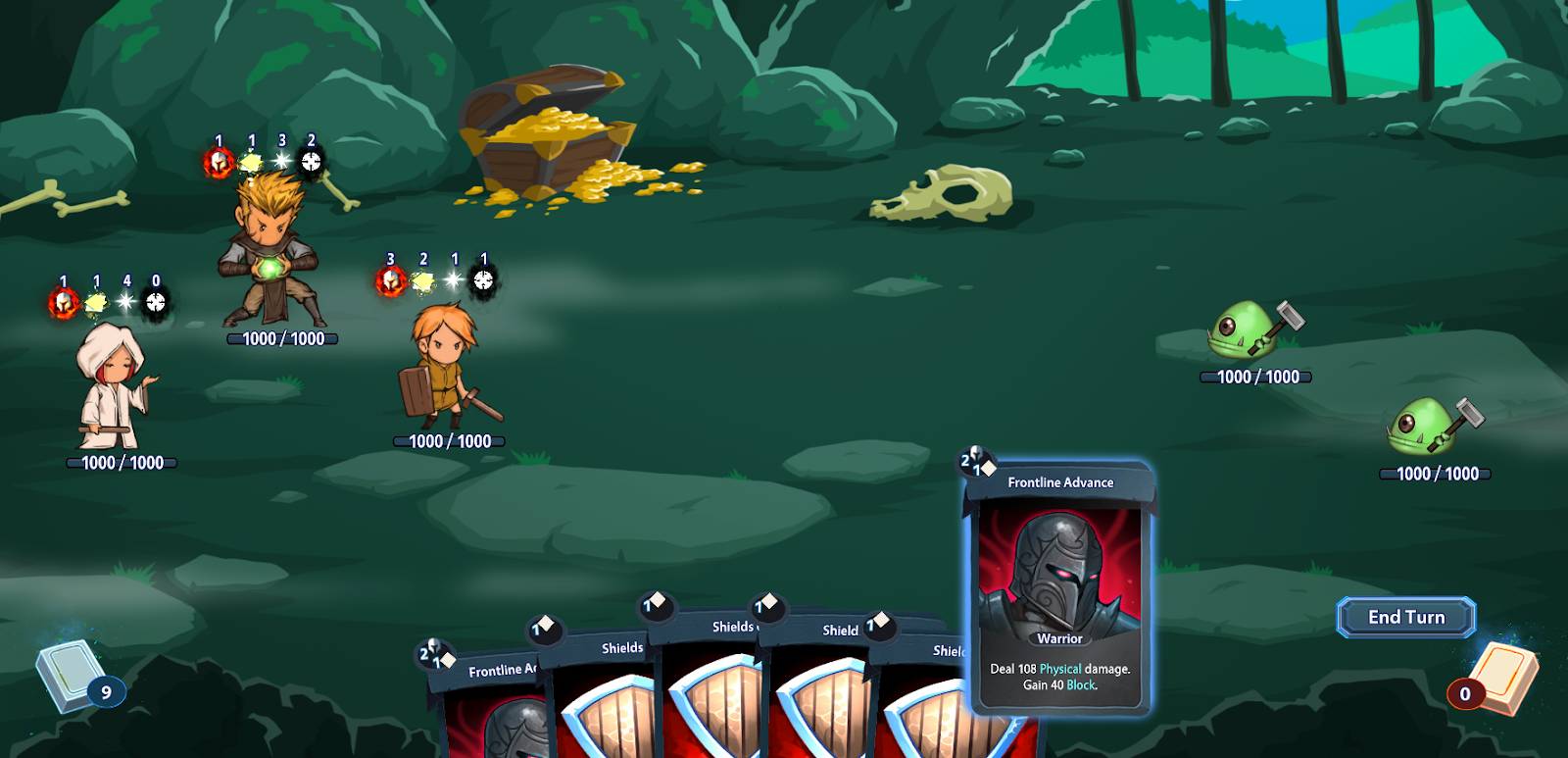
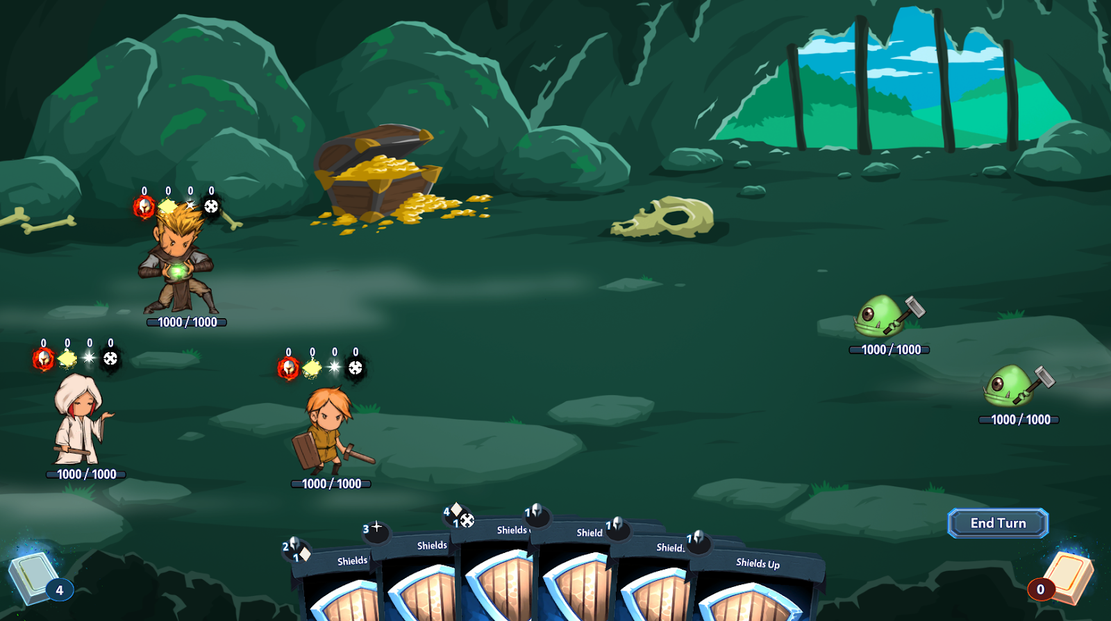
... finally with some visible card effects:
And a video to finish it off!
That’s it for now, time to go back to designing cards for the Priest, the Wizard and all the other ** classes we have planned. See you all on the next blog or in the feedback channel in Discord if you want to let us know your preference between the overhead icons or the side ones for the characters on the screen, or any other comment about the project of course!
Profile