_w_
I joined
I'm a belgian who likes gaming and drawing. Thanks to some argument with an 11-year old i have been muted by henley on moddb since september 2011 and can't post comments on this site. [according to loner you need to fill this in completely, since he's dutch i wouldn't be surprised if this is some kind of trick. Come to think of it cheese is a valuable resource after all and the cheese reconstruction project looks like a worthwile investment in the long run. On to weed, those damn dutch and their marihuana. Just listen to glebstar while high. IF YOU WANT TO PLAY BLACKLIGHT CONTACT ME - i want to profit of the friend referal system :3. Belgium has good comedy and music, the dutch have cheese and drugs. chewing gum is nice, though i don't like your face. onbeskoft. and what is this pen doing here, get lost pen nobody likes you. seems like the cat's out of the bag again... mother of god 100 characters left >.> so i'll just end with: si vis pacem, ill give each one of you 5 across the assss

hope it dsnt compress like a bitch
justice on the frnech baguettes
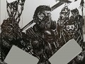
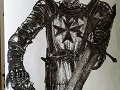
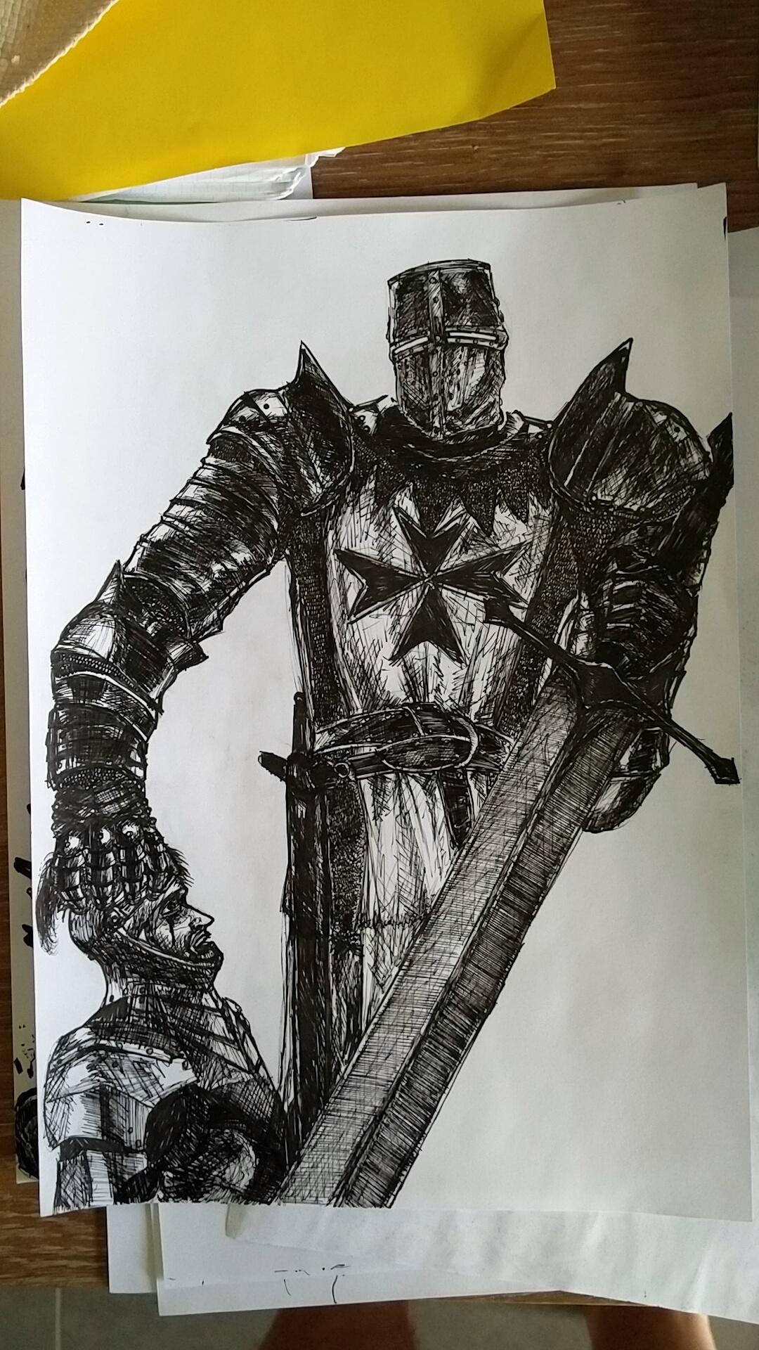
Is that a self-portrait of you as a cosplaying Templar?
Want me to give you a full review?
haha sure go ahead ori ;)
First of all, amazing attention to detail. I love the slight Dark Souls hint on the tunic and helmet. I admire how perfectly drawn the Knightly symbol is and how you see the folds in the tunic, the segmented parts in the armour and gauntlet and the reflection of light. The armour itself is very bulky and menacing looking.
Now, the soldier on the ground looks well drawn as well. Sharp, natural nose and eyes and straight teeth along with what seems to be a moustache. I like the little dash of blood beneath the eye. Again, great attention to detail.
Now for the critique!
The proportions are awkward between the pauldrons and the helmet, the arm to the viewer's left looks enormous. It takes me great attention to differentiate between the blade hilt, the pauldron and the fist. I could barely make out the fist at all.
Also, the knight seems to be missing the rest of his body beneath the amazingly drawn claymore.
All in all I give it a Wout out of Bissy.
haha thanks the symbol was suggested by sakura ;)
for the rest youre absolutely correct, theres always some proportion errors creeping up and areas are a bit too dark to diffreentiate
i cut off his body out of uuuuhm artistic purpose yes :P and lazyness