

Meet us at E3 2018
News 6 commentsWe will be attending E3 2018, keen to chat to modders and game developers about ModDB, IndieDB and mod.io.
Work has officially begun on V5 of the DBolical sites. Our goal is keeping the same layout with minor improvements, that focus on usability, responsiveness and mobile support. At the moment we are testing various CSS frameworks to see what works best.
We will be attending E3 2018, keen to chat to modders and game developers about ModDB, IndieDB and mod.io.
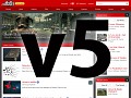
For the past 6 months we have been working on a redesign of ModDB and IndieDB, whose design was last updated in 2008. We invite you to join the alpha.
v5 will bring many new features like a design that is much more up-to-date than the current one. In this article I'll provide some feedback to this new...
To make sharing downloads, games, mods easier we've created an easy to use widget system. Oh and work has finally begun on v5, learn how you can get access...


search botton not working
Drive.google.com
also why have two ways to post comments?
The images section of a mod page should probably also include the images in its articles.
Make an SVG of the logo, too!
I made a mobile app concept. To install a mod from the app, you can download the mod to your PC over the internet. Drive.google.com
Font used is Univers LT STD
You've got black bars on the side. Perhaps add a switch where we can stretch it, a la TV Tropes' Wide Load.
Also make the header stick when scrolling.
Please, make it simple for new users, many are driven away by the very clustered layout, a lot of people can't find the download for a mod and this is a known problem about this website, I'm aware because it happened to me to receive the reply once I said I was uploading here: "I don't understand how that site works".
Besides, it's what I read in many comments in various mods pages "where is the download?"
AND it's been the same for me years ago when I came to ModDB for a download, it took me lot of time to see where the download was located because the mod menu was like... buried among all the tables (entire site menu in the mod page, mod menu, articles, images, lateral column filled with everything, all at once).
People primarily expect a clear description of the mod with no elements of distraction and a download link or button, then a place to comment for help, then the rest, in short something way simpler.
Thank you for all your work, this is just my opinion as a user.
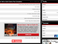
I see in the pics the mod menu is way better and way clearer, that's good!
And thank you for the customization option, it's really important and no other site offer such awesome feature, so that's something to treasure imo, even for the colors, it's very good to have the page matching the kind of mod and its spirit.
Thank you.
If the web dev's need Graphic Designer/css, please feel free to message me for hiring.
Is this still in development or are we going to skip all this by straight going to V7 ??
When I used the v5 beta and looked over my profile, I was shocked that I have had the most negative feedback. I'm not upset, but I was just stunned.
I'm not using V5 anymore.