Welcome back! Last time we looked at the problems in trying to draw small sprites. So this time let's dive right in and start looking at how to solve 'em!
Overemphasizing
The first important step, I found, in doing especially tiny sprites, and what I'd been unsuccessful in doing the first time around, is deciding what it is that really needs to be emphasized in the art. When you have a lot of pixels to work with, it's easy to add as much detail as you want. But when you have a severely limited space, you must decide which details you can live without, and which you need to exaggerate in order to keep the overall look, and more importantly, the overall feel of the sprite.
Of course, what you'll want to emphasize depends on the style of your game. If you're going for a realistic style, the most important things may be color, lighting, natural proportions, etc. In Wyv and Keep we combine a semi-realistic painted style of background sprites together with cartoonish characters and animations. For this tutorial, we're focusing on how to make something extremely tiny but still instantly visually comprehensible. To do this, we first use a process called overemphasizing.
Let's look at our clock again. What are the things that need to be emphasized in order for it to translate well to a 16x16 sprite?

First, and most important, is the actual clock face, because we must be able to tell what the item is right away. We can see the 16 and 32 pixel tall sprites have already failed here, as imagining seeing them for the first time they look more like an olde tyme rocket and a bundle of TNT. The pendulum is nearly as important, as it conveys much about what type of clock it is, balances strongly against the clock face, and uses the nice gold color to contrast. The pendulum's been underemphasized in the 32px sprite and completely lost in the smallest. The spiky decorations at top and bottom contribute much to the overall feel, so we'll need to find a way we can translate this fine detail into a tiny space, which we already know we haven't been able to so far. And we'd like to keep the ridges as well, as they frame the object, providing it structure horizontally. These have been lost in the smallest version, and are not even so clear in the 32px version, despite being outlined.
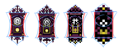
Perhaps even more important than these is the overall shape of the object. The long ridges near the top and the bottom extend past the body of the clock, making a sort of concave lens shape. The decorations add triangles to the top and bottom. This is the shape we need to mimic in the small sprite. So why is it difficult to get the clock to keep this shape when you resize it down? Well, the problem comes in trying to keep ratios inside the sprite consistent. Because the original large sprite is quite tall and thin, we try to keep this proportion but inevitably lose the horizontal detail because there simply aren't enough pixels. Notice how the red arc loses shape completely by the smallest version. What's the answer? Overemphasize the shape, too!
What's NOT important? Well, the actual shape of the spikes isn't such a big deal, as long as we can figure out how to keep the impression of them. Neither are the specific curving, layered details in the columns to either side, which do contribute at high resolution, but are not prominent enough to need emphasis.
Add up all these areas of emphasis, and we end up with something like this:
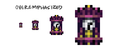
We can see here with everything we listed having been overemphasized. The clock face is much larger, as is the pendulum. They're close together now, but that's okay. Each individual spike hasn't made it, but the overall effect is there, and that's what's important. The ridges are intact too, keeping the horizontal framing and helping with keeping the proper shape, which has been exaggerated as well.

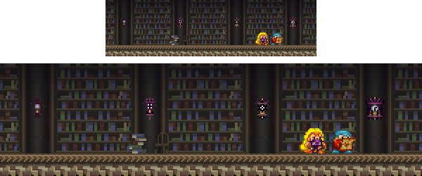
The shape has also been exaggerated, becoming wider, but gaining back the concavity it lost earlier. It may look as though it's gotten stockier, losing some of the long thin shape from the original clock, but we've taken care of that by overemphasizing the other parts of it. Take a look at this screenshot (bookcases and such by Beau!). Which clock looks best to you?
Left is reduced to 16 via standard bicubic reduction, middle-left is reduced via nearest neighbor, middle-right is our first manually sprited 16x16 clock, and right is the newest version. Even at this tiny size it's crystal clear that our right version is a clock, with a pendulum and decorations on top and bottom, and that it has a horizontal frame as well. It's much closer to the original than the others. You can even make out the little gold squares at the bases of the left and right columns!
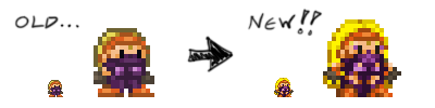
Now let's take a look at Keep. What parts of her would need to be overemphasized in order to translate?
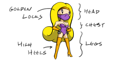
Clearly, Keep's defining visual characteristics start with her long, flowing, golden locks. In addition, we have her long legs, her high heeled boots, her feminine chest, and her thin arms. Believe it or not, Keep used to be a bit stockier (as evidenced by the original Wyv and Keep promotional poster), but most guys like a girl with shape, and even the ladies around me in real life didn't seem to care for the first stumpy, unfeminine version, mentioning that she was much cuter in my newer sketches than in the game itself. That's when I decided it was time to do a new sprite. I made sure to overemphasize these features when I redrew it, and we finally got the new version:

You'll notice that after going through this process of overemphasizing, Keep (unlike Wyv) doesn't really even have much of a torso anymore, save her bosoms. Her three-pixel chest goes right into her legs, which take up nearly as much space as her head. Her heels are more prominent than Wyv's shoes, and her over-stressed thighs help to distinguish her from her partner and to keep her feminine. Her arms are a bit thinner than his as well, and the final touch is adding her exaggerated locks of golden hair. The result is a much more attractive Keep that the old version can't hold a candle to, and one that provides a much more fitting counterpart to the rotund male treasure hunter.
Oops! Looks like we're out of time again for today. As for just how we actually MAKE these sprites, I'll finally tell you next time!

Good stuff right there! Thanks a lot for taking the time and effort on making this helpful and informative tutorial.
Yeah, really nice rundown on getting all that info into those little sprites :)
Just following your train of thought, I wanted to see if it'd be possible to 'thin' up Keeps final sprite (obviously a hard thing to push when you're trying to fill a square sprite).
Imageshack.us
Pushed the eyes together 1 pxl, thinned out her thighs a bit, and covered her exposed ear (to push that iconic hair).
Just some suggestions (and forgive me if you're not looking for critiques). Love the design work and can't wait to see more from your game!
@Bov Of course! Hope it helps you out! There'll be another section soon.
@boogiebac Nice edit! I think you may be running into a few of the problems I ran into myself. She does look thinner, but her thighs look a bit off (to me) with that pixel in between them. That's why I have that shadow there. The eyes closer is a stylistic thing too, I'm not sure I care for it... but good stuff!