Finding the Right UI Style
UI can be an effective way to set the general tone for a game. A Sci-Fi game might have a futuristic themed UI, whereas a F2P match 3 game might be brightly coloured and full of playful animations. There's also the minimalist approach where the design tends to be less decorative and more utilitarian.
I'm hoping to explore a few games that will help me find a UI style that leans more toward the utilitarian side, but still stylised just enough to keep things interesting.
Moonlighter
The first game on the list is Moonlighter.
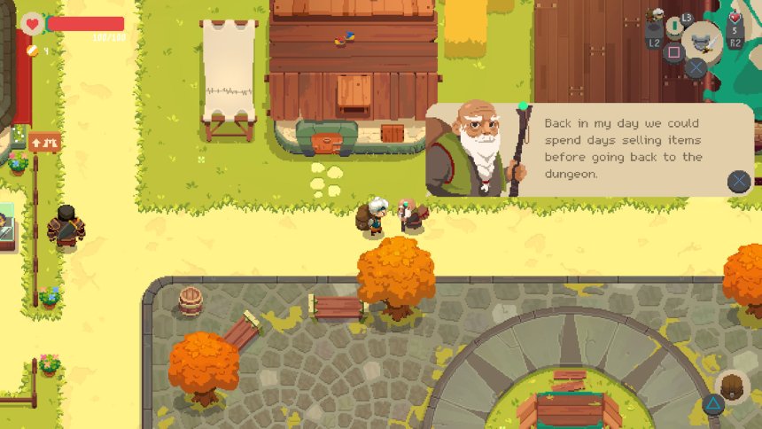
Needless to say, the general art style seen in Moonlighter is incredibly strong. Its design never strays too far away from a well-established colour pallet and it manages to use modern UI concepts whilst maintaining its retro look.
A good example of this can be seen in its dialogue UI. The screenshot below shows a nicely rounded textbox with an image of Zenon snugly masked at the bottom left, but just tall enough to poke out at the top.
The pixel art font strengthens its retro look alongside the pixel art image of Zenon and action button. Had this box used a non-pixel style font, I'm sure it would drastically change the game's tone.

Example of textbox dialogue in Moonlighter
Final Fantasy
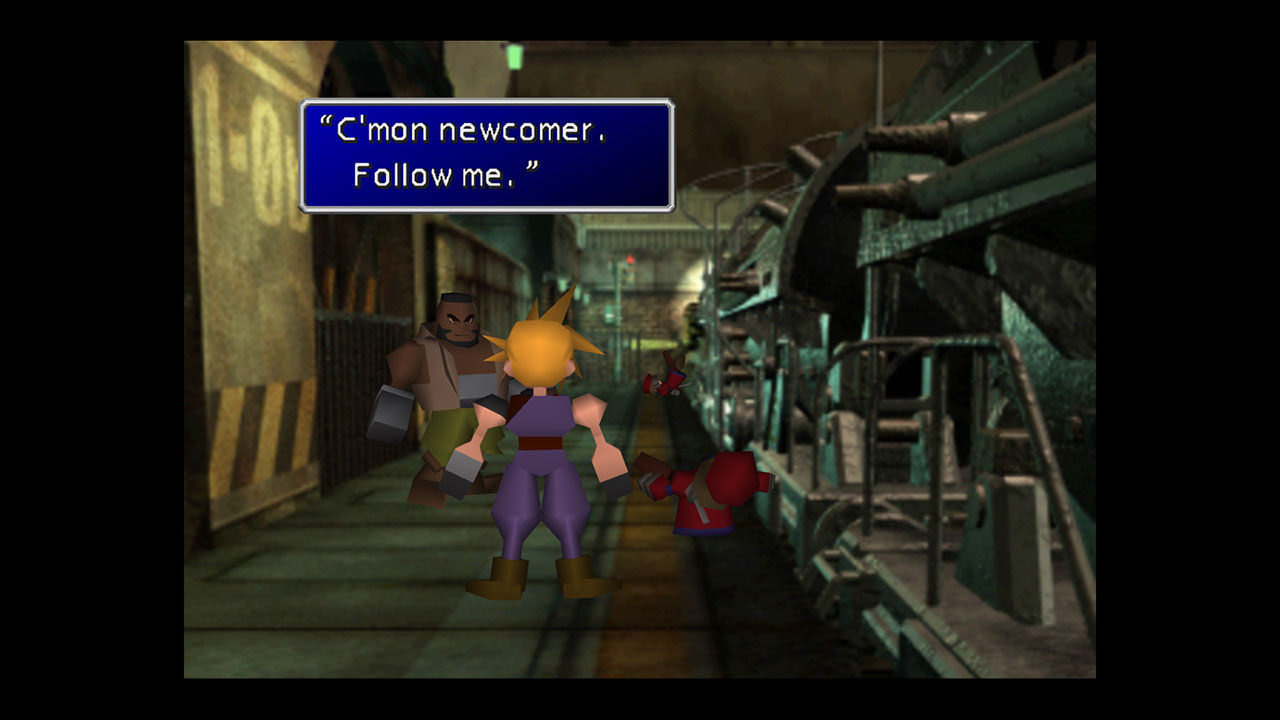
The UI style in the Final Fantasy series was fairly consistent for the most part. It isn't hard to recall the rich blue menus, white text and that little finger pointer dancing around the screen.
The thick white bevelled border helped the textbox pop out from the scene and the saturated blue background provided a good contrast for text on the screen.
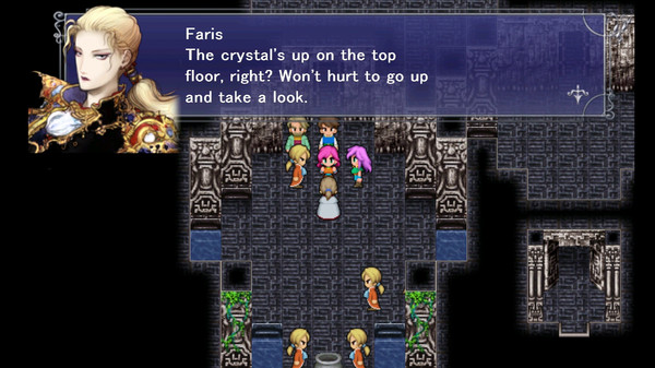
Some of the remakes included avatars in dialogue boxes which made it easier to identify who’s speaking, but on the flip side also had semi-transparent backgrounds which could make text a little more difficult to read because of the reduced contrast.


Valham
Although they look incredibly appealing, I decided to give avatars in textboxes a miss and the reason for this was exactly that. Whilst I feel it quickly allows the player to identify who’s talking, I think they can be quite distracting and momentarily take the focus away from the actual text being shown. I feel it pulls the player out of the moment. By not having an avatar on screen, the player is reading text line by line, building up their own image of the characters in their heads which in turn creates a more personal experience of the game.
Additionally, as a solo developer, I feel it would add a considerable amount of work to the project on top of everything else that needs to be done. I know that if I had avatars in textboxes, I’m going to want to give them idle animations and reactions, which wouldn't be practical at this point.
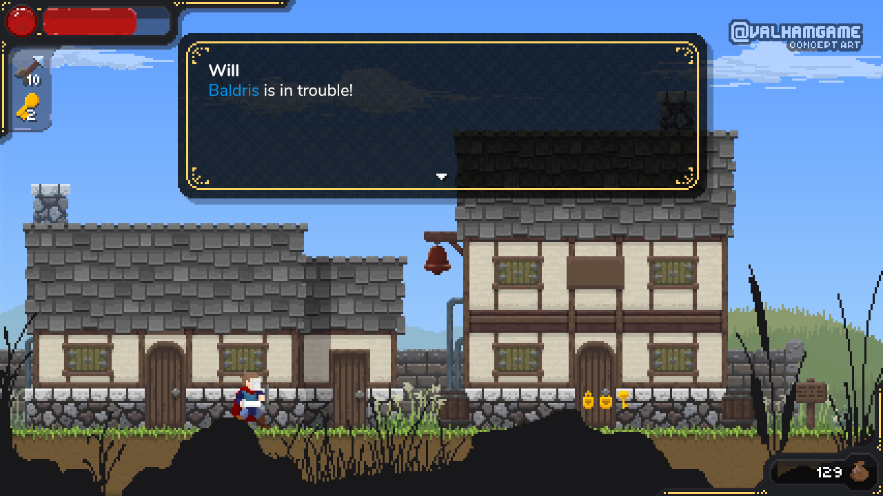
The mock-up below is a first pass at the dialogue box with a slight thematic update to the HUD as well.You can see I’ve used a border to help the textbox to pop out from the scene, and instead of a solid colour, I’ve used a pattern. I think the pattern is a touch too intrusive as it stands and will need to be toned down.I also ditched the idea of a pixel art style font. This in itself was a difficult decision to make as I wanted this game to be as true to its roots as possible. However, as charming as it is I felt it was too unreadable. So I opted for a clean rounded sans-serif font.

Part of the next steps would be to tone down the decorative elements and also find a colour pallet that suits the style of the game. Maybe a dynamic colour pallet that changes depending on the area you're in? Maybe not :).

