Today we want to talk about the switch of UFHO2 from 2D to 3D.
I was convinced that it was an easy change, and in terms of the overall work it is, because UFHO is ultimately made of simple geometries and the characters themselves are not humans with tons of bones, clothes, hair, etc - all things that are hard to render in 3D and that require a lot of work.Our characters are mostly jellies, the UFHOs themselves are collection of repeated geometries (extruded hexagons :D) and so on.
This doesn't mean that it's all a piece of cake though.
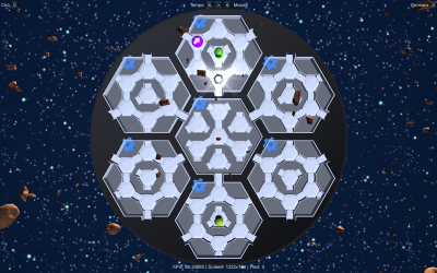
One of the biggest issues I had was to port the point of view from 2D to 3D. Consider the old 2D top down view:
As you can see, the aliens were filling the entirety of the room that contained them. This was on purpose: there's 49 rooms on screen at once, so they can have only a limited dimension. Making the alien as big as possible to keep its appearance interesting and meaningful, meant that he had to fill all the room.
When you port all of this in 3D, it doesn't make sense. Imagine a room that's 2,5 meters tall (I made it this tall so it can hold all the characters).
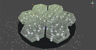
Now one of the first features I thought about when deciding to switch to 3D was the ability to rotate the camera a little bit to better appreciate the characters and the scenery. If you do, that's how 2,5 meters tall rooms look like:
Additionally, if you see these rooms with the characters in them, it looks like they are in very, very narrow elevators where the walls are 2 cm from their faces. Which doesn't make sense, because they are supposed to be rooms.
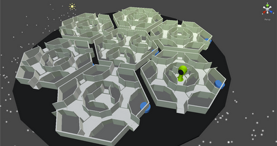
So a friend had a good idea: why not make the walls lower? Well, "lower" wasn't the right word. But I could literally cut them, as if the player was seeing only a section of the UFHO.This is a trick used by other games I guess, and it worked. First I cut them in half, getting this:
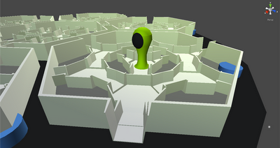
But it wasn't enough. So I cut the area walls (the big hexagons) in half, and divided the rooms' walls by 4:
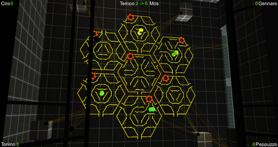
This way, the UFHO looks like as if it had been sliced horizontally, while the characters, the gem and the powerups stand out beautifully and can be appreciated when the view is skewed. When you play normally, the camera stands almost perpendicularly to the playing area and gives all the clarity of the old 2D representation with a bit of the nice 3D depth:
The 3D is exaggerated with the help of external elements, which sit way above and below the UFHO to give additional depth of field. When you rotate the camera you see them on top of the UFHO, but if you just play they are arranged not to cover the playing area, so they don't disturb the actual game (if you are a hardcore UFHO player you know you don't want distractions).
A screen of another level, as you can see the virtual reality spotlights are mounted on structures that sit way above the floor, but you notice only when you rotate the view (as in this screen):
A lot of things in those screens are not final of course (the characters, first of all!). But you can get a hint of the direction where UFHO is headed.
Do you like it? Any suggestions? Voice them in the comments, we are listening!

