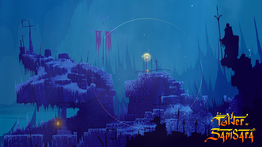
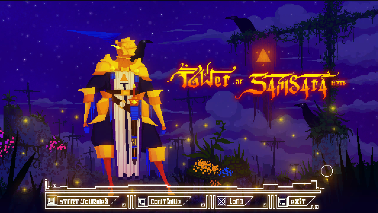
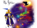
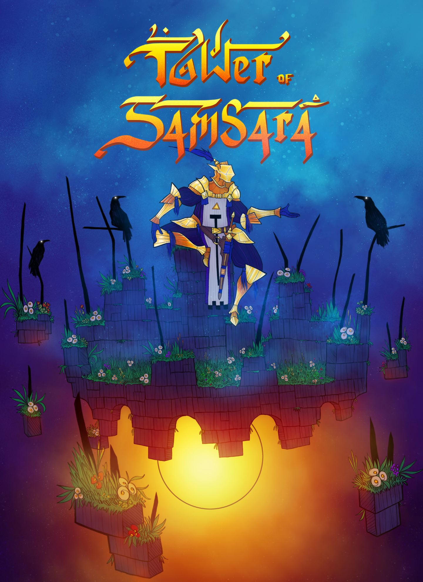
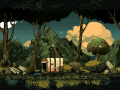
Tower of Samsara is a pixel art adventure game
Its a journey which the player will seek spiritual ascension

Tower of Samsara is a transfiguration.
The player, longing for interior peace,
will undergo demanding challenges
that will ceaselessly test
his ascent toward Nirvana.
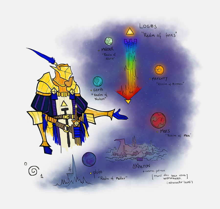
This epic journey will lead
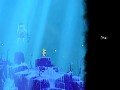
to different planets
each being a representation
of a karmic state of the being
thus moving from infernal worlds
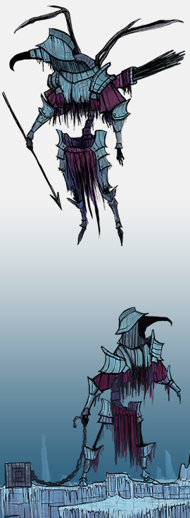
such as The Realm of Matter
to worlds that are closer to the divine
until reach of imperturbable awareness.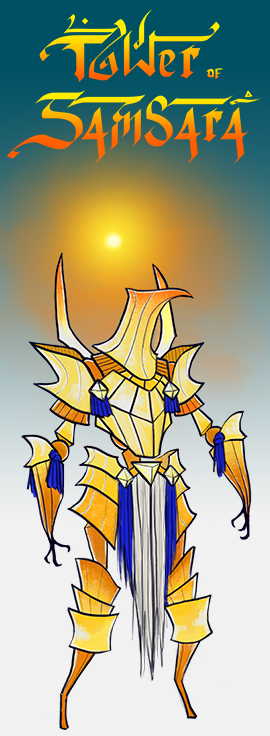
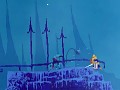
In these worlds there will be uncountable
obstacles and envious entities that will
try to steal your inner light.
Every obstacle we face in our journey
represents an opportunity
to overcome ourselves and our limits
understanding good and evil
two sides of the same coin
just like yin and yang.
Once the correct path is clear
the player will increase his karma
letting him continue his ascent.
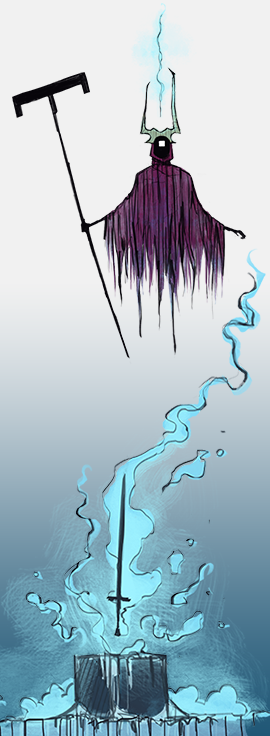
On the journey, the player shall meet wise deities who will give spiritual help
so that he may find the necessary strength to carry on his epic journey.
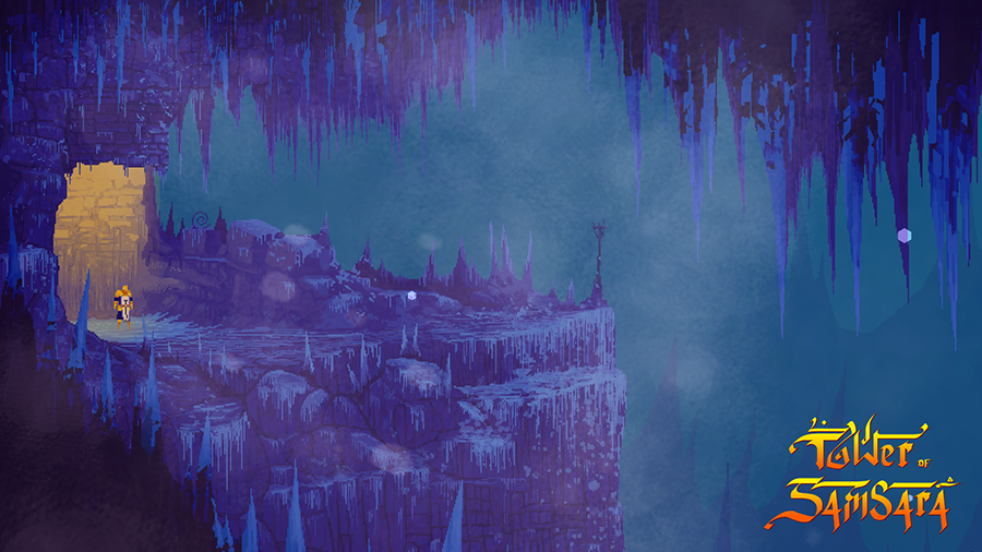
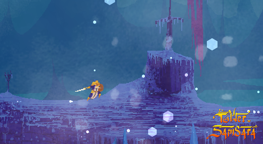
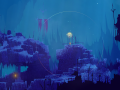
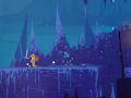
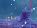
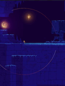
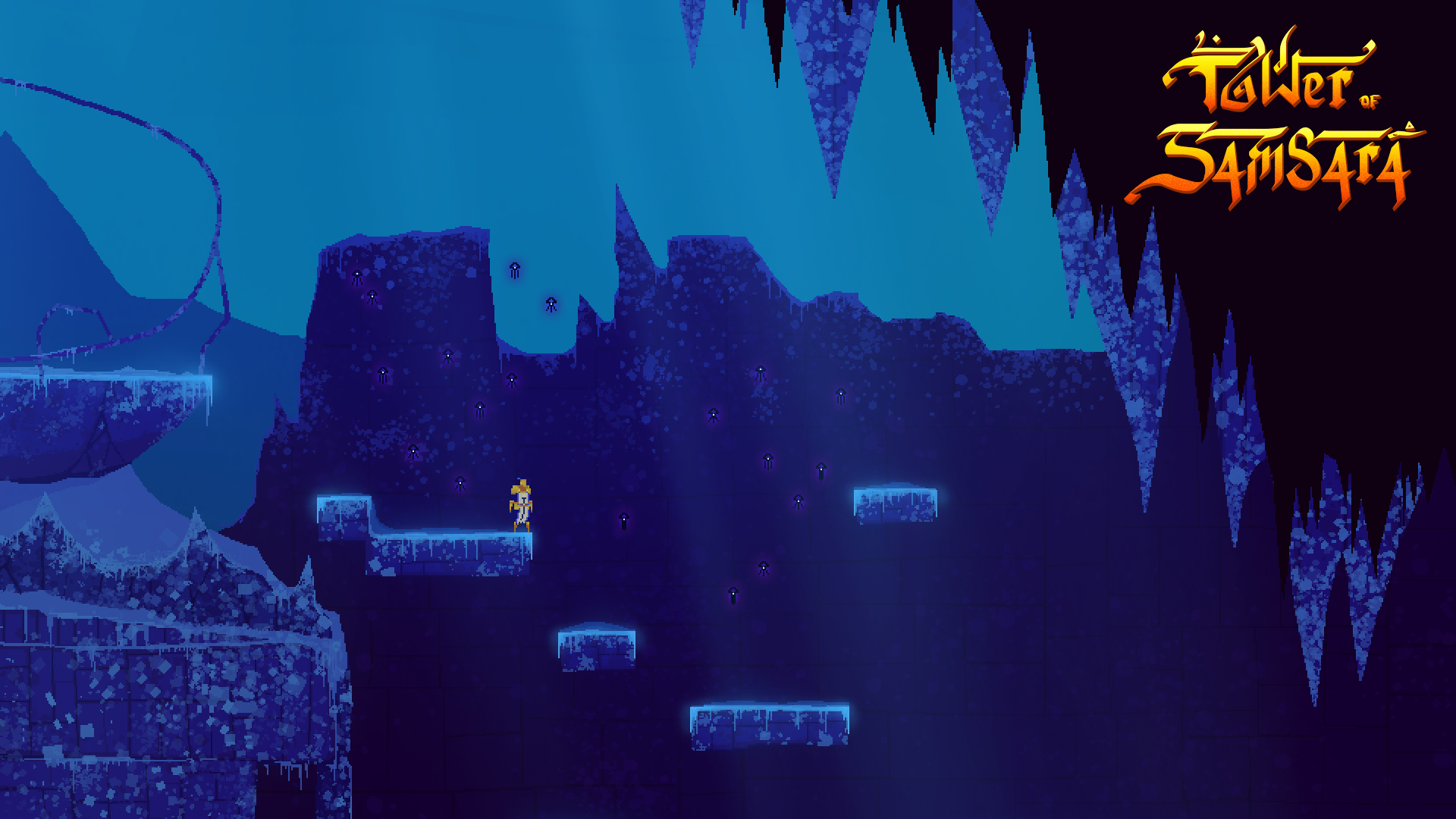
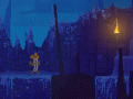
The game features detailed high-res pixel art graphics,
with immersive ambients, a lot of particles and 2D dynamic lightning.
- BE the character and live an epic adventure - Full movement platform-fight adventure
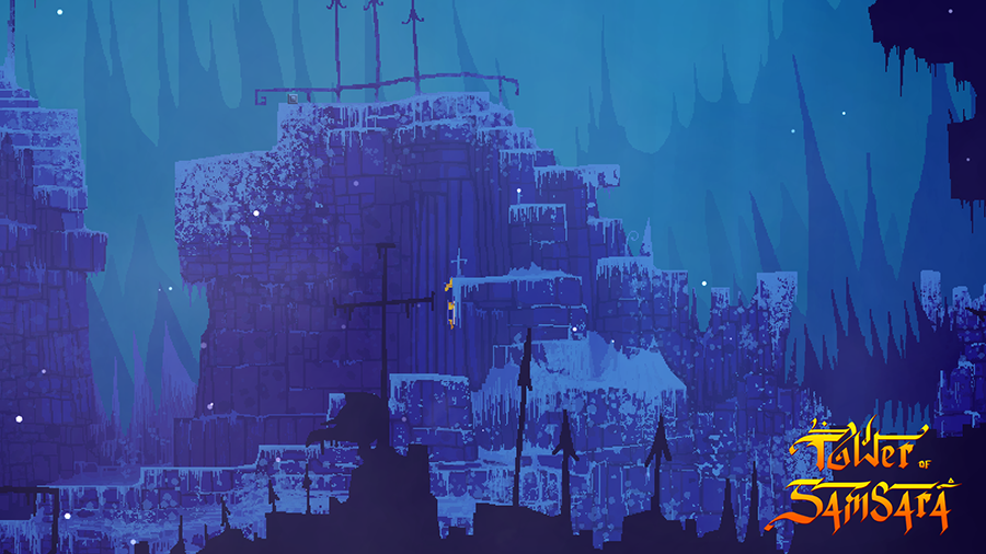
- EXPLORE planets of the solar system - Enormous hand-made scenarios
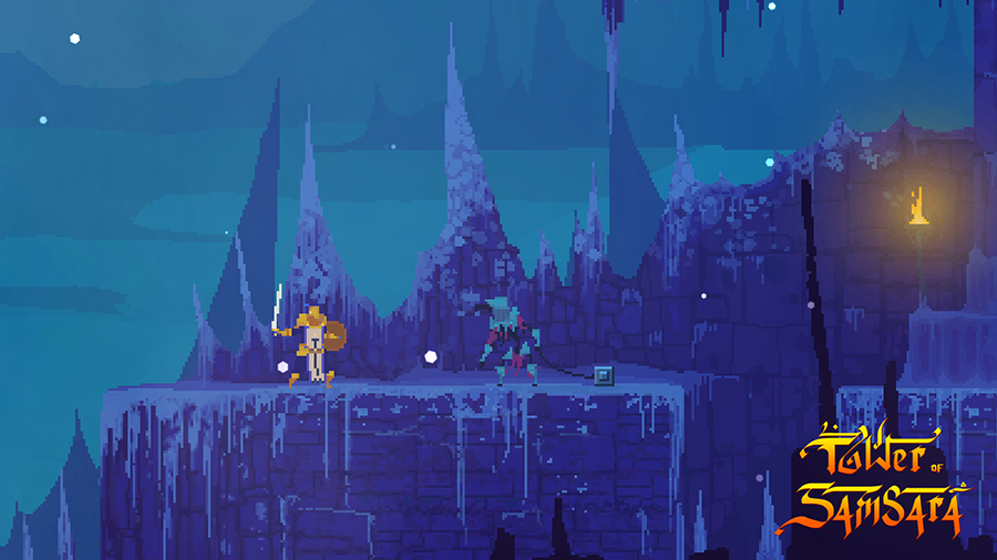
- FIGHT dozens of enemies and gigantic bosses
- FIND relics embedded with good karma - Hidden & Puzzles
- SHARE your poetry with other players - Similar to Dark Souls, share a haiku with players that pass through the same spot
In Game
SCREENSHOTS
GIFs
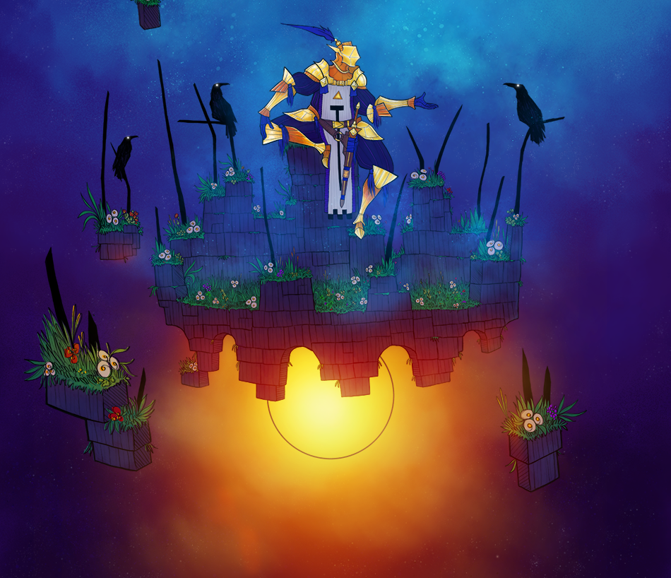
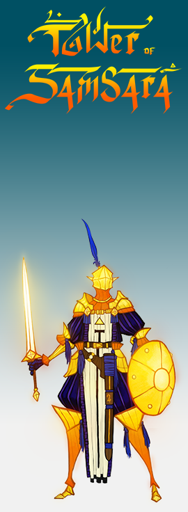
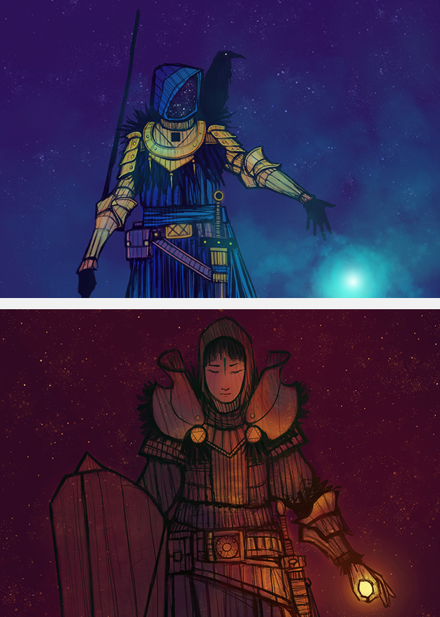
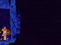
Player Avatar(we call him kopper behind the curtains, a nickname)
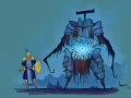
Immortu (Realm of Matter Creature)
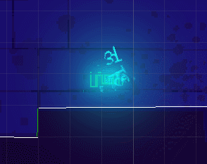
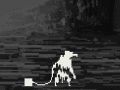
Blizzard (Particle Test)
Torch (Dynamic Illumination Test)

We are Martelo Nero™
Danilo Ganzella - 
Game Design, Management, Tools Programming, Particles, Marketing, Testing
Gabriele Marchi - 
Gameplay Programming, Social Media, Marketing
Guilherme Gaspar -
Creation, Art Direction, Ambient Design, Character Animation, Concept, Storytelling.
Articles
Continuing development, we recently implemented the first UI windows.
First, we present the message writing window. The message system will be similar to dark souls in the sense that ou can leave messages though the scenario.
In our game, you will leave a 3 line poetry, also called "haikai" from the japanese culture, to inspire, help, or even trick other players.
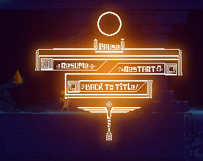
Also, the pause window, a simple menu inside the game.
Following, this is the effect of fixed messages that appear through the game. Besides the player messages, some fixed messages will exist through the world.
Now to the title screen, still to be animated.
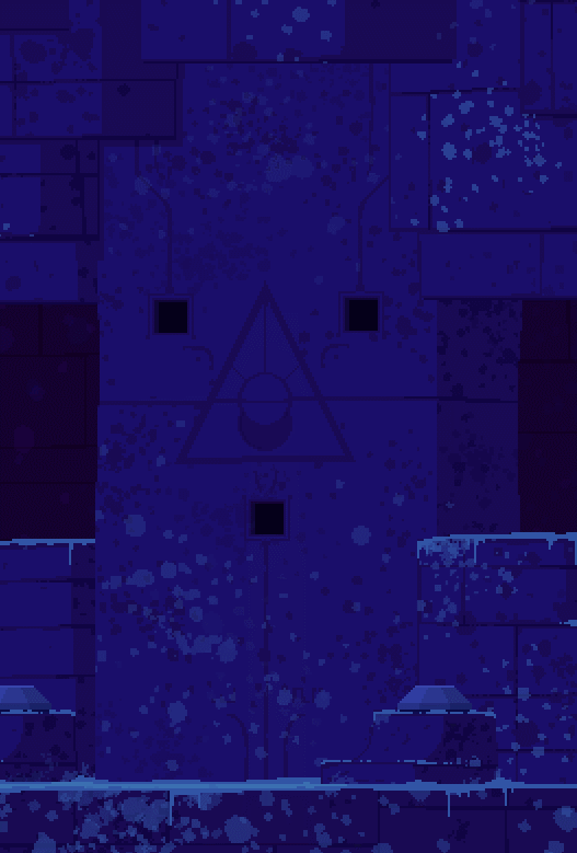
Now leaving the Ui a bit to focus on gameplay. Here is a portal opening. Portals will open once you find the seals to open it.
And for last but not least, the critters will be creatures that will add immersion and life to the scenario. You will be able to interact with them in various ways.
Thats it for now! We are going fast on development and hope to have a demo build soon!
Thanks a lot!
Martelo Nero Team
The path Forward!
News 5 commentsOur kickstarter didnt go as planned. But we decided to go on with the game and try once again in the future. We will also have a build available this...
Our Kickstarter is on!
News 3 commentsCome Back us! Our Kickstarter is finally live! Check our our Kickstarter video with new scenes of the game!
Less than a month to kickstarter! + New GIFS + Fan Art
News 2 commentsIts less then a month to kickstarter! Game Updates,new GIFs and Fan Art.
Our Thunderclap is on! + Updates
NewsSupport the game by scheduling a tweet or a facebook post that will go live on May 3, right after the beginning of the Kickstarter!
Post a comment
Profile
Icon
Developer
Martelo NeroEngine
UnityContact
Send MessageHomepage
Towerofsamsara.comRelease date
Game watch
Follow
Style
X
Tags
Embed Buttons
Link to Tower of Samsara by selecting a button and using the embed code provided more...


You may also like
Sonic The Hedgehog 3D
Platformer
The Mind Hero
Platformer
Camera Obscura
Platformer
Vagante
Platformer
The Harmony Of Buku
Platformer
SonicGDK
Platformer
I am definitely not a platformer fan and I haven't played any platformers since 90s. The last two platformers I played were Prince Of Persia 2 and Flashback and they were on DOS. By the way Prince of Persia 2 is definitely a masterpiece and I recommend it to all platformer fans. Anyway, indie game scene seems to generate literally tons of platformers every month. When a new and shinny platformer comes along I find myself thinking: Okay, another platformer claiming to bring something "unique" to the table which in the end turns out to be a mario or meat boy clone at best.
So when I first watched the gameplay video of Tower of Samsara the first thing I noticed was that the char looked somewhat "realistic" compared to more traditional platformers which is a great thing in my opinion because we don't see that very often. That instantly reminded me of Prince Of Persia and Flashback.
Modern platformers seem to play extermely fast and the screen is always full of colorful lights, post-effects, exaggerated screen shake effects, exterme & frantic jumps, wall jumps and lots of saturated particles everywhere. It just feels cluttered and frantic.
In TOS the character seem to move at a more natural pace and the player has time to sink in to the scene. In my opinion that helps the immersion and feels natural. The art direction looks very good too.
Plus I am a BIG fan of medieval themes: Swords, shields, armor, archery, castles, sieges and melee combat.
For me the sword and the shield is an awesome addition to the character.
I think the game will benefit a lot if you implement a detailed and fun melee combat system to the game. Shield play, low-high attacks maybe? I think this has potential. And that comes from someone who doesn't even like platformers anymore :)
Best of luck with your project, cheers.
Hello! Its the game desinger here. You are absolutely right. We want the game to has a slower pace, the player actually feel the effort of the avatar in every movement.
We thought about a deeper melee system when we thought about adding PVP. Although this may bring too much complication on a game that should actually be clean. Instead of a deep melee system, we will add a second mode battle mode with non lethal attacks where you can spare enemies instead of killing them. Nidhogg already brought deep combat recenly, we want to explore better the new trend of pacifist games brought by undertale, which fits well with the buddhism and karma themes of the game.
I'm loving this!
I just love the way this game looks and feels, but that said, there are some small things bothering me the way they are now.
The enemy designs (while striking and unique) use a color scheme that seems to blend with the background. The lock-on helps mitigate this somewhat, but the player should always be able to tell where the enemy is and what he is currently doing (which is kinda hard because they all look kinda slouched or "melty" and, I assume, move in an "undead-ish" way). If the designs use teal, as the background does, readability takes a hit.
Kopper doesn't have this problem because he has gold bits that help him stick out.
Another little bother are the tutorial prompts (though I assume this is far from the final version). The player is expected to raise the shield against the wind, but the prompt that tells the player how to enter combat mode appears way later, in the first fight. This could be a good opportunity to teach the player how to block in a safe environment. There's also no prompt that says how to jump.
Just small problems really, I'd hate to see such a promising title get dragged down by miniscule issues like this.
Most of all, keep up the good work, it's looking great! :)
Hello! Its the game designer here! Sorry for the late reply.
The player dont need to raise the shield against the wind. It can overcome the obstacle simply by running. I just wanted to show the cool particle effects on the video.
Later on the game, we will combine traps, enemies and wind, and then, shielding the wind may help, because you won't want to run towards an enemy or be pushed by the wind and fall from a ledge into spikes. That part is where the player is supposes to learn this and its very far from the beginning of the game.
I actually created the jump tutorial but vertov felt it was too dumb, and I kinda agreed. I like to make it complete too but the lack of it doesnt really bother me. If you dont know that platform games do jumps maybe you are too young or unskilled to play the game, its not a childs or beginner to gaming game. The good part is that is has much less tutorials.
We are adding tutorials only to non intuitive stuff. Which is basically the lamp system, lock on system, lateral and vertical grabbing, and as you pointed, the dodge.
We wont add the dodge tutorial because 100% of people learn it when trying to jump in combat mode. You cant jump in combat mode, just dodge.
Also if we already teach how to enter combat mode and you see a sword and shield, its too logical you can hit or defend.
Also, the lock on is in fact PRESSED for you when you learn it. You see it happening. The idea is, even if you didnt saw the top left message of the buttom, you know that somehow its possible to lock on.
I remember when I was a child, I played a castlevania from ps2 which you can steal itens from enemies, but I didnt know that, and then I played the whole game without this ability. A friend of mine played the Vagrant Story game without doing any combos.
We Will in fact test the tutorial a lot and see how people deal with it. We feel that our game being platform and 2D sidescroller actually help a lot with users having previous experience, thats why we only teach whats specific.
thank you for the feedback Tinkerton! as the artist im very welcome to second observations.
yea, i confess that i had this concern about how the enemy would blend in the environment, the pre-version of that mob had only blueish tones, so i added the red to compensate that... but the teal can work, i agree the armor tone is close the ambient color and adding more teal would work fine, and would leave its armor with a more icy look. :)
as the second point, i'll leave for our game designer to talk about it. ;)
for the jump prompt, i can say we thought that to be intuitive already..
I like to think of tutorials in binary. Either you don't teach the player anything and let them figure it out on their own (Super Mario Bros, for example, but that game had the benefit of having only a d-pad and 2 buttons), or you teach the player ALL the basic controls. Some games use shift as a default for jumping. For FPS games I use C for crouch and F for use, but the defaults are CTRL and E respectively.
It's important not to leave anything up to chance or assumption. You don't know who your players are, what games they played before (if any) and what/IF they'll try to figure it out. The responsibility of the designer if they say "OK, I'm going to teach you how to play this now" is to teach the player everything they need to know how to play. The complexity later arises from the mechanics, gameplay and its nuances. It costs almost nothing and covers everything.
A good example is what I noticed in the video after posting my comment. I noticed that while in combat, you can perform a dodge move. Because there wasn't a prompt saying how to do it, I could assume (if I knew you could even do it) and try any one (or none, if I haven't played much/any games) of these things:
-There is a dedicated dodge button that can be seen in the control options (assuming you can only dodge backwards, because that's what we see in the video)
-There is a dedicated dodge button that can't be rebound and is thus unknown until mashing on the keyboard randomly
-You can use the jump button while in combat mode to dodge backwards
-You can use the jump button while locked-on to dodge backwards
-You can double tap an arrow key to dodge in a certain direction at any time
-You can double tap while in combat mode
-You can double tap only while locked-on
You can see how just putting a simple prompt eliminates all of these possibilities and any doubts and helps me understand something that might be crucial to survive later on. Also makes me less likely to quit the game in frustration because I wasn't privy to all the basic rules the game uses.
Sure, it's a bit more 'dodgy' (heh) than the jump button, but all controls should get the same treatment none the less.
I love your concepts and pixel art ! ;w; they're amazing
Thanks!! Watermelon-eating wolf!
Wolfa-wolfa
om nomnomnomnomnom
fear me !
nom nom
Btw, if I may ask, did you do the concept's outline first, then color it ?
vertov is the artist. I have no freacking idea why he isn't showing as creator
i think the 'creator' tags are meant to be the creator of the article, who posted it
and yes he replied already xD
you guys reply fast too, I like it
I see. Well its fast because I am 24/7 on this marketing the game thing I'm going crazy ;_;
so you're this team's marketing man?
can you divide the marketing jobs to other members of the team? Maybe that'll help you
haha yeah yeah I'm dividing the task with another guy! He's taking care of the Twitter. also vertov is creating the visual assets for the marketing
niceee, how many people are in your team btw? just curious
I'm sry if I'm being annoying ;w; but I wanna have some internet talk regarding indie games
haha no biggie. But its almost time to sleep so if I stop answering its because of that.
3 people. You can check more info about us here: Forums.tigsource.com
haha, yea timezones suck xD
Thats super awesome! 3 people to make such a beautiful game is an achievement itself ;3;
I myself am in a team with only,.. *cough* two people
our game hasn't took any form yet, me and my partner plans the game to be shown to the public at around summer this year
Its nice to see other small teams working hard tho, keep up the good work!
thanks! good look 4 you too
in the last 4 images, yes i do outlines then colors but on the two on top i did merged the layers after i painted basic colors and then i painted over.
:)
so its like (layer sequence):
paint over
---------------Merge
outlines
Basic colors
---------------Merge
Did you also incorporate different layer types to your concept arts?
paint your basic colors in a layer botton of your draw, add mid tones and lights then merge all and start paint over that.
or you can not merge and do something more like comics and leave the outline clean.