Toodles, y'all! o/
With the gameplay demo just around the corner, I've been working on the user interface a bit to make things looking slightly more professional than Ariel Regular. [:P] Apart from touching up the labels, buttons, and multiresolution aspects of the UI, I've also been browsing some fonts to see what caught my fancy. Only problem is, I found rather a lot that did.
After narrowing it down to these four, I'm still undecided about which one to pick. I'm leaning towards the second one because it's the font that inspired the Tidal Fall logo, but otherwise they all have equal appeal.
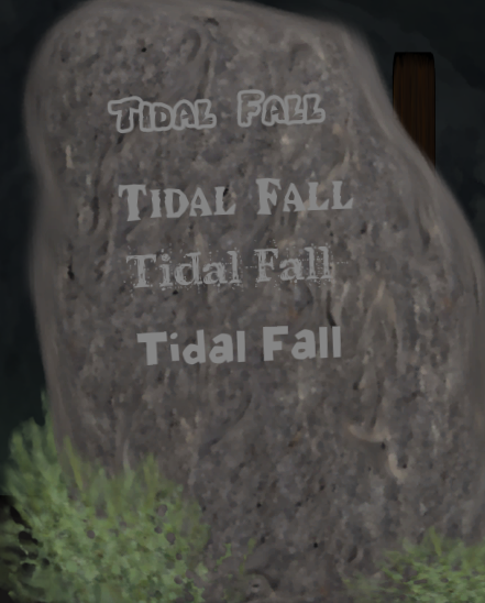
Which one do you guys think I should pick for the main text in the game? Post your favourite in the comments, and save me from having to roll some dice to decide (Yes, I do that more than I should. [:P] 'Tis the roleplayer's curse [:P]).