Hey Guys, my name is Mark Yampolsky, and I’m the User Interface Engineer for The Maestros. The Maestros is a brand new Arena RTS where you can command, build, and customize armies on the fly and pit them against other commanders in the heat of battle while defending your own. We just launched our campaign on Steam Greenlight, so be sure to check out our page!
Today I want to talk to you a bit about our visual language, how it’s evolved, and how our interface has improved as a result. If you’ve been with us since the Alpha, you’ll notice in our current iteration that the UI has gone through a pretty significant makeover in terms of coloration, arrangement, and assets. This is part of an iterative process to improve the existing UI so it’s more modern and user friendly.
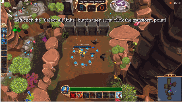
Fig 1. Old In-Game UI

Fig 2. New In-Game UI
The in-game UI has for the most part remained visually the same, with the exception of new design for the pause and score menus. However, we wanted to address some serious usability issues where we felt the important information such as health or unit count weren’t displayed as prominently as they should have been, leading to users being unaware of their player state. Most notably, our health bar was too bland and our population count was, in some cases, completely unreadable.
To make the health bar more prominent and user-friendly, I brightened the green to create more contrast, as well as incorporate color switching from green to red at low health. This, in combination with strengthened screen bleed when taking damage meant we could alert the player of their dire situation with enough time for them to react accordingly to avoid death. I also added numbers on top of the elements that before were purely analog representations of health. This combination of analog and numerical representation allows the player to glance at the bars momentarily and get a general sense of their player state, but if they choose to pay closer attention to gain granular information, their exacts stats are present as well.
In UI/UX design, arrangement and color use are especially important. In an average game, if you were to remove the UI, the majority of players would concentrate on the center of the screen, since that’s where the most action/gameplay occurs. Various combinations of the color and layout can be used to not only create aesthetically pleasing graphic design, but also draw players’ attention to specific areas of the screen. I like to call this “visual traffic,” which essentially is an abstract measure of how often players look at parts of the interface. As a result, arrangement and color played a critical role in determining where I placed the updated population bar.
I knew we wanted to represent the population as a bar/number combination just like we did for the health bar. What I also knew for sure was that the bar had to be blue since green and red were already reserved for representations of health while yellow and white were reserved for score indications and alerts. In terms of placement, I knew we wanted to consolidate it with an existing portion of the HUD, because the less time the user spends darting their eyes around the screen, the more time they can spend concentrating on the game itself.
Another addition to the population bar was the vacuum tube at the top. This was actually originally an aesthetic addition, inspired by the steampunk aesthetic of the Teutonians and vintage tube amps, but as I added functionality to it, it became an essential part of the UI. Basically, the way it works is when you reach a full population (20 if you’re a Teutonian, 10 if you’re an Alchemist), the vacuum tube lights up signifying you’ve reached maximum population, and the bar animates and displays in a lighter color. The reason I wanted to bring attention to a full population bar as opposed to an 80% or 90% population is because once you have a full bar, it fundamentally changes the way the game is played. At full population, it’s impossible to gain any more units, so your focus shifts from farming to fighting players or transforming your army. I felt it was imperative that we notify the player of this shift so that they don’t farm without reason.
When iterating through prototypes with the population bar on the central HUD, which contains the ability buttons and health bar, we discovered placing the population bar on top of the health bar was too busy, and could result in the two easily being confused at a quick glance, and placing it underneath the ability buttons meant it was too out of the way. Placing it on the minimap felt clunky, and placing it with the game score at the top would mean mixing player-specific data with team-specific data and wasn’t intuitive. In the end, I decided to place the population bar on the inside of the unit selection menu. This made sense because it brought more visual traffic to an underutilized gameplay element, and the population of your army is directly correlated with the unit types you choose to transform into.
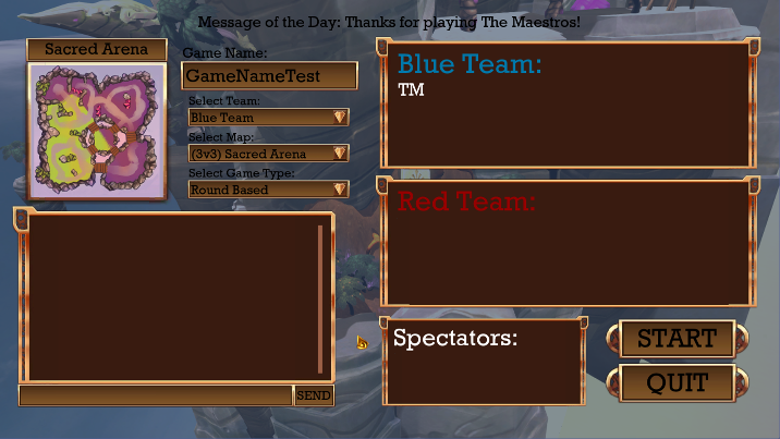
Fig 3. Old Lobby Design
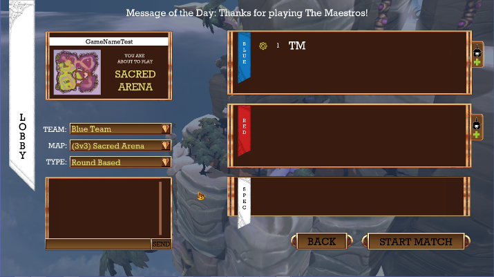
Fig 4. New Lobby Design
We use a virtually identical design process when working on any portion of the UI, regardless of how large the task is. For instance, when unifying our design language, we made sure that our coloration of elements was consistent across the board – black text on decorative buttons for clickable elements, yellow text for dynamically passed information such as player level or games played, and white for alert or information text. We’ve downsized all of the game buttons for a more modern design and even shifted our entire main menu to the left side of the screen to accommodate the future implementation of submenus in an effort to minimize the number key presses a player has to make to jump into a game.
An interesting and fairly recent example of this is the addition of banners to the menus. Whenever I go through a redesign of a menu, I take a catalog of all of the elements I need to display, and try different layout combinations to find what fits. To take a term from the film and theatre industries, I call this step in the process “blocking,” similar to when a director determines where actors will stand and move around a set for greatest dramatic effect or proper sightlines. During the redesign of the lobby screen, I tried about 7 different configurations to determine the most optimal layout. In one of these configurations I positioned the red team and blue team player lists at the top of the screen, stretching horizontally across the top of the screen.
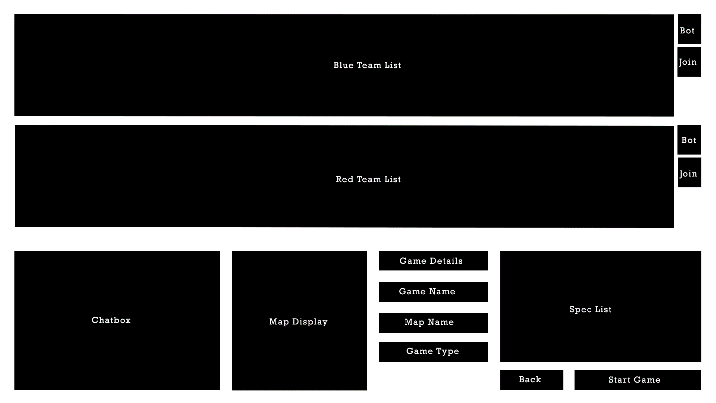
Fig 5. Lobby Blocking Prototype
This, on top of the fact that we’re designing for 16:9 screens, didn’t leave us with a lot of vertical space for the red and blue team header text above the player lists. On the flip side, the lists were overly wide for the information we wanted to display, so I took advantage of this by creating vertical colored banners to represent the teams. In the end, I reverted to a variation of the original layout, but the banners carried over from the variation before because, frankly, they look dope. In fact, it was that design change that influenced the addition of menu banners across the board.
Hope you enjoy learning a bit about our UI design process. After over three years in development, we’re finally launching our greenlight campaign so we can hopefully launch in Early Access sometime soon. Support us on Steam Greenlight!
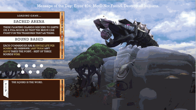
And just as a bonus gif, here’s our new loading screen design :D