We’ll be the first to say it - the UI in the demo of SVSH isn’t that great. It is confusing in some aspects and the presentation of information is not terribly clear. A large part of beta work up to this point has been working on a completely new ingame interface, with an emphasis on clarity. We’re also graduating the UI to a fully 3D version, which looks cool and lets us do a few interesting things with depth.
The Navigation Panel (which was placed at the bottom right of the screen) in the demo was a bit of a mess. The initial “intent” of the panel was to display critical information to the player – health level, shield level, energy level, and speed-related navigational info. We had also tacked on a number of other bits of information related to missiles and such. If you were ever confused about all that stuff, well, here’s a little description.
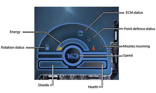
When redoing it, we looked at player feedback in general. People playing the game tended to miss the health/shield/energy bars completely or looked at them infrequently. They were often surprised when their ship was destroyed due to lower awareness of their health. So, a key design goal of the new Nav panel was to emphasize the various level bars so the player wouldn’t miss them as easily. We rescaled them to make them larger and gave them a set of colours that would make them jump out of the background. Bars now have very specific increments (every 10% for shields and health, every 12.5% for energy) so that a player can tell approximately what the levels are like with a quick glance.
The 3D aspect of the new UI also allows some highlighting with depth. The status bars are distinctly pushed outwards compared to the UI background, which highlights them even further. When they are low, they change depth as well, adding more highlights.
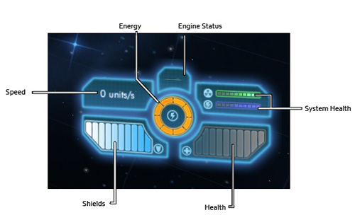
Additionally, we looked at all of our additional info on the original panel. We dedicated a lot of space to icons related to navigation that weren’t strictly necessary. Speed was important, but the large bars to indicate engine thrust were not, so we reduced those. We also removed all the missile and electronic warfare information – it’ll reappear elsewhere. The rotation lock icon was also unnecessary, we felt, as the only way to get into a rotational lock is through player input (holding down the appropriate key). Anyone who is specifically pressing that key implicitly knows they’re locking rotation (at least in theory!). So as a result, the new panel is much cleaner.
In that area or the panel, we added another pair of health bars for system health. This is a new feature that we are working on adding, and we’ll talk about it in a future update.
We also implemented particular visual feedback for events – generally flashing bits. The health bar now flashes when you’re low on health – the shield bar also flashes when your shields are down. Energy flashes if you try to execute an energy-using action when you don’t have enough power remaining. These cues help draw the eye down to the panel so that the player is encouraged to check their levels.
In addition to the visual feedback, we’re working on additional audio feedback. This again takes the form of specific audio cues that are linked to particular events. Things like losing shields, being hit by weapons fire when health is low, etc, will all trigger UI feedback, which has the dual effect of cueing the player to check his health as well as providing a way to partially eschew the use of the UI in high-focus combat situations.
So really, the panel should probably be called the Status panel or something – it no longer contains very many navigational elements. Just health bars and a little speed.
We’ve also revised all of the other UI elements – stay tuned for future posts discussing and elaborating on the changes