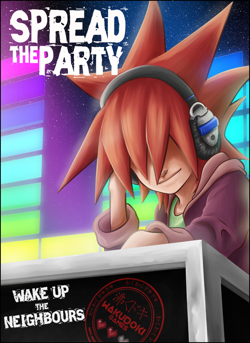
“Spread The Party – Wake Up The Neighbours” is the first game by Waku Doki Games. It’s about a kid who dreams to be a DJ and, every night, he takes his paper boxes, which, in his imagination, he converts into sound equipment in front of buildings. Using this sound equipment, he wakes up all the neighbours and makes them dance to the rhythm of his music. The game is based on the lights-out-puzzle, and it’s a free game with In-App purchases. Each level of the game consists on a building facade in which the player has to push some windows to make all of them light up. The idea is to wake up the neighbours with the music of the DJ, and for every pack of windows the player gets to light up, he discovers new musical instruments matching with the beat of the song. We intend to develop the game for Ouya, Steam, and later on mobile phone platforms.


Articles
As a little indie studio we wanted to give the best first impression we could, and that’s the reason we didn’t release our website until we perfectioned the logo as much as possible.
Logos tend to evolution with time, pairing up with the company’s philosophy, but we tried to rush this time to show the most evolved image we could get.
As we describe in the website, the mix of our influence from Japan and the company’s philosophy, which is “trying hard and never giving up, until you accomplish anything you want”, made us redo and redo the logo as many times as necessary until we got the one we looked for.
And here is the evolution and final design:
 On the first design we thought about making a squared logo, as the typical Japanese “hankos”, then we thought to make it round to give a more personal, lovely image.
On the second image we see a finer design of the seal we wanted: we changed the script of the name and added “waku waku doki doki” on the borders, as well as the three typical videogames hearts.
Those represent three lives that remind us of something we learn from games: “if you lose one life you can still try and try again with new ones”, which makes you try hard to loose as few lives as possible because they are finite and valuable.
On the third design we tried changing the position of the hearts and the company name, to give more visibility to the name.
On the fourth picture we see a clearer evolution to what we had in mind: to imitate the paper effect when the tint of the seal dries on it.
And on the last image we finalized the logo by changing the kanji by a katakana symbol and giving the burgundy red a more vivid color.
We crafted our logo, as the image of the company, with lots of love and dedication, what we do with our indie games, too. That’s why the logo symbolizes the seal of quality of our games.
www.wakudokigames.com
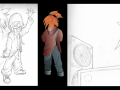
We are improving the art style
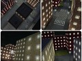
NewsSilvia designs the facades, Andrés draws them, Marta selects them for each building and Victor puts them together in the Unity engine. And that’s the...

Comparative between Manga Studio and Photoshop:
NewsThe first time I heard about Manga Studio I was pretty skeptical. First of all, how would a program whose name seems to be so focused on something as...
How we made: The Music
NewsThe music in “Spread The Party – Wake Up The Neighbours” is one of the most important items. Everything in our game is related to the music: the...

…and that’s where we work:
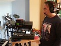
NewsWe work in different countries: Like many distributed teams, we work in different countries. Some of us work in Doha (Qatar), some of us work in Molins...
Files

Spread The Party - All the people go to dance
MusicThe music in “Spread The Party – Wake Up The Neighbors” is one of the most important items. Everything in our game is related to the music: the...
Presskit Spread The Party
WallpaperFor the press: Here you have the downloadable Presskit of Spread The Party. Texts, video and more screenshots coming soon. For now we just have some screenshots...
Post a comment
Profile
Icon
Developer & Publisher
Waku Doki Games Ltd.Engine
UnityContact
Send MessageHomepage
Wakudokigames.comRelease date
Game watch
Follow
Style
X
Tags
Embed Buttons
Link to Spread The Party - Wake up the neighbors by selecting a button and using the embed code provided more...


You may also like

MuCap
Rhythm
Combat Cats
Rhythm

Beat Boxes
Rhythm

Shape Factory
Rhythm

Entrudo
Rhythm
Round Rain
Rhythm