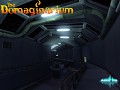
If you look at the different games being developed using UE3/UDK, there isn't really much difference between them (other than the color palette, of course), since they all aim at realism in one way or another, like Batman AC, Mass Effect, or Epic's own GOW. The indie scene is no different: Hawken and The Ball are perfect examples (and actually, Hawken looks exactly like GOW).
I'm not saying this is a bad thing. I like realistic graphics as much as the next guy, but since I've been into filmmaking as well, I know sometimes a specific visual style can be more powerful. In a different feature I showed you some sort of "illustrated look" in Parasite, which generally looked OK, although it obviously needed some adjustments.
There were some things that didn't work so well, though, like rendering the outlines on (very) curved surfaces. The outlines didn't work well in 3D either (I mean stereoscopic 3D), so I decided they'd have to go.
Still, the idea of a visual style is present. There will be 2 different visual styles, actually. One of them is the style that will run through the "normal" parts of the game, while the other is reserved for flashbacks (just because the character has amnesia doesn't mean we're using it as an excuse not to give you a back story). Both styles should be similar, although the one in the "flashbacks" should feel "ghosty."
I gathered a few reference images, which you can see below:

Uploaded with ImageShack.us
Personally, I find the Sin City look very interesting. It's not completely monochrome, but rather kills all colors except one. The hard contrasts and terminators are very cool too. If I went after this look, I think I'd keep the color red, since our character has red color, and all that. The hard part would be to guide players in a level that is almost completely monochrome, so we'd have to find ways to give "non-color-based visual cues" (so you can say goodbye to that line where the NPC tells you "press that green button over there to raise the platform!").
The Sky Cap look is similar, although it has a golden-ish feel, and all colors are kept. I was also going to include a "300" reference image, but I realized the "300" look is almost the same as the Sky Cap look (but the Sky Cap has this cool soft bloom). The hard part would be staying away from the "brown look" a lot of current-gen games have (not that I'm against brown, but there are more colors in the spectrum).
So, which one do you like the best? Let us know by leaving a comment below! :)
On another subject, I know this place has been very quiet lately, but that didn't mean we weren't working on the game.

Personally I love the style of Sin City the most too. They use a focal colour to draw the focus from one shot to the next or to guide the emotions. So if you have a green button that needs to be pressed, it could be a bright an bold green to help guide the player by directing their attention which would be a very useful level design tool imho.
Also, different characters have different signiture colours like Quentin Tarentinos colour is a sickly yellow. It helps evoke a sense of repulsion towards the character. Very useful for distinguishing between different character types. So don't just stick to red but use all the colours with a sense of powerful distinct meaning but to keep the style consistant, keep it to one main colour per area or character.
It also uses high contrast lighting with a very low colour saturation. Notice the skin tones of the characters are subtle but are still there, the lighting is crucial in this regard. It's this bold contrast between low saturation and vivid colour that makes it such a powerfull style. Since the viewer has been starved of colour most of the time, when it does appear it has a much greater impact on the audience. So, it's important to think carfully about what colours to use, where and what their meaning is.
So when you're making these decisions ask yourself this question. What are u trying to communicate with the colour and which colour expresses it the best? This will help you use colour in an appropriate and meaningfull way.
Anyway sorry for the long post but I really like that you are thinking about the overall style in this way, not enough commercial games do, they just push for photorealism mostly. So I can't wait to see what style you go for and how it translates into the game.
Hey there, thanks a lot! I didn't mind the long post at all, your comment was really helpful!
Honestly, I kinda like the Sky Captain Look. Hated the movie, but the look was interesting. Sin City didn't play well with me visually. Bleeding out almost all color except for bright vibrant reds? No that didn't really work for me...