Since attending Dare to be Digital 2014 - where I demonstrated the Observatorium prototype - I've been pushing ahead with Alpha development whilst reacting to user feedback. This post highlights some issues encountered and ways in which I'm addressing them.
(1) Star Zones
Originally, all puzzles in a level were visible from start-up. This caused various problems during playtests as around 1 in 10 players would try and connect separate (unrelated) puzzles. I played around with various solutions but the one I'm happy with is something I call Star Zones:
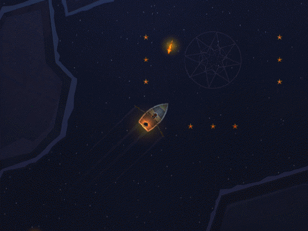
Now, when you enter one of these zones, the corresponding stars become visible. This helps drive the progression forward whilst framing the puzzles much better. It also means the game look visually neater when you're not in 'puzzle' mode and allows me to arrange the code/level in a more modular fashion.
(2) Overwriting
Originally, the controls for the game allowed you to brighten stars with left mouse and darken stars with right mouse; the game did not allow you to draw a line to/from any lit star. This led to alot of problems during playtesting as I could see players just wanted to be able to draw wherever they like. The solution - allow overwriting:
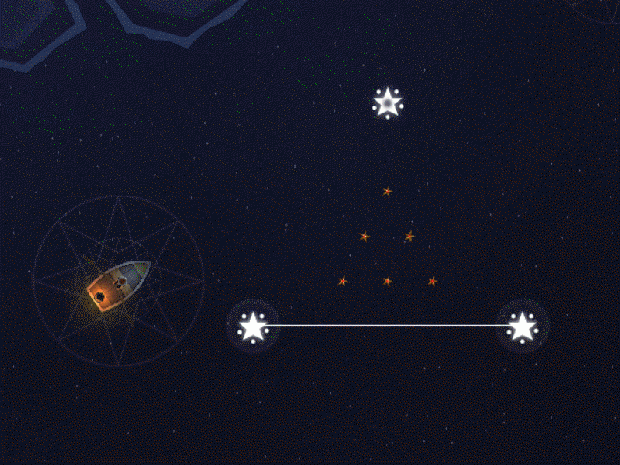
Now players can sketch to their hearts content and the game will update the puzzles dynamically as they overwrite any pre-activated star.
(3) Positive Reinforcement
Another issue found during playtests was players would understand the basics OK then immediately get stumped as they encountered negative mechanics: such as objects that destroyed lines or shapes. One problem was there wasn't enough visual feedback when the lines/shapes were destroyed. Another was related to overloading the player with negative effects too early in the progression.
The solution: more informative feedback when a negative situation is fired and add more positive gameplay mechanics - such as White Starfish - close to the start of the game:
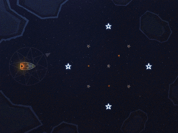
White Starfish turn into stars when you activate them and combined with the new overwriting mechanics the player can't mess these puzzles up so easily. This lets them experiment more and try out various shapes/patterns until they find the correct constellation. I also polished up the jellyfish mechanics which proved to be very popular:
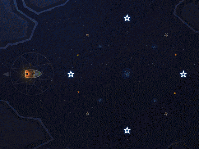
Previously the circular range they emit just snapped on/off but now I grow/shrink this over time (via co-routines) making their effect much more obvious.
(4) Tutorial Simplifications
Due to time constraints, I was unable to polish the tutorial code as much as I wanted for Dare 2014. As a result, I ended up adding alot of text prompts to the game world to compensate. I found that this didn't necessarily help the player out as it opened up too many opportunities for ambiguity.
Post-Dare, I had a little more time to spend on these mechanics. The solution I found was 3-fold: (1) try to keep the tutorial text/prompts as light and direct as possible (2) add plenty of feedback to the game world so the player understands the result of their actions and (3) allow the player a little room for experimentation.
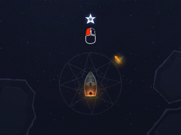
For instance, when the player encounters the first star puzzle now they are simply given the following prompt and their progression is halted until they click on the star:
As a general point, I would recommend trying to keep your tutorial prompts as direct as possible: one word next to an icon can often be infinitely more useful than a wall of text. Of course this will depend on the type of game you are making and sometimes lengthier descriptions will be necessary.
Conclusion
The game is progressing nicely and I'm starting to get a good feel for how I want to lay the game world out now (will cover this separately). Suffice to say attending Dare 2014 was an important step in the games development. Thanks for reading and stay tuned for some exciting news in December!
Clive Lawrence
The Man Who Flew Away


Some solid improvements. Keep it up!
Thank you!
I find this curious: "The solution: keep your text as light as possible and force the player to experiment in order to proceed".
Have you tested this idea on people? How did they react?
The day will come when I need to make a tutorial for the app, and I imagine it will be considerably different from writing a rulebook for a physical game (can't really let people experiment to proceed there).
I've tested this on a few people so far but no doubt I'll have a day where someone doesn't get it and I'll need to have a rethink.
My suggestion for keeping the text as simple as possible will probably only work in certain games/cases. In the case of 'Grimslingers' I expect your approach will be alot different to mine. I would assume alot of contextual help will be required: a step-by-step guide up until a certain point (perhaps) and then let the player experiment a bit?
For Observatorium, I'm trying to keep the text in the world as light and direct as possible and have the game world objects react in a meaningful way as you interact. This is what I've had the most success with so far.
Will update the article above a little based on our discussion :)
Cheers,
Clive.
Looks really nice! Keeping my eye on this!
Best,
-Tim
Thanks Tim :)
"As a general point, I would recommend trying to keep your tutorial prompts as direct as possible: one word next to an icon can often be infinitely more useful than a wall of text. Of course this will depend on the type of game you are making and sometimes lengthier descriptions will be necessary."
Sounds good :) I can't stand walls of text. Unless I really love a game, I ain't gonna reach too much text. A lot of asian made apps have super long intros, and tons of text. Guess it's hard to simplify when it's a second language?
I guess part of it as well is just how rewarding the player finds their initial experience. If everything is called out very explicitly then you don't ever have any of those 'eureka' moments you find in games like Braid and Portal (which I enjoy quite alot). It's a balance for sure!