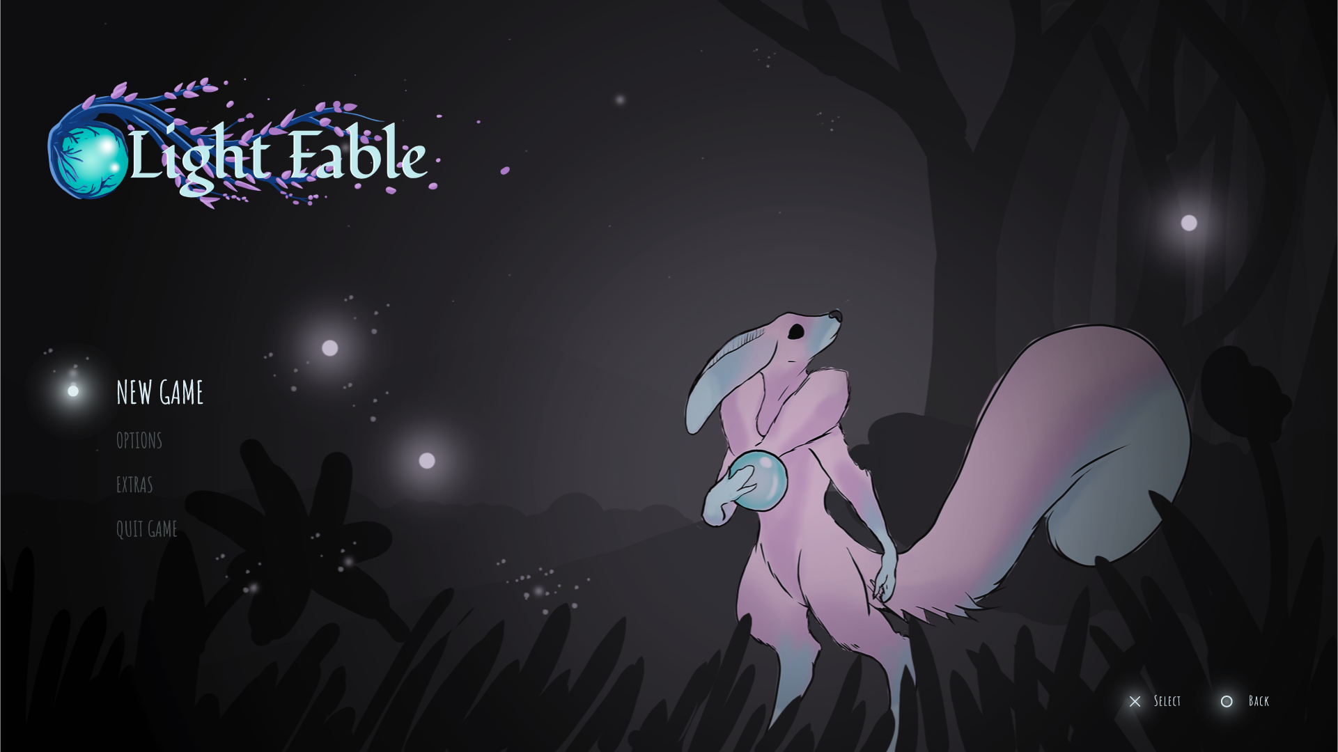
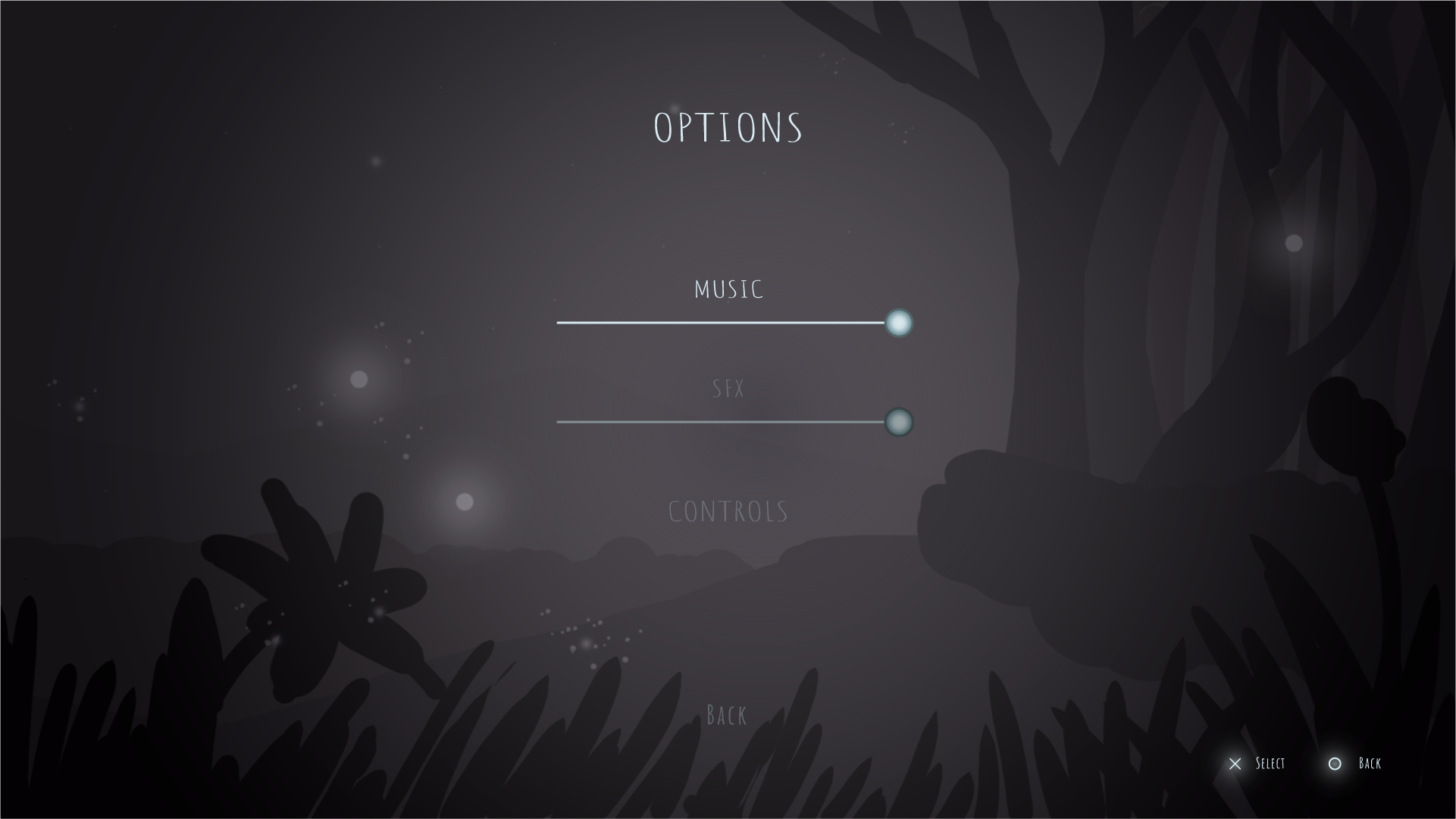
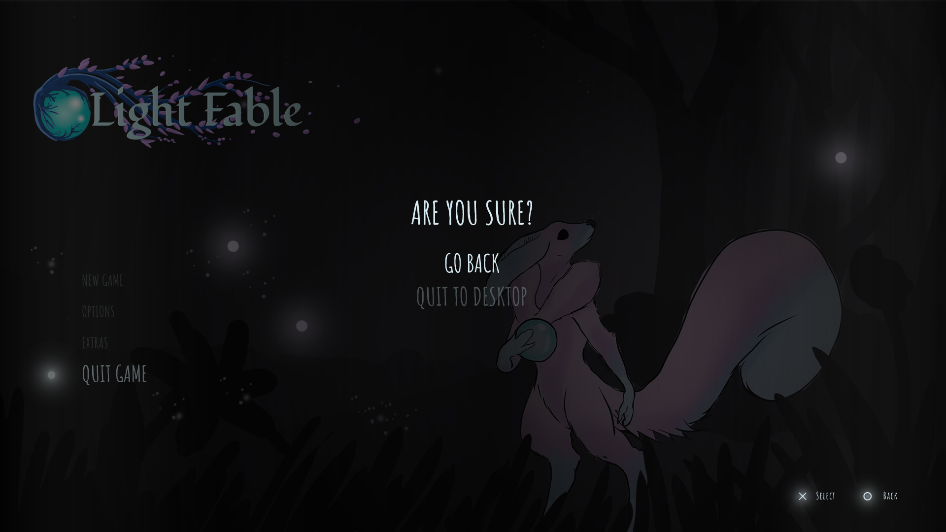
In just a few weeks our vertical slice will be competed for our project, these last few weeks have been hectic trying to get everything to look how we wanted to look. There are still things that can be improved but we believe we will be able to achieve our objective.
Here are some things we are still working on>
![]()
![]()

I really like the contrast of the black and white, it highlights the dark and tense yet slow-paced atmosphere of the game. Plus the simple menu fits better and its intuitive enough. Just think the options should have more contrast, the rest looks promising.