Hello! 
I'm Tarita, one of the two artists in our team, and this is my first blog post here. My main task in Interplanetary is to help to make the User Interface fuctional, and hopefully, also pleasant to look at.
Thankfully, I have studied graphic design in the past, and my previous game projects have provided me with enough experience to understand that design work like this involves more than just throwing a few boxes here and there and calling it a day.
So, the theory side is pretty well covered, but my hands-on experience? Very little. Our team size used to be a lot smaller, and as the sole artist my attention was mostly directed at in-game assets. I had made some UI graphics, too, but there wasn't enough time to actually concentrate on them, not properly. Interplanetary is my first chance to redeem the hasty UI:s of the past, so to speak.Despite this, my first mockup sketches for Interplanetary were conservative: Electric blue elements surrounded by a subtle shine of blue light. I wasn't satisfied. While the combination definitely looks appealing, it's also a very common sight in scifi games, and I wish to avoid sticking to the most obvious style choice. I was looking for something modern and sleek, simplistic rather than cluttered and glossy.

Pictured: creative processAfter "some" time, blood and bitter artist tears, I ultimately came up with three different style options for us to choose from: a) A light and delicate combination of solid metal parts and transparent holograms, b) Solid, traditional boxes with a white color scheme, and c) A mix of typography and colourful, yet subtle elements that obstruct the game view as little as possible.

Based on the sketches, we decided to go on with C, but we dropped the main focus from the typography elements and I was requested to tone down the amount of colours. To compensate for the losses, I picked up the white colour scheme (originally from B) and decided to use partially transparent objects instead of plain text.
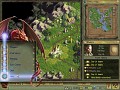
To be continued...In my future posts I will shed light on some of the many hassles of designing a functional UI, and provide you with some images of the final UI style. See you there!


Really interesting! I am looking forward to seeing the final one!
It reminded me the artist of our game when he made UI. He changed it four times or so. I am glad to see that it is normal. :D
Thank you, I'm glad to hear that. :)
Heh, yeah, it's pretty normal. The first attempt is rarely the best, after all, and you tend to get all sorts of ideas on how to improve it. Iterating is all fine and good, you just have to know when to stop.