Hey everybody. First of all I would like to apologise for the more-than-delayed weekly update. The main reason is that since moving the weekly updates to the forums, I thought it was the good opportunity to get some feedback for the HUD revamp. But to do that, the patch had to be almost ready so that I could present screenshots of the updated HUD. And here they are ! But before we start, we hosted another Alpha community event last Saturday ( 17 November 2018 ) You can view the replay on our YouTube Channel.
A patch including the HUD update will be coming this Friday. Once you’ve tested it, feel free to post your feedback in this thread. Note that a new control scheme for capital ships ( plus some upgrades on the weapons systems ) is in the works, but will not be ready for this upcoming patch.
HUD Revamp
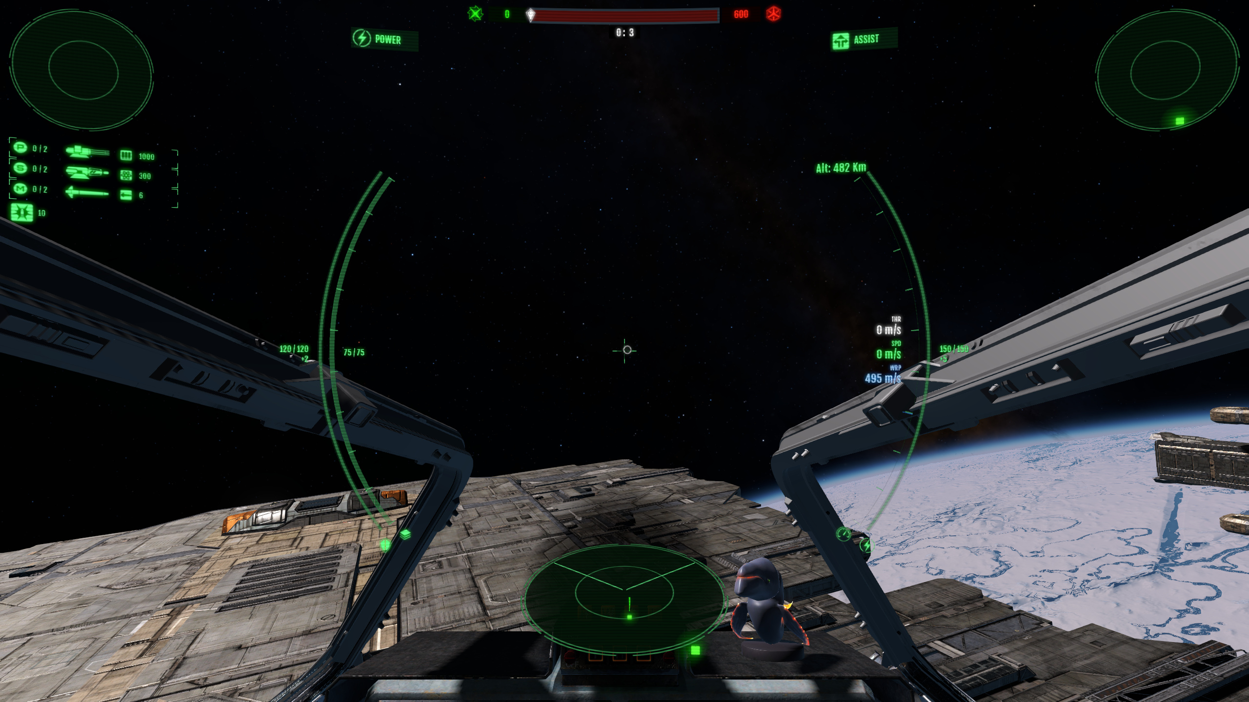
The first thing you will notice is an update in the visual style. I’ve kept the green theme but integrated it to a helmet-deformation cylindrical shader and added some bloom and (animated) holographic styling. The goal here is to make it feel more integrated to the ship.
I’ve been debating between actually displaying holographic elements integrated into the 3D viewport environment, or to render the HUD into a texture and project it into the head’s helmet ( following the camera’s movements ). It quickly became a no-choice: utilising a real 3D HUD would only work with cockpit interiors, but half the ships don’t have those ( capital ships ) and besides, a part of the HUD needs to be functional in third-person too.
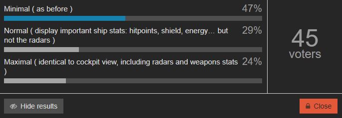
This leads me to the first question. At the moment the HUD in third-person mode is minimal ( you can’t even see your ship’s hit-points or shields… ). I’ve seen a number of people express interest in having the full HUD available and playable in third-person mode.
Q1. How much of the HUD should be visible in third-person mode ?
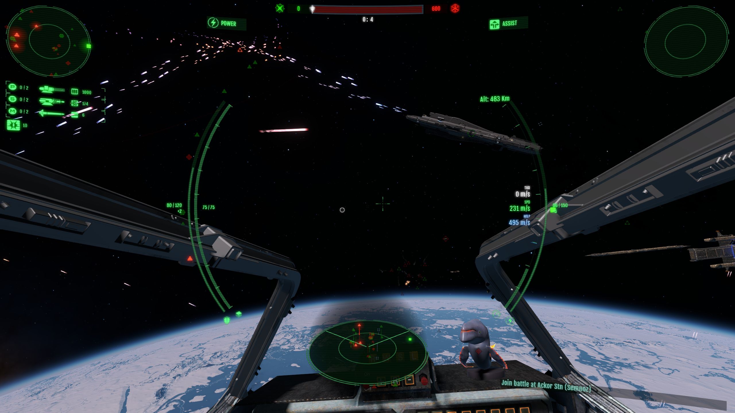
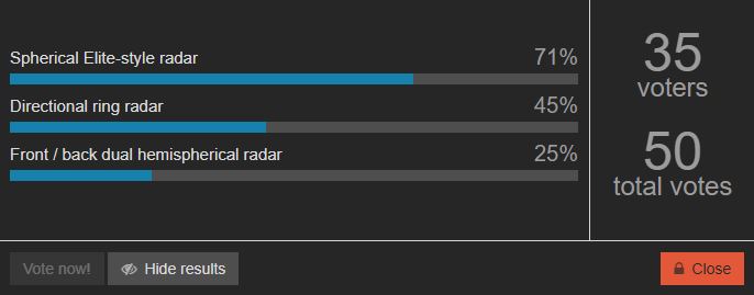
Radars
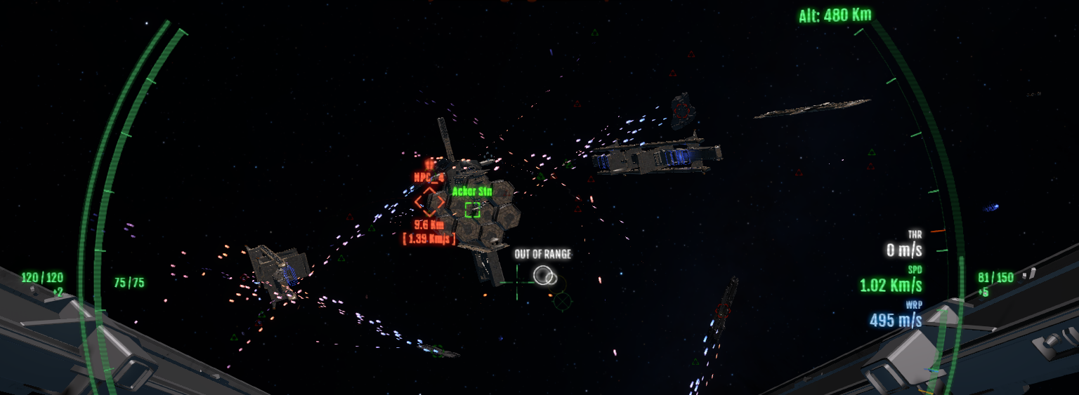
Now let’s go back to the HUD update. As you’ve probably noticed by now, the big change is that we’ve introduced two other kind of radars. That makes a total of three:
- The ring directional radar ( as before ): displays target indicators around the circular area at the HUD centre.
- The new spherical radar ( Elite-style ): currently displayed at the bottom centre of the HUD. It has a darkening halo background to be more visible on bright backgrounds. The frustum is also represented by the two lines and adapts dynamically based on the camera ( if you zoom for example ).
- The dual front/back radar ( X-Wing style ): at each top left/right corners of the HUD. Each is representing the front or back hemisphere around the ship.
The current goal is to allow players to customise which radars they want to toggle on or off based on their preference. If there are other kind of radars that you think would work better in a heavy-battle context, please let us know and we might be able to draft it quickly.
These three radars overlap in term of information they relay, but some are a better fit to a quick understanding of the player’s situation, depending on the context:
- The ring radar mostly provides directional information and can be used to quickly know how to orient your ship in order to make a target come into your view
- The front/back radar does not relay distance/depth perception as well and is split in two, requiring the player to glance at different areas of the screen. However, it can show if a threat is coming in your back; an information that the ring radar does not really provide
- Finally, the spherical radar is more strategic: it gives you a better understanding of the spatial volume around you. At the moment it is non-linear: the inner circle is at a 10 Km range, but the outer radius is at 25 Km. I tried a linear radar first, but in large battles it seemed to cluster too much information around the centre and not enough around the edges, making it harder to read at a glance.
I’ve also implemented a little surprise, a radar zoom for the spherical radar that seems to fit our HUD design pretty well. It is displayed at the centre of the HUD, within the circular area:

Make no mistake though, it is no replacement for the actual star map. It only displays targets in the local zone vicinity around you, so it is useful in the middle of a battle to avoid opening / closing the future star map all the time, which you would have no time to do in a battle.
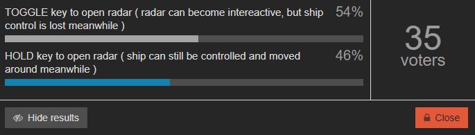
The current implementation is hold-key based ( default is assigned to the “quote” key, above TAB ). I’ve been wondering if it should be toggle-able by a key press instead and made mouse-interactive ( changing filters, rotating with a mouse drag, etc… ). I’m uncertain, as it might enter the star-map territory and defeat the purpose of a quick glance in the middle of a battle. The key point here is that if the radar is made interactive, you can’t be moving the ship around, pitch/yawing or even firing while the map is opened…
Q2. Should the large spherical battle radar be interactive ?
Another important modification to the HUD is the introduction of a smarter target colouring system. Targets are also now coherent in terms of sizing based on distance. But the critical change is that now the game can recognise and highlight threats ( or important allies - in the future, it’ll be members of your squad, but this is not implemented yet ).
The threat system is based on 2 major criteria:
- A ship is a threat if it is currently targeting you ( this includes missiles - more on them later )
- A ship is a threat if it has hit you in the last 30 seconds.
When a target is deemed to be a threat, it becomes highlighted on the HUD on the various radars. The current selection ( no matter the team ) is also highlighted. In the picture below, you can see my currently selected target ( an ally on the right ) as well as three enemy threats on my left:
Ship “trails” ( the artificial ribbon displayed behind a ship, showing its last movement path ) is also only visible for highlighted targets. In the previous versions, especially in exploration mode, all ships had a trailing, which sometimes made the screen a bit too busy with information.
One remaining question is: given that there are now 3 kinds of radars, which should be the default one(s) ? Or should all 3 be the default ? We don’t want to overload or scare beginners with too much information… especially when some of it is redundant ( the dual front/back radar are pretty redundant with the ring radar ).
Keep in mind that, technically, the larger spherical elite-style radar will always be available on the HOLD-key press, so even if the small one is not always displayed on screen, it can be brought up on a key hold. This seriously raises the question of whether the Elite-style spherical radar needs to be always visible at the bottom centre.
Also keep in mind that the dual Front / back radars are somehow redundant with the directional ring radar; although the dual radar shows better what’s in your dead angles, or right behind. Which begs the question of whether there’s a need to enable both at the same time for beginners.
Q3. Which of the radars should be available as default to beginners ?
Layout
As you’ve noticed, the layout ( positioning ) of the HUD elements has changed. The font has been changed ( it is now more compact ) and its size increased, for more readability, especially at lower resolutions. The radars layout seen in these pictures isn’t necessarily final, but it is the best I’ve found so far. I tried moving the spherical radar to the bottom-right, but it felt less comfortable than keeping it at the bottom centre due to the amount of distance your eyes have to travel. I’m less sure about the positioning of the dual front / back radars. They could be moved closer to the centre ( replacing the score bar ); feedback on that is welcome.
I’m also not sold on the position of the weapons. I originally tried to move this information a bit below, on the left centre, but it felt too invasive with the central ring.
There’s going to be a need to display more information in the future, too. The ED ( energy detection ) value will probably move to the top-left; at some point I’d like to show some information about the selected target. This could be displayed in a small window in the bottom-right ( that’s why this space is reserved for now ). Mission objectives will appear below the back radar, on the top-right.
You might have noticed that the ship systems status has been moved to the top edge of the screen. In the previous versions we only used icons, but it was too easy to forget what which icons meant, so I’ve added a short description to each ship system. This is how it looks when many ship systems are damaged:
There is space for a total of 12 states ( 3x2 on the left side, 3x2 on the right side ).
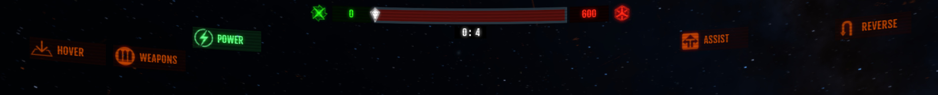
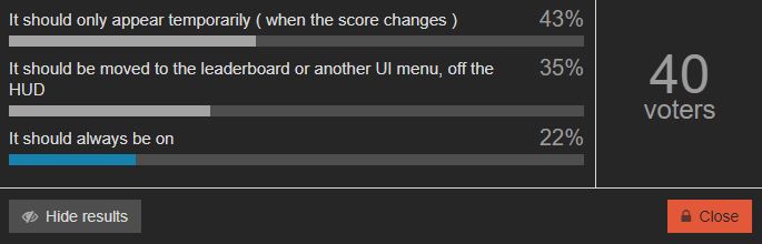
I’m still unsure about the team score bear ( top-centre ). I haven’t touched it, but it’s not exactly an essential part of the HUD, so maybe it should be moved to an actual UI menu or to the team leader-board ( TAB ) instead.
Q4. Should the team score bar remain visible at the top of the screen at all times ?
Quality of life improvements
The HUD revamp also includes various “quality of life” improvements. I’m still working on the locking system, so I cannot show it in a picture, but here are some other ones:
The incoming missile alert now displays the distance to the closest missile:
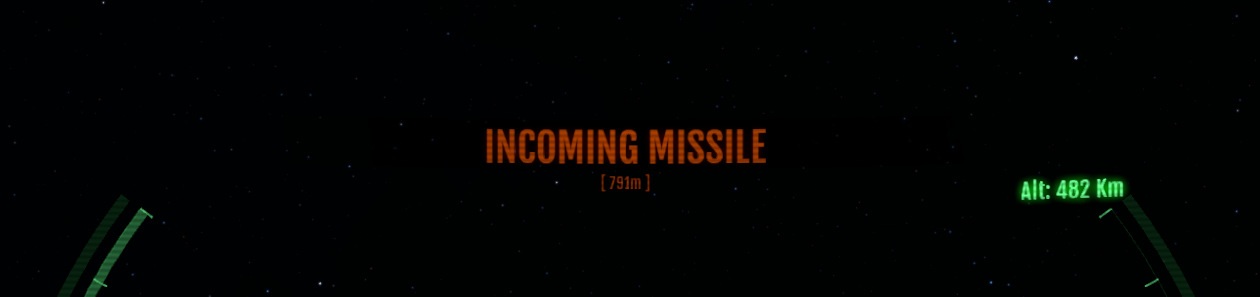
This should be useful to time usage of chaffs / countermeasures. In fact in my tests, I’ve found it to be dramatically easier to counter missiles now ( as long as you pay attention, which might be easier said than done, in a heated combat ).
Another change: the target lead reticles now flash red when a hit has registered ( in addition to the small hit feedback sounds ).
The reticles now display an “out of range” messages when you fire at the reticle, but the target is out of your weapon’s range:
I’m still playing with icon updates for reticles or the mouse; nothing is set in stone yet. Reticle for a firing weapon is also highlighted.
Closing words
While this is an important milestone for the HUD, it is not the last one. Nothing is set in stone, so your feedback at this stage of the development matters. Please let us know if you see better / easier ways to improve the HUD.
In the future, we’ll also have to figure out a couple things:
- un-cluttering clusters of indicators ( they’ll get merged together as a single indicator )
- when shields are no longer a single bar, but split in 2, 4 or 6 sides, each with their own bar: where to display that information on the HUD ? Originally we wanted it to be part of the circular ring, but adding a circular meter on top and bottom will obscure the HUD. Maybe a ship schematic should be shown in a corner of the screen instead.
- cockpit consoles / MFD screens will become functional in a future patch. Which information should be put in there ? The problem: we’ve kept the cockpits un-obscured to maximise the view space, but in consequence none of the MFDs at visible by default - you have to turn your head manually to see the consoles. So whatever information we put in those MFDs has to be secondary / optional; but if it’s of less importance, nobody’s gonna use them practically. It seems like they’re doomed to stay useless / elements of decoration, unless somebody has an idea…
- on the third-person topic, if you voted for keeping the full HUD visible, including the radars, keep in mind the Elite spherical radar is currently placed on the centre bottom… which is right where your ship is displayed. This might become uncomfortable or require moving this radar…
- we’ve tried an experiment to display capital ships or installations as shapes instead of symbolic icons, to better represent their size/shape. So far the results are pretty messy. We might introduce it back in a future patch just as a test to get feedback.