Disclaimer
I’m a bit hesitant to reveal game mockups, for a couple of reasons. For one thing, the art in the game could change and end up looking quite different. I don’t want to set up expectations and disappoint anyone. Also, the mockups are quite rough. They’re meant to give Carlos and myself an idea of what we’re aiming for. People might look at the art and conclude that the final game is going to look worse than it actually will.
Finally, I don’t know how fair it is to Carlos, our artist. I bug him to complete these things very quickly, so they’re not really reflective of his talents.
Fun Stuff
That said, I think that you guys understand how things work. We’re doing open-heart surgery on the game right now and it’s not pretty. If all you want to see is the finished product, you should probably check in a couple of months. On the other hand, if you’re curious about the intermediate steps, come along.
Here’s the original mockup that Carlos made for me a month ago:

I like a couple of things about this picture. The interface is much better than the original game. The mockup also shows one of the cool things about the game – huge swarms of baddies. Finally, I like the idea of breaking up background monotony with randomly scattered objects (circles in the picture, but maybe rocks and debris in the final game).
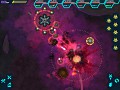
As you can see, the walls and the colours were still being worked on at this point. In fact, we still haven’t decided 100% completely on the final look. Let’s look at the latest mockup:

As you can see, the colours are quite different, and Carlos has removed the outlines to go for a more “natural” look. There are several things that are great about this picture.
I like the internal texture of the rock walls and the idea of having little crystals stick out of the side. The gray “rock” floor adds variety to the background. I’m thinking of how to code it up right now. The red thing in the middle is supposed to be dead enemy blood, but I like to think of it as a wall too. It almost looks like cooled volcanic rock with those spikes.
There are a few things that we still have to figure out in the picture above. The colours still need some experimentation, in my opinion. The plain gray may become too boring over time.
Summary
Overall, I really like the picture above. There’s still tweaking to be done, but it gives me a good idea of what I have to code. The next step is to actually implement it in the game.
I try to be flexible when I translate mockups into reality. I like to provide hooks for the artist to play with the art assets. That way the mockup is just a launching point for exploration and not an ironclad specification of how things should be.


Woah, looks amazing.
This looks great. Makes me think of PixelJunk Shooter. Don't know if you and Carlos likes hearing that or not but frankly I don't care because I love it ;).
Keep up the good work!