Since the completion of our proof of concept, we've been researching to know lots of things about our game: what we want with it, what kind of audience to we want, what do we expect players to feel from it.
Recently, we've attended conferences and panels at the BIG Festival, and received valuable criticism there, a lot of which helped us put some things into place.
One of the first things we accomplished (even before attending to the festival) was creating a proper logo.
Our team is composed of one programmer, and one artist, me. As you know, I am not a graphic designer. I do have design knowledge and understanding of some concepts, but that's not my area of expertise. However, the logo must be done! Incidentally, if you want to learn a bit about how a non-designer gamedev created their logo (and branding), take a look this post, by Blake from Dinofarm Games.
I researched and studied, and what helped me the most in this task was this Aaron Draplin video. The gist: paper is (almost) free, vectors are free.
So the first important thing to do is to think about the game, and what you want it to represent. Then sketch till the paper is soaked in blood, sweat and tears!
![]()
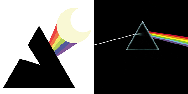
As you know, IABO is all about "rainbow colors conquering the moon". After testing various approaches to this idea I reached one I was happy with: the triangle.
As you know, I like triangles and pyramids. :)
And, coincidentally but not so much, this triangle resembles my favorite Pink Floyd album.
I refined the rest of the logo by a process of building and iterating:
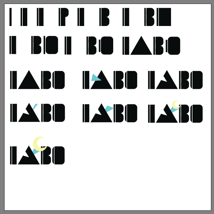
And then tested it:
![]()
Here's the comparison with the previous placeholder logo:
![]()
> Why was the previous placeholder logo in Japanese? Because IABO sounds a bit Japanese and because the symbols are large. I was too influenced by Japanese cute culture at the beginning of the development, so it might have influenced my decision a bit.
So I plan to design the more definite logo on the basis of this new mockup.
On my next post, I'll talk to you a bit about the character design!


This comment is currently awaiting admin approval, join now to view.