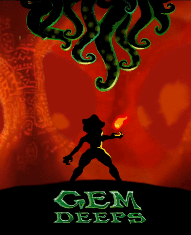
I decided to create a new UI, and in the process, I've redesigned the title & the box art too.
![]()
My first idea on the title was to create a font that will have that old school vibe, and, at the same time, be readable even in small formats. That made me simplify box design.
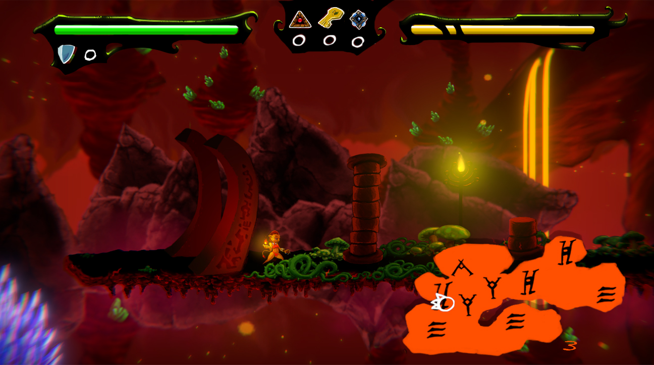
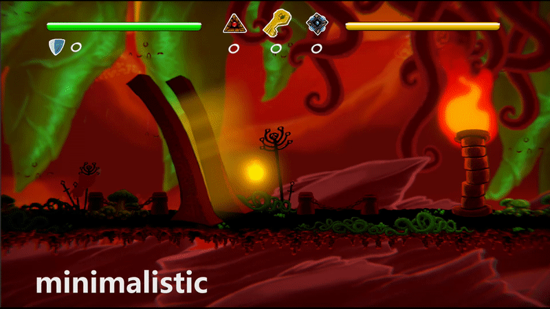
UI was a challenge. At first, I wanted a clean, minimalistic UI without any sweeteners, just necessary info with a touch of art. But after a lot of thinking, I decided to give UI some love.
I created a map that can be helpful to some. You must read the signs to read this map, though. I added functionality to map activation in two modes: tap & hold M.