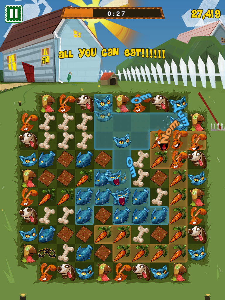
When Feeding Time began to move past its prototyping phase, we decided we didn't want to make just another puzzle game with abstract shapes and symbols; jewels and candies are all fine, but they lack a certain sense of life and personality.
Since we also weren't making a match-3 title but rather a game about pairing things up, combining animals with their iconic snacks seemed like a perfect fit.
At the beginning of Feeding Time's development, Abel Oroz -- an artist we had worked with previously -- was busy joining Tequila Works to work on future projects like Rime. However, he was still gracious enough to provide some advice and work with us through the early concepting phase.
To emphasize the game's pairing mechanic we sketched out some samples of animals being merged with their archetypal foods, but those came off a bit too surreal. We also realized that showing the whole body of an animal didn't neatly fit into the grid of the gameboard. We could still do it, but it shrunk the real estate available to the animals' faces and required more complex animations for movement.
In the end we chose to simply focus on the animal heads, which also fixed scaling issues by displaying both the animals and the foods at the exact same size.
With that much figured out, it was time to seek out an illustrator. A fun and colourful look was a must for Feeding Time, but we also wanted the visuals to stand apart from all the cutesy titles that used a bland, glossy art style. George Bletsis contacted us during our search, and his incredibly varied illustrations and subtle texturing proved to be a great fit.
After putting together a bunch more concepts, we had to address one important issue: should we have multiple facing directions for each animal?
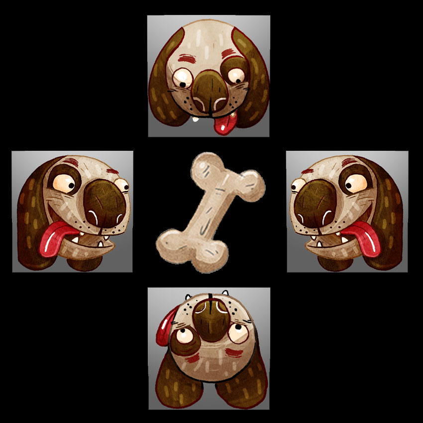
On the surface it seemed like a good idea to display each animal so its direction would clearly indicate the direction from which it could start eating. Unfortunately there were multiple issues with this approach. Not only would it triple all our art/animation costs for every animal (we'd need to do a version that points up, down, and left -- the right side would be a flipped version of the left side), but there'd be some visual oddities for the up/down directions, and we'd lose a consistent silhouette for each animal.
Simply keeping a single direction and flipping it 90 degrees to facilitate facing directions wasn't an option either as it looked cheap and awkward.
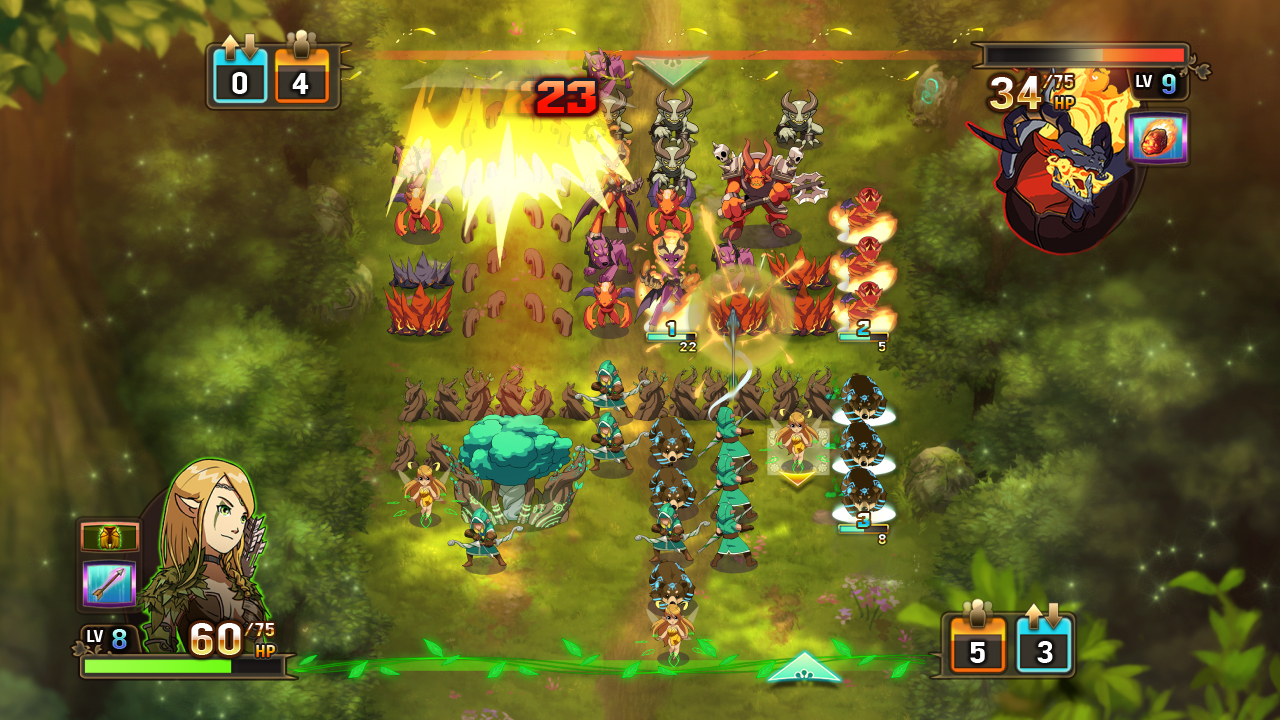
I don't think anyone ever noticed that all the units in Clash of Heroes pointed down. In the very least, there didn't seem to be any complaints about the approach.
Back when we were at Capy working on Heroes of Might & Magic: Clash of Heroes, we encountered a similar problem. The player's units were located at the bottom of the screen facing up, but this left something to be desired as it only displayed their backs. Eventually it was decided that both the player's and the enemy's units would all face down (unless attacking) to create more interesting visuals.
We tried a similar approach in Feeding Time by making each animal point "head-on" at the screen in a neutral pose. It worked but looked a bit too symmetric and boring. In the end we decided to give each animal a singular but unique pose that best displayed its personality.
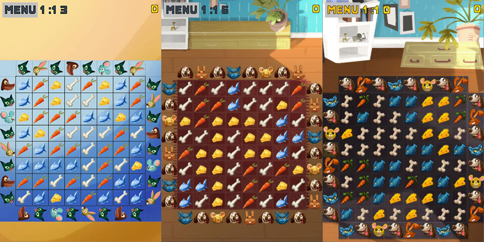 Various early takes on the animal heads. From left to right: animals rotated by 90 degrees, animals pointing straight at the viewer, and animals in non-standardized poses.
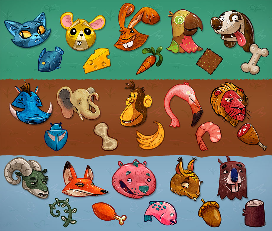
Once we established the format for each animal, we sketched out a lot more concepts and made sure to give each animal a distinct silhouette in order to make them easier to recognize. Since we were now confined to only a single animal pose, we tried to mold each one into a shape similar to that of the animal's corresponding food. We had already taken some liberties with the colouring, but when this extra step made sense, it further helped to make the pairings easier to spot.
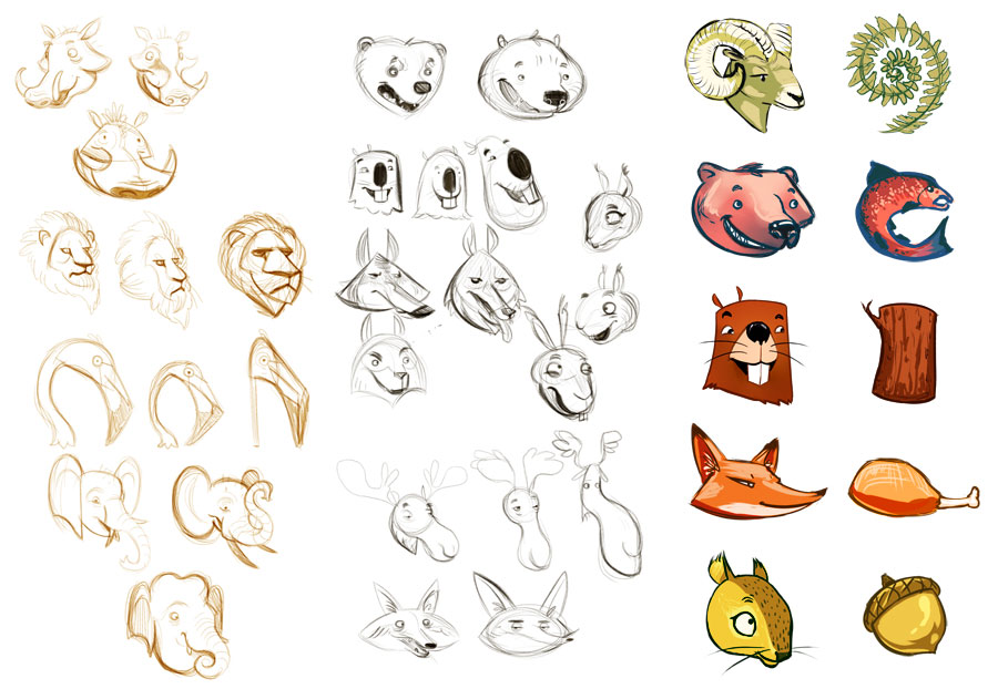
Concepts for animals in the safari and tundra stages. Note that the shapes of the foods closely resemble those of the animals for ease of recognition.
And this is how it all turned out!
Next up: backgrounds!
