In with the new! This gonna be a slightly dry update: we’re gearing up for Fatal Theory’s release and realised it was time to finally tackle some of the rougher looking old menus. To make it a little more worthwhile, we’ll discuss user experience, why we made the changes we made, and what problems we still have to solve. Hopefully if you’re new to UX (user experience), you’ll be able to take something from it.
The weapons menu
Here we have the old one:
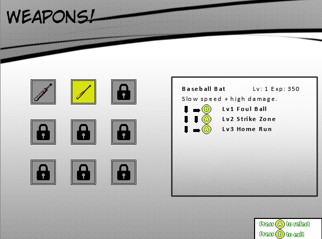
It’s more or less functional, sure. But there were two major things wrong with it: people kept thinking it was a shop where they could buy new weapons rather than change what they have equipped, there was no easy way to see what was currently equipped, and the moves and experience and so on was just a barrage of information. Also, the Chainsword needs to be there so you have a reference to its moveset, but it can’t be equipped because it’s always on. Nothing really indicates that here.
Contrast to:
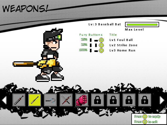
This layout hopefully looks a little less like a shop. Does it show what’s equipped at all times, and does it show that the Chainsword is always on? Not at all (we only realised the importance of showing that after reviewing these changes). So it needs further revision. But the layout looks cooler, and those are easy fixes, so it’s getting there.
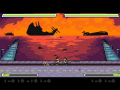
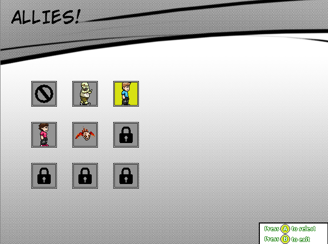
The Allies Screen
This screen was more or less fine, but we figured we could jazz it up a bit.
Before:
After:
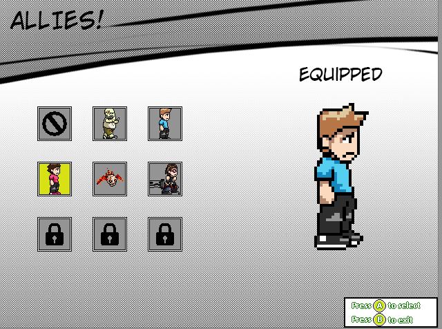
Not terribly different, but it fills the space a bit better. Now, however, we have a problem with consistency. What good is it to have the allies screen look different to the weapons screen? Why make our users work out how to use two completely different screens? We'll have to reorganise the information to match the previous screen.
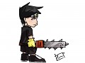
The Heinous Controls Screen
This thing was an absolute mess. No sensible human being would want anything to do with it.

Now we’ve got it looking like this.

We tucked the different player controls into separate menus, and decided to show the controller graphically. It's much easier to see what's going on, but I'll be the first to admit it's still pretty ugly. So there are still some underlying issues, but it takes time to iron these things out. Menus are always hard too: we make games and game graphics, menus are really the realm of graphic designers. We don't have one. So we'll make do for now and revise until it sparkles!
What do you think, wreckers?
- Adam