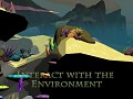
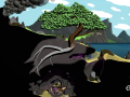
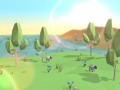
In Evergreen you play as a seed dropped from a mythical world tree onto earth with the purpose of starting life on the planet by exploring the world and discovering ways to subtly help life prosper.
When growing your tree you will have to adapt to the environment in each level; wind, ice and lightning can all affect how and where you should grow, and the constant pull of gravity and threat of snapping branches will make you think twice before growing a branch.
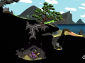
As you explore the level and complete challenges you will unlock new variants for your tree. New bark and root textures, leaves, flowers and fruit can all have an affect on how the people and animals around you perceive your tree.
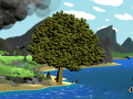
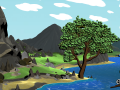
As you progress through the game your tree will grow tall enough to dwarf buildings, and you will gain access to new ways to influence the world as your tree becomes more mystical and ancient.
Game Modes
- Story Mode will see your tree surviving throughout history. Interactions with the world will leave a permanent mark on your tree and completing challenges will unlock cosmetic options for you to use.
- Sandbox Mode will allow the player to build a tree with full control over the environment, controlling physics, tree branch breaking, music and backgrounds will all be possible.

Articles
Game Logo Design: An Amateur's Guide
Graphic design is an important part of the creation and sale of any good or service, and video games are no different. Graphic designers are hugely talented artists who combine aspects of psychology, aesthetics and marketing to produce designs that sum up their project and appeal to their audience, while also being instantly identifiable and easily memorable.
Unfortunately though, sometimes you are trying to produce a small indie game with a very limited budget and instead of hiring a professional you decide to take the challange up yourself. After all, how hard can it be?
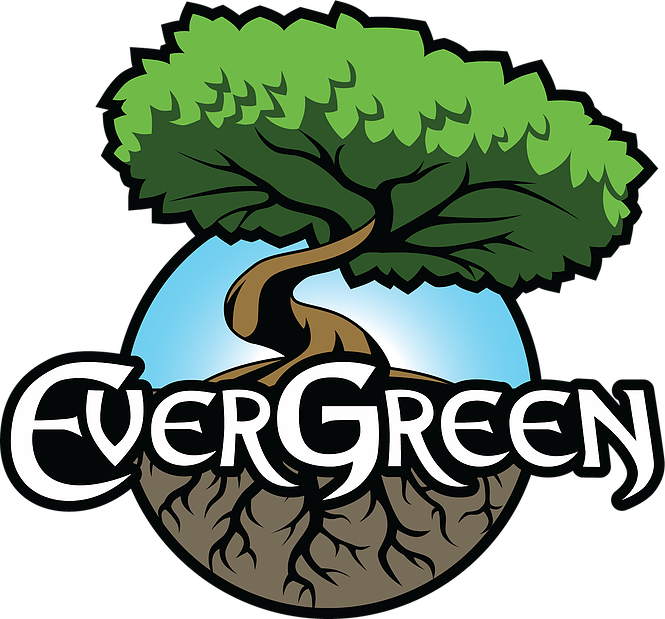
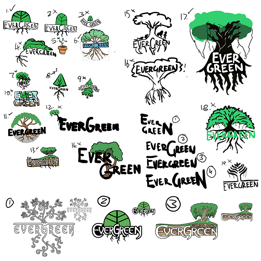
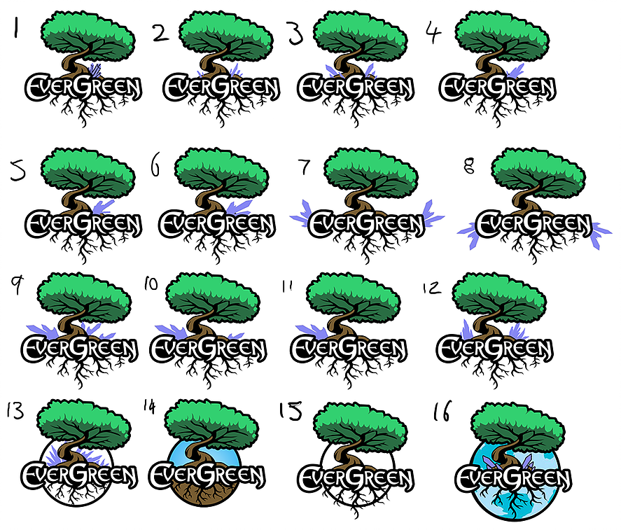
This is the situation I found myself in as my team and I were preparing to display our first ever game at PAX Prime late last year. Despite being a complete amateur I managed to go from a thoroughly underwhelming first design:
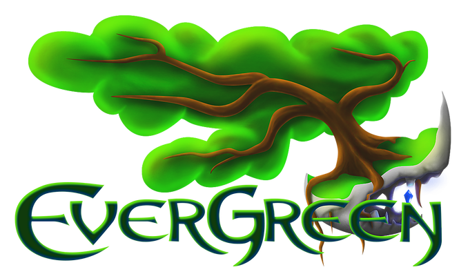
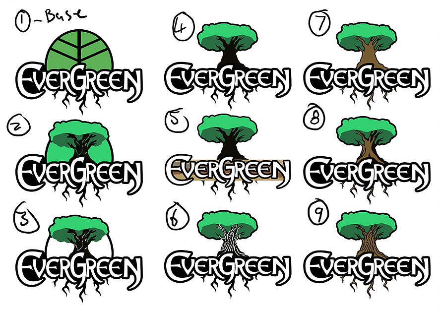
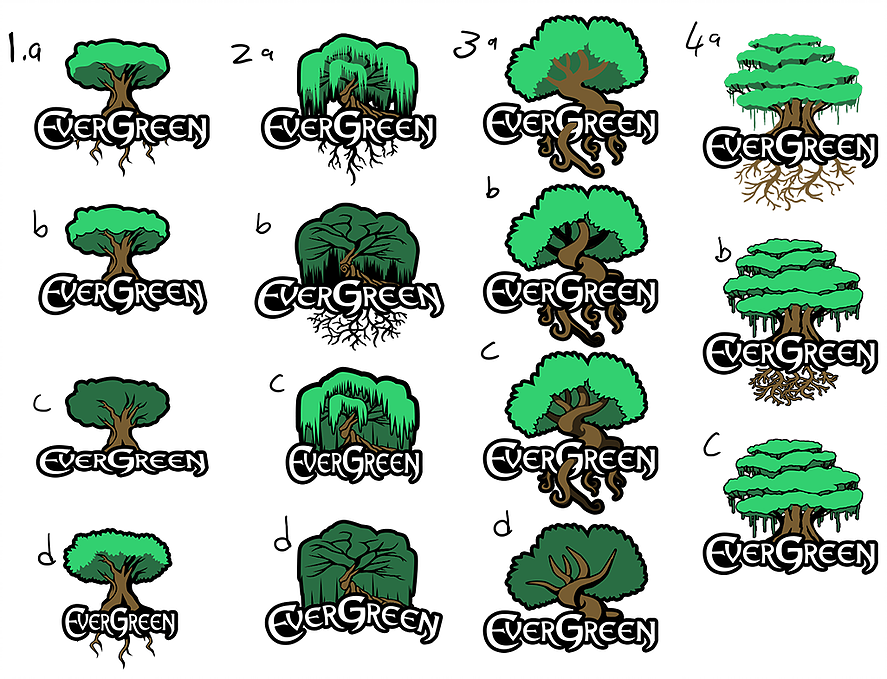
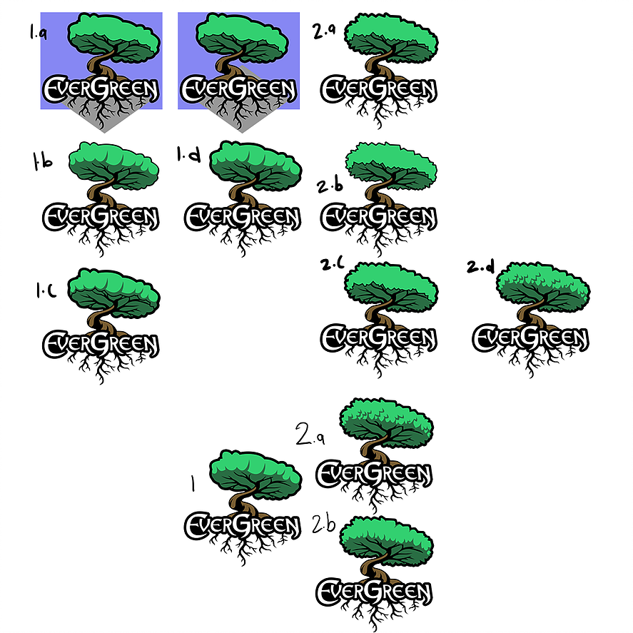
To our current sexier and much cleaner finished logo:
To help you all avoid some of the initial design stumbling blocks I want to share four rules for good graphic design that I wish someone had told me at the beginning of the whole process.
1. Understand what the logo should say about your game
This is first on the list because it is the very first thing that you should do. This should come before you sketch a single idea. Your logo is often the first thing a potential customer will see of your game and so it needs to summarize what makes the game important, unique and interesting. So before you can start your designs you need to have a good understanding of all of these aspects yourself.
Our game Evergreen, to quote our website, is a “zen single player game where you control the growth of a mythical tree with the goal of guiding and nurturing life throughout the history of Earth”.
From this we narrowed down some key themes that we wanted to highlight: nature, a relaxed, calming vibe and a big awesome tree. With these themes in mind I had a clear place to start, a clear idea of what the finished design should feel like, and was able to identify and eliminate design ideas that didn't quite fit our vision. With every new design I created I could ask myself: “Does it feel natural? Does it feel relaxing? Does that tree look cool enough?”.
2. Know what the logo will be used for
This step is very important and also very easy to overlook initially. Sure, the logo you design will be on your Steam page and your website, but where else are you going to use it? Will you be printing it on shirts, posters, business cards or other merch? Will it be used in an ad on the banner of a website or as a small desktop icon? Is your font legible at different sizes?
Keeping all of this in mind can help to shape the logo into something that not only looks good but is also versatile enough to be used wherever you need it without constant time-consuming redesigns.
3. Keep it simple
Another easy mistake to make (that I was definitely guilty of in my original horrible design) is to over complicate and clutter your design. This is a good step to begin considering the composition, balance and silhouette of your design, which parts of it are essential and what you can cut.
You want your design to be both clear and memorable.
Not cluttered, messy or confusing. Less is more is a great philosophy when approaching your own design.

4. Test multiple versions
And this is the heart of what eventually made our logo work for us. Believe it or not I didn’t get it right on the first try. Nor the second, third, or even the tenth. Sketch out every idea you have, create multiple versions of every design you make that works even a little and show it to as many people as you possibly can.
Sure the other people you’re working with might get what that strange little squiggle in the bottom left is and what it means, but if your customers don’t then sorry mate, that logo just ain’t working. To show you my own approach here is an abridged version of my redesign process:
Ultimately there is no perfect answer to this design problem, but with enough planning and time to polish and refine your logo you should be able to get it to a point where you’re satisfied. Eventually.
Now I just have to finish redesigning our actual company logo. Sigh.
Post a comment
Profile
Icon
Creator
SiegeSlothGamesEngine
UnityContact
Send MessageHomepage
Evergreenthegame.comRelease date
Game watch
Follow
Purchase

Style
X
Tags
Embed Buttons
Link to Evergreen by selecting a button and using the embed code provided more...


You may also like
Farming Life
Virtual Life
AQUAMANA - magic snake in real water world !
Virtual Life

Admiration of Heart
Virtual Life
Pawz: your virtual pet
Virtual Life
Cool Ranch
Virtual Life
Equilinox
Virtual Life