Once again, you're being rewarded with two updates in the same week! And today, it's all about the "U" and the "I", that is, it's all about the UI. We've been focusing on user interface design, and all its nuances and details, and we're going to walk you through Eclipsed's soon to be implemented interface. So, let's get started!
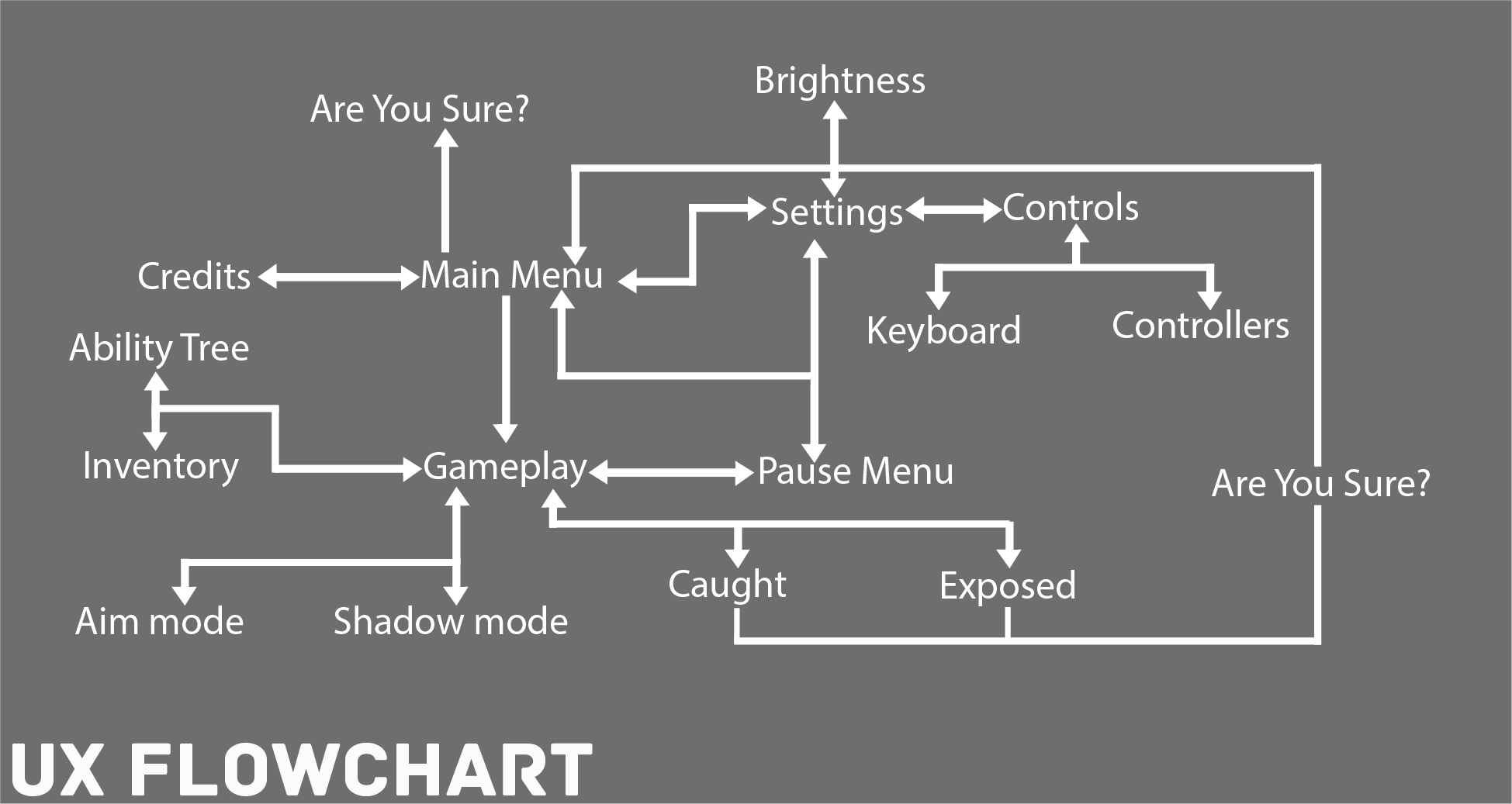
As is customary, we started with the user experience: first, we developed a flowchart of all the actions users can take in the game and where they lead.
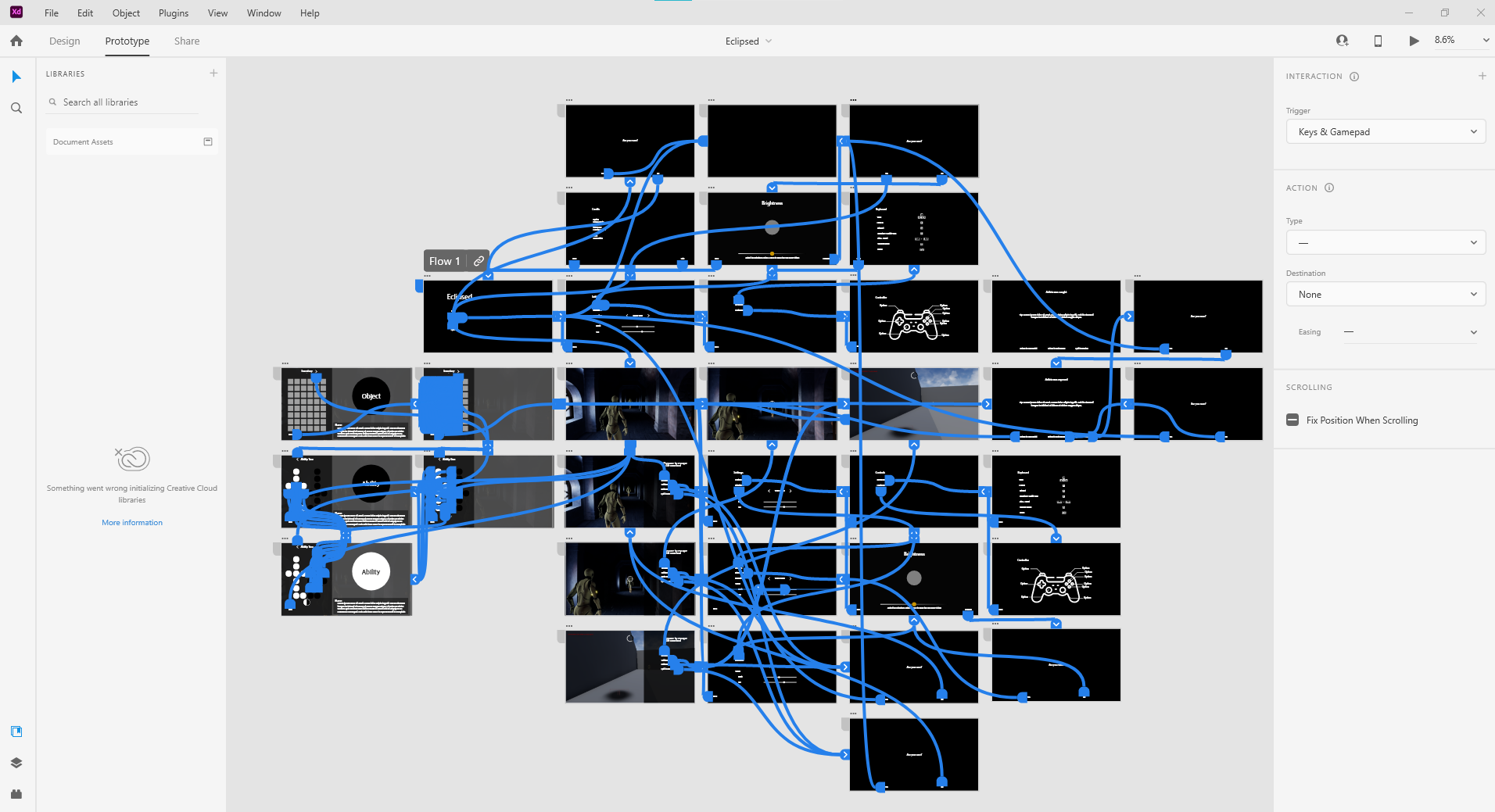
Then, we created a prototype in Adobe XD, which allowed us to test the interface and the flow between screens without having to actually implement it in the game.
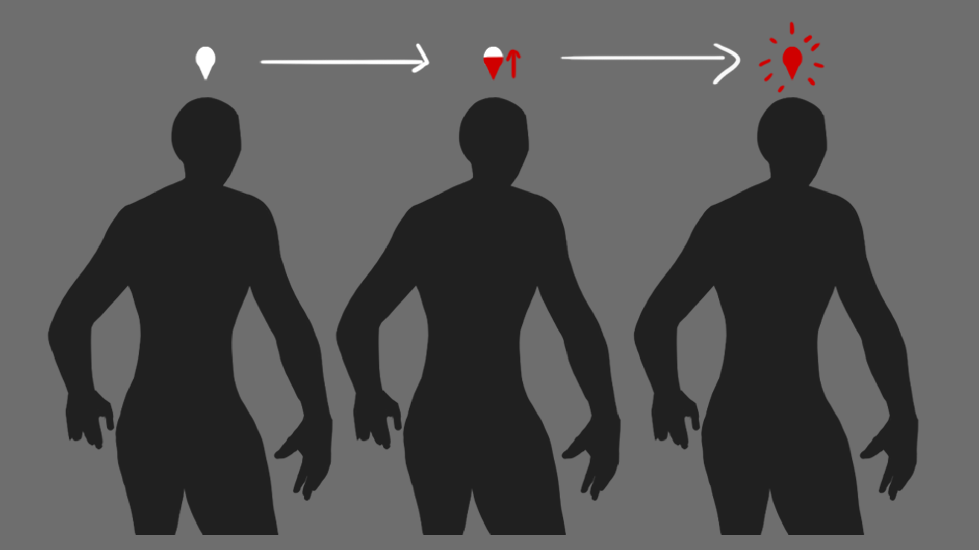
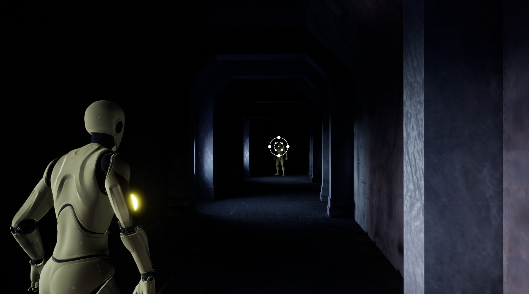
With this user-oriented part out of the way, it was time to focus on the little things, that is, a myriad of HUD information and icons to study, design and test. First on the agenda was the icon that will alert players during gameplay, telling them that Aelizia has been spotted by the guards.
As we showed in our guards' AI development, when the guards detect Aelizia, players are notified through a white icon which either turns red slowly and gradually (when Aelizia is spotted at a long distance and stays in the guards' line of sight) or instantly (if Aelizia is spotted at a short distance away):
Since we'll have guards who represent both Light and Shadow abilities, it made sense to create icons which represented the two abilities, which then could be used throughout the interface in a coherent and recognizable manner. Therefore, we started by studying and developing these symbols:
![]()
![]()
During this process, we ended up creating two icons which were better suited to represent both abilities, that is, the "eclipsed" symbol. Below, you can find these two icons (first two), followed by the two best choices for "Shadow" and the three best choices for "Light":
![]()
Then we tested the Shadow and Light symbols in the "guard detection" icon.

Next, we focused on Aelizia's abilities. First, we studied different crosshair types for the Light ability:
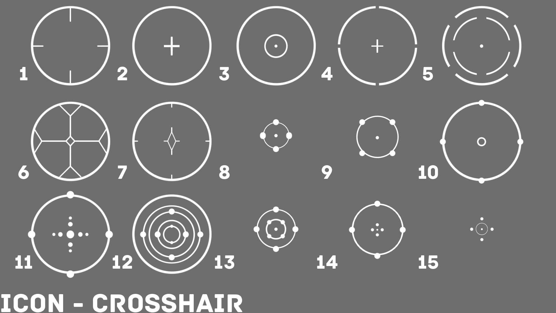
We ended up choosing number 13, and immediately tested it out:
As for the Shadow ability, we studied different timers:
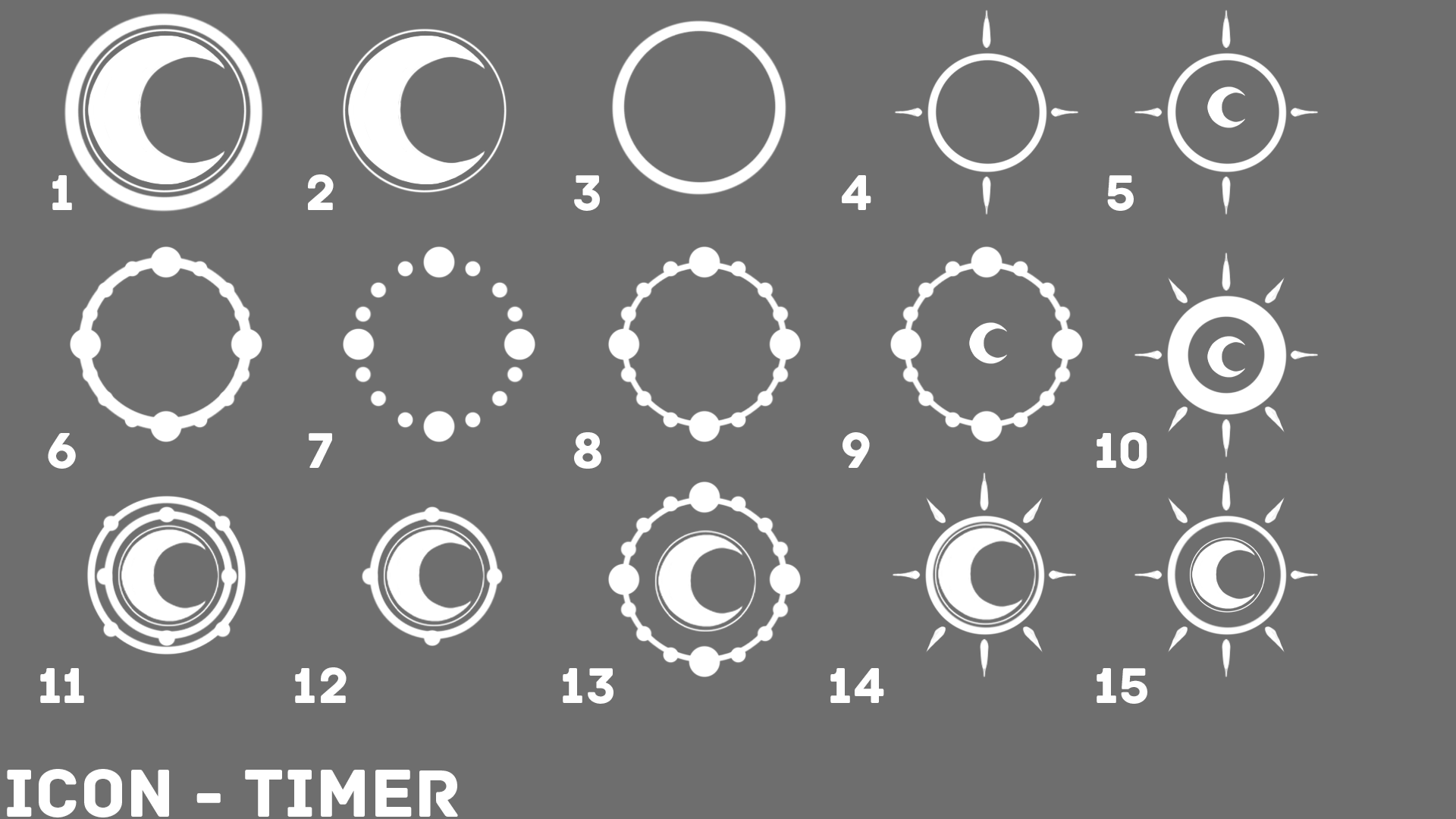
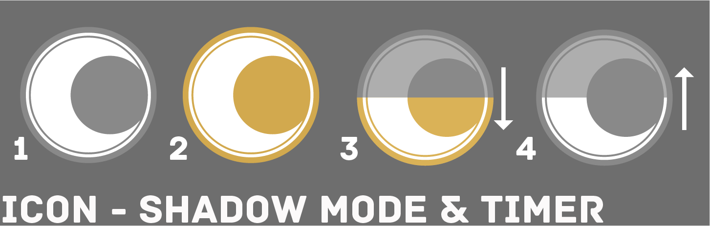
But ended up going an entirely different way. Since there are four "phases" in Aelizia's Shadow ability, we decided to convey that using the same symbol/icon, but with different colours and transitions. So, it goes as follows: first, there's the icon that will be used to tell players that Aelizia can enter Shadow Mode when she is on top of a "shadow" (1), then, if players actually enter Shadow Mode, the grey from the background will turn yellow (2) and the timer's countdown will begin, so not only will the yellow colour decrease (telling players that they're running out of time), but the icon itself will "lose" colour and opacity to indicate that the ability will be "lost" (3). As we've mentioned, when the timer runs out, there's a sort of "cooldown" period before players can re-enter Shadow Mode. Since players need to know how long they have to wait to be able to go back to Shadow Mode, the icon will gradually "gain" colour and opacity (4) until it is completely filled (1) and the cycle can begin again.
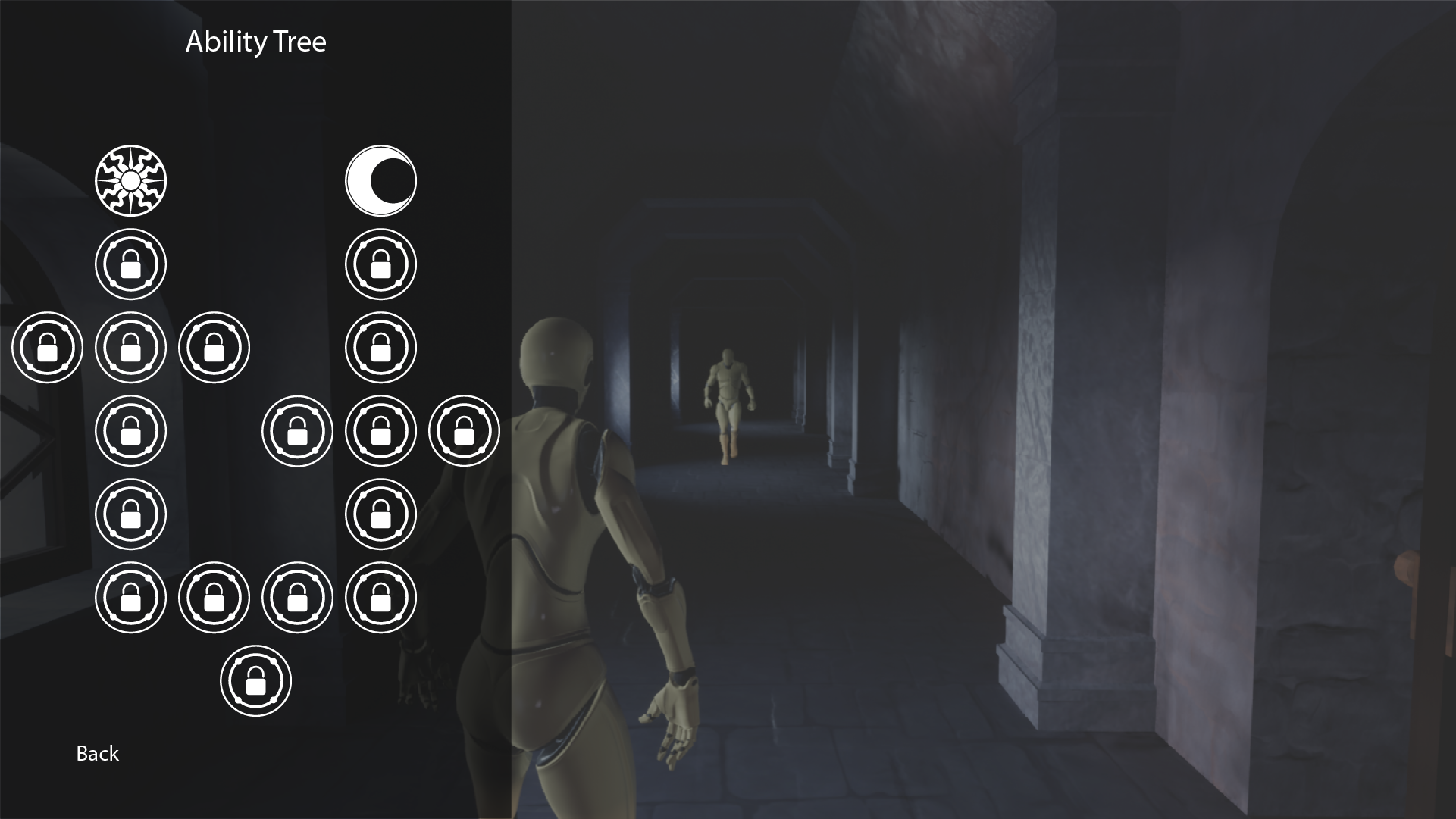
Afterwards, we tested "locked" icons for the Ability Tree screen, which will be used as placeholders to represent the phases that have yet to be unlocked by players.
![]()
As a treat, here's a sneak peek of the Ability Tree menu, a representation of what we hope to recreate in game:
To sum up, these are all the icons we ended up choosing:
![]()
Last, but not least, we used the "eclipsed" symbol in the app icon, using the yellow from Aelizia's cape to colour the sun rays, to connect everything together:
![]()
Next, we'll be moving on to the study and design of Eclipsed's logo, and the implementation of the game's user interface in Unreal Engine.
Stay tuned for more Eclipsed news!
#gamedevelopment #indiedevelopment #indiegame #indie
This looks great! Epic tips and design process, cheers mates!
Thank you :)