For the past weeks, we've been developing Eclipsed's logo, and, we're not going to lie, it's been a struggle. Since a game's logo is one of the first thing players see and recognize, it's paramount that it reflects the game's identity and core, that is, the soul of the game. And, at first, nothing seemed to depict the essence of Eclipsed.
This process has been a long road filled with ups and downs and a lot of back and forth. Sometimes it seemed like we took one step forward only to take two backwards. None of our initial ideas seemed to fit the game's concept, aesthetics or mechanics.
We started like we always do: research, followed by sketches. So, we researched and compiled multiple logos from our main game references to be used as inspiration and then sketched random ideas in Photoshop.
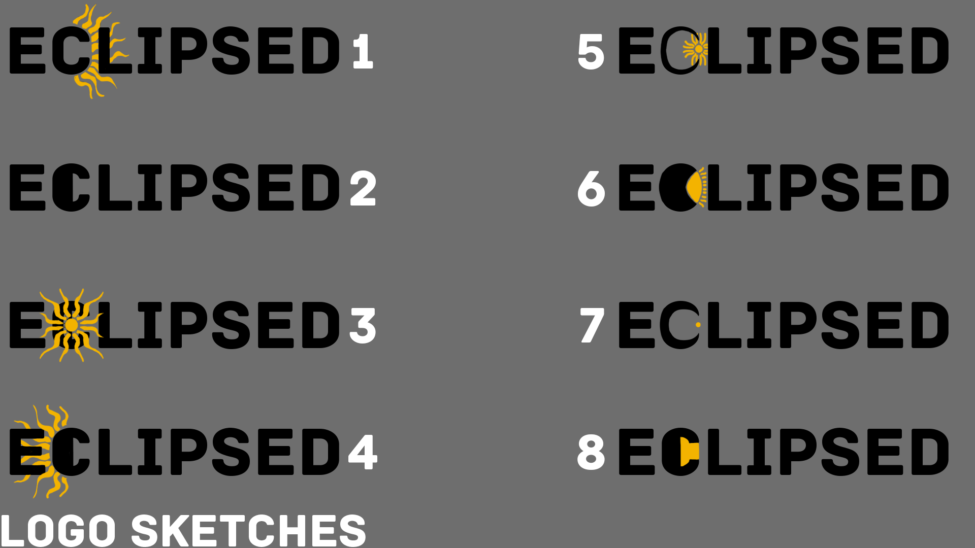
Inspiration was in short supply in these early days of logo development, but Joana soldiered on, trying to create an identity in the logo (through the symbols of light/sun and shadow/moon), that could be recognized throughout the game:
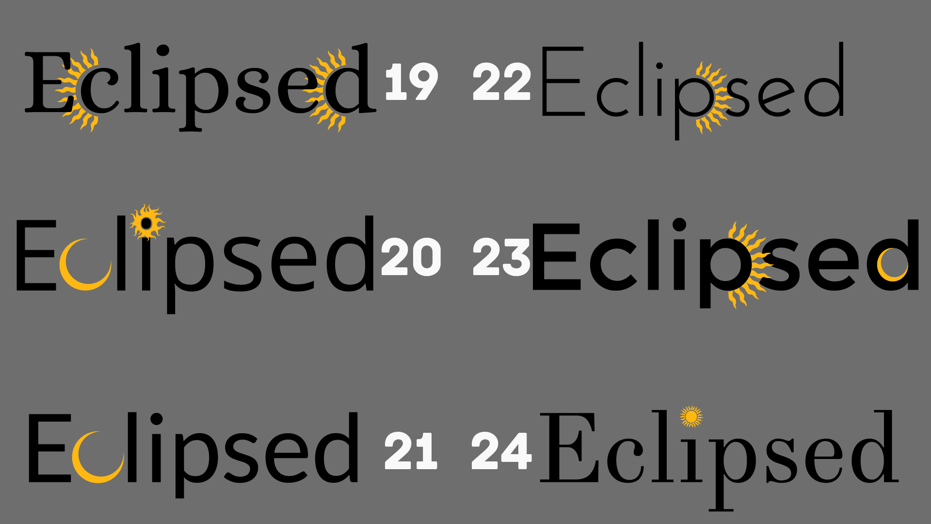
But nothing seemed to click. The tests were either too simple, too bland or too illegible to work. So it was back to Photoshop in a desperate attempt to force something out. This time with colourful results, but the spark, the "soul" was still missing.
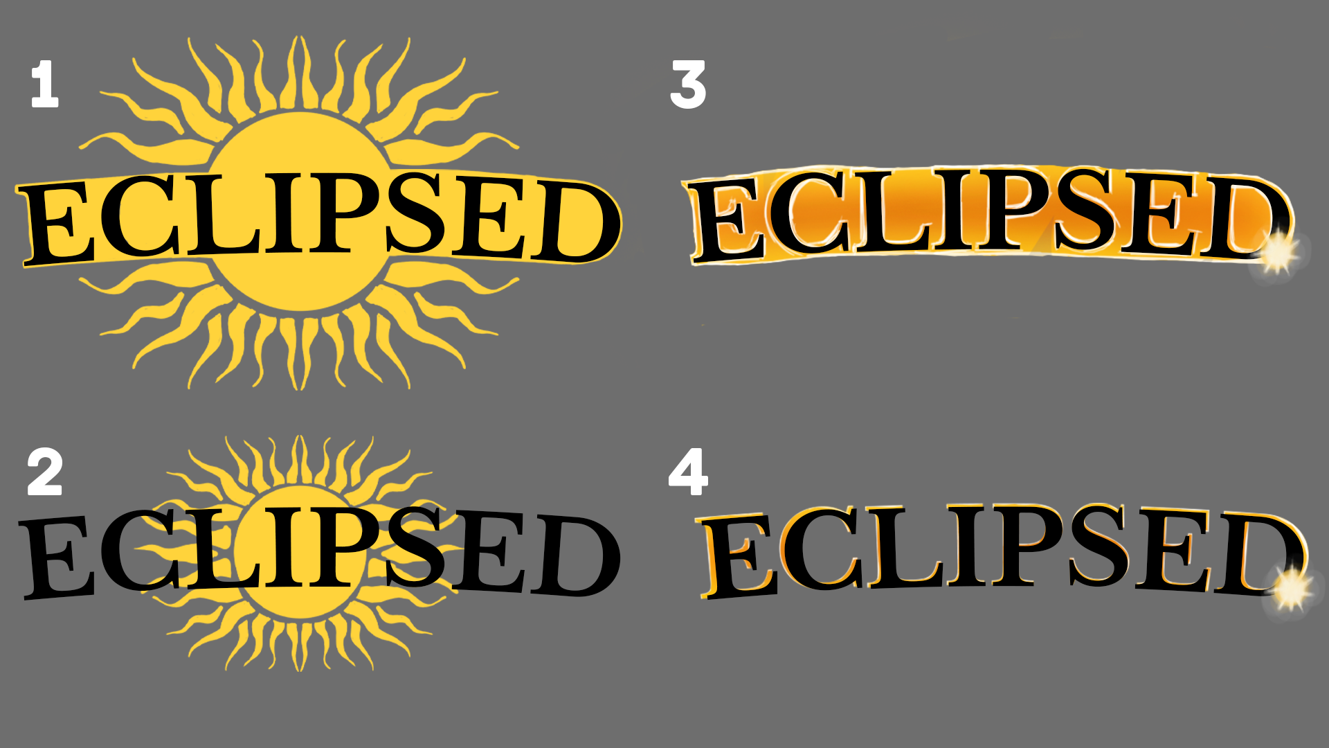
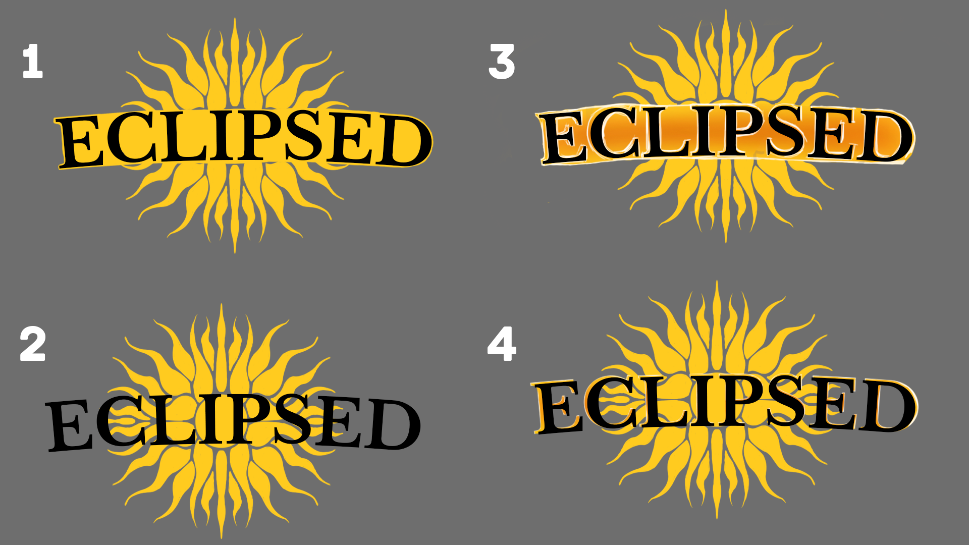
"Forcing" it was clearly not working, so we put the logo aside and decided to work on Eclipsed's user interface, which we showcased last week. As we revealed, we developed icons connected to both Light and Shadow abilities and even created one for the eclipse ability to be used as the app icon.
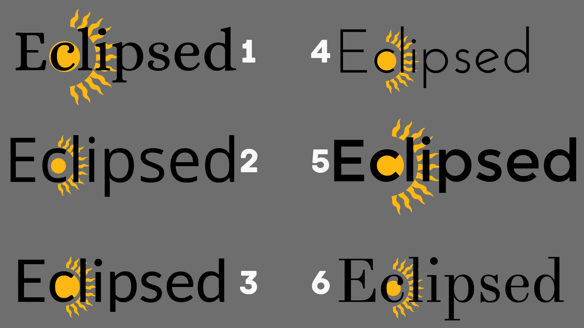
When it was time to get back to the logo, we decided to try to use those icons in the logo somehow. Since we had yet to test fonts for the UI, we felt that was a great place to restart the logo development process:

We didn't have to try many fonts to pick our favourites, and we also tested the icons to see if they worked well with the fonts:
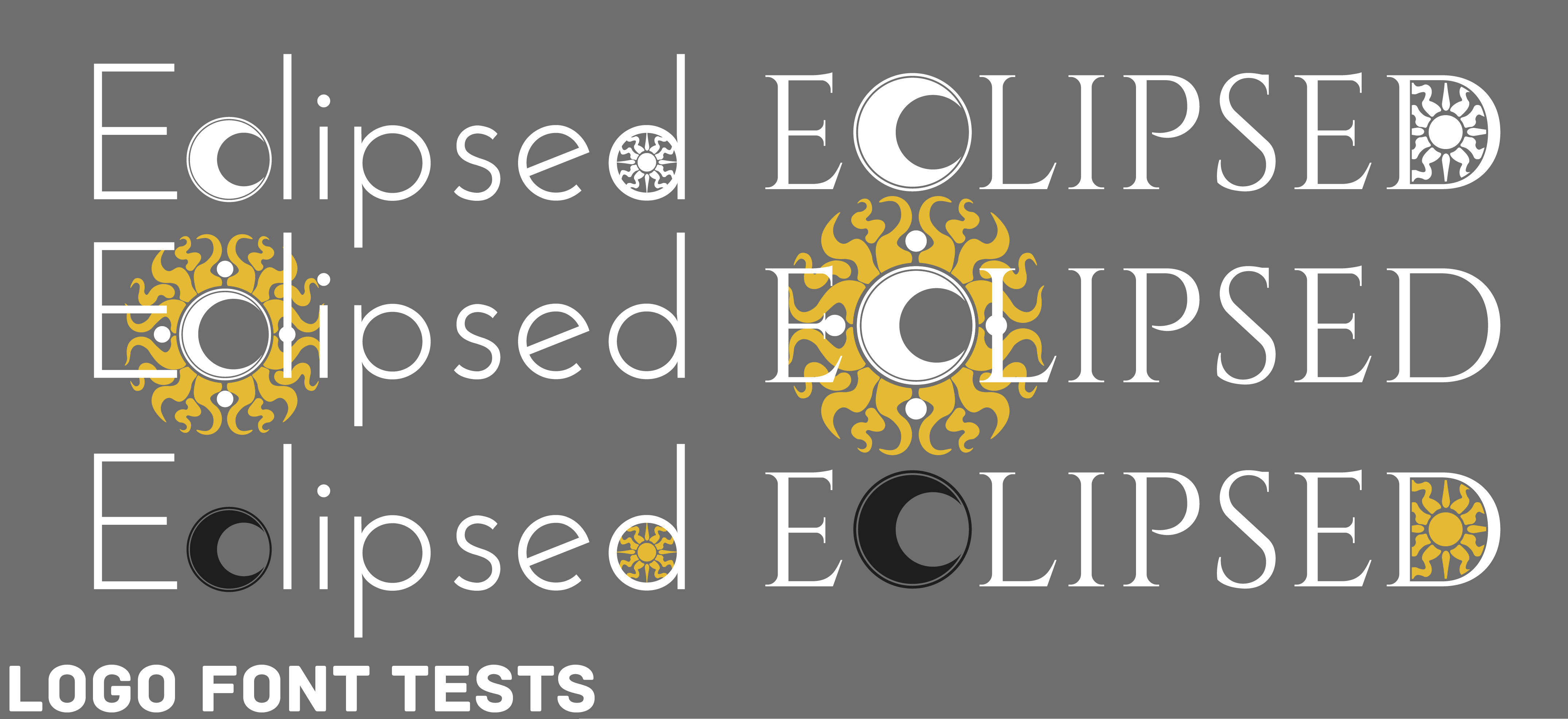
We had our first victory: we picked our font! And it was time for some more colour tests:
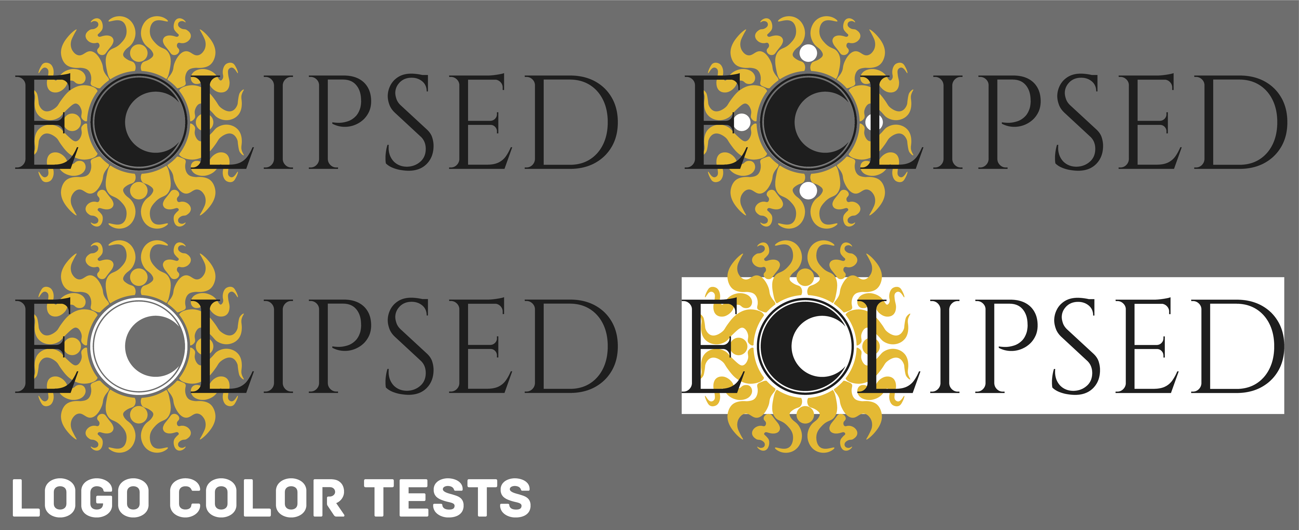
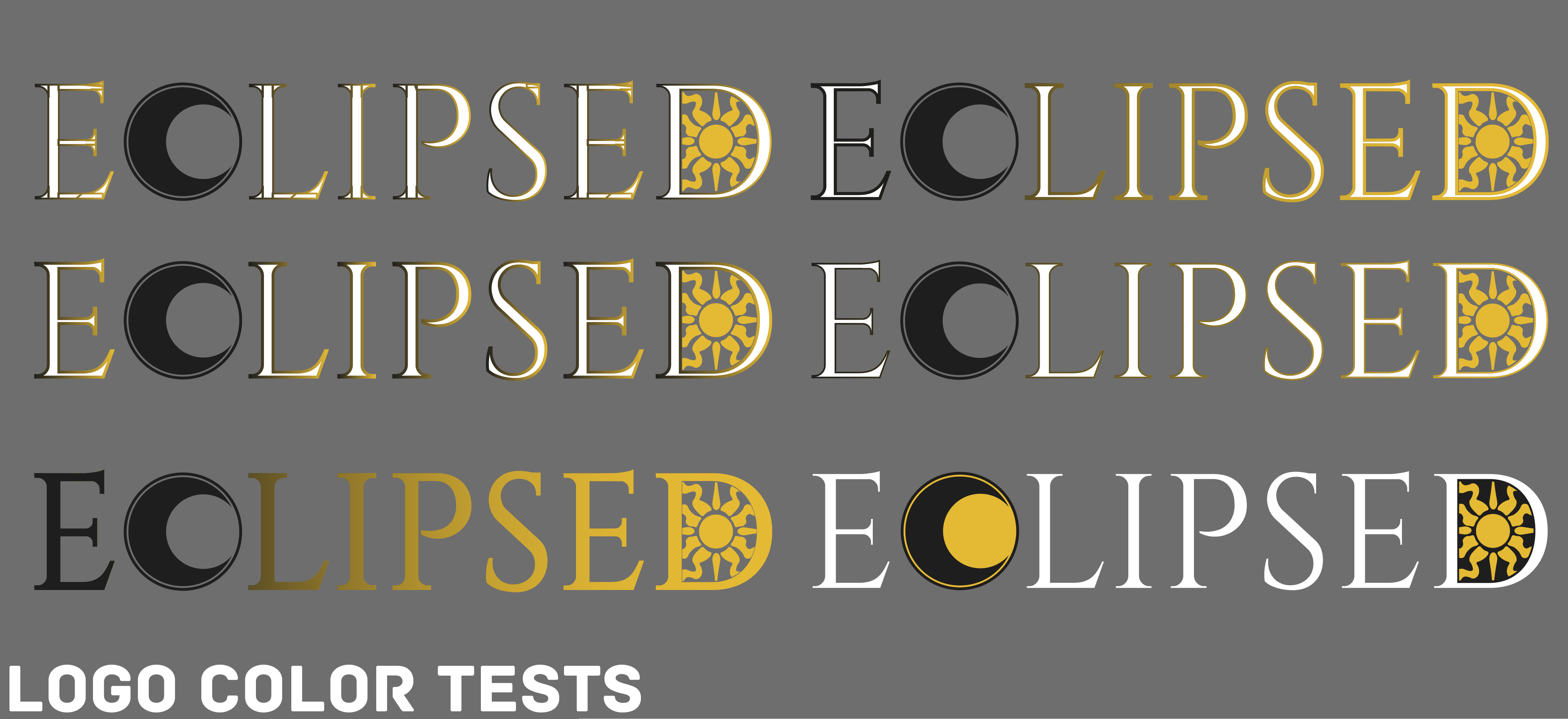
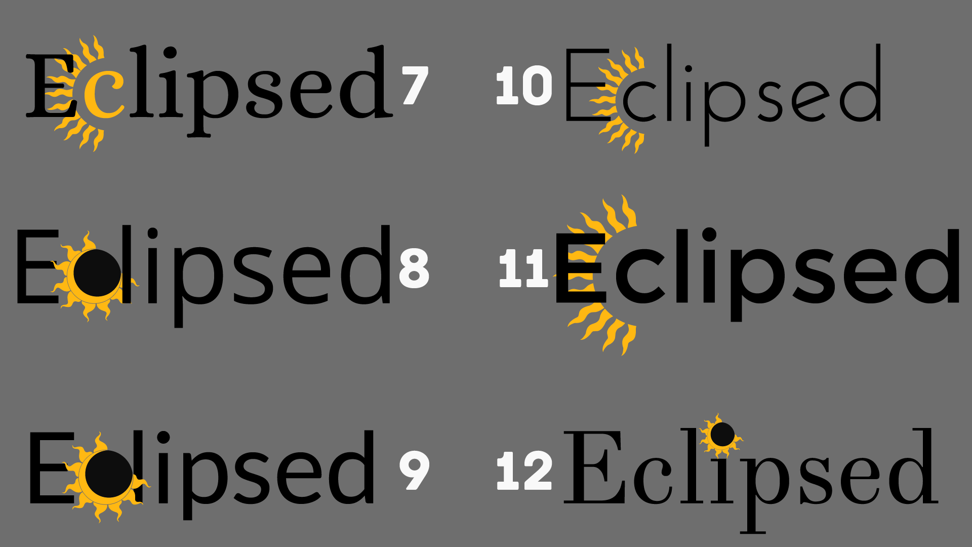
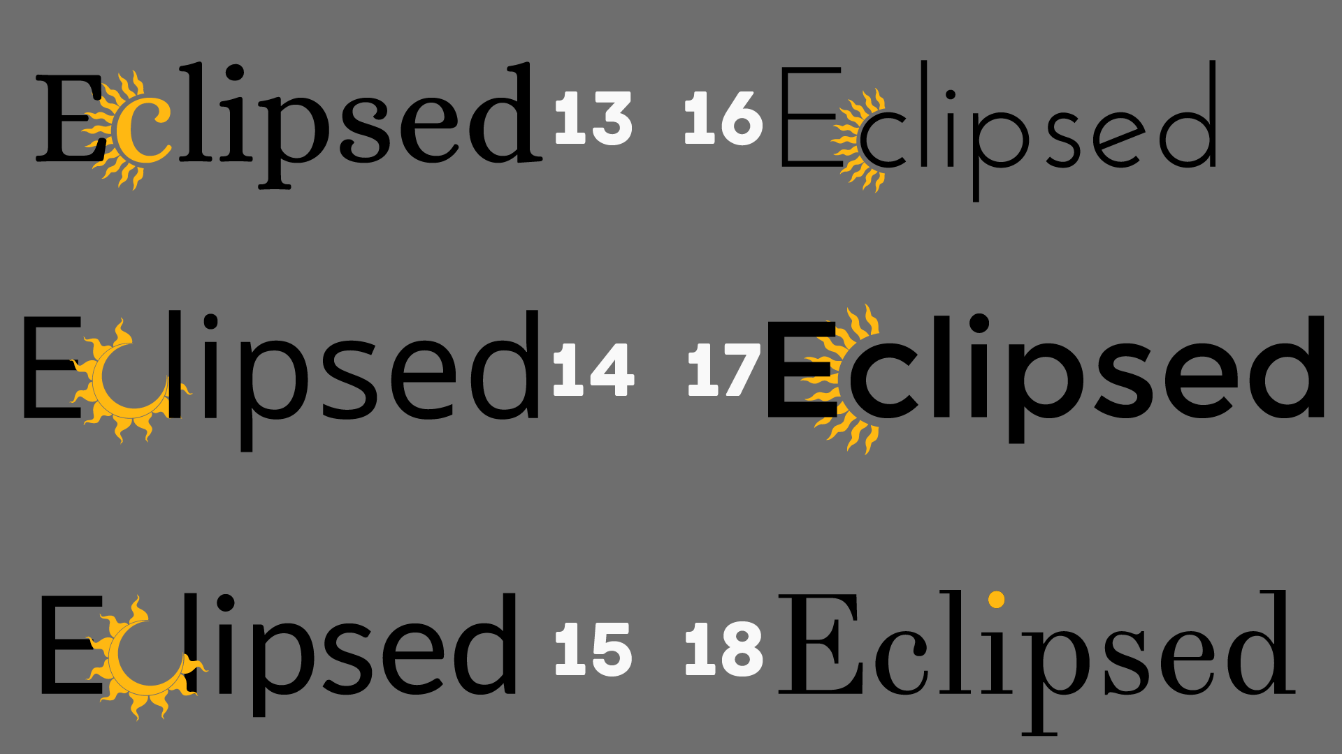
Finally, we picked our favourites and developed them:
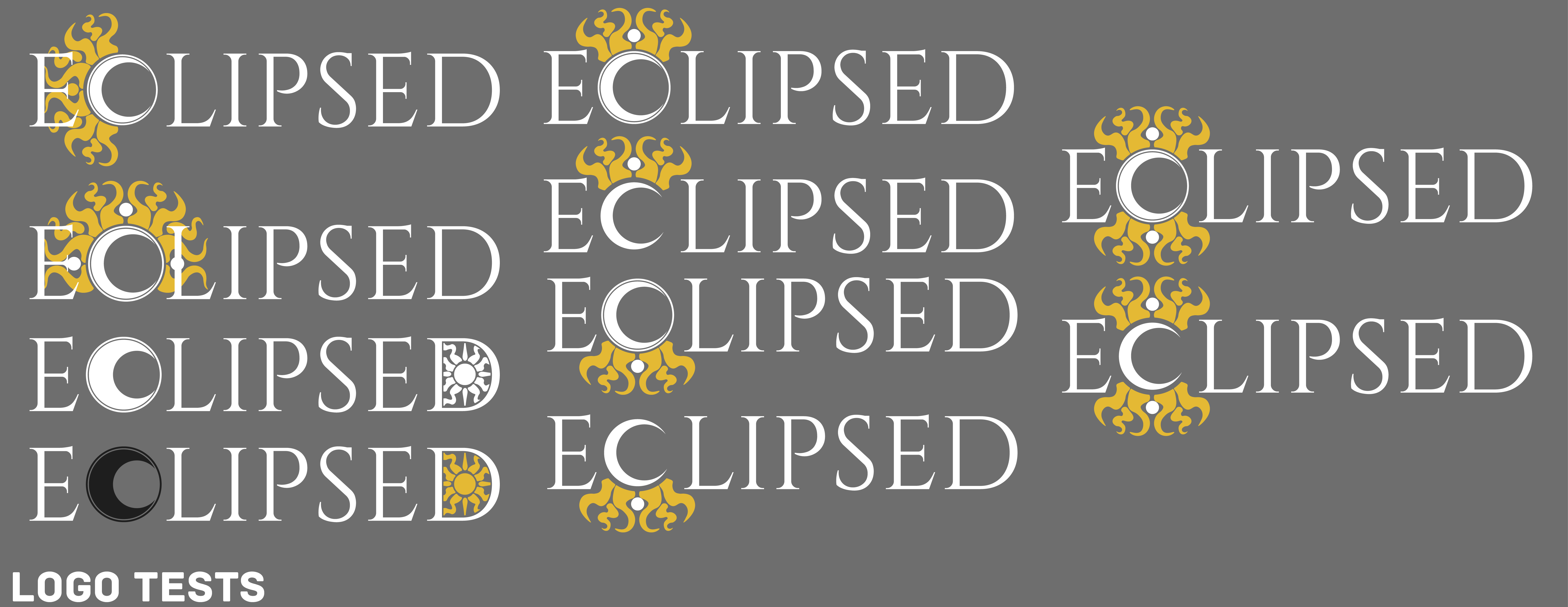
Try as we might to use the eclipse icon in the logo (shown by our many tests), it just didn't seem to work. Using the entire icon makes the logo hard to read, but using only a part of it makes it unrecognizable. We even asked some people from our target audience to pick their favourite version from the tests above, but their opinion was unanimous. Their choice (and ours, right from the start!) was the logo that remained unchanged from the very first font tests.
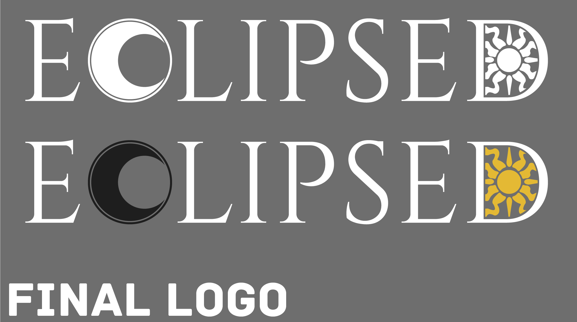
Thus, without further ado, we reveal Eclipsed's logo, which comes in two versions. The first one (white) will be used in dark backgrounds, and the coloured one in light backgrounds.
What do you think of Eclipsed's logo? Do you believe it fits the game?
Stay tuned for more Eclipsed news!
#gamedevelopment #indiedevelopment #indiegame #indie
