Hello, Everyone!
Welcome to the fifth development article, on my video game Dystopia!
This week I decided to share the development process of working on the level design so far, from sketches, to a more final version, with the help of a grid, to blockout proportions and also some user interface concepts I worked on, for a better understanding of what I might want in the final game.
Level Design
1st Draft
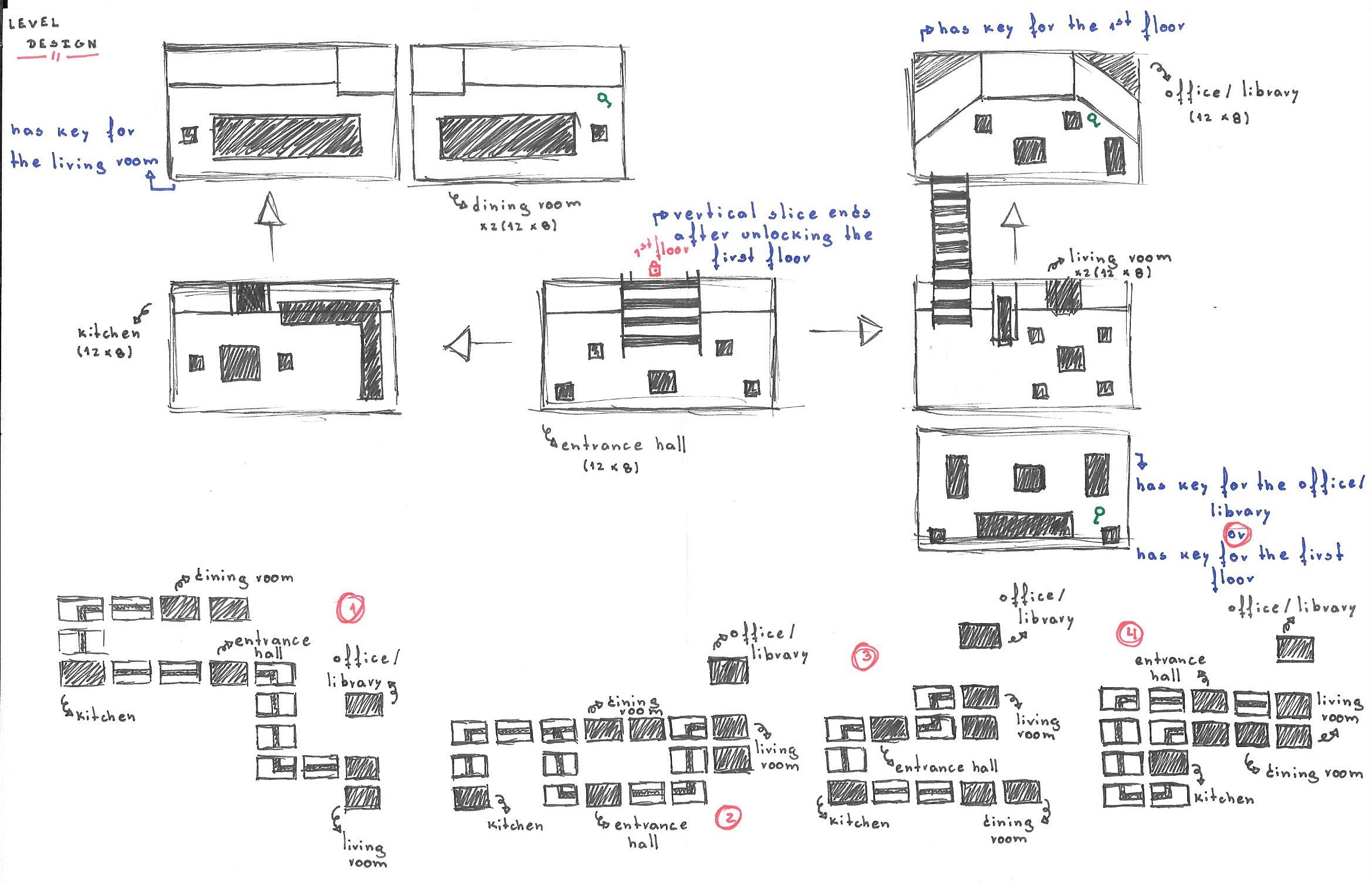
To begin with, I wanted to start by making my final decision on how many rooms I wanted this level to have, as well as the proportions of each one of them, as I didn’t wanted every single room to have the same amount of space as the fear of the game to become boring, quite crossed my mind, if I did that.
In addition, I proceeded to not only decide the room order in the game, but also worked on a few possibilities on how I wanted the hallways to be placed in the level to walk from room to room, but eventually I decided that I will go with no hallways for this vertical slice, and instead the player will move on from room to room directly.
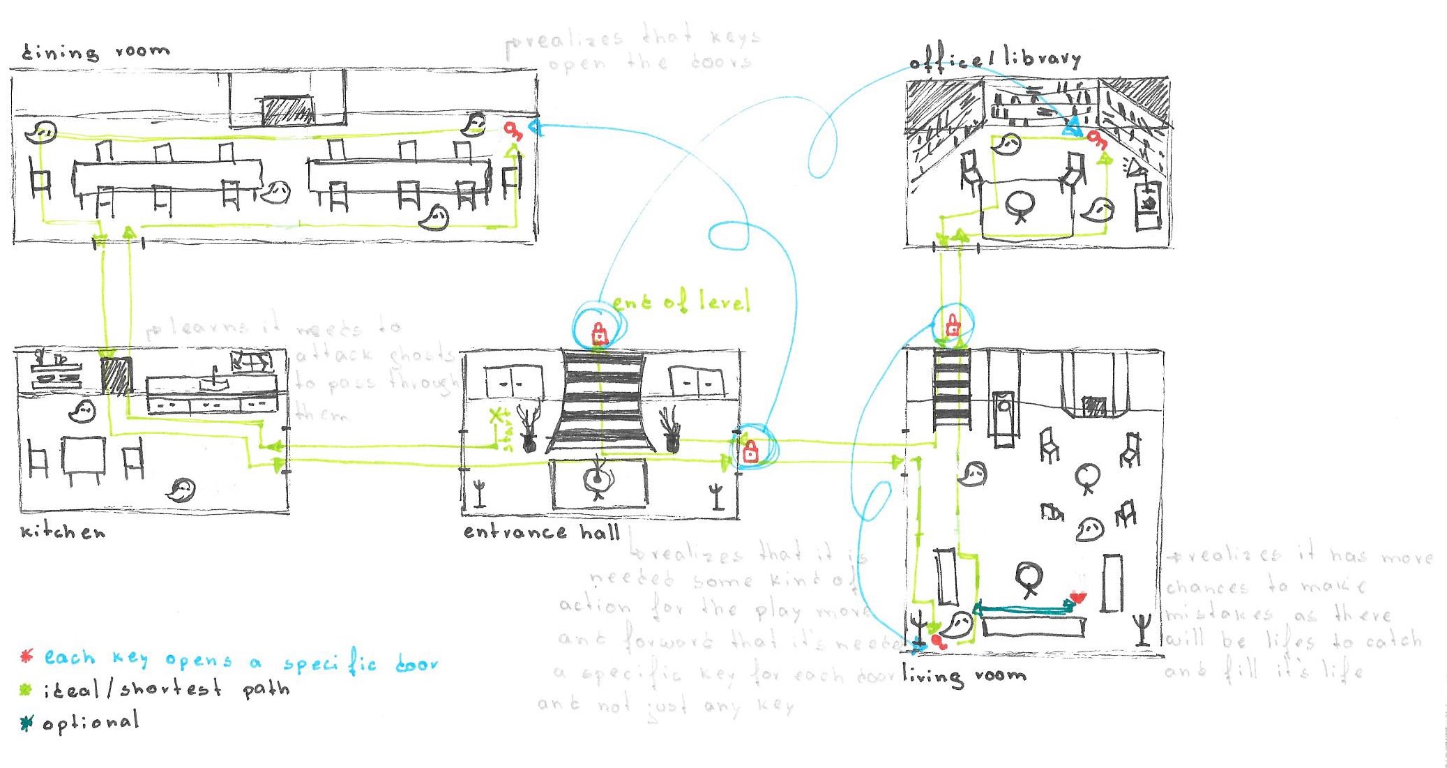
Furthermore, I went a bit more in depth into how I wanted the level to flow, since enemy placement, locked door, key placement and which key would open which door, this was just a first approach of what I wanted in the beginning.
Room Space
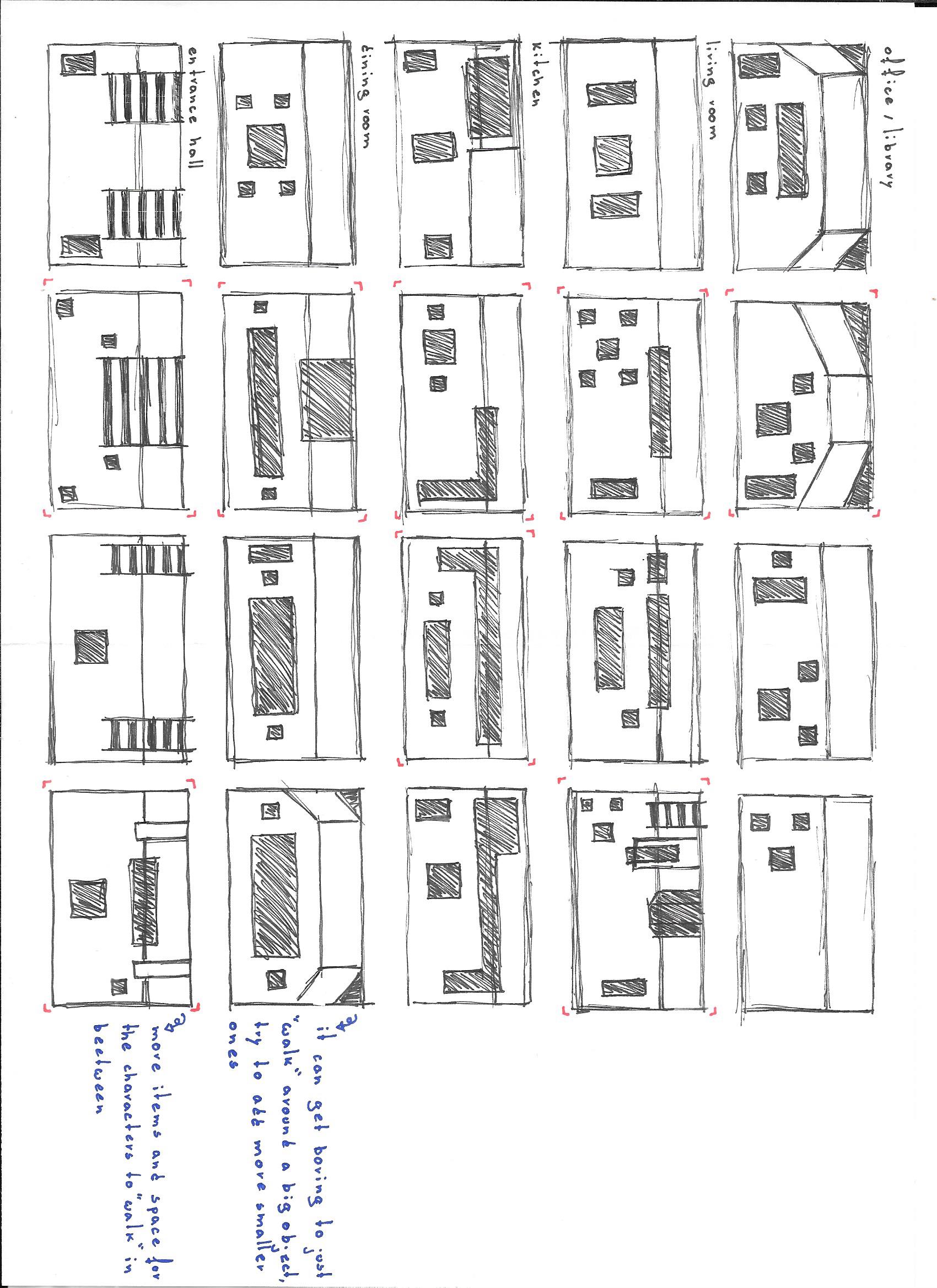
Upon deciding on the rooms, I proceeded to work on how I wanted things to be placed in each one, as I wanted to avoid the player to have to walk around the same object in the room instead of having several objects around, to walk in between, which makes the gameplay a lot more challenging and interesting, for the player.
In Depth Design
Before proceeding to a more technical drawing of the level, I decided to improve my level workflow, as the first approach I showed previously was not as detailed as I wanted, which could lead me to doubts when working in the game in the next few months.
Proportions
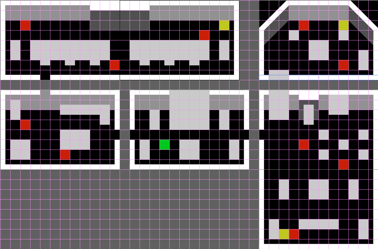
This is for now the final version of my level design, so far, in which I just grabbed on the latest sketch and tried to work a bit on proportions for each room, so that this way I have something to refer to, when actually working on the final art, which I'm definitely super excited about! I still think there are things to improve in this level design, but for now I’m glad I was able to actually come up with something.
UI Concepts
A couple of weeks ago, in one of my previous blogs, I showed the initial process of my UI development, in which I started doing some research in similar games, and by creating the flowchart for my own game.
Since, I already had the base for my UI, I thought it would be nice to do some concepts, instead of in the future, get straight into the final interface art, without any kind of reference and studies of might or may not work out for the game. As there are a lot of elements in each menu, I decided to work on variations for each one of them individually, this will help me in already having something to choose form when working on the final menus and maybe just do a few improvements I think it might work better at the time, instead of just working straight into the final version with no references.
Some of the elements I worked on, were the life indicator, which I went for an heart shape, some buttons, text boxes, some alphabet, for both bigger titles and smaller sentences, sound and music bars, some keys and lockers I thought might be useful to indicate whether the doors are locked or were unlocked and if the player is carrying a key with him, and I even worked on some cursor options that I might use for the game.
Alright, hope to see you all next week with a new blog and more exciting stuff in the works!


