User Interface or UI is a truly under appreciated art in game development today. It's one of those things that if it's done well, you don't care, but if it's done badly people complain. It’s the buttons and menus that pop up, health bars and damage indicators, anything that shows the player how to work the game or help them play it. For Duck n' Dodge, our UI goes through constant improvements to make sure players are understanding the menus and where to find things they need. Even something as simple as changing the color of a button can make people think differently about what it does. This article is going into some UI philosophy, changes we've made over time, but also the reasoning behind it.
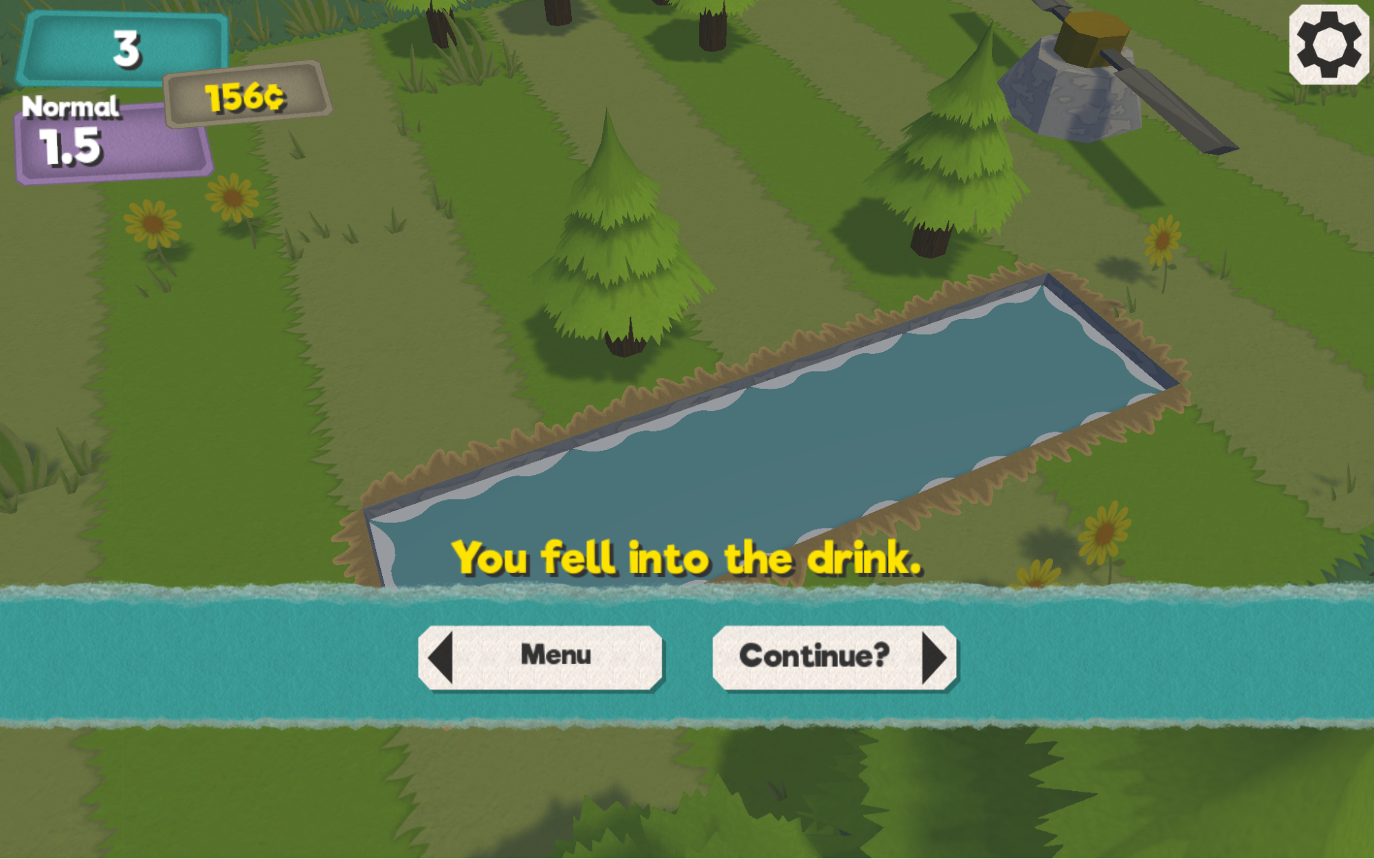
First off, keeping a menu simplistic and easy to use is important. Even games like League of Legends with hundreds of characters, items, and runes has a menu system that people can understand. So a UI is meant to explain what you need it to know as fast as it can, but not dumbing down the game either. A good example of this is a recent change we’ve made to our death screen UI. Instead of giving players a paragraph of information on their last run, buttons to go to other menus, and any possible tips they need to know, we’ve broken it up into separate menus to not overload the user with too much text. If you present somebody with a few buttons at once instead of many that are labeled, it’s daunting to have to look through them all, and most people choose to ignore them.
Another important aspect of UI design is how efficient somebody can interact with an interface. I’m not talking about something like StarCraft’s Clicks Per Minute, but more along the lines of how big is the button area to click, the distance you have to move a cursor to it, and where the cursor started out. You could make a UI with buttons on opposite corners of all the other buttons and it would be functional, but the constant movement of the mouse across the whole screen would be annoying and tedious. So clustering similar options or buttons to ones they would have most likely just clicked is good to do. Most all of the menus in our game at the moment are centered in the screen so you never have to throw the mouse to a corner for things except pause.
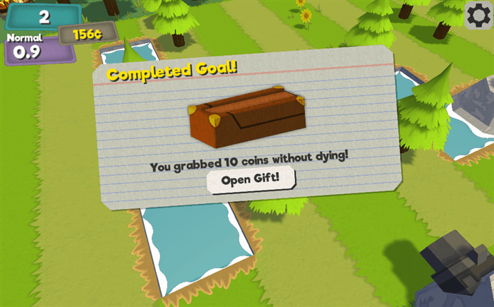
The last thing I want to point out is user feedback. A UI that is easy for one person to understand might be confusing for another. My favorite story of this is back when I was working on Outland 17: Void of Liberty, we had a yellow caution tape barrel you could shoot to explode enemies. This barrel had a bright orange health bar above it with an explosion logo beside that, and even with all of those queues, people didn’t understand what it was and never shot it. In Duck n’ Dodge we’ve had a few times like this when we have given people a gift notice that appears in the center of the screen, but people ignore the free coins. So we now animate it larger, give it special effects, and make it an event so that people are more drawn to it instead of just thinking it’s a useless pop-up.
I’m sure many game developers have had the same woes where a UI they thought would be effective is a little confusing. It’s one of those things that needs to be refined for the information it needs to display. I’m also sure we’ve all played games where something just isn’t too obvious and could have been showcased better somehow. There is a lot of thought and design that goes into all of the little buttons we constantly click in games, it’s not just something thrown together. I hope you check out the game HERE and give us more feedback on things we can improve and make easier to understand for you!