Here's a brief rundown on how I make the background art assets for Damsel. I've chosen one of the statue set pieces because it has more detail than some of the other basic props, as well as a good mix of different textures.
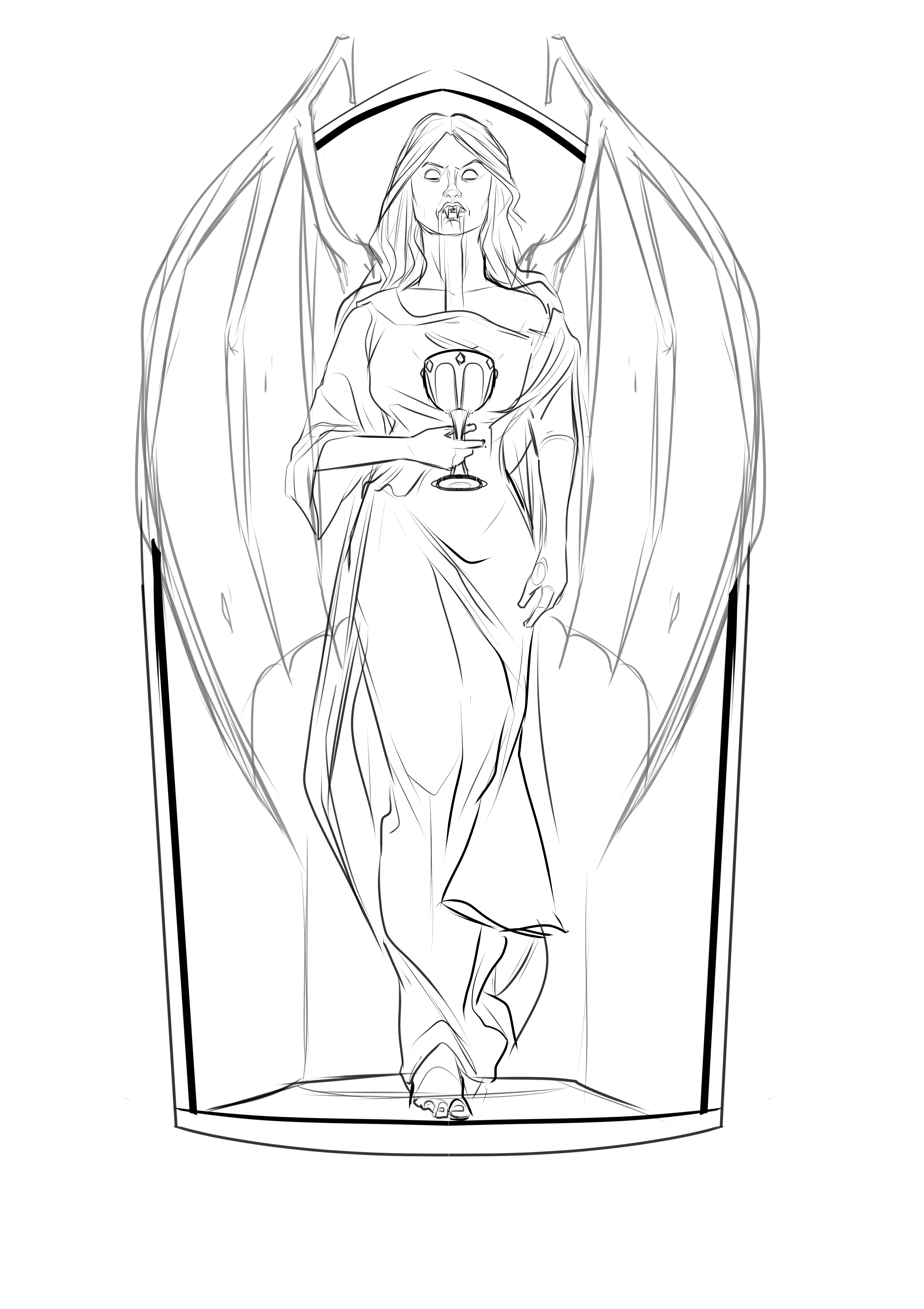
Most props start with a quick sketch to get the basic shape and silhouette. The drawing is pretty loose at this stage which works especially well for things like the robes as it gives a good flow to the fabric.
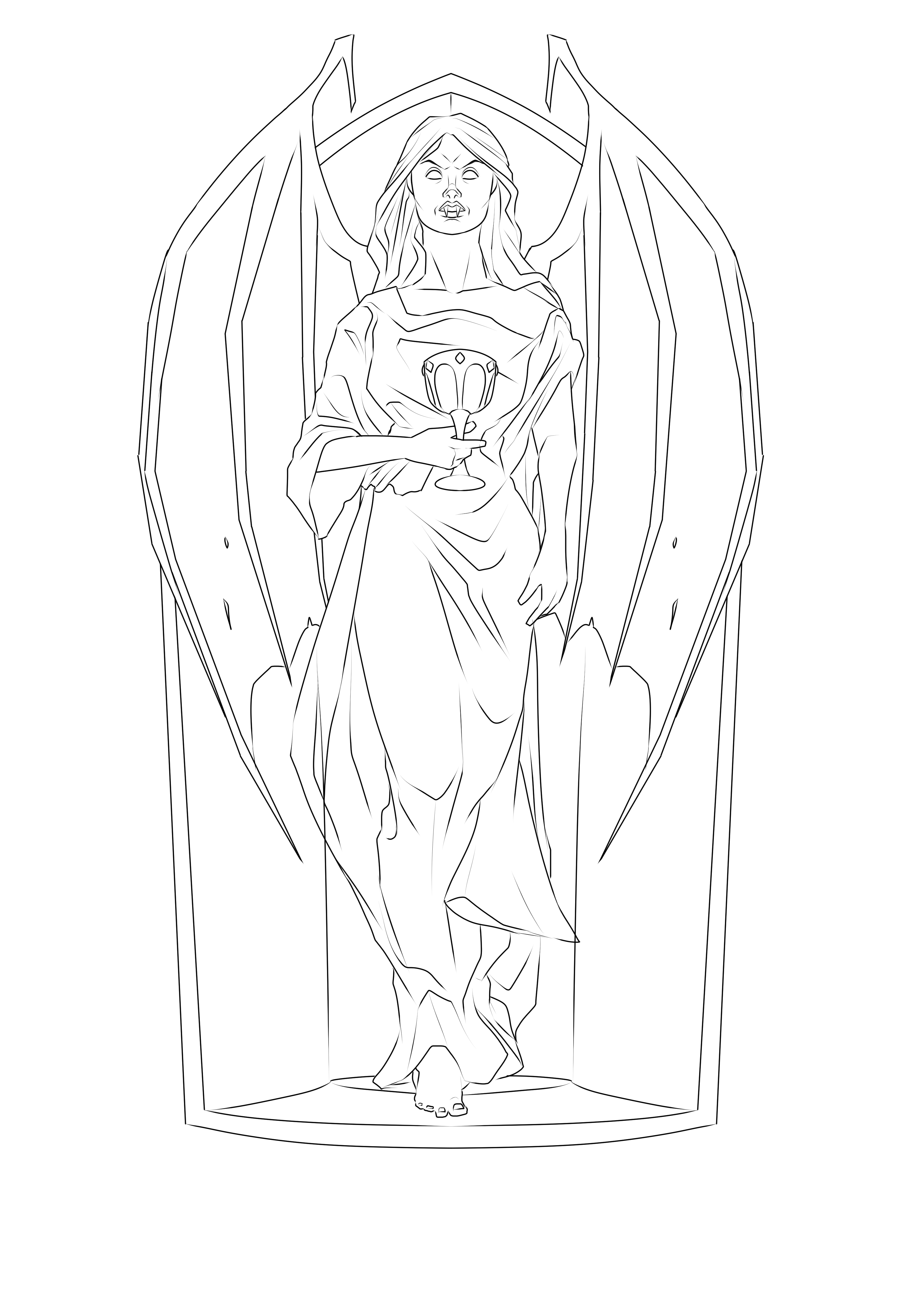
The sketch is then cleaned up with some simple line work. This will be covered up later so not much effort is put into the fine details. The arch and wings have been dawn on one side and then flipped and copied to the other side to make sure the statue is symmetrical where it needs to be.
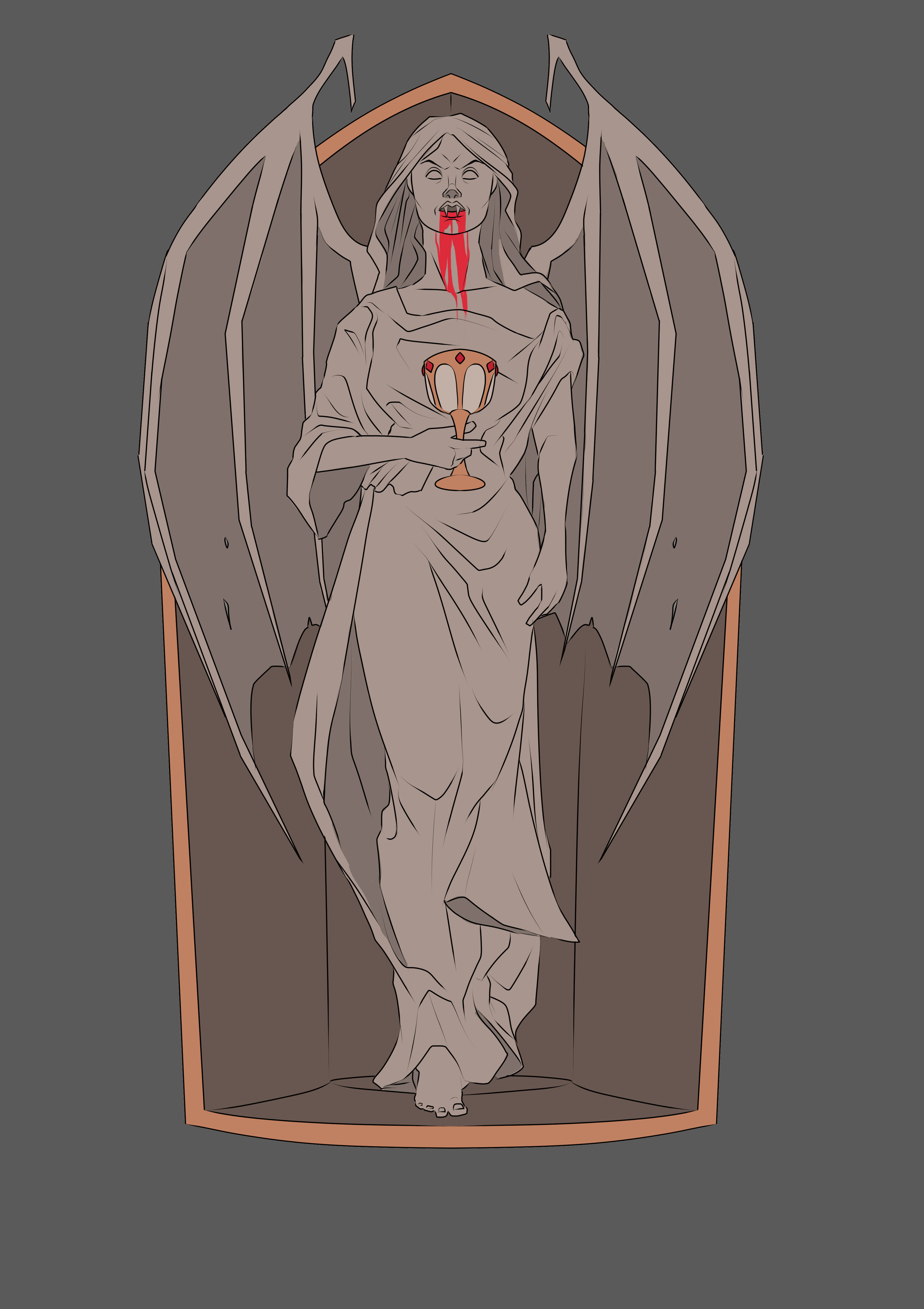
The line work is then filled with some basic colours. This is done on a grey background as it keeps the colours neutral, you instinctively colour things too light on a white background or too dark on a black background. The greys of the statue have a warm tint to match the rest of the level. I made the inside of the wings a bit darker so that the silhouette of the woman reads better.
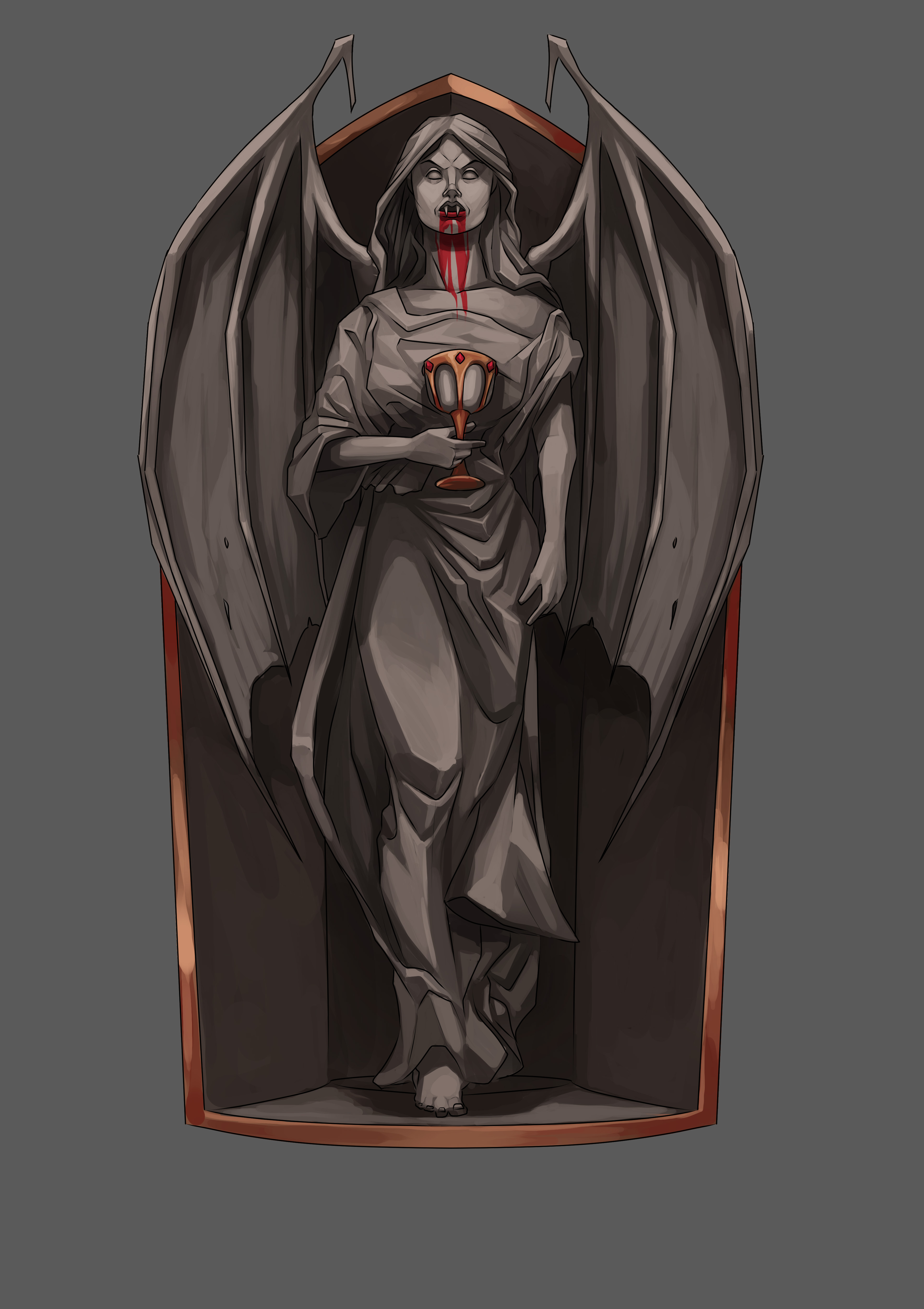
I then add some basic shading with a soft brush. This is done with a layer set to multiply. The aim here is to define the light source.
The basic shading is then painted over with a hard edge brush. This is where everything it cleaned up and polished. I tried to make the stone of the statue look blocky by not having a lot of smooth shading. The bronze areas have more highlights to make them look metallic.
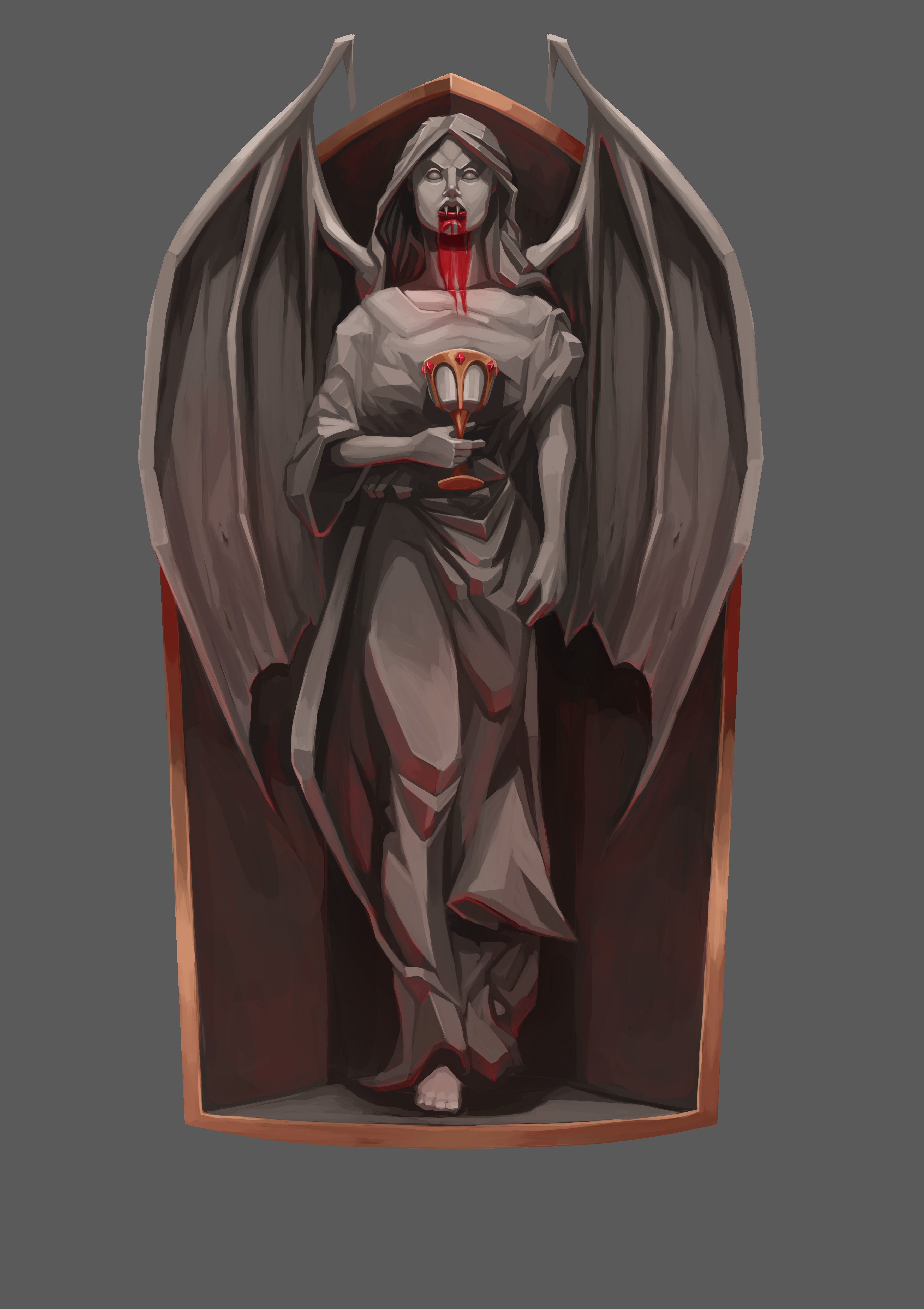
I then get rid of the line work and add some red secondary lighting. This will help it blend in with the rest of the scene as it makes it look like it is being affected by the other objects.


Thanks for detailing the process, it's looking good. May be fun to add a video of the process too.