Here at Wraith we talk about accessibility a lot… and I mean A LOT. I’d go so far as to say that it’s one of our foremost tenants; which is actually pretty weird seeing as we just only really started thinking about it in 2013 or so! We really started focusing in on accessibility when one of our team members, Ryan, tried to play Collapsus and couldn’t because of his color blindness. It was a real eye-opener (pun very much intended).
Heck, we really started to ramp it all up (and make accessibility a fundamental part of our design process from the ground up) when we first met our friends over at the AbleGamers charity when we hit up OGDE (now GDEX) in 2015… but enough backstory. Like I said, accessibility in games is important to us (and it should be to you too)! With that being said, I’d like to talk about some of the things we’ve been doing to make Collapsus more accessible!
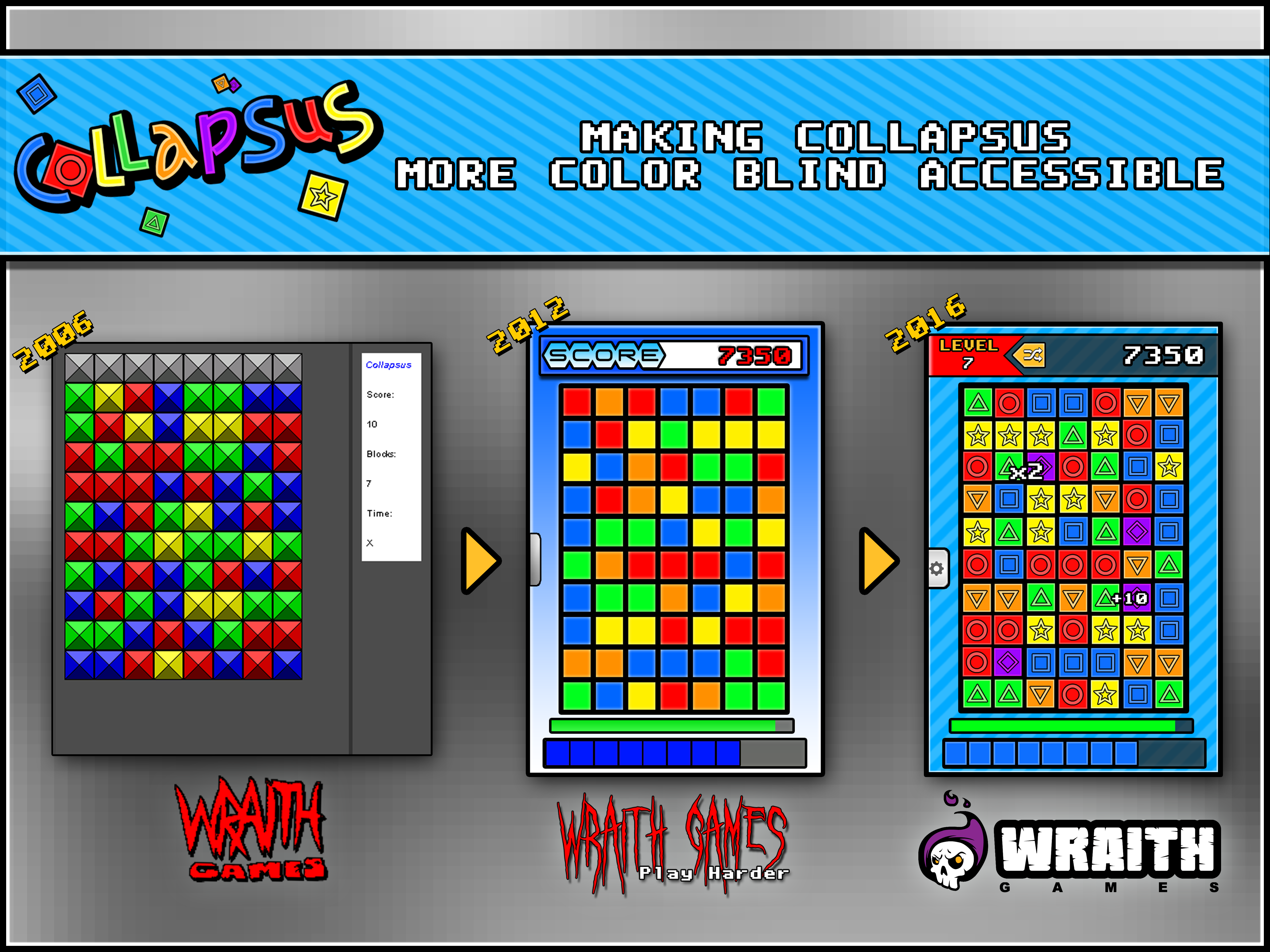
So, with color blindness accessibility at the forefront of our efforts with Collapsus, let’s start there. As you can see with this infographic, when we started Collapsus with the 2006 prototype, it used these sort-of “retro” style blocks. These are terrible. There’s virtually no way to tell these apart even in greyscale!
Believe it or now, but the 2012 version was even worse! You see, these flat blocks of color don't’ even allow the advantage of being shaded differently for the very slim chance that someone may figure out what color they’re supposed to be. This is the version Ryan played… YIKES!
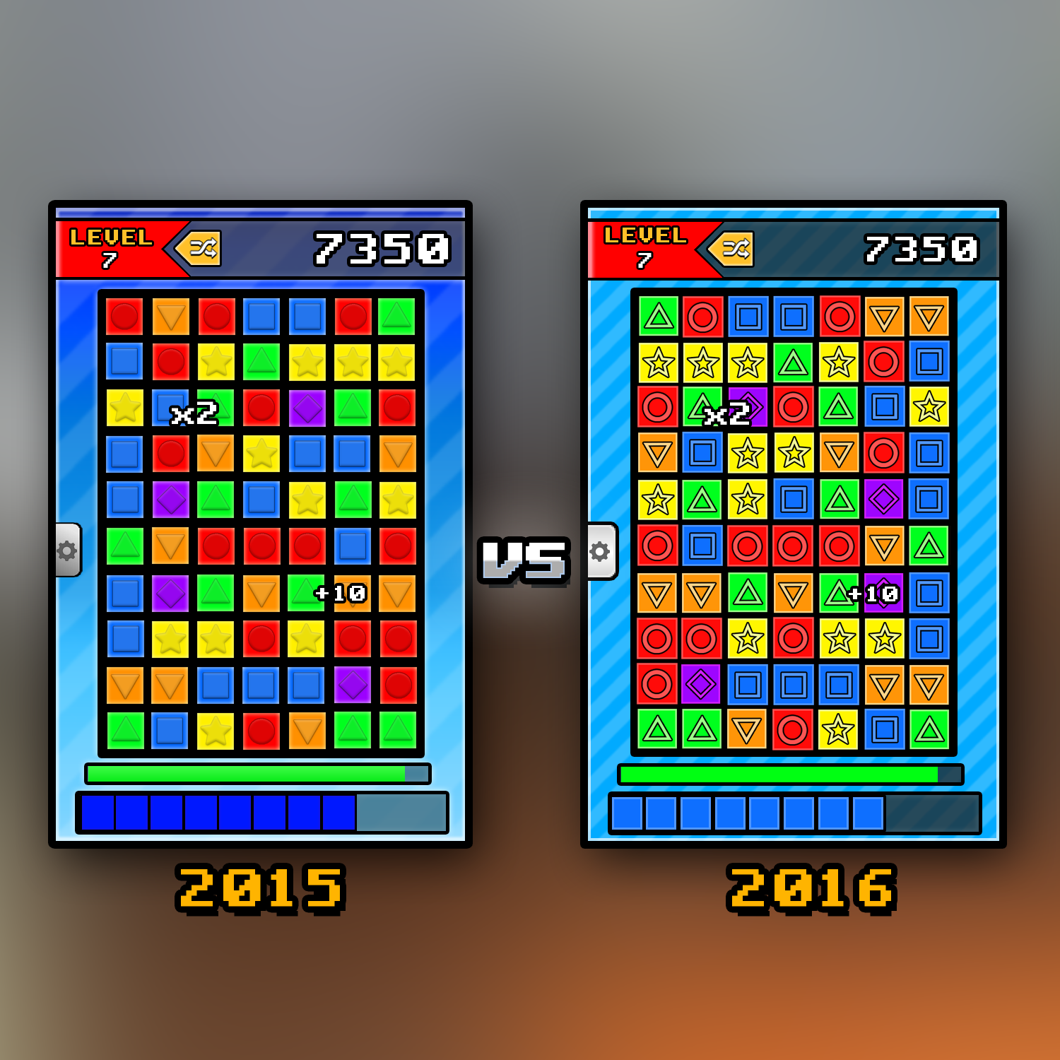
Now, we did end up adding shapes to the blocks in 2014, but as you may have seen in our posts before, they were a bit different. Here’s 2015 and 2016 side-by-side for comparison. Both 2014 and 2015 use the same blocks so I’ll talk about why I used the 2015 picture instead in a bit:
You may find this kind of hard to believe (or, actually, maybe not since I believe that it’s mostly other developers who read these posts rather than just fans… so who knows) but we actually went through a LOT of different blocks shape ideas both before and after the 2014 ones. Even transitioning from the 2014 shapes to the shapes we use now wasn’t without controversy both internally and with those who follow development, though that settled down very quickly and the new shapes are now seen very positively.
Why change the shapes at all, though?
Well, there were several reasons for that. The two main ones, though were visibility/readability and the other was because, to be honest, we actually started to care about how the game looked. I’ll address that second part first, because this is a post about accessibility first, but there’s really no better time to talk about it…
When we brought Collapsus back into active development in 2011, the game was a mess. We were using several different fonts, gradients everywhere (we’ll explain why that’s bad after while), and overall, there was no sense of a unified, cohesive, visual style. We were FAR more worried about getting the game playing well rather than making it look pretty.
They block style we ended up going with in 2014 was actually inspired b y the box art for one of our personal favorite DS games: “Planet Puzzle League”... or, more specifically, the Japanese and European boxart for “PaneldePon DS” and “Puzzle League DS”, respectively (same game, different name. This IS a sequel to “Tetris Attack” in the US after all, so names are all over the place). The funny thing about this box art is that the block style pictured on the box was never actually used in the game at all (some styles were similar but that's about it). So we based our look on theirs (ours were convex rather than concave and we used different shapes and colors, obviously).
The look we were going for with the 2012 “blank” blocks was that of a Rubik’s Cube (one of the things that inspired Collapsus), but since that couldn’t cut it now that we new better, we just added our new shapes to those blocks and BAM! We had passable blocks. Again, though, they didn’t really fit with the rest of the game’s art style. Well, to be more accurate, NOTHING did since the game didn’t really HAVE one!
So, after awhile, we started bringing everything in. We went with a more flat design (with is MUCH better for people with visual problems) and started actually using the fancy art educations we had rather than just making placeholders. Looking back to that 2015 vs 2016 infographic, you can see all sorts of gradients run amok: you have the tab, background, and progress bar… but also what you CAN’T see are the menu buttons, logo and other UI elements that used them.
Don’t get me wrong, gradients can be used well, but how we were using them was neither aesthetically pleasing or accessibility friendly.
So, why did I use 2015 rather than 2014 for that infographic? It’s actually pretty simple: in 2014 we were using the background we were using now. Wait… what? Then why change it for a year just to change it back?! It’s quite simple… it was art by committee. One of our team members didn’t like the background and so we changed it. We then realized that the old one was more in line with the clean, flat, pop art-inspired (yes, really) aesthetic that they game had taken on. That’s it.
So, by the time 2016 rolled around, since we now had an idea as to the art direction we wanted to take with the game AND were now keenly aware of what worked and what didn’t as far as designing for color blindness accessibility was concerned, we flattened everything we hadn’t previously flattened, changed the block meter to be more readable (which was a change we’d made before, but finally actually implemented), and changed the the contrast of the “containers” we were using for the field, score, and meters so their content was more readable as well.
The only thing left was the blocks and logo, which, as you can see, we made short work of! Everything was now aesthetically cohesive, and (most importantly) far better for those with color blindness!
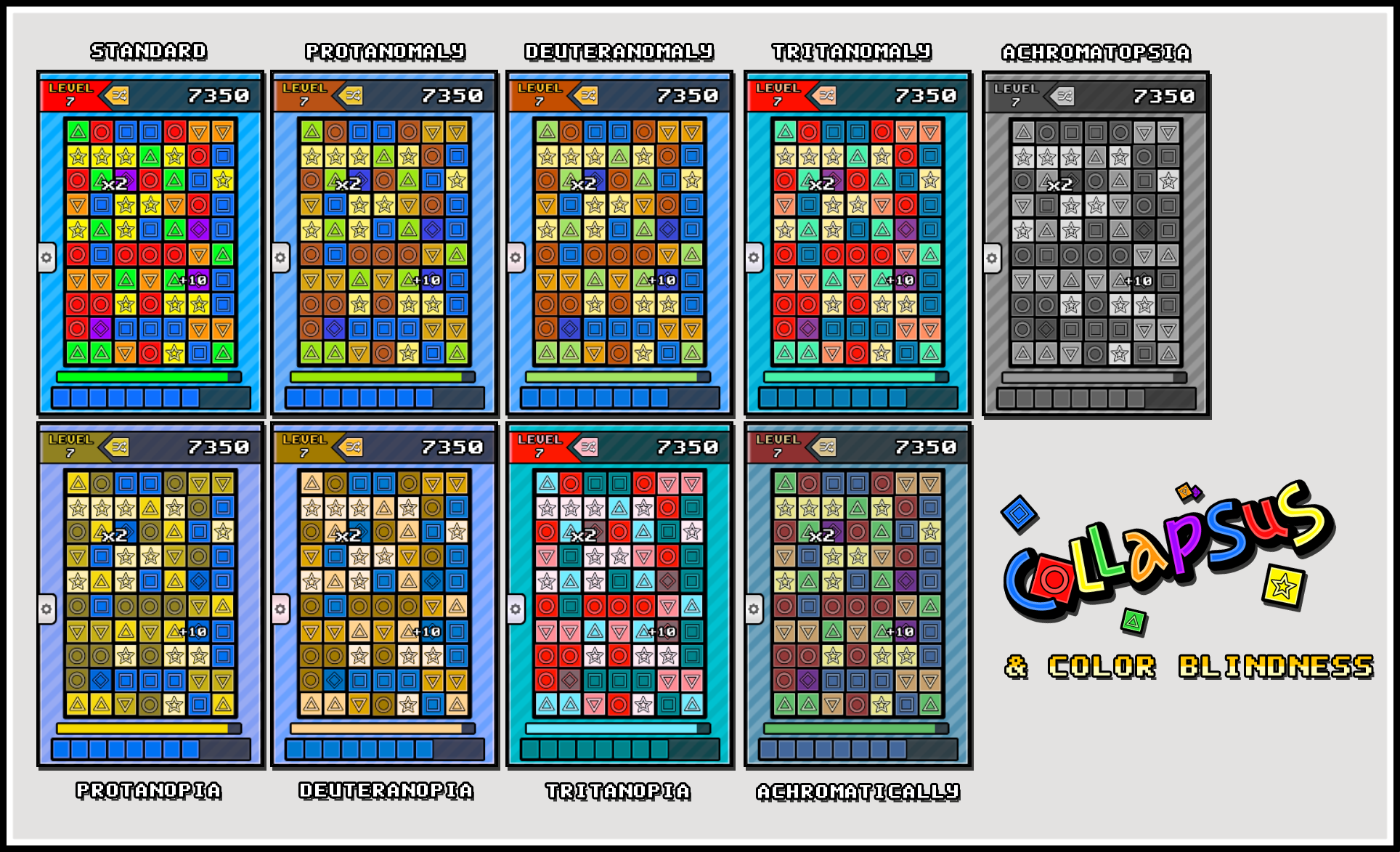
Before going on, here’s an infographic showing what Collapsus looks like using filters to simulate different types of color vision:
As you can see, for the most part, Collapsus is playable regardless of what type of color blindness you have. We wanted to take it a step further, though. See, some of the colors, while still mostly distinct are a little too close for comfort. Also, while we’ve tried to avoid color combinations that are physically painful to look at for some people (this is very much a concern for many people with color blindness), some of the combinations are still not entirely optimal. That’s when we came up with a solution: Value!

As you can see above, we’ve greyscaled out all of our blocks. What this allows us to do is, within Unity itself, change the colors of the blocks individually. This means, that in our options menu, you can select the type of color blindness you have and the game will change the pallet to be more optimal to your particular requirements! Pretty sweet, huh?
That’s not all! On top of that, we can theoretically even make pallets for the legally bind (not just the colorblind). How is that, you ask (wondering how one can make a video game for the blind, especially one reliant so much on visuals)? Well, it’s a pretty interesting answer!
While talking with accessibility expert Ian Hamilton, we found that only 18% of visually impaired people are “legally blind” and that only about 10% of those people are totally blind! He pointed us over to the “World Wide Web Consortium”, the main international standards organization for the World Wide Web. They have what’s called the “Web Access Initiative” (WAI), an initiative for making the internet more accessible.
This initiative includes what is called the “Web Content Accessibility Guidelines” (WCAG), which just so happen to include guidelines for designing websites for the visually impaired (among a host of other accessibility guidelines). In addition to the visual changes needed to be made, allowing one clock click to make one sound while a different block click make a different sound also helps. This just means that a double click is needed to actually break a block.
Now, unlike the colorblindness steps we’ve taken, we’re still very much in the research process with actual blindness… but it’s looking promising!
That’s pretty much what we have to say about that. Well, for now, at least. Now, it should be noted that not only do we also have both fall speed options and the ability to independently adjust the brightness of the gameplay and background, but also we’re currently partnering with another software company to incorporate head/face tracking software in Collapsus for those who can’t use their hands, but that will have to be a topic for another day (since we’re still in the early stages of both integration and negotiation with that company) but who knows, if everything works out as planned, we may just be able to open Collapsus up to everyone; and wouldn’t that be wonderful!


