There's a reason "terminal" fonts are a standard for traditional roguelikes even today. Certainly tradition plays a part, but even more importantly, they're designed to be highly readable.
Last year while still in pre-alpha Cogmind received a huge influx of font bitmaps to support different resolutions, in some cases with multiple variants at a given size. At that point the goal was to make sure Cogmind had a unique look that was also consistent regardless of resolution (or as close as possible given the difficulty of pixel-perfect scaling that maintains proportionality).
With the alpha launch behind us and hundreds of players diving into the game and providing feedback, the first few releases were/are aimed at quality of life enhancements--tweaking the interface and adding optional features that will improve the experience for even a minority of players (because the options menu is not already crowded enough =p).
By far the top request is to improve readability. A majority of players enjoy and prefer the Cogmind's original font, but a number of factors contribute to poor readability for some players:
- The UI is extremely dense, and at minimum must be able to display an 80x60 grid of characters, thus screen resolution places an upper limit on the size of each character.
- Modern high-DPI monitors squeeze the grid cells into an even smaller physical space, making the native fonts hard to make out since in many cases they rely on lines with a pixel width of only one.
- For the same reason, Cogmind's native fonts don't usually stream or record very well--video compression tends to reduce single-pixel lines to almost nothing.
We can resolve these issues for most players by providing thicker fonts with more even pixel distribution, as well as multiple options at each size to suit slight differences in personal preference. These alternate fonts will lack the thematic appeal that we get with Cogmind's sci-fi font, but accommodating players is more important--readability trumps all in a text-heavy game. Besides, they're optional :)
With single words and short phrases readability is less of an issue. The biggest problems arise when reading log text, hacking results, and dialogue where there are full sentences and paragraphs to parse, so that's the best test of readability and what I show below.
Four New Typefaces
Typeface #1: X11
This font comes from a common Linux windowing system. You can find a huge collection of bitmaps and even the source code for producing them here. Of the new fonts, X11 might be the easiest to read overall as it's the most traditional of the bunch.
")
New X11 fonts.
Typeface#2: Terminus
For Cogmind, I like Terminus for its natural readability with a shape that still preserves some sci-fi flavor. See many more sizes and optional features of this typeface here.
")
New Terminus fonts.
Typeface #3 / 4: Proggy / Dina
These fonts will be familiar to many programmers, as they're commonly used for coding. Programming fonts are a natural place to look for good roguelike fonts, since they're both monospaced and designed to facilitate character recognition.

Cogmind's entire engine loop as seen in the IDE (VS2010). I've been using Dina
as my coding font for about eight years.
Adding these to the game was simply to provide some extra options at smaller resolutions, which they work best at. You can see the full selection of Proggy/Dina fonts here (all by the same author).
")
New Proggy fonts.
")
New Dina fonts.
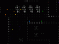
Options Menu
As of Alpha 2, Cogmind comes with a mind-boggling 82 font bitmaps.
")
Showing some of the fonts in action via the options menu.
For comparative images showing all the new fonts grouped by size, see this forum post. (There are also many larger sizes available for resolutions at and above 2K, though all are derived from fonts shown above.)
More Possibilities
The above fonts seem to have solved the readability issue for most players, at least those for whom their resolution-limited size is not simply too small regardless of font (and therefore requiring a larger screen to select greater sizes).
More typefaces can easily be added, though I think the current set combined with what was already there is enough to cover most needs. (The new fonts come with Alpha 2, to be released soon, though they were pre-released separately weeks ago in the forum post linked above.)
For those of you developing your own roguelikes, another nice option to consider is an amazing customizable font named Input.
This is the fourth in a four-part series on roguelike fonts:
- Part 1: Fonts in Roguelikes
- Part 2: Font Creation
- Part 3: Cogmind Fonts
- Part 4: Readable Text Fonts for Roguelikes

I like Size 18 T11B and Size 16 Terminus best.
I like 16 Terminus a lot as well. Used that in an animation capture I showed yesterday and it worked really nicely: Twitter.com