DevLog #5 – Main Menu
Hey everyone! Welcome to this week’s article of Chama.
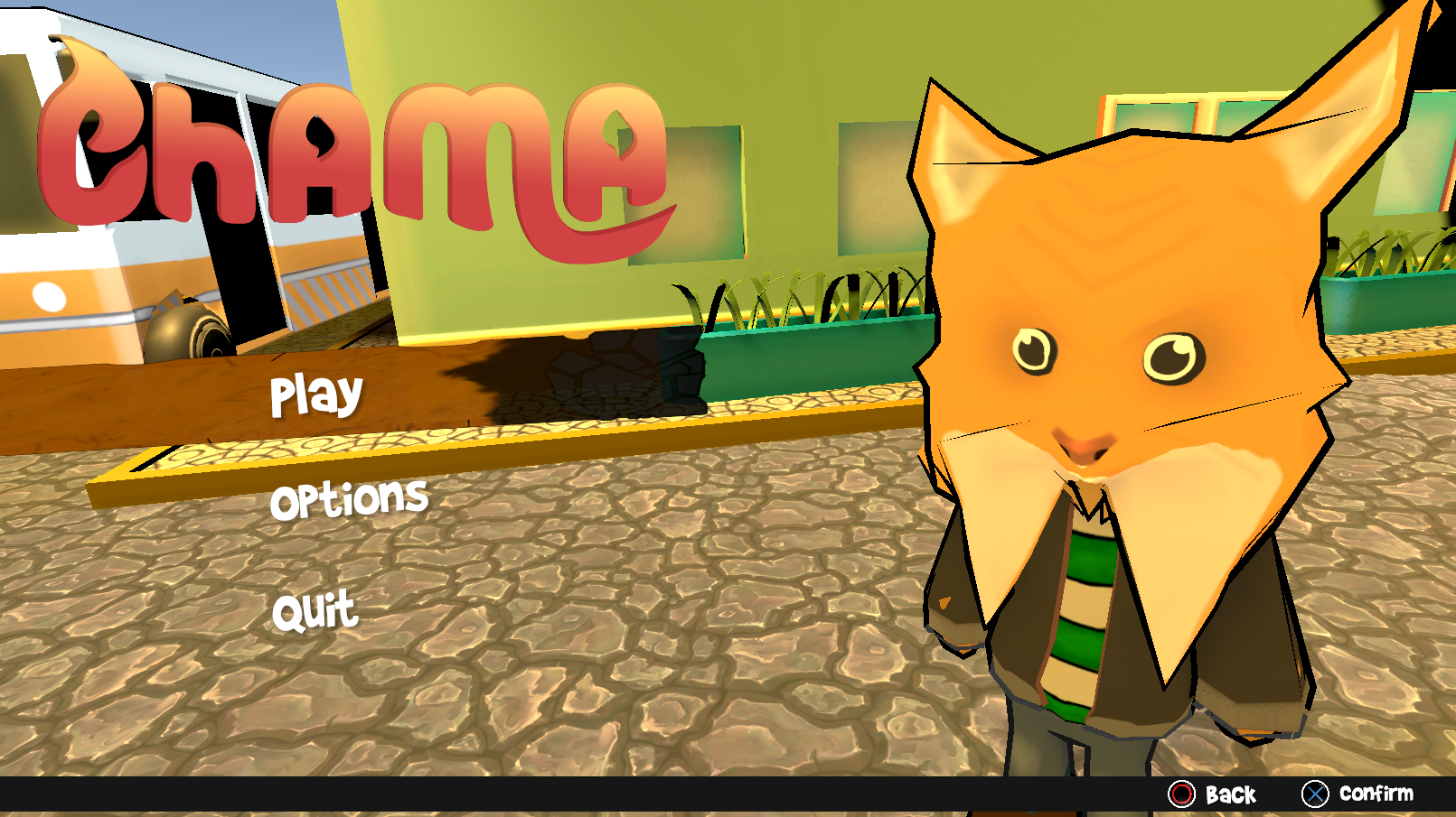
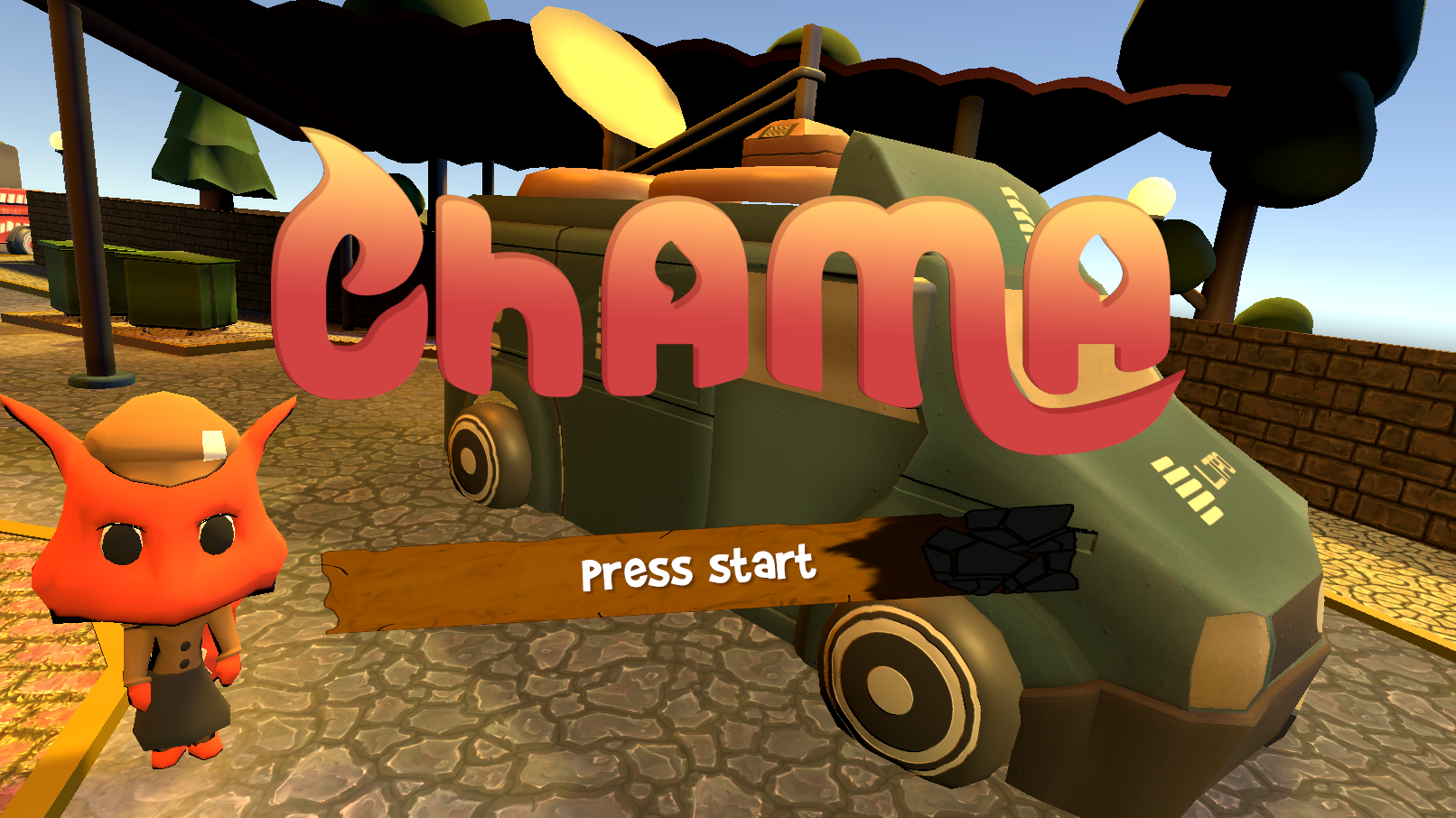
Today we’re going to show you our main menu! Here it is:
Well that it for this week’s article! We’ll see you next week!
Just kidding! We’re going to talk about it and our process through it as well.
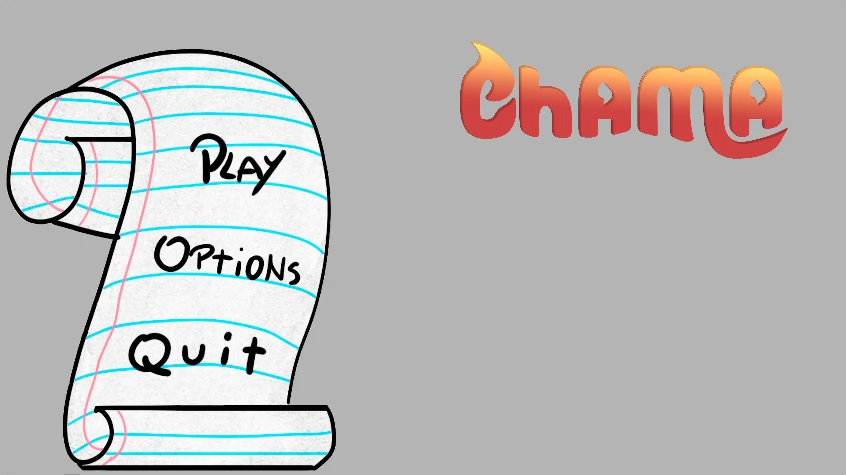
The First Iteration:
We started off with a very simple menu. Composed with the title of the game a grey background and an asset of a sheet of paper that was later on changed onto another more important feature of the game. It didn’t have much to it, but our main worry at the time was to make a functional menu, not a pretty one.
Why Change?
Has simple has it might be, it was turning out pretty boring to look at. Even with the game’s colours added to it we couldn’t stay with the menu like that. It had to turn more dynamic and diverse! After all it is a colourful game despite its seriousness.
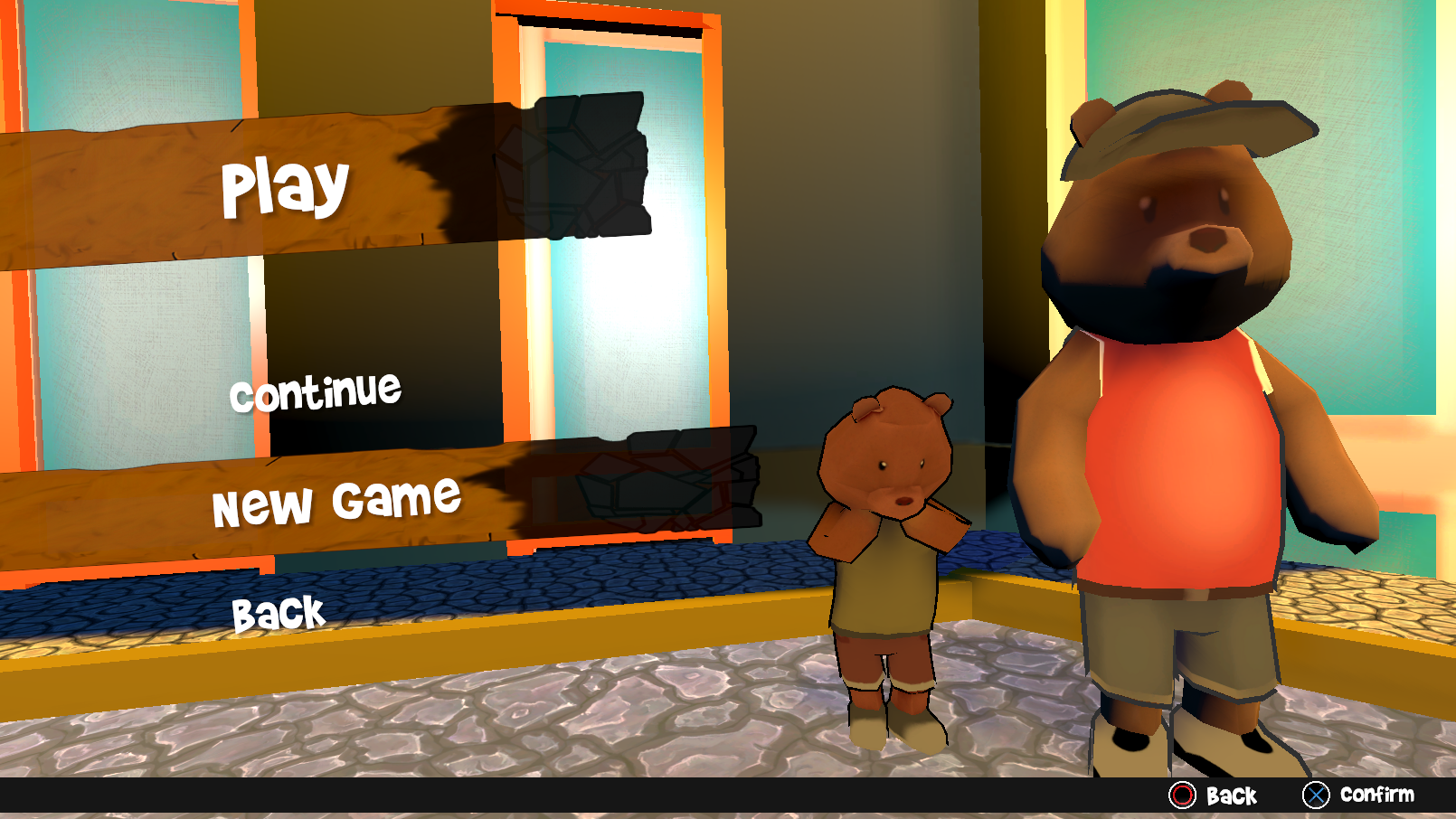
Inspiration was quick to come has we came across and searched up various types of main menus from both indies and triple A titles comparing them. We’ve even got in contact with a development group in the meantime and ended up discussing ideas for both games. And thus, we got to the main idea of how we wanted to dynamize the menu to. Here’s a video of how the menu looks like currently:
I hope you’ve been enjoying our articles so far! That is all for this week’s devlog! Thank you for reading our article! See you next week.