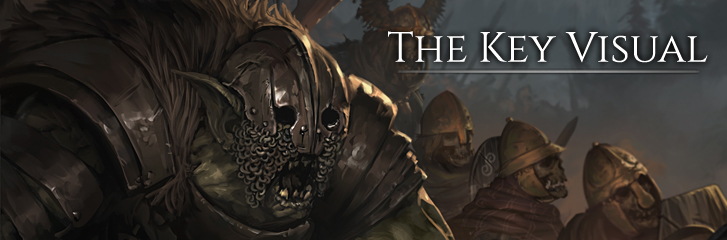
Dev Blog #88: The Key Visual
This week we present to you our final key visual for Battle Brothers and dive a bit into the visual evolution of our game over the last four years. Why did we create a completely new artwork and why does it look the way it does? Find out!
The visual evolution of Battle Brothers
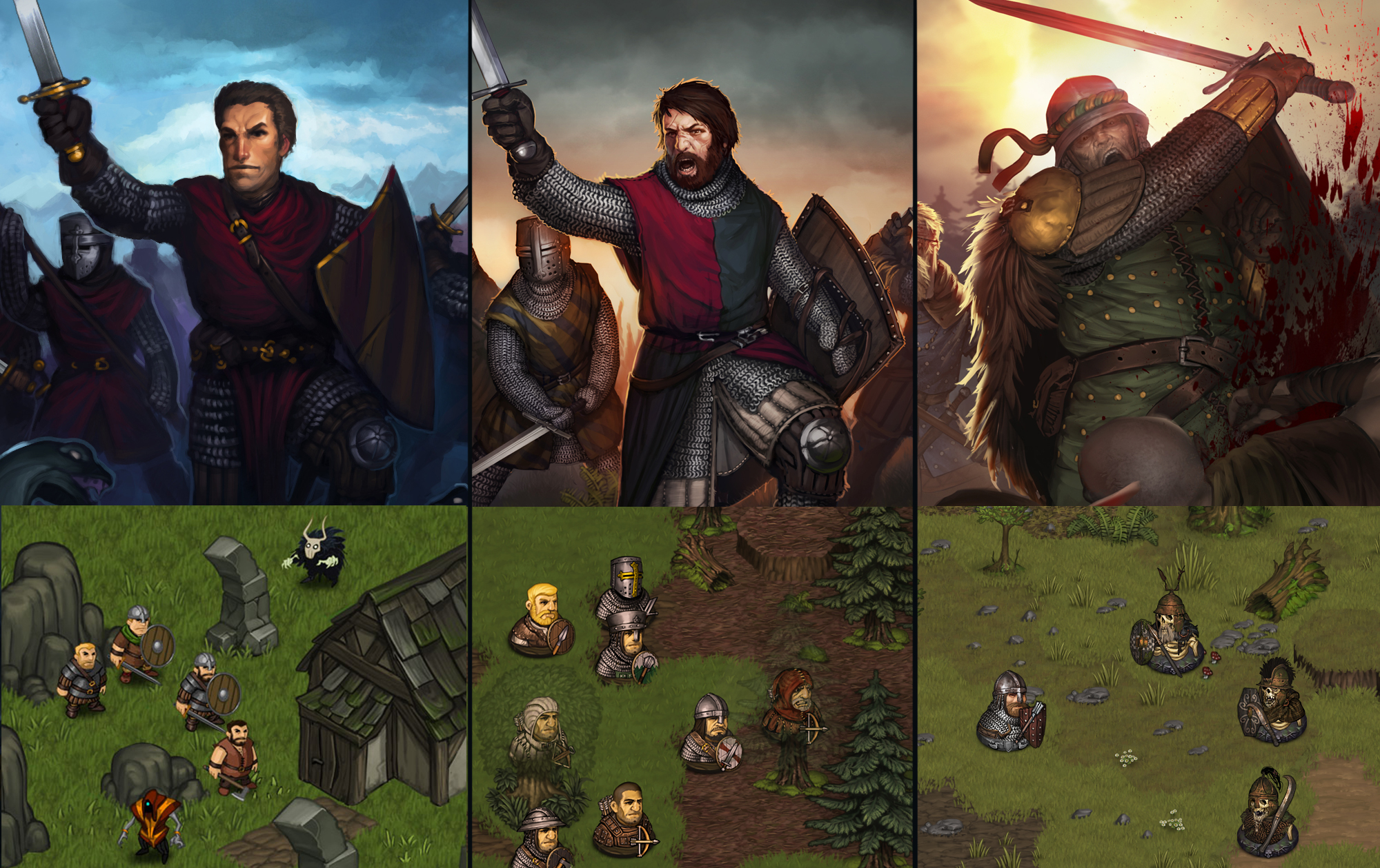
Battle Brothers has come a long way since its conception and has seen some significant changes in development. It started as a hobby into which we invested many an evening on top of our day jobs, and turned into our full time jobs. The original art assets had to be created in short sessions late at night, and as we gained the means to invest more and more time into the game, we eventually redid most of the assets in order to bring them up to a higher standard of quality. As the game design evolved, so did the art style from a light-hearted comic approach to a somewhat more serious and gritty, but still exaggerated one.
The different iterations of both the key visual and ingame assets illustrate the changes over time pretty well.
Why do a new key visual?
The key visual is of some importance for the success of the game, as parts of it are used all over; in the game itself, on Steam, on our website, in social media and as press material. It’s what catches a potential player’s attention first, so it really has to get people interested to learn more. Many of you want the development of Battle Brothers to continue beyond its initial release, and for this to work out, we need the game to be a success, which the key visual plays a part in.
So what’s wrong with the old key visual and why did it need to be redone? There are a couple of points we wanted to address.
Quality - The previous artwork lacks in overall quality. It’s more than two years old already and has been painted over countless short late-night sessions.
Design - The character looks don’t match our ingame assets anymore, raising memories of back when box cover art showed things not even in a game. Some characters also have a certain ‘knightly’ vibe about them, which may lead to wrong expectations for players. Finally, it still looks kind of light-hearted and the enemies are borderline cute, which is more commonly associated with casual mobile games and not a complex and challenging game like Battle Brothers.
Composition - Now we’re getting to the core of what's wrong with the old artwork. It's never a good idea to have a center-focused composition in a landscape format picture, especially if you need some space to show your logo. This puts you in a position where your main character and your logo have to compete for space and attention on the canvas.
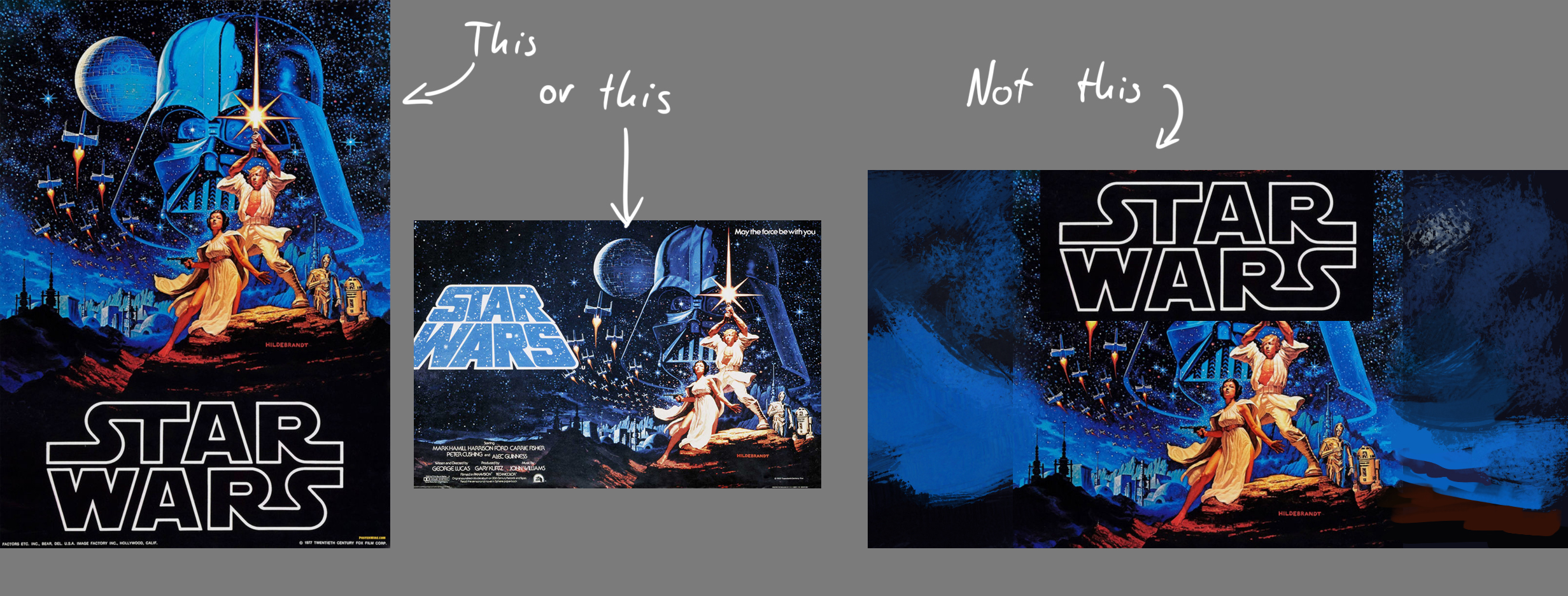
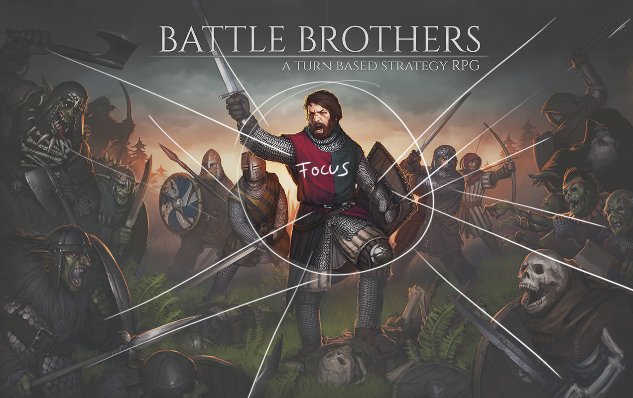
Guiding the eye is very important in any artwork to help the observer find the focus point and not get lost while exploring the picture. As you can see, we used a variety of elements to emphasize the focus on the main character in our old key visual. Unfortunately, this absolutely excludes the logo from holding any meaningful position in the picture.
The Solution
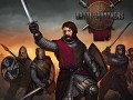
Here is what we came up with to remedy all the above issues and add a good amount of additional awesomeness on top: the final key visual of Battle Brothers.
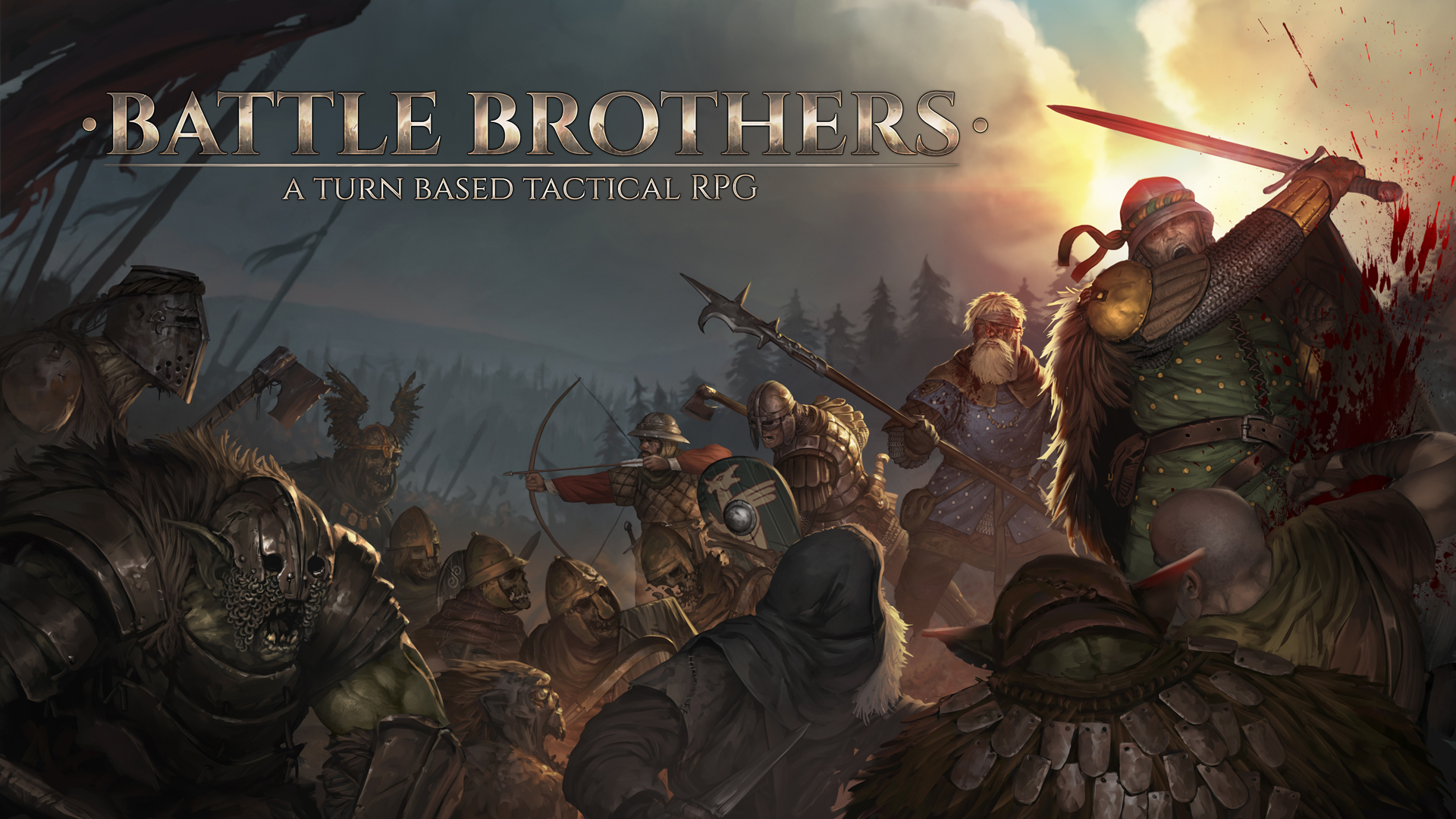
As you can see, the rendering quality of the picture is a lot better now. The whole picture features a broader format and an off-center focus, creating a more dynamic and visually pleasing composition. Additionally, a lot of space has been freed up to place the new Battle Brothers lettering where it doesn't collide with the main characters. Designs are inspired by actual ingame assets, and the characters look more like mercenaries now and less like knights. The whole atmosphere is more serious and less light-hearted, while still retaining an over-the-top heroic battle style.
Another important point is that the landscape setup facilitates easier creation of header graphics and other assets for secondary websites like Steam, Twitter, Facebook and Youtube. To complete the visual rework of our assets, the Battle Brothers logo also got an overhaul.
![]()
Everything could be improved further, of course, but that’s always the case. We’re quite happy with our new artwork, so it’s time to move on to the next important items on our todo-list. Next week we’ll take a look at a new worldmap mechanic!