GREENLIGHT
So we're now on Steam Greenlight! If you're interested in the game then please head on over and vote.
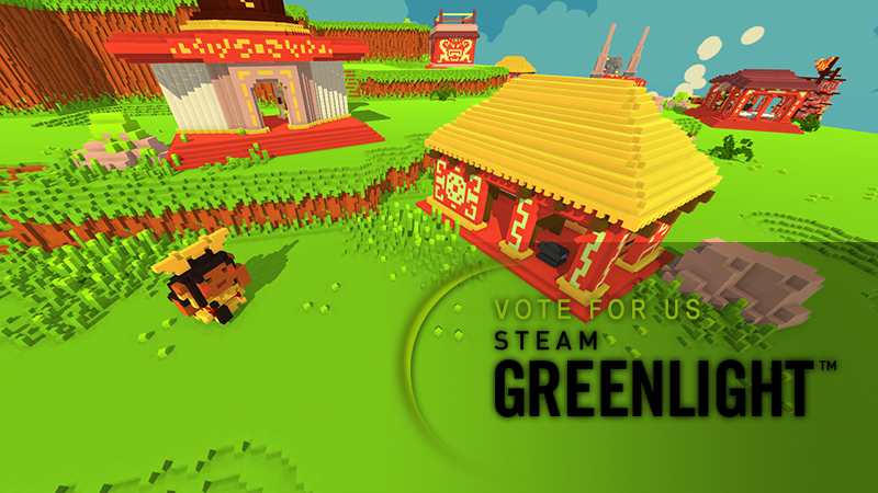
We've been working hard since the last update; here you can see a small part of the trailer we plan to put together for the full release, currently being used as the Greenlight trailer. We're working hard to produce a gameplay trailer soon, giving people a better idea of the moment to moment gameplay.
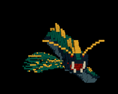
ANIMATIONS
Carrying on from the previous article you can see the w.i.p. animations for the Quetzalcoatl. Still working on the wings, but I'm pretty sure we've got those worked out now.
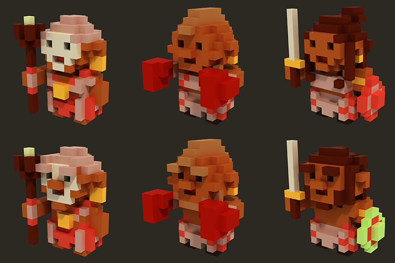
MODELS
Here's the three new units created by our talented artist, Leo. From left to right we have the; Shamans, who act like medics healing other units, Melee Guys, standard issue glass cannon types, and Swordsmen, who are the most balanced combat unit in regards to damage, health and defense.
New units means new buildings! These buildings are definitely a tad more ridiculous then the previous buildings we feel like it's a good direction to take the game in, more fun!
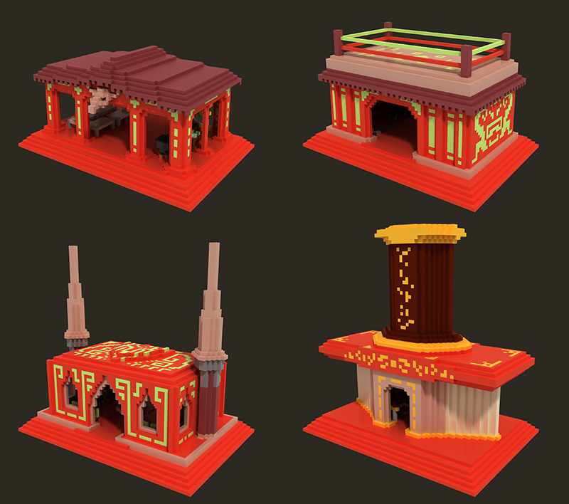
From top left to bottom right we have the buildings for; Medic, Melee, Spearman, Swordsman.
My personal favourite being the melee gym, sadly not visible in the render but it has a lovingly crafted gym on the inside and who can't be charmed by roof bound boxing ring. I'd like to point out that this is 100% accurate Aztec architecture.
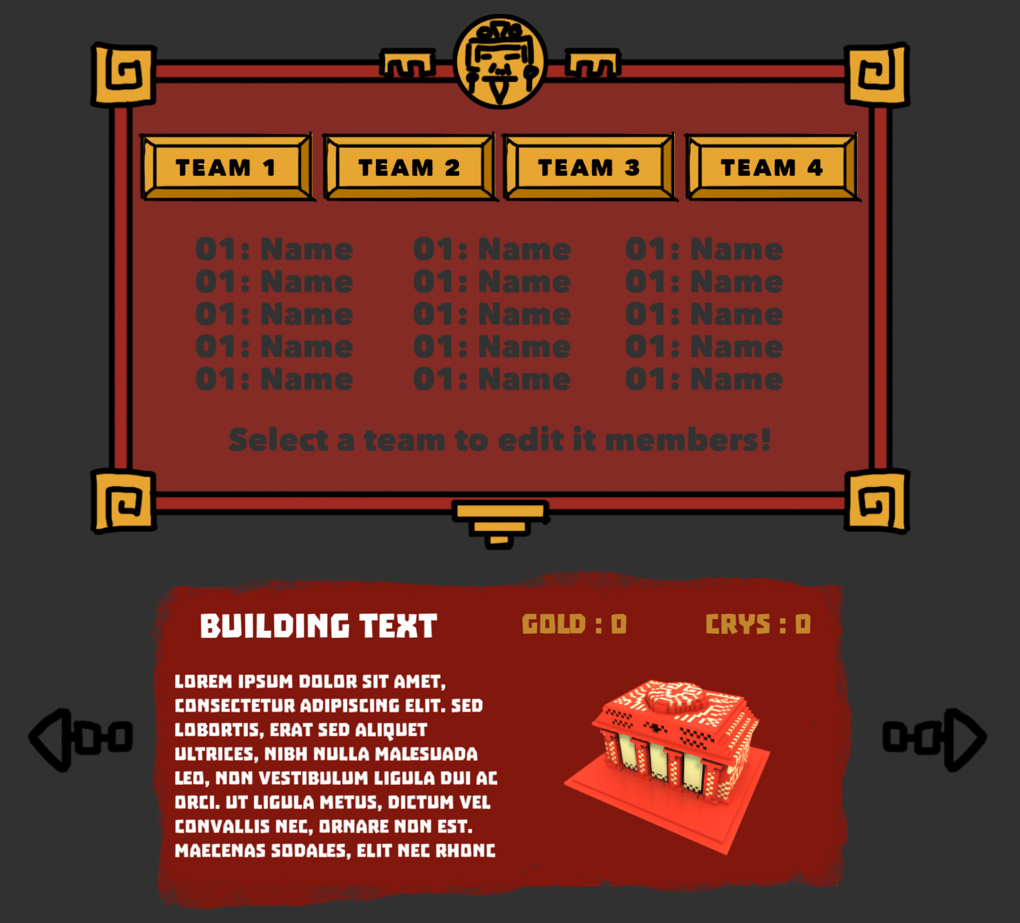
UI
UI has been left at the wayside for a while now, which is a problem considering a lot of our game relies on it! There have been three main stages to the UI visuals as of this point.
This is what the previous two version of the UI looked like; the first having a theme to match the game but what we ultimately felt was to bulky and distracting for a menu that would be used a lot. The second was painted by Jason. We wanted to simplify the UI and decided flat colour boxes would be best. We spent a while playing around with what looked best, paint splats and strokes highlighting elements of the UI etc; we realised that we were spending longer dressing up a crucial part of our game instead of getting it working.
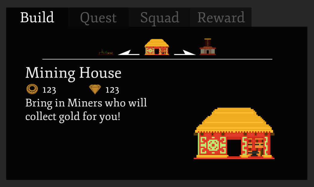
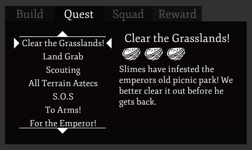
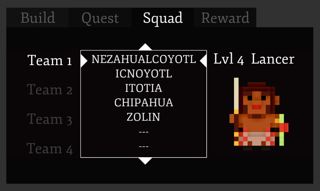
So here he have the current iteration of the UI, designed to be functional first and foremost as well as clean and aesthetically pleasing. We're able to present information in a way that's conforms through every tab. That is to say that we're not throwing the idea of theme'ing the UI more but for now we'll stick to what's clean and what works.
Thanks for reading!