Sometimes, an idea is so vivid, I just go ahead and create whatever's in my head -- right in the game, the first time, with no preamble. The map screen was not one of those times. I had no clue what to do with it. In these cases, what happens next? Seems like a topic for a devlog! I'll go through the entire process as I make the map, but for today, let's start with getting a clue: making the concept art. I'll keep the text short, and images a-plenty!
My Concept Process
Step 1: Outline Requirements
Sounds like a no-brainer, but without actually listing the gameplay needs, I'll surely miss a subtle detail, leading to fugly clutter later in production. So what is the map screen, then? It allows players to answer two important questions: where can I go? and where have I been?. Pretty simple! Which leads to the following small list of requirements
- A scrollable directory with many names that players can look up
- Items in the directory should be clickable
- A visual map of San Francisco
- Buildings on the map -- at the very least, previously visited ones -- should be clickable as a shortcut to looking them up again
- It all fits with the style of the rest of the game
Step 2: Inspiration
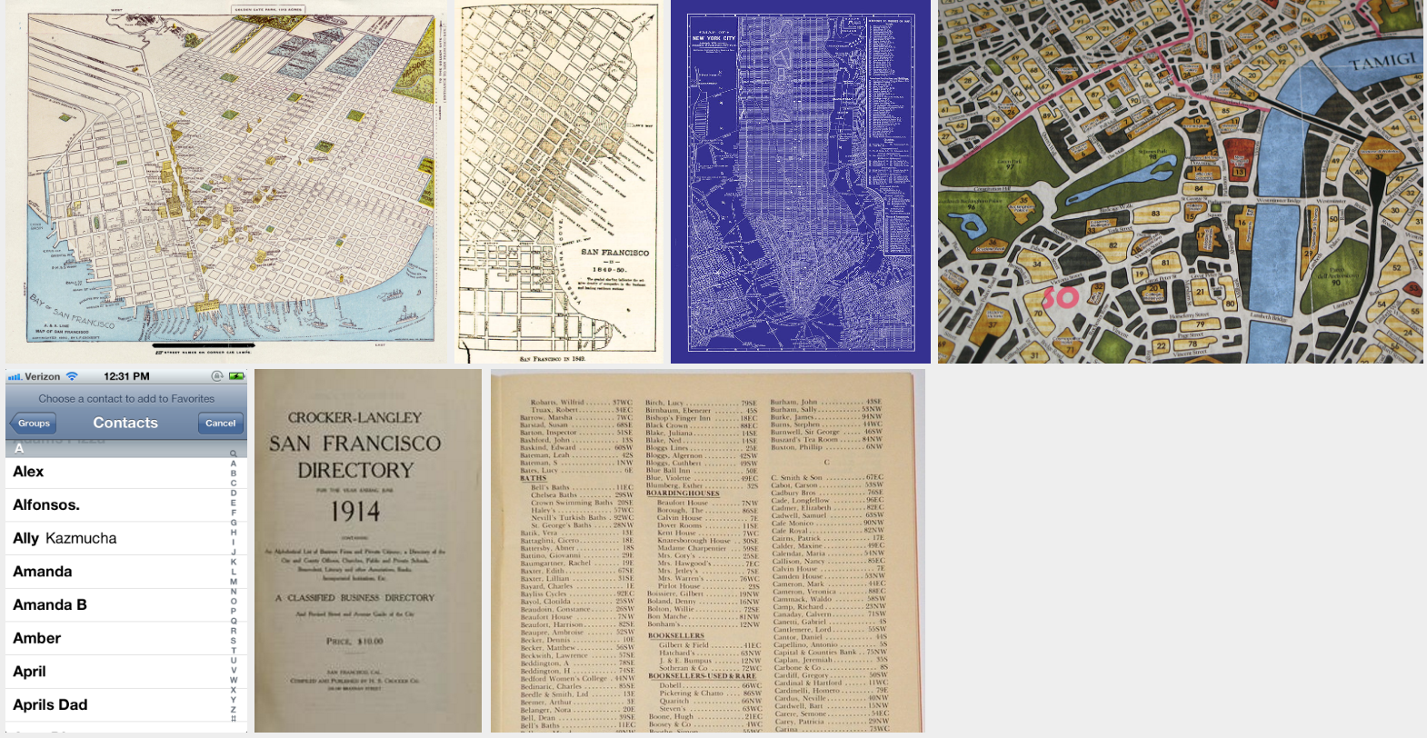
Gathering resources for concept art can be a blast. Quick Google Image searches lead to some great map ideas, including some seriously awesome stylized ones:
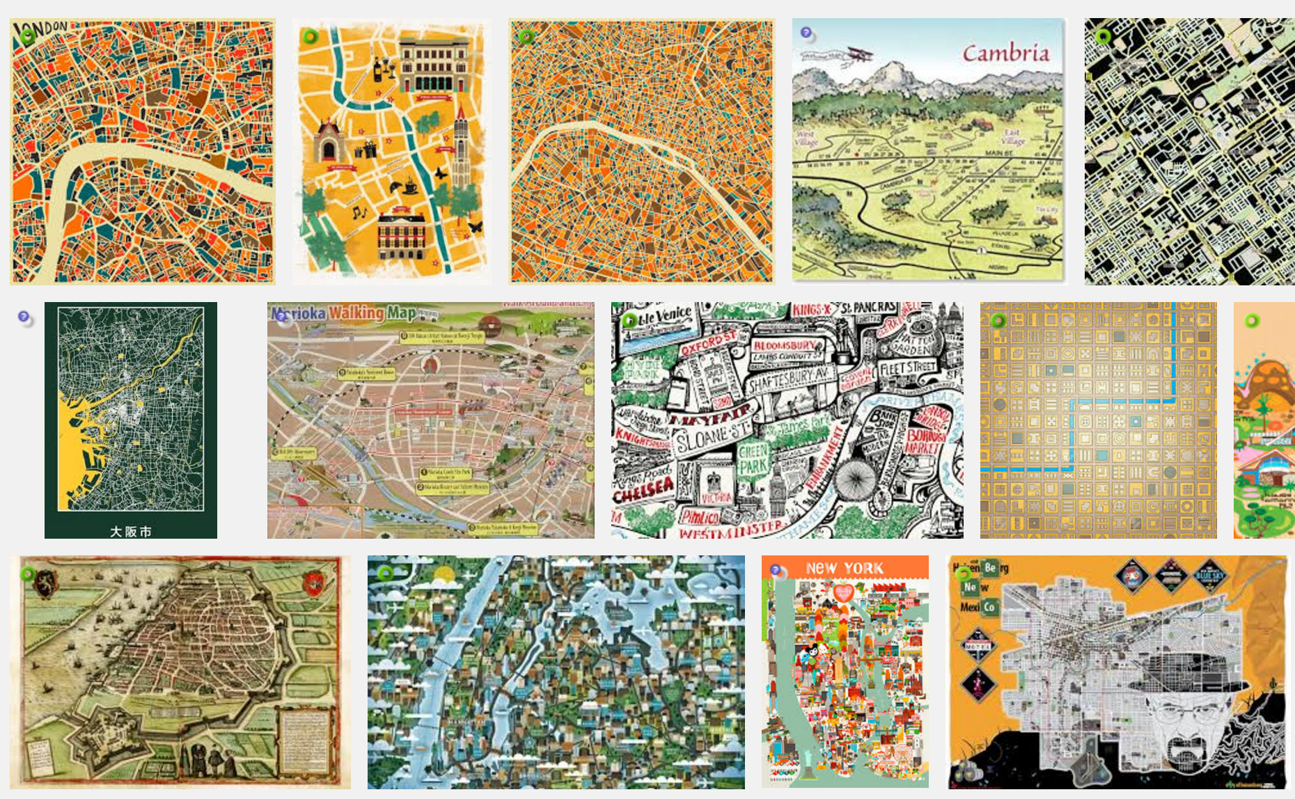
But remember, my map needs to show previous locations, and those locations gotta be clickable. Hard to incorporate all that with my minimalist silhouette style! A lot of searching later, the following thumbnails were the most inspiring. Note there are a few era-appropriate maps in the mix -- especially useful since they're both historical and public domain! Also note the directory inspirations -- a mix of era-appropriate for with contemporary usability. Finally, there are some images from the board gameSherlock Holmes Consulting Detective, my original inspiration for this whole travel mechanic:
Step 3: Concepts and Iterations
At first I toyed with the idea of a 3D map, where I rendered previously-visited buildings as silhouetted 3D objects. This was heavily inspired by the first thumbnail above. So, just for the mock-up, I decided to paint right over it:
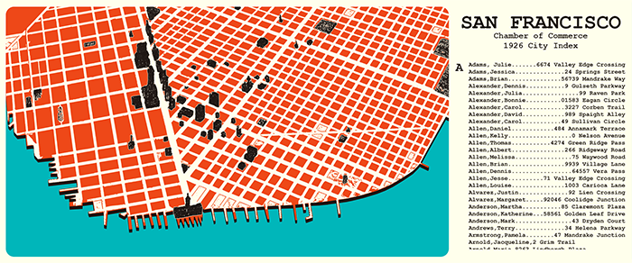
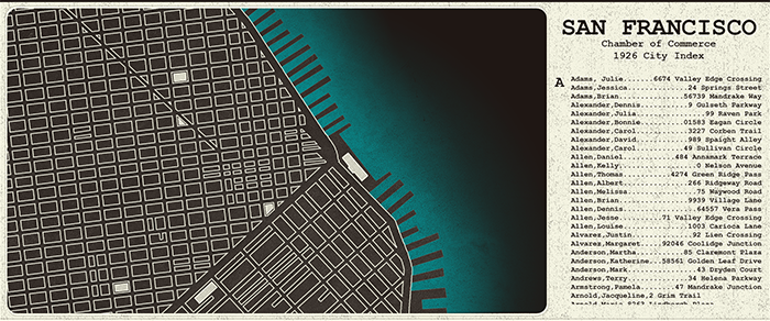
Notice that I added a simple directory here too -- showing the names as a scrollable list on a side panel.
There's a good here, but I don't think it's quite grunge-y enough to match the rest of my art. Let's take away some color and add a few masks for roughness:
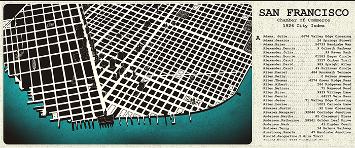
This looks better! But there's still something not quite right. The map looks... empty! I mean, there are dozens of buildings rendered, but it still looks like there could be so many more. In fact, I bet I could render a hundred buildings and it would still look barren. And if I took the time to render an entire city (not a small task!) the map would be cluttered and confusing from almost any angle except the top. And would it really add that much to the game for the heaps of dev time required? I don't think so. I'm not liking this 3D idea anymore.
This is where the blueprint inspiration comes in. Let's go back to 2D like the rest of the game!
Much better! I think this really compliments my other artwork. And I don't need thousands of buildings! Maybe not every one of those city blocks is a location the player can get to, but perhaps they're all clickable, and I can at least write some text for each. Now that's a more efficient way to make the world feel large!
Still, it got a bit too dark. And that side panel needs some love. Okay, one final mock-up!
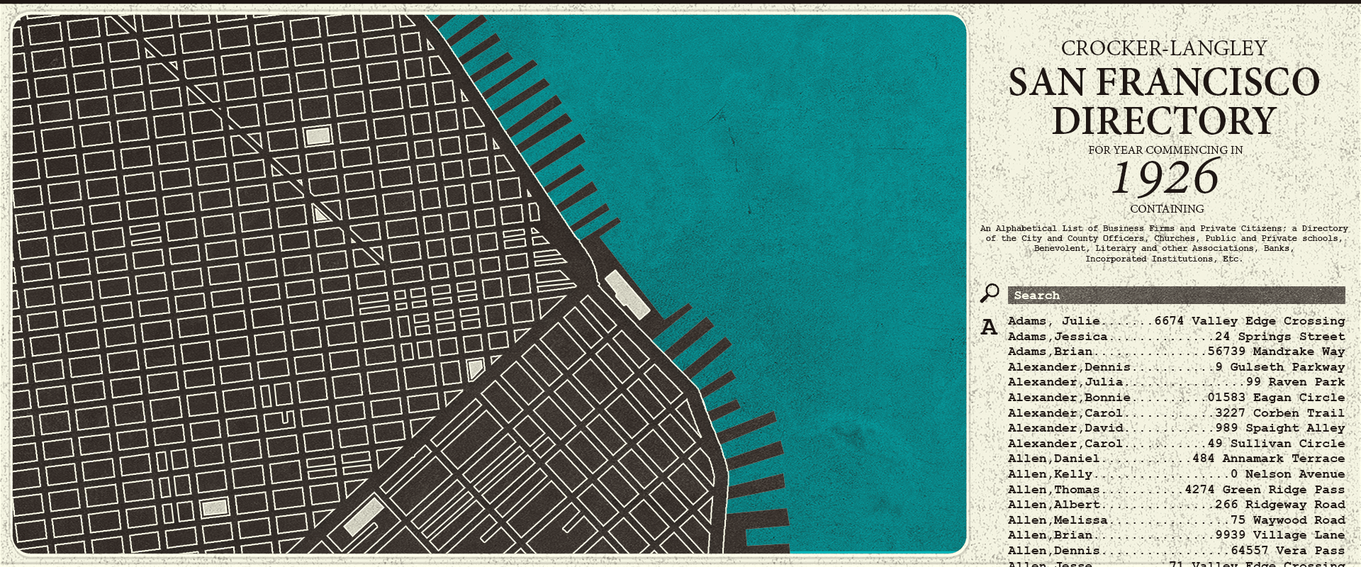
Now this I like! A bit lighter on the blacks, a full blue ocean, and a directory that has some (and an important Search function, that will make the long list manageable). This is a concept I can work with!
Future of the Map
Next up is actually creating this map in the game. I'll probably make the directory panel first, since that's most important for early gameplay, then I'll move onto the map itself. I'll keep you up to speed, and we can see it evolve together!