I must say, I do enjoy talking about both the technical aspects as well as the artistic choices of our game. I already wrote a lengthy article about the technical side, so I thought that I'd talk about some of the design decisions in this one and at the same time show some of the stuff we're working on.
Currently, I'm working on creating some resources for a new area, as shown below:
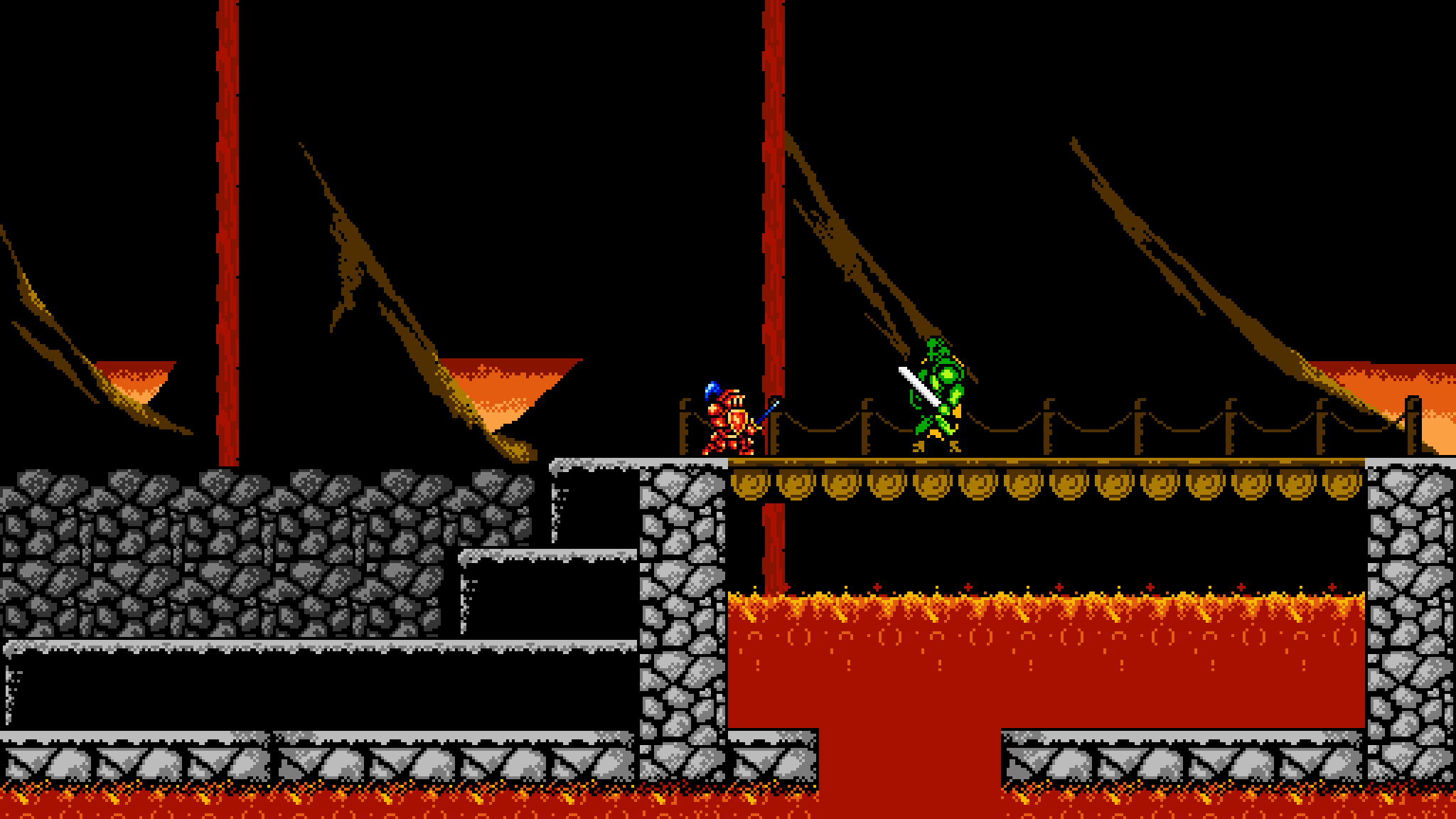
As I was working on this, it hit me that it would be a nice piece of art to use when discussing some of the restrictions that we're working with regarding sprites and colors. We have some restrictions with music and effects as well (mostly by keeping to a NES standard chip with four channels in total), but I'll leave the music stuff to Aron to describe, since he's our composer.
Anyway.. Let's talk about sprites.
Color restrictions and sprite sizes
So, first of all - We're trying to find a nice middle ground between getting more of a NES-look, and restricting ourselves to the capabilities of an actual NES. We started out working with a pure NES palette, but as many others have discovered before us, it's astonishingly lacking in darker shades. After experimenting for a while, we came up with 7 darker extra colors to complement the NES palette. This is what we came up with:
You can see the extra colors All in all, we have added a few extra dark brown, cyan (I guess?) and grey. Adding 7 colors might seem a bit much, but we do try to use them sparingly, letting the actual NES colors emerge. We also try to limit the number of colors per sprite: we haven't set a hard limit, but we're trying to not go crazy with the number of colors.
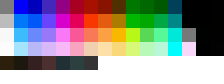
The actual NES could show 4 colors per sprite and sprites were either 8x8 or 8x16 pixels. As I said, we haven't really followed these restrictions. Instead, we picked 16x16 pixels as the "base" unit for our grid system with a total native resolution of 512x288 (a 16:9 resolution), scaling accordingly with a nearest-neighbour filter to fit the current resolution. Each sprite can basically be expressed in the grid system from this base unit, meaning that we can still have both smaller and larger sprites than 16x16. It's just that 16x16 is a good solid "common case" for both collision and graphics. For larger tiles, we always assume that they'll be a multiple of the base tile and calculate their size from that. You can see this in our level editor, where we've placed sprites of a few various sizes. The sprite boundary is marked in red:
![]()
(Why yes, I DID spend about five minutes in MS Paint drawing those lines. Thank you for noticing)
Keeping color reduction in mind
The fact that the NES had such harsh restrictions on the number of colors per sprite kind of gives its games a very special style as well. Developers and designers would probably have loved to be able to use the entire NES palette freely without thinking about the restrictions involved. Even though it started out as a technical restriction, it becomes part of the aestethics when designing something which is supposed to look like it came from the NES.
One thing I like doing is starting out without thinking about the number of colors I use. I draw characters/environments etc. and end up with way too many colors for a sprite. At that point, I generally simplify and restrict the number of colors. For instance:
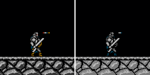
In the sprites in the picture above, I've removed some of the shading, reduced the number of colors for both the ground and the character, which kind of gives the impression of something that would fit more in the NES era. I might go over the ground once again and use more black to give the impression of a darker shade for the rocks, but it illustrates the principle quite nicely. We're still going back to the earlier sprites that we created and reducing them like this (plus some additional touch up while you're at it)
Playing around with different color compositions
Another thing I really enjoy doing is switching out all the colors for sprites, seeing what they might look like with another color scheme altogether. First of all, you might be surprised over how much better a certain color combination suits the sprite than the one you initially thought. It's also a nice way to create alternate versions of a resource:
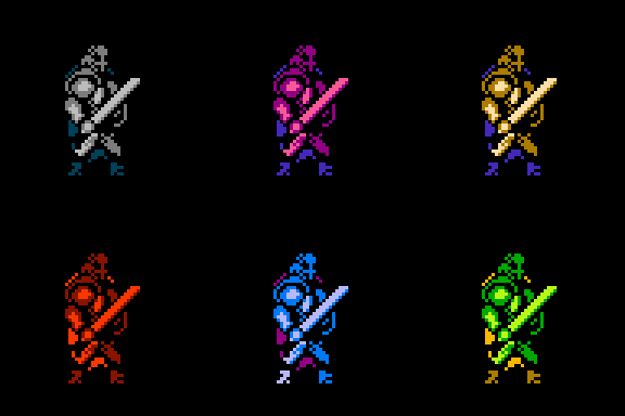
For me, this is all part of the prototyping process, trying to find colors that make sense together (and sometimes flat out failing on doing so). Sometimes you might even find new resources this way (for instance, by accidentally creating a nice looking statue by using an all grey theme)
Finally, this idea can be taken a bit further, and each resources can be changed around a bit to create entirely new resources instead.. For instance, our current set of mages for health and magic refills, where we vary both color schemes and form:
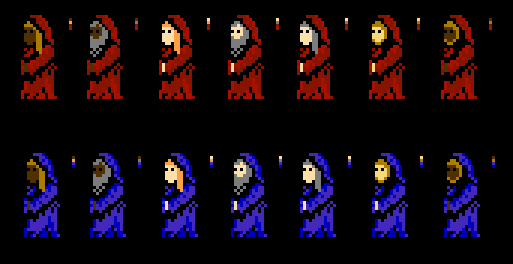
It's a simple thing to do, and it just adds a whole new depth to the game.
In conclusion
... This was a relatively spontaneous writeup from my side (Eric), where I wanted to share some of my thoughts and ideas with you guys. As usual, I just hope that there's something interesting in there for someone else too.
I'm always open to discussing gamedev - feel free to contact me if you have any questions or comments.
// Eric Lavesson


Great pixel art!!! Really has that old school NES feel to the sprites... Awesome!