![]()
Hi there Wizards & Sorceresses!
I feel such a nice sensation today! I took a look back to the last year of work and I just realized my pixel art improved so much! Is so nice when such results come so clear to your eyes. It is the same feeling I have in these days, testing the new version of our alpha Luca is working on. We started from zero, and now things begin to work properly, as our technical comprehension extended. I painted a lot this year, maybe more than I ever did. 8 hours a day, six days per week. I painted mainly landscapes, with all the 3 method of observation: in person, by pictures, and by memory, and all that training enhanced my skills.
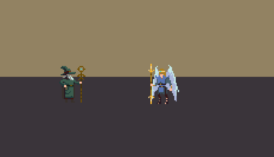
In this post opening you see two version of Auriel, Flame of Heaven. If you will be able to forge a Pact with him he will share with you his Holy power. On the left there is the 2014 version, and on the right Auriel 2016 with his animation (not complete yet!). It was great fun to remake this one, keeping the hardcore 3 frames per cycle. In this two years I started to learn how to take advantage of keyframing, and now finally animations are more juicy. And I have to say thank you to Adam Kling (Duelyst Character Animator) for his useful tutorial.
And here below the complete animation of Auriel 2014.
Auriel, Flame of Heaven. First version. 2014
I still like this one because of the old school approach, but I feel the new version is much more charming for a boss. I don’t mean to trash the old version. It will become an angel fighter, and I will use it as a template for some others characters I need.
But, what I can’t really use is this one here.
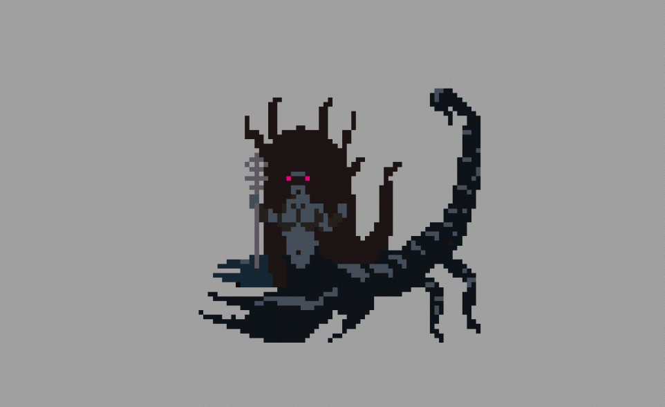
Erishkigal, The Scorpion Queen. First draft, 2014
I’m a nostalgic one, so, I do really like her. But I feel there is no comparison with the new version of Erishkigal, The Scorpion Queen, Lady of the Great Earth, here below.
This new work isn’t simply better, just because of details and animation: it’s gonna match much more the entire style of the game. Wizards of Unica has retro pixel art graphic, but with an unlegit photographic render of it. I don’t care to copy the old school style. I want to contribute to push it forward.

What I like in pixel art are the potentials for abstraction and illusion present in it: it’s a great exemplification of paint technique at his best. The XVI and XVII centuries’ masters used to have no more than 8-12 colors on their palette. And they were starting a painting “a musaico”. This means they were painting in the first phases with large brushes, putting a color side to side with another, without any blend, just like pixel art (or mosaic, direct ancestor of pixelart). We can blend with dithering, but is a perceptive blend, not a physical blend like it is possible to do in further phases of painting.
Another thing which intrigues me in pixel art is the interpretation: the subjective perception which fills the gap between the media itself and the final illusion of the representation. And even more, I like the error. Not as a mistake, but from its Gothic and Sanskrit etymology “ersare”: something which is lost, wandering, slipping. To juxtapose a pixel by another we represent a figure, just by making lesser errors about its own appearance. And if this definition is true for every kind of drawing, even with “higher resolution” (as a traditional drawing), in pixelart the error is an unavoidable presence, which you have to embrace.
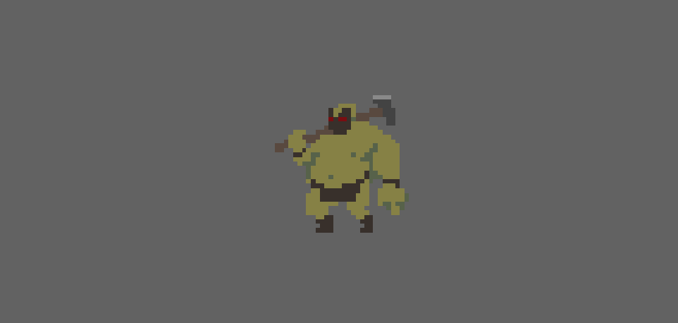
An early animation of an Ork. 2014
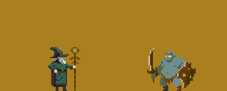
2016 Ork restyle
At first me and Luca were tempted to use 8×8 pixel graphic for Wizards of Unica. The charming of that graphic is not only the limitation, but the impending error. A misplaced tree in a pencil landscape doesn’t change nothing. A misplaced dot in 8×8 pixel describe a complete different thing. In the end I felt more comfortable with a 32×32 resolution which balance cartoonish graphical rendering with the deep need of smart and condensate solutions.
That’s why, even if figurative, pixel art is always related to abstraction. A single pixel is a monochrome abstract painting. If we double its resolution (2×2) we have the first minimum cell of modulation, but still the abstraction is almost complete.
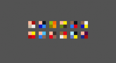
2×2 Street Fighter II characters
In the past I had a try to paint in 2×2 the Street Fighter II characters. It was a great experience to understand principle of pixel art, but the only connection with the figures was the color. And that’s another reason I deeply love pixel art. The relation between form and color is unbreakable, and one constitutes the other.
Things are moving further here, and soon will be able to show you a next alpha version after Luca’ smart refactoring. So keep yourself updated, follow us on Twitter and our dev blog. We’re moving slow, but restless. Think of us as Juggernauts. 2×2 Juggernauts.
Thanks for your passion and support!
Daniele Lynx Lasalandra
tweet @TheBlindLynx

I'm also a big fan of pixel art. Nice article and you've made great progress so far. One thing though, the walk animation of that orc character needs a little more work.
Keep it up!
Hey Sph!nx! Thanks for appreciated. I totally agree with you, and it will be polished soon. Keep following!
this is so cool! I wish i could do stuff like this!
Glad you like my work! I just started to make pixel art a couple of years ago, but I have studied traditional paint all my life and it start to help now that I'm more confident with the pixel medium. If you want to improve my advice is to follow #pixelart on twitter, so you can find out lotta of great artist and learn alot from their works. On YouTube there are also amazing tutorial from pro artist. So start to improve your techniques, and never quit! ;)