I enjoy sharing lots of information about Cogmind's development process, and before the first alpha released two years ago, the main spot for followers to stay up to date on progress was this dev blog.
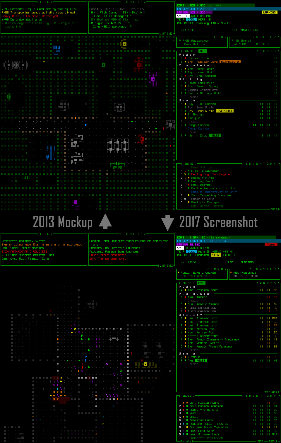
Sharing early dev stuff can in some cases become a problem later when related features, graphics, or some other aspect of a game are no longer representative of the game, but for me it's never really caused many problems. In fact, it's kinda interesting to even compare Cogmind's very first mockup with how it actually looks today.
Cogmind 2013 mockup vs. 2017 screenshot. Note the older font, and others, are still available, and have a rather significant impact on the look (!), but honestly neither looks incredibly improved upon the other--even old media more or less represents the game today. One exception would be the addition of tiles, which didn't exist during early pre-alpha and I use in about half of demo screenshots and GIFs these days.
There is one issue in particular where old info has come back to haunt me, though: The title logo design.
Back in 2015 I explained the logo design process, showing here on the blog how I used REXPaint to draw layers which were then animated separately in game. (No, I'm not even going to link it, but I'd also prefer to not edit or remove it outright--I believe it has its historical value.)
Some months after that, not too long before the first public release, I revisited the logo and made changes to its shape. Specifically, the original idea was to make the entire thing as square as possible, but the 'D' required a slight adjustment (missing corner) to help distinguish it from an 'O'. In the end that didn't look nicely balanced, so both the 'C' and 'D' got two rounded corners each. (I admit that the current style can still be interpreted as an 'O', but at least the whole thing looks better overall...)
But I wasn't experienced enough at the time to realize that all those PNGs I'd put out there would be enshrined in Google Images to be found by anyone searching for Cogmind's logo to use elsewhere... So in the time since, many people who've gone to create things like cover images for LPs just grab whatever Google Images tells them the logo is (no one bothers with press kits, it would seem, because Cogmind has lots of proper logo downloads in various sizes available there!).
In the end, there are a lot of incorrect logos being used out there. Some are even using the old 7DRL logo, or the non-ASCII logo used during pre-alpha development. It's basically a mess :P
It's possible that some logo searchers may want to try to save the header from the web site, and in those cases it'd be my fault that I stubbornly insist on using the GIF there, because it's cool :)
 Cogmind Logo, 10x10 animated version. This was recorded from within the game, which actually animates the logo procedurally rather than itself using a recording, so it's formed slightly differently each time the game is run :)
While it's also possible to screenshot its long static frame, some people might not be set up to do that so easily, and from that source it's only available in one size anyway, whereas logo seekers would like to check for other options as well.
You want more options? I've got more options!
Cogmind Logo (size 4) (animated version here)
Cogmind Logo (size 5)
Cogmind Logo (size 6)
Cogmind Logo (size 8)
Cogmind Logo (size 10)
The lesson is, be careful what you put out there, and how you do it :P. At least be aware of what can happen. Some developers are afraid to even put out screenshots or videos of their early progress (which may feature programmer art), lest it become attached to their game forever, though I believe this attitude has been shifting significantly over recent years with the indie boom as more developers share their progress--players are becoming more aware of the dev process and have a better understanding of what WIP means.
That said, I can understand why devs use code names for their projects before a proper release or marketing campaign. On a related note, at the start of pre-alpha I did at least foresee an issue with the old 7DRL stuff interfering with future reception of the game, the older jam version being as inferior as it is, so in 2013 I went and renamed all the original online content as "Cogmind 7DRL" to make the distinction more clear. That much worked out okay.
And yes, this post is a completely unveiled attempt to put more "official" logo images out there :P


