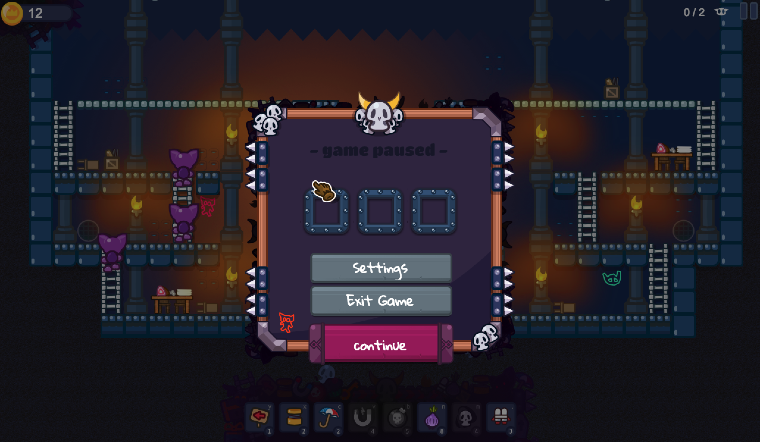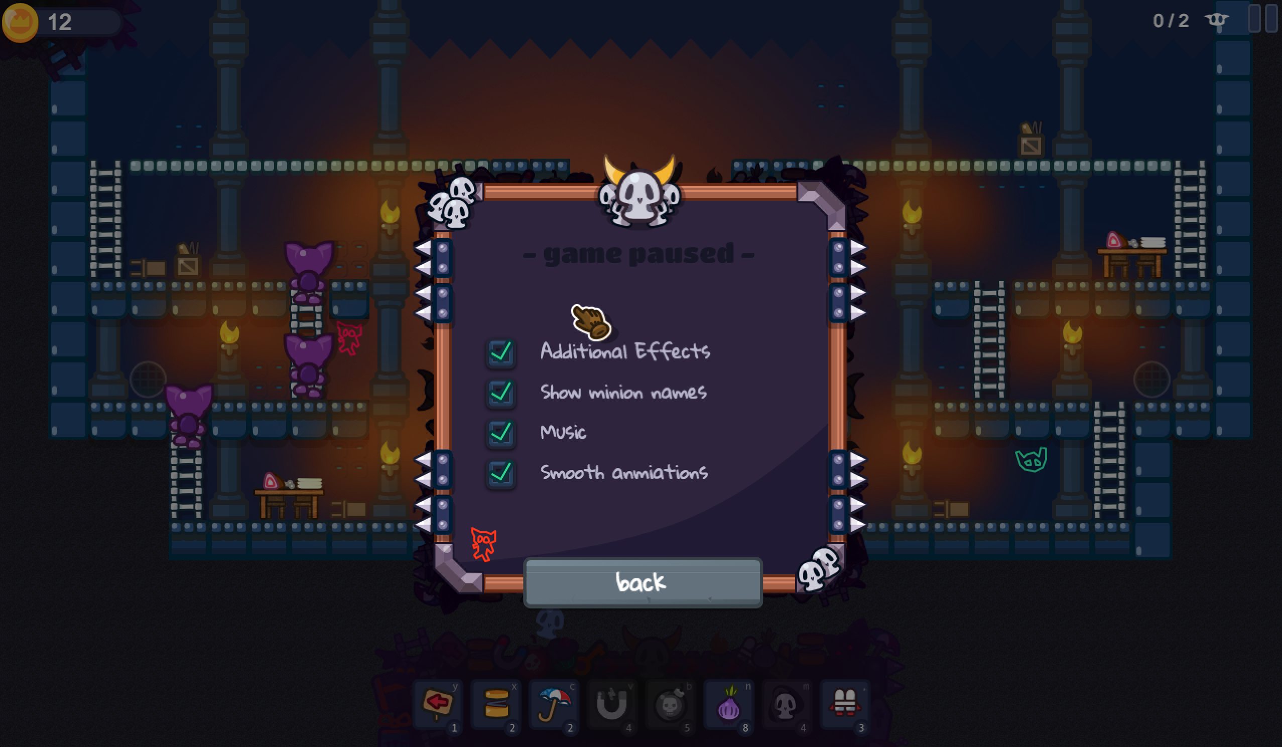
It's been a while since the last update. Right now the intro-Levels were made and I am building the UI. The main ingame-menu graphics were done some time ago, now it's implemented into the game. You will have some options for performance settings. Minions within a Dungeon does not require that much but I wanted to get sure that you can play the game even on older devices.
So I started to work on the settings menu. All settings will be saved instantly as status of now. So that's nice, without having to restart anything. First of I made different UI-Frames for different menus. But this visually jumped a way too much. So I considered doing the main ingame-menu in one frame. So if you switch to settings or exit options, you will remain in the same frame but the content exchanges.
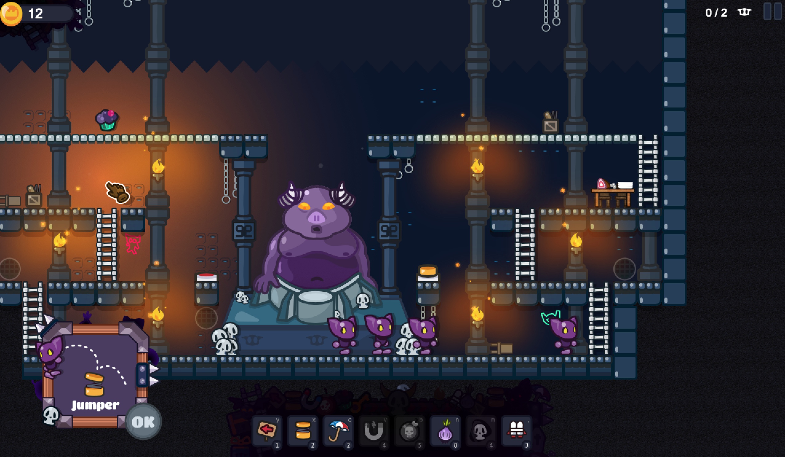
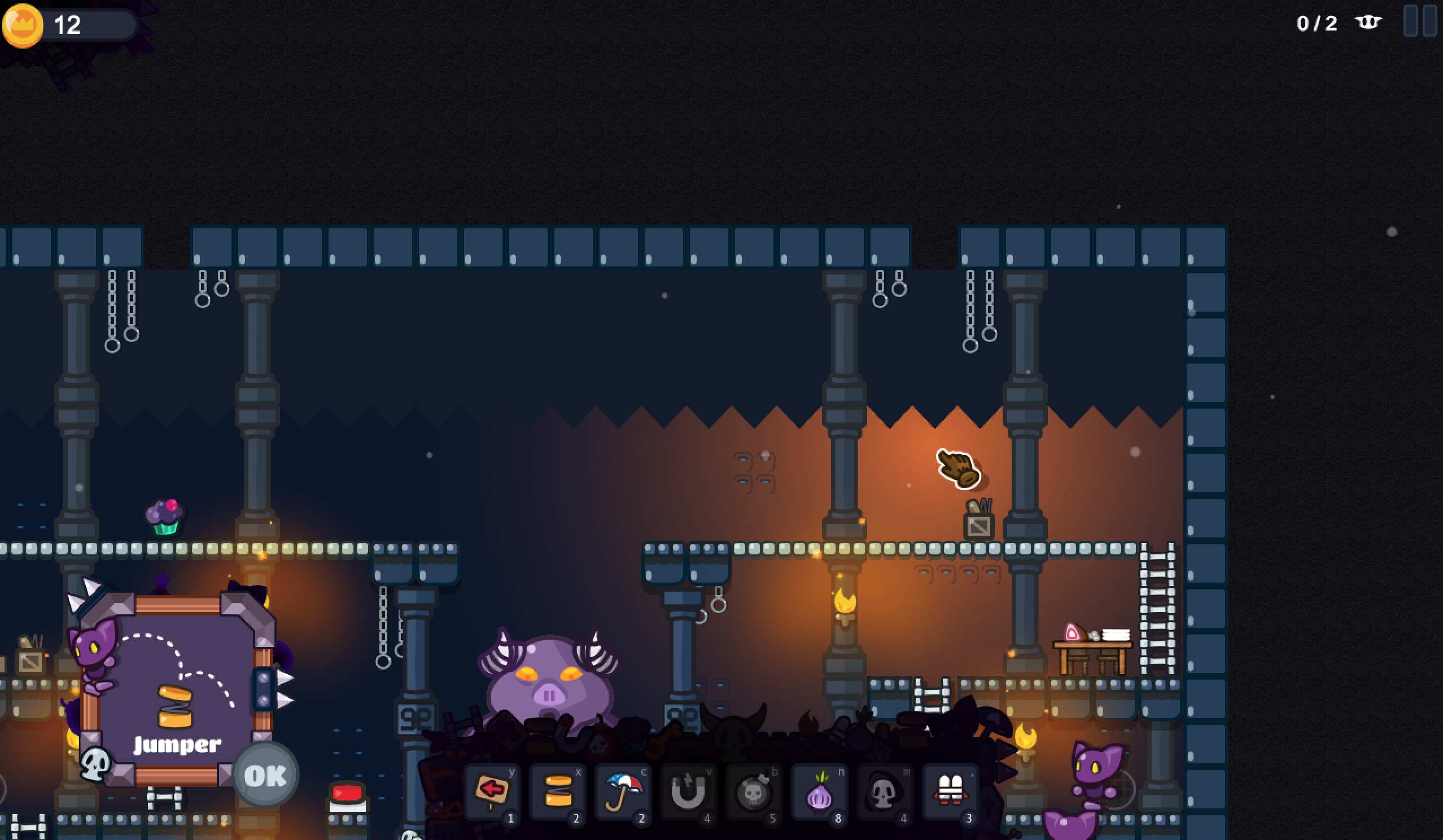
Also I felt like the animation was too heavy, so if some of you saw that whobbling effect. It's gone. You will see the new UI in action on future posts on twitter. I also added new UI for hints and failure conditions. So every time you get a new item, you got a small popup that tells you what it is. It's not for tutorial, it's merely an introduction. What you do with it, you still have to figure out by yourself since I want player to make think and not follow some tutorial guides. It's still a game not a manual ;)
If you got less minions left than needed, there will also be a game over popup which gives you direct access to restart the level. So you don't have to go to the ingame menu and exit and then restart the level. It's an abbreviation.
The whole UI is measured that way that the popups and every fits into place nicely. It even consideres your screensize. The screenshots you see are taken from a 1280 x 800 screen and everything sits well. So you will be able to play the game in smaller resolutions as of in FullHD. And it will fit at any time and the graphics will look like that, yes. Talking further on UI there are also small improvements on the main-Tool-UI at the bottom and the goldcounter at the top left. They got both a darker background which fits in the overall game topic. This gives it a more withdrawn look and differentiates it more from the background to be recognized easilier.
I hope you enjoyed this little update, If you got feedback you can just contact me anywere you want. I am quite available on nearly all platforms. The next update will be on the games story, but only a small glimbse to not spoil it :)
cheers
- Sam
Minions within a Dungeon: Building the UI, menu and settings
from the game Minions within a Dungeon I am just going through the new game UI and telling you a bit about why I build it that way. This article features new unreleased images :)
Posted by s4m_ur4i on

