As we’re working hard to make our stonepunk arena action game Antegods a reality, we’ll keep you up to date with regular development blogposts from our design, art and code departments. This time, art intern Max shares his work on the game’s visual environment.
Insomnia58
But before we go into that, a quick heads-up. Antegods will be at Insomnia58 in Birmingham, the UK’s biggest gaming festival, at the end of the month. If you’re there, be sure to seek us out and give the game a go. We’re looking forward to your feedback.
Introducing Max
Hello! My name is Max. You may have seen my name in previous blogposts once or twice. I was an art intern at Codeglue from February until June and I recently worked here as a summer job. During my internship I spent most of my time working on the visual effects and environment of Antegods.
During the last couple of weeks, art lead Tom and I took up the challenge of making the environment of Antegods a lot more visually attractive. We started with the background.
National Forest Park
The initial idea for the background was to base it on the Zhangjiajie National Forest Park in China:
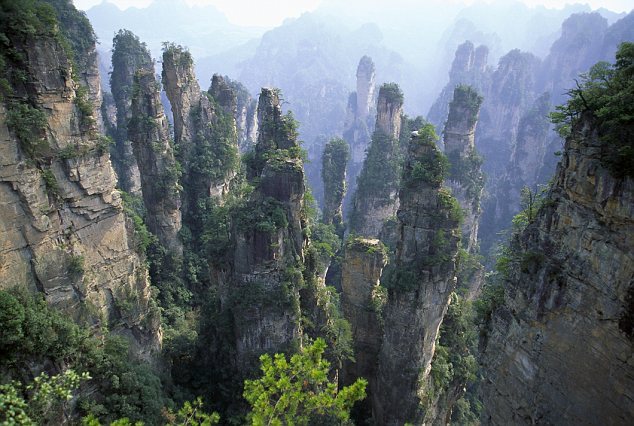
We loved the otherworldly feel this image gave us and wanted the game’s background to convey something similar. So we made a first mock-up with placeholder assets:
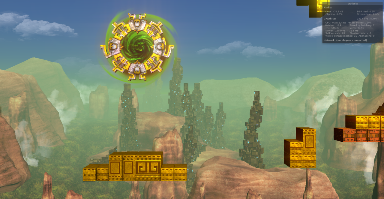
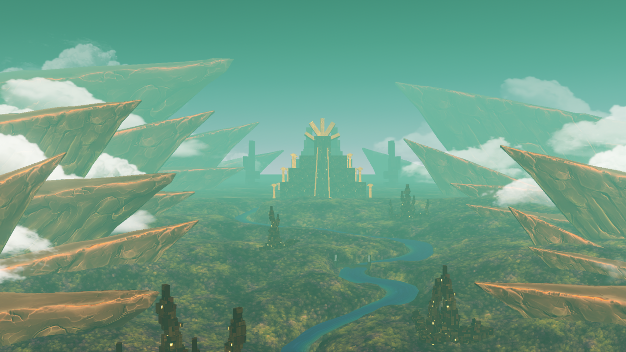
We weren’t happy with the above result. The scale was off, as Totems and Titans are gigantic, and the overall composition felt boring. We tried to make it work by changing scales and compositions but it still wasn’t what we wanted. We then went back to some old concept art that we liked, and decided to work towards that instead.
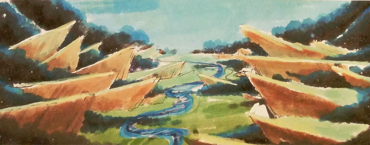
Very soon we had a new mock-up of the environment built around this sketch:
This felt more interesting than the first one. The mountains were still too high, but we liked the enormous temple in the background with cities riddled across the landscape. Because the temple is the centre point, we tried to make sure that the most prominent background objects point towards it. This way we indirectly put emphasis on the temple.
The next step was to improve the assets. Tom made two slightly different mountains to start with. With the new models in place, we gave the composition another go. This time we lowered the mountains so that the scaling would be a bit better. We also played with the colors of the skybox to see what would work and what wouldn’t.
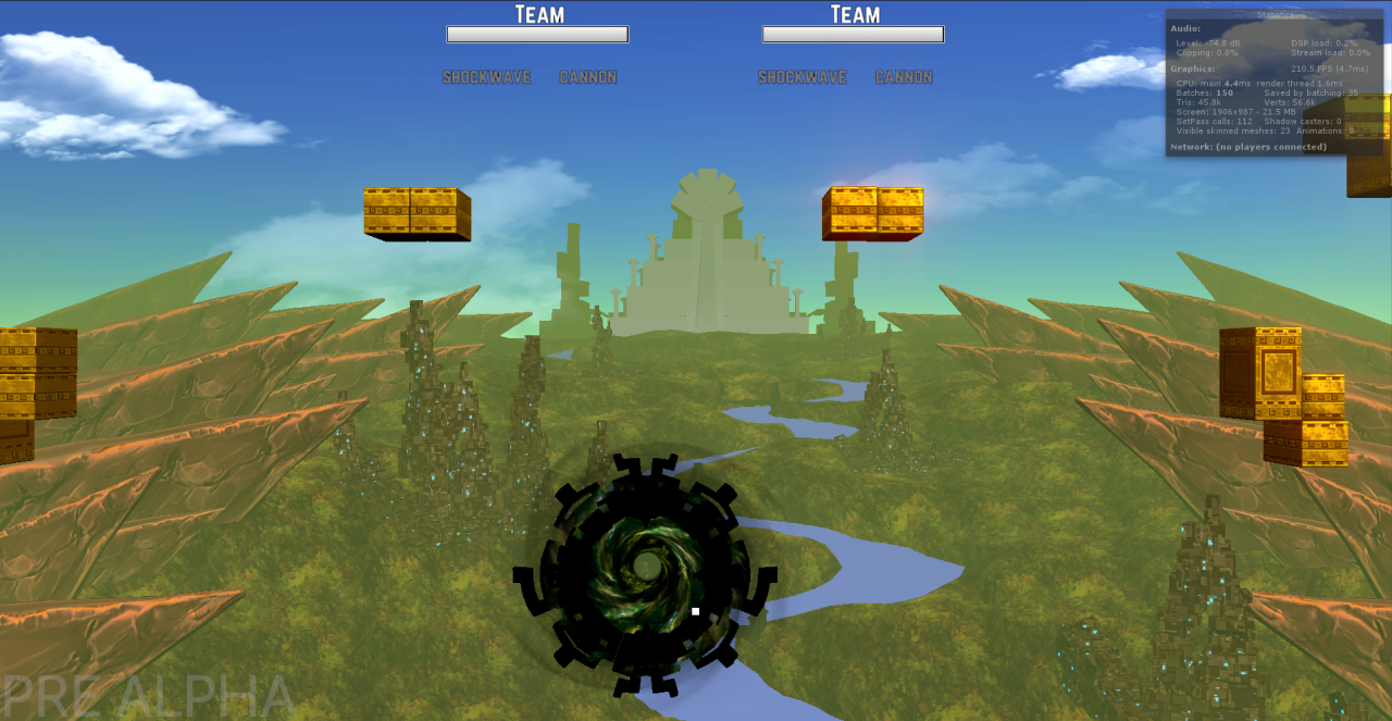
We liked the direction of this iteration. However, we didn’t like that there was barely anything going on above the horizon. We also didn’t like the amount of mountains and the colors being way too saturated. It became hard to see what was going on when playing the game.
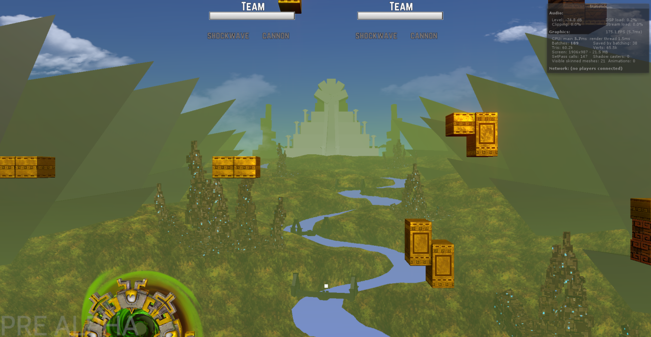
In this iteration we changed the fog color and density to better match the feel we wanted. This also separated the background from the foreground a bit more. The biggest change was the composition of the mountains and clouds. We drastically increased the size of the mountains in the back and decreased those in the front, so they seem much bigger and imposing in the back. The mountains near the front are a lot smaller but still work great for the parallax scrolling, while not being in the way of gameplay.
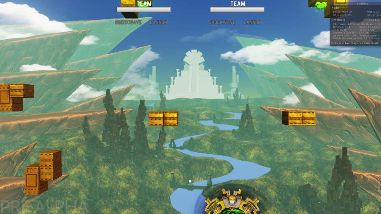
With some final tweaks such as a better skybox color, better placed mountains and clouds, we think we achieved a solid first pass of the background. There’s still a lot we want to change and improve upon, such as finalizing the temple and cities and finding better solutions for the landscape and forests, but for now we’re happy with the result.
Because we now have a solid foundation, it will be much easier for us to improve upon or create new worlds altogether.
Nimbus
We didn’t stop with the background. The Nimbus cloud around the level also got juiced up and looks more like we always wanted it to look. Niels and Kevin worked together to make a really cool shader that makes two textures scroll in parallax on a single material. They also made sure that the same shader would work on particles with transparency.
The Nimbus particles now also have two layers. A front layer and a second layer. The front layer makes the bulk of the Nimbus, while the second layer adds the red border. Because they are separate and not in a single particle, it creates a lot of motion and a more realistic look to the Nimbus.
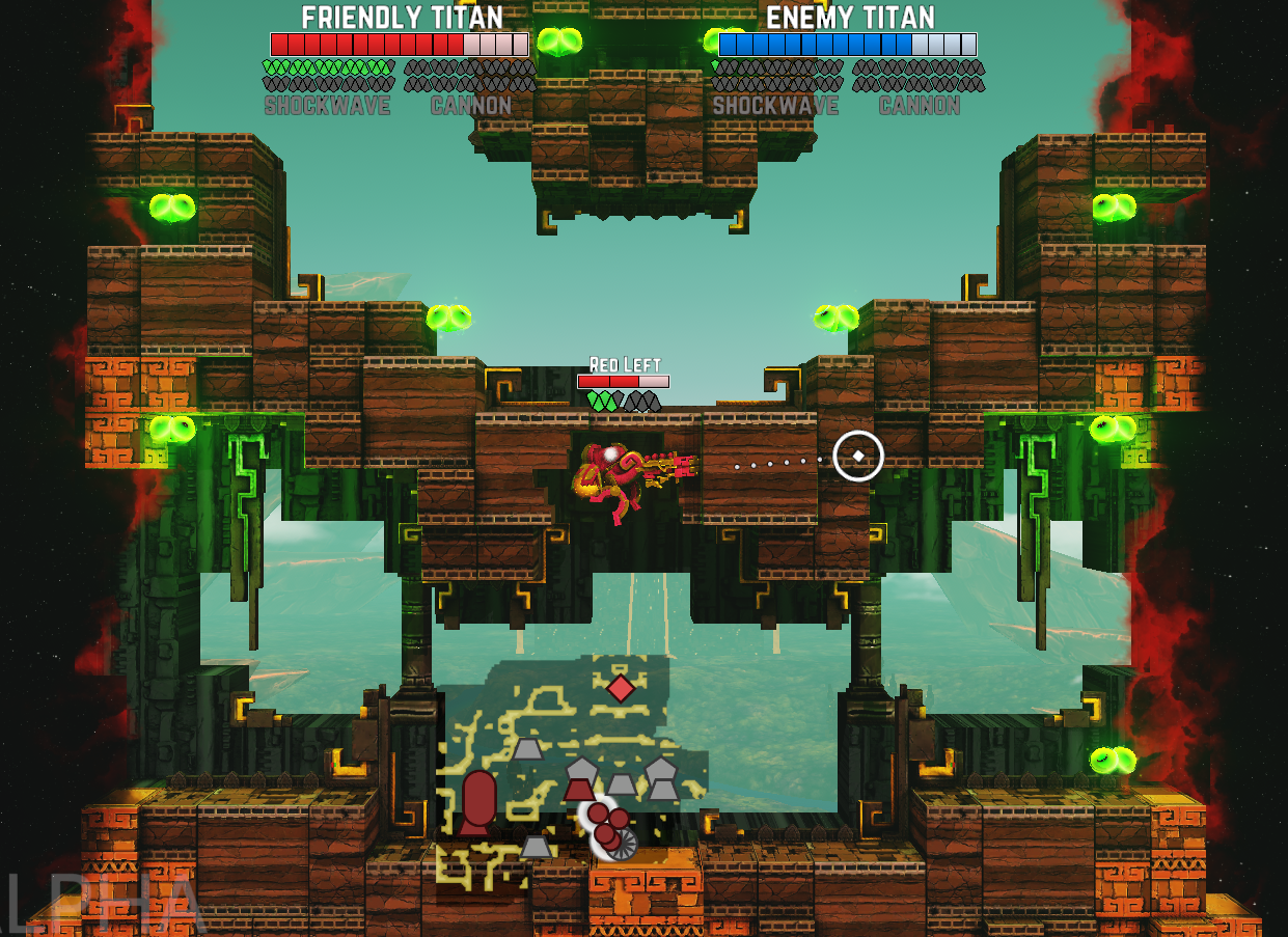
Gameplay layer & image effects
With the new background and Nimbus in place, the main gameplay layer felt visually out of place. Wytze also just created an awesome new level, so it was the perfect time to bring it all together.
I started by decorating the level with lots of ornaments, to make it more visually appealing. Right after this was done, it was time to introduce image effects to the world of Antegods. The image effects currently implemented are SSAO (Screen Space Ambient Occlusion), Bloom and Color Correction.
Below you can see a comparison that shows the game with and without image effects.
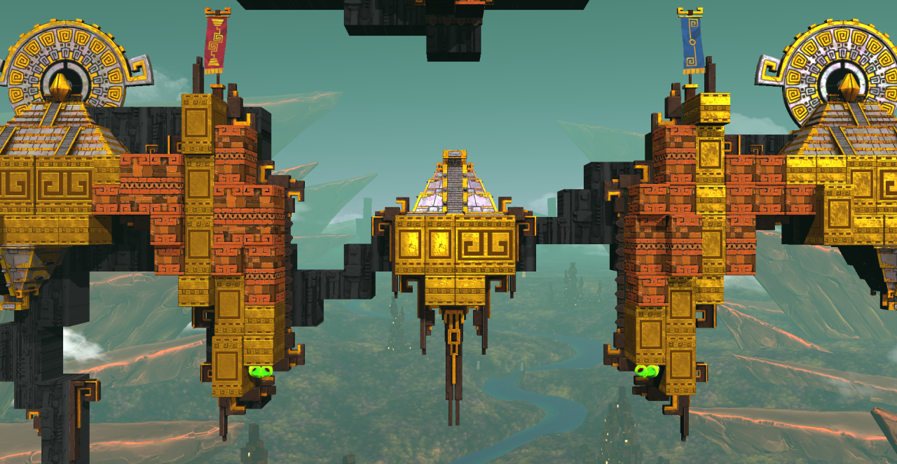
No screen effects enabled
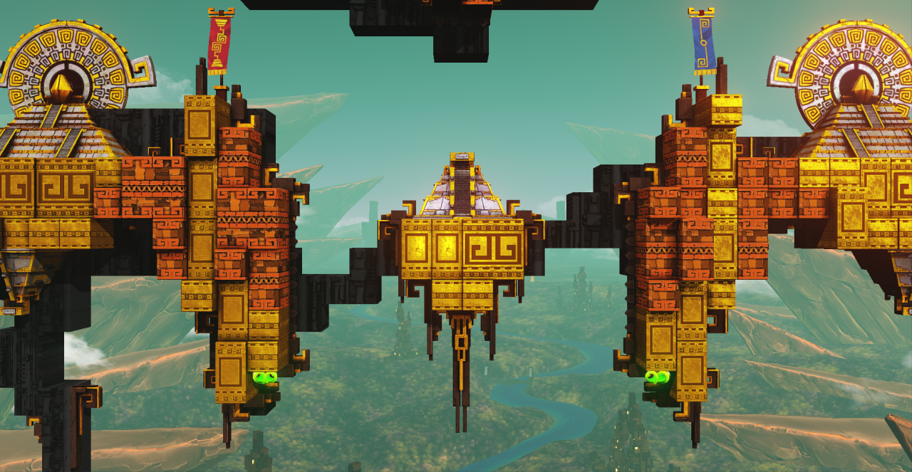
All screen effects enabled
Ambient occlusion
When ambient occlusion got implemented, this gave a lot more depth to the level. However, the blocks only had a small offset in the Z axis, making the effect smaller than it could have been. After increasing the offset by 4x, the effect was really noticeable and looked great. The offset by itself worked great too, adding a bit more depth to the scene.
Bloom
I love bloom lighting, which is no secret to anyone working at Codeglue. So I was really happy when bloom got implemented. The bloom adds much more than just a visual glow around emissive or reflective materials. It also makes other visual effects like explosions, and transferring energy much more impactful and noticeable.
I made sure that the bloom was subtle enough to not be in the way of gameplay, blinding players, but still noticeable enough to have an impact on the visuals.
Color correction
For the color correction we use the Amplify Color plugin, that’s also used in the game Firewatch. Amplify Color makes it incredibly easy to color correct your game with LUT’s (Look-Up Tables) and blend between them when needed. Because the plugin makes good use of those LUT’s, it’ll also be much easier and faster to implement all kinds of support for colorblindness.
When you look back at the comparison with and without image effects, the difference is clearly visible. The colors are brighter and the front layer is separated more from the background.
I, of course, wanted to play with the blending of different LUT’s to see how well it worked and what could be done with it. So I made it so that when players fly into the Nimbus, the game desaturates in color by 60%. This effect also makes it clear to players that the Nimbus is a dangerous place. The rest of the team liked the effect and it was kept in the game.
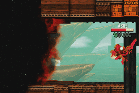
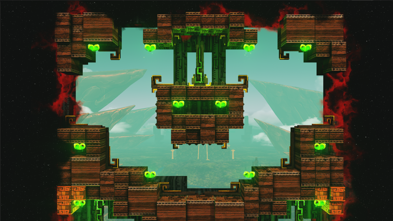
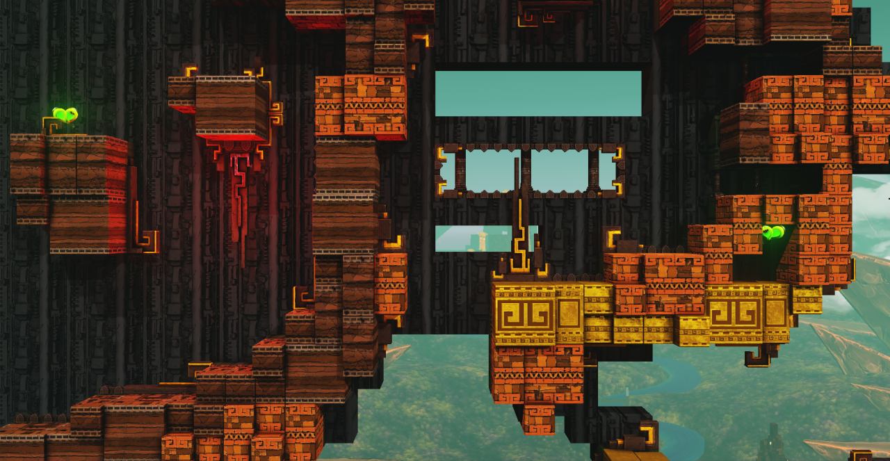
All these visual changes are impossible to properly show in one image, so here are a few more of the environmental changes of Antegods. I hope you enjoyed reading this blogpost, until next time!
Next time
In the next post, we’ll have an update from our code department. To keep up to date, please follow us onTumblr, Twitter or Facebook. Or subscribe to our newsletter. Whatever is your taste in social media!
Antegods is supported by the Dutch Cultural Media Fund, Cultural Industries Fund NL and the MEDIA Programme of the European Union.