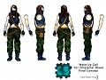
Wake Up Call is a next-generation sci-fi stealth-action shooter with a heavy emphasis on choice-driven gameplay and story in a unique and atmospheric post-apocalyptic world. Wake Up Call tells the story of Kyle Rogers, an ex-special ops soldier who has been awoken after over 150 years of cryostasis sleep. The world went to hell while Kyle slept, and it has been transformed into an alien planet. Experience Kyle’s story through a visceral and intense true first person perspective that allows for heightened immersion and gameplay fluidity. Challenge yourself to beat the game’s smart AI that adds new levels of challenge to the stealth-action genre. And finally immerse yourself in a dynamic and choice-driven story-line that will have you on the edge of your seat until the very end. Wake Up Call will be one epic adventure that any and all sci-fi fans will need to experience.


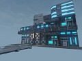
too blocky- I'd think it to look much more impressive.
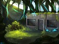
Well this is only the entrance of the cryo station. the rest of the structure is underground, its a lot more massive and it doesn't look like this at all in the inside.
Thanks for commenting, if you have any other suggestions to improve the game feel free to tell us.
Haha, I'll always make a point to put in my own two sense.
Anyway, I still would make the entrance more elaborate. Logic aside, this is a very important entrance to a very important asset of the storyline. I'd make it more memorable, but that's just me. And sorry for the double post, dunno what happened. Somebody was so motivated as to issue negative karma to both lol
The thing is, the designers wanted the cryo station to look as non-chalant as possible, so a run-down little building makes total sense.
No. Its a cryogenics storage facility, not a tourist attraction. The goal would be to -not- garner excessive attention. Making something flashy and elaborate would be counterproductive in this scenario.
However, maybe widen the door a bit. It'd be receiving shipments, supplies and whatnot (presumably.) Many of them would be too large to fit through.
I still strongly disagree. Sure, keep the low profile but add something to distinguish it from a cardboard box castle.
Look at my reply above to your earlier post on this.
I still disagree, but if I've learned anything from My Little Pony, it's to accept others opinions.
lol
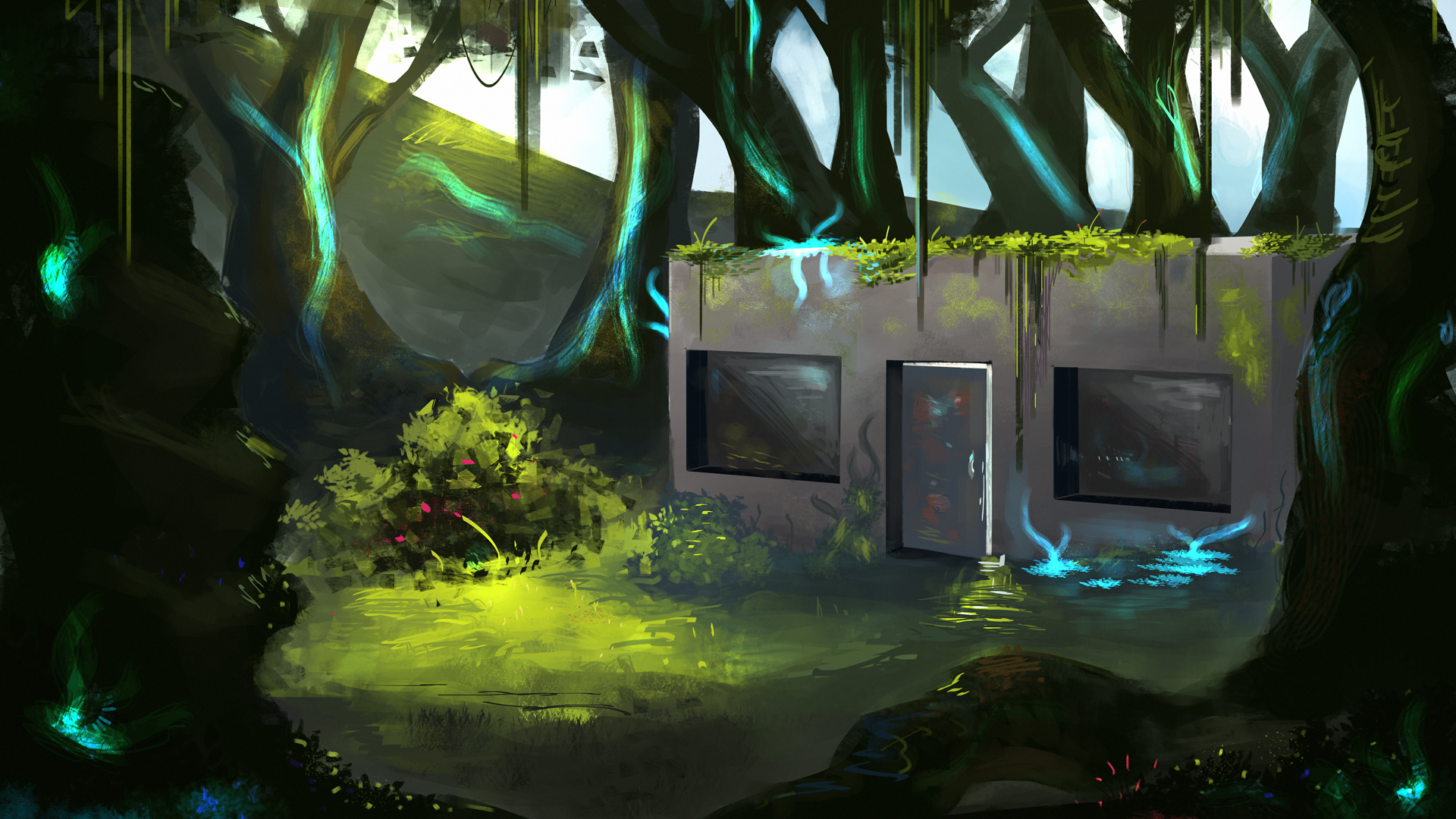
Besides, the point of this was to get a fell not necessarily the final look, as I believe the texture will look different.
you mean you couldn't do that before watching a show for prepubescent girls?
I don't get your point, what are you trying to say?
He's talking to piedoom not you millan.
lol.
I was being sarcastic :P
Still, show is quite good, lovely story lines, great animation. Saying it's only for prepubescent girls would be like saying Freudian psychology can only be enjoyed and understood by other psychologists. But I digress.
Perhaps an interior view would change my opinion. Again, believe whatever you'd like, but in my opinion I would picture such an important entity to be at least a bit memorable.
and I'm not talking like having Big Ben sticking out the roof, just details added to the window and such, and maybe some lights or what not.
Oh, I see, well yea, like I said this piece was mean more to show the lighting and general feel rather than the nitty gritty details, and now I understand the whole prepubescent girls thing (lol, was a little slow on that one).
lolol
you were all serious
Yeah, I get yah. Can't wait for more arts.
too blocky- I'd think it to look much more impressive.