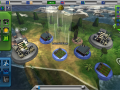
Tellus is a game that challenges players to improve the global quality of life through the development of a sustainable global society.
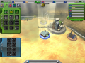

Region View, North America
(view original)

Post a comment
Description
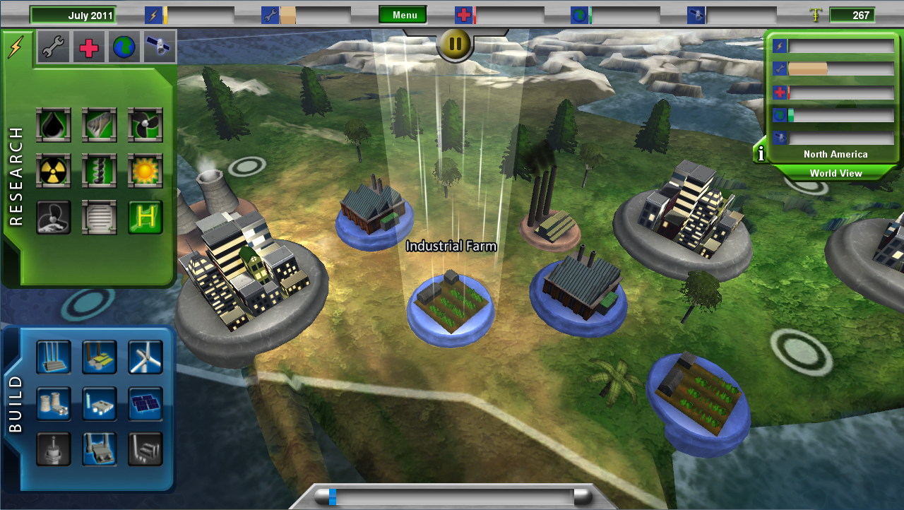
The region view of North America in Tellus Alpha Version 3, with updated GUI.
Ok, but you really shouldnt use so much gloss and everything is so big. I would also not go further with the Bewel than 1 or 2px
I would ditch the gloss gradient on the top bar and the "i" + "menu" & "pause" button and the world view button fully. those are the worst
make everything a little smaller , especially the build and research frames
2D graphics live from very small gradients and very tiny effects. It looks like you know how to use photoshop but you gotta work on the style
Dont use so many über strong effects, light effects is where its at. people will notice 1px thin lines :)
Thanks for your comment, ShrikeGFX! I personally tend to agree with you on a more minimalist approach. We already had plans to revise the build and research menus. They will be smaller and those heavy "purchase confirmed" frames are going away completely!
Regarding the size of the bevels, this was intentional because we were attempting to create a sort of board game aesthetic, but we can certainly experiment with reducing the size as you suggest.