Welcome! Welcome, Ladies and Gentlemen!
Let's take a small and quick look at what I've been chiseling! Dioramas! I am aiming for each tile (tile in Knightwasher means a single location that is centered on screen) to be impressive and special on it's own. I want them all to be dioramas. Stages of play on their own merit! Of course some of the tiles will be relatively empty. I don't want everything to look cool because then nothing does. Nothing should look utterly boring and uninteresting either!
As a diorama, each tile must stand on it's own, even the most common tile full of grass should have some character. If I can't take a screenshot at random, I've failed to make the tile. When I was younger I used to play Warhammer 40'000 all the time, now I've moved more towards board games, but the love for tiny handcrafted things still stay.
Diorama backgrounds!
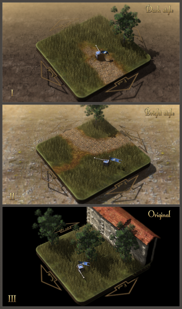
Recently I've been testing some backgrounds to find some solution to "dead half of the screen" and I'm fairly confident now with what I've got. As I already have all sorts of lovely effects like depth blur, nice lighting and camera view with low fov (field of vieor) bringing the look of miniature photographs, adding a background itself was a no brainer. Everything I've already got in, benefit more from actual background than just a black screen.
Current tests include the "Dark style" which brings out the tiles themselves more, but darkens the overral picture a bit too much. Second test is "Bright style" which I like more in terms of brightness, but it makes some tile pieces, such as the travel direction arrows and roads very hard to read.
As for the progress itself
I have most of the "common tiles" done for Westwood forest (the starting area), just shore tiles missing and of course a lot of tweaking and adjusting! I had some issues with conversation window not accepting line breaks (/ enter presses) which prevented me from actually typing in conversations, but it's fixed now :)
I should have more free time for the next three weeks, so more content!
I always welcome feedback, so let it pour out if you hate it or love it! Or anything in between of course!
Cheers!
Detocroix


Wow I love the depth in the backgrounds. Looks amazingly beautiful.
I must agree - the backgrounds really add color and eye-pleasing composition to the already fantastic levels!
Hm. I liked the black, it was nice and simple.
If you do add backgrounds, I would consider making them simpler than they are right now. They should, in no way, distract from the detail on the actual tile...