Hello there! It's been awhile since the last blog post and a lot of major updates have been made that we'll share here soon. But for this update, I thought I'd discuss one of the most critical updates to the player interface, which covers how the player interacts with objects in the game. The challenge is there are currently 32 contextual "actions" that a player can perform such as "open door", "drink", "eat", etc, but how can we make it easy to perform these actions without having to memorize keys, button modifiers, etc? Our solution was to borrow from two UI/UX mechanics and combine them into one.
Picker Mechanic
The first mechanic, which can be found in various Apple iOS apps as well as other OS' is sometimes called a "picker wheel". The idea to use it in HEVN actually came from an iOS game/app we developed called Iambic, Are You? which makes use of the Apple picker/scroll wheel in a Poetry Types reference screen. Here's an example screenshot of the picker wheel at the bottom with the ad blurred out:

Basically, this list/scroll mechanic seemed like a pretty good way to convey a list of options that work contextually. So not only could we inform the player of the options that are available, we can also update those options based on what the player just chose, such as flipping between "open door" and "close door" in real time.
Application Switcher Mechanic
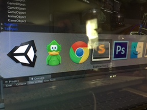
With a proven "list" mechanic in place, the next step was how do we let the player interact with this on various platforms from keyboard and mouse, to controller, to possibly touch screen? The current solution is to borrow from an OS "application switcher" style keyboard combination that allows users to navigate through all open programs using one or two keys. On the mac the keys happen to be CMD+TAB and looks like this:

By holding down the CMD key and hitting the TAB key, users can cycle through all open applications quickly. We decided to combine the "picker wheel" mechanic with the "application switcher" mechanic into one "player scroll menu".
Player Scroll Menu
The scroll menu allows players to use a single key to cycle through all interactive options quickly. As an example, on the Mac the TAB key can be used to cycle through the displayed options and the E key can be used to select it. This could also help with muscle memory, such as hitting the TAB key once to add an item to the player's inventory, while two TAB key presses can be used to examine or drop an item, etc.
And just in case, SHIFT+TAB can also be used to navigate the list in reverse order (note that on a controller using the D pad with the up and down arrows would likely feel much more intuitive). But it also means on a touch device we can use a single touch to navigate the options in a relatively simple manner.With the mechanic in place, we also had to make sure using the scroll menu is responsive and hopefully not tedious to use. Essentially we set a few guidelines in place:
- Limit the number of options available so the player can quickly navigate through all of them. Currently the maximum number of options is 7.
- Make the first option the most commonly used one. Make sure all critical gameplay options are front and center.
- Only show one option if only one option is available. This should help when interacting with computer terminals or any object that has only one purpose/function in the game.
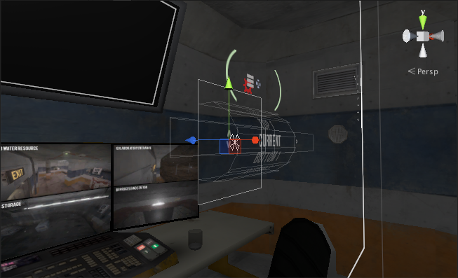
Here's a look at the player scroll menu UI layout in the Unity editor:

And here's a snippet of how it looks in action while interacting with a couple objects as well as the player helmet itself:
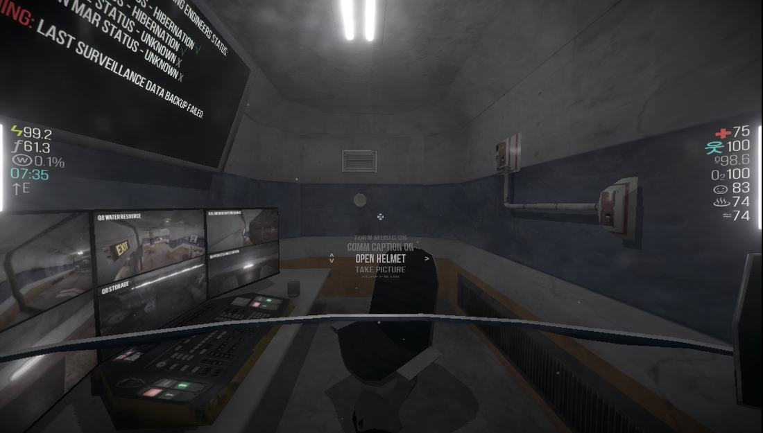
Here's a static image of the scroll menu with a player helmet equipped:
One of the benefits of having a simple contextual menu when looking at an object is that it conveys information and options to the player about the world in a fairly straightforward way. For example, when looking at a lamp it might list the options to: "Turn Light On", "Take", or "Examine". So just from looking around while walking the player can learn quite a bit about what is possible in the game's world.
Hopefully this will help to make the game feel deep and yet still accessible.
Well, that's it for now. Thanks for reading!
Larry


Having a list of actions through which you have to scroll to get to the one that you want is not quite a good idea in my opinion... Especially if the actions may change while you scroll through them (say you try to do something special with constantly moving object), and when you cannot see the full list when you bring it up... I remember that exact thing screwing me over and over in ArmA series since Flashpoint...
A radial menu might be bit better suited though there is innate drawback of it intercepting the mouse input for choosing actions, when it would be used to track the object you are trying to interact with (or turning in general while trying to do something on the run).
Hope the feedback is of some use.
Thanks for reading, your feedback is quite helpful! I haven't tried ArmA yet but did find this: Dslyecxi.com (not sure if this is quite what you were referring to). We actually had a quasi-radial menu at first but it felt a bit cluttered with how it was implemented. But it's definitely still an option to explore/learn from though.
I was also reminded of Arma and its problematic menu system. Dslyecxi is a well known and respected Arma player who's been pointing out the flaws of the system for years. The linked video is concerned more in general with the flaws of the engine rather than solely the menu itself, but it might still be relevant.
From my own experience playing Arma, the context menu starts to get unwieldy once you have more than three or four options since you spend a lot of time scrolling between the options to get to the one you want. It's also a problem when you are in a rush for any reason, since it's easy to accidentally select a wrong option.